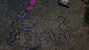
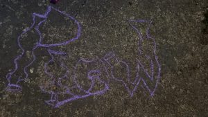
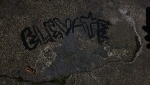
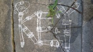
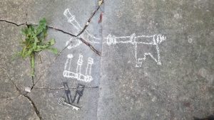
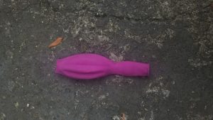
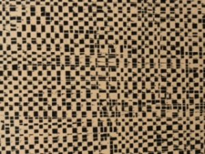
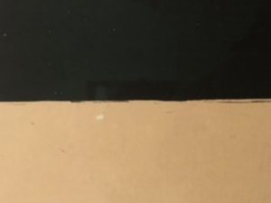
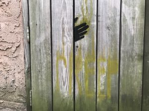
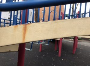
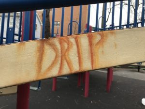
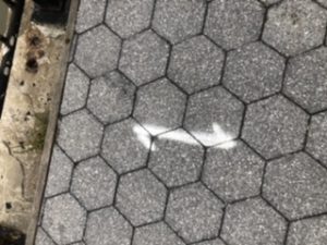
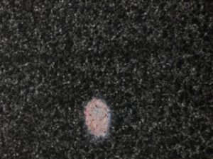
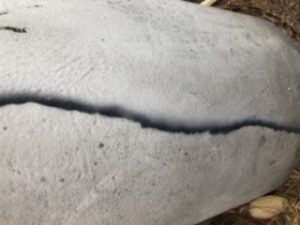
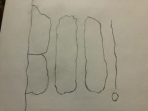
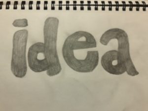
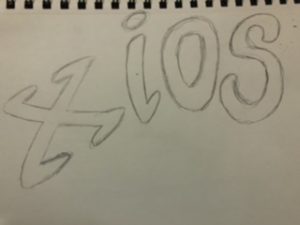
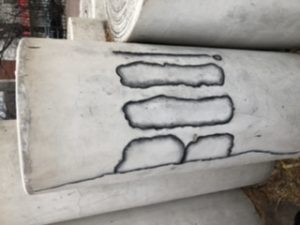
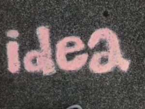
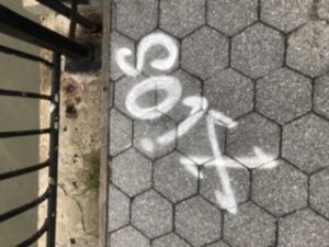
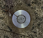
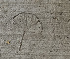
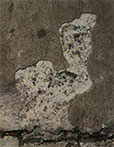
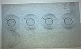
So these are my final composition. This project was really fun especially because it was outdoor. One of the thing that annoyed me the most were the first objects I found were effected by weather so I had to change pictures also my chalks were crap it was really light all of the colors were hard to see so I had to over write all 3 again and again it was really frustrating but the project was really fun
The Metropolitan Museum of Art – The Princesse de Broglie
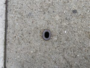
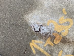
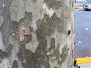
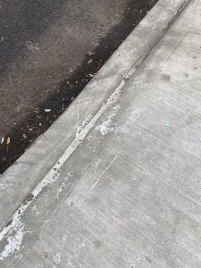 These are the 5 pictures that I chose to work with
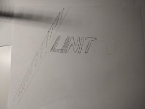
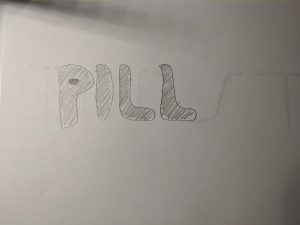
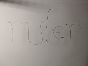
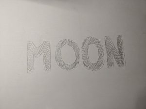
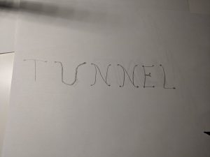 And here is the 5 sketches for those picture that I’ve been working on
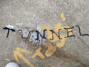
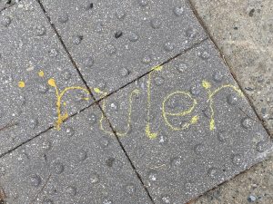
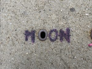
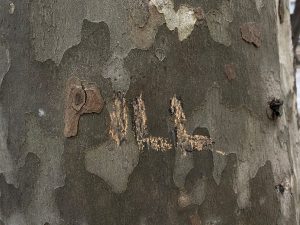 Finally, these are the 4 final pieces for this project. Only 4 because the one with the word UNIT was gone when I came back.
This project is by far the hardest in term of finding ideas at least for me because looking at the “starting point” to imagine the whole word with a specific typeface is really forced me to squeeze my brain to let my imagination does its job. The second hardest part of this project is the weather. As you notice, I started with 5 “starting point” and 5 sketches but I only have 4 of the “final phase” because this project was based on little things outside and we also have to come back so not everything stays the same when we came back. It’s also really cool outside at this time of the year but luckily, I’ve been a good boy this year so Mother Nature saved me by not raining or snowing when I was about to start to work outside. After this project and also looking at my classmates’ final, I learned that every little thing could turn into a typeface with a little bit of imagination. sometimes things are a little bit harder to see like my “PILL” piece when the “starting point” which is “P” is backward so I draw the rest of the typeface backward and flipped the image but I guess Openlab doesn’t like that so somehow its flipped my image back to the original. Finally, I also learned that if not because of the project please don’t go outside with a bag of chalk/charcoal trying to draw something in this kind of weather cause IT IS FREEZING.
Project 5
I enjoyed this assignment more than any other one introduced in the class even though I don’t like drawing. This instilled in me concepts that I can use in the latter of my career (law and health). It took me a while to realize this , but this course has taught me things that I need to pay close attention to. Nonetheless, the above were not the initial pictures that I was going to work with. I changed over to this because it is not too complex. All of this was taken and done outside the basement area of my building. For PLOW I decided to outline the purple chalk with charcoal that way it would be more visable to the eye. Due to my inability to write small, I was not able to keep the fonts the same size as the objects or mark chosen. In the future, I would look for items that are much bigger to fit my penmanship. I do take it upon myself to practice writing smaller on concrete and on paper. Did I meet the objective of the assignment..in some aspects yes. Much better could have been done.
Museum visit
Museum Visit – The Frick Collection Museum
Project 5: imagiNATION
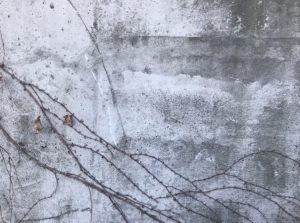
Bloom – For my first typography, I’ve decided to go for the vines crawling on this abandoned building. Personally, this is my favorite one out of the three I’ve done because I think I achieved my goal of making it blend in with my subject but at the same time you could still see the word Bloom. This is also the one I’ve enjoyed making the most, the leaves were pretty fun to do, I thought it was interesting as I tried to make it look somewhat like the actual leaves — I did my best. Color matching the typography was fairly easy too, thankfully I found the colors I needed, I used a combination of black, browns and mustard yellow to match it with the real vines, which helped making the piece look united.
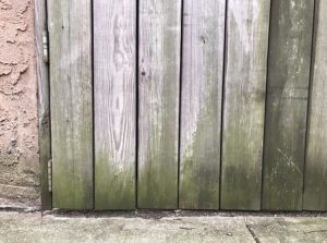
Creep – I had a hard time on this one. I had trouble making the typography stand out. Personally, I think I could’ve approached this better, it just lacks character. The word should’ve been the first thing you should see, but the hand I drew to go along with it takes away all the attention. The color I chose for the letters didn’t match the way I wanted it to be also, it was a tad bit brighter, it had more yellow tint to it. I still somewhat like the mossy look of the actual letters though.
Drip – This was the easiest one to make out of all three. There’s really not much going on for this piece though, it is also lacking character in my opinion. But, I was quite happy I had the almost exact color shades of the actual stain at least.
imagiNATION-deliver
sketches
Final composition
This project was really interesting to do. It was kind of hard for me to find spots because i didn’t want to be in the middle of the street drawing on the floor. It was also hard because of the weather some days was rainy or just really cold. I think they all turned out really nice, I would’ve done it better if I got a better variety of chalk. My favorite one is the first one “Boo!”, at first I was hopeless that it was gonna turned out good but it came really nice, even though it took a moment to match the colors so I had to blend the chalks together to get that nice shade in the borders. Overall I really like this project and I learned a lot about creating things out of simple stuff that you find in the street, you just have to think outside the box and be creative.
Project 5 – ImagiNATION
For this project I went out and searched for interesting objects and shapes on sidewalks. I had plenty, but these are just some of the ones I found:
In class I came up with some ideas for how to turn some of these objects and shapes into type designs. I tried visualizing them as letters and then thought of which words I would want to use for each composition.
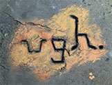
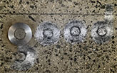
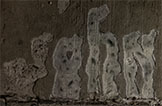
Then I went back to the same sidewalks and used the same shapes as starting points for my designs. These are my end results:
To me they are all readable, but the middle one that reads “good” is a little harder to see. It bothers me that I couldn’t make it better because it was my favorite one to sketch out. It didn’t work out as planned because the concrete near the metal circle was full of pebbles and that was not something I had thought about before going back to the location. It was hard to draw on that surface.
I wasn’t able to get the letters of my “ugh” design to be as thin as the object but I think its okay. For that one I also had to fill in cracks with orange because if not the empty spaces of gray made it look weird and patchy.
My favorite composition to do in the end was the third one that reads “john” because in a way it was the most elaborated one and I feel like it just works best and actually fits in with the object/crack on the sidewalk that i designed it with.
This project wasn’t difficult to do in itself but it was work. I had to do them at night while relying on street lamps and flashlights. I feel like having done them at night worked in favor of my “good” composition because when I saw it in the daytime, the metal circle looked one bright and glossy shade of gray and everything I added in chalk looked darker. But at night with the few lights around it, it was more reflective and I drew my sketches and my compositions to look like that. I realize now that I didn’t think about the fact that the circle would be bright gray in light because I first took the photo of it at night too. So it makes sense for me to have done the chalk-work at night as well. This same thought applies to the other two compositions.
The process was tedious and a little nerve-wrecking because every time someone would pass by me while I was working on it I thought they might say something about me drawing on the sidewalk. But they didn’t. That made it a little fun too.
In the end I’m stuck between loving what I made and feeling that I could’ve done it a little bit better.

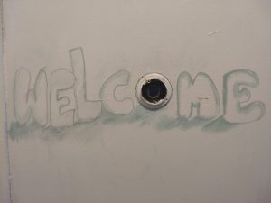


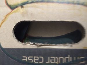
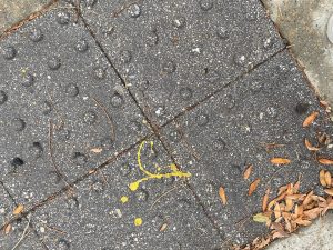
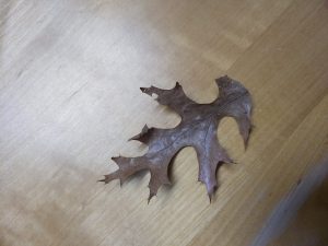 these are all of the 3 objects I found the others I found wasn’t there anymore when I got back so I couldn’t take pictures of them