Klarissa Grullon
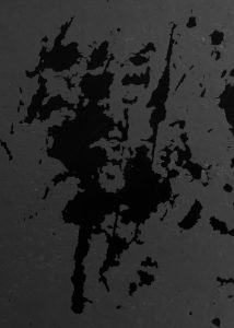
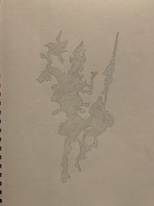

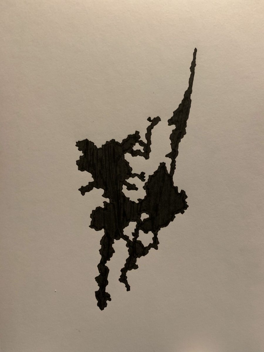
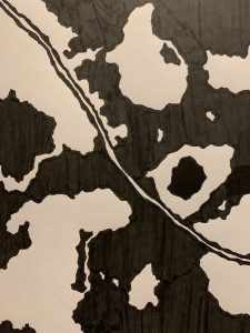
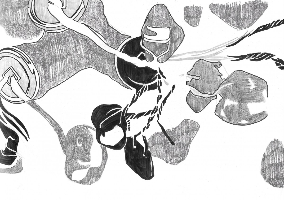
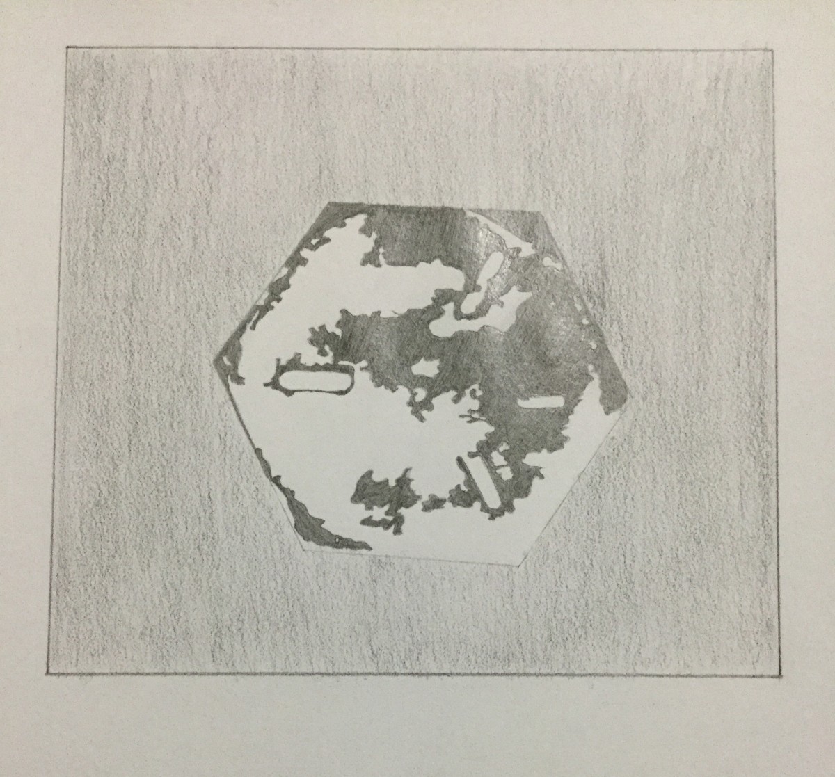
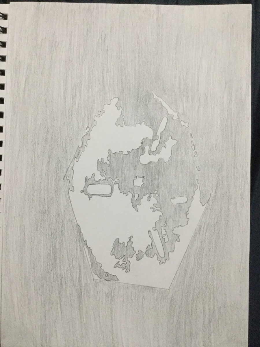
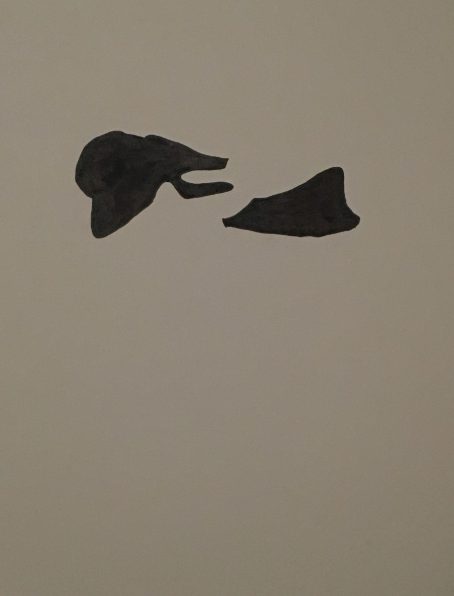
This is an example of an obvious foreground-background relationship. Even though the black is prominent, I don’t think it takes over the gray’s space. It makes me think of islands and archipelagos scattered through an ocean.
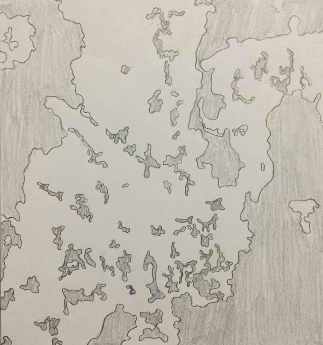
These shapes were made by someone who was trapped at the workplace they loath for a 9-hour shift, while they were using the restroom during their break. They just sat in the bathroom stall, prayed that nobody would come in, and scratched away at the stall door. They carved big shapes and super tiny shapes, all random and near each other, until they saw what it became: a tiny continent. Then they wished they could quit their job and go live freely in their own little world.
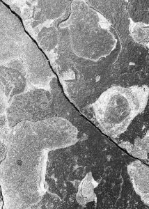
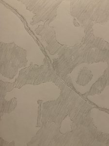

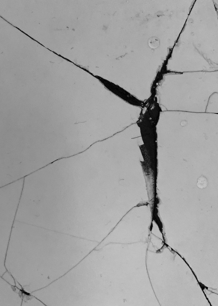
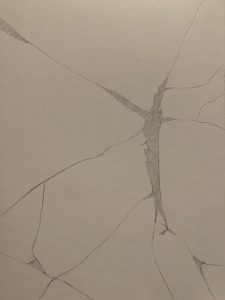
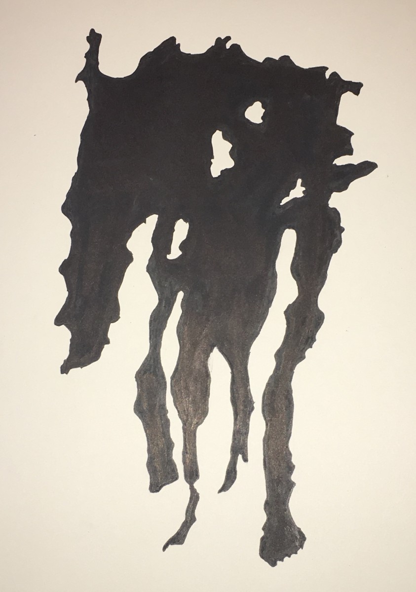
This example is of an ambiguous foreground-background relationship. There are bulbous, round organic shapes with some parts looking a little rougher and more linear. The crack in almost the center of it doesn’t add on to the shapes but I think it still makes an interesting composition. The shapes together make me think of splats, bubbles and drops.
This came from the aftermath of earthquakes, tsunamis, landslides and even acid rain on the hardest and strongest concrete known to man. Any other kind of concrete would cease to exist after having gone through the same disasters. This one, instead of crumbling apart, just scarred. These shapes are scars that show how strong it really is.


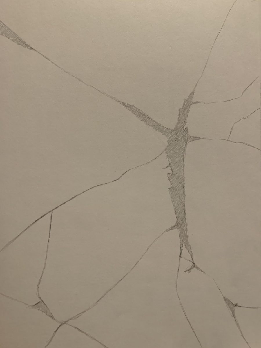
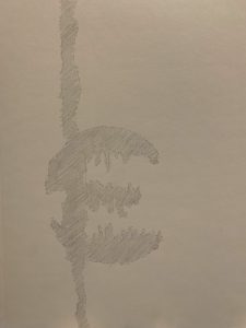
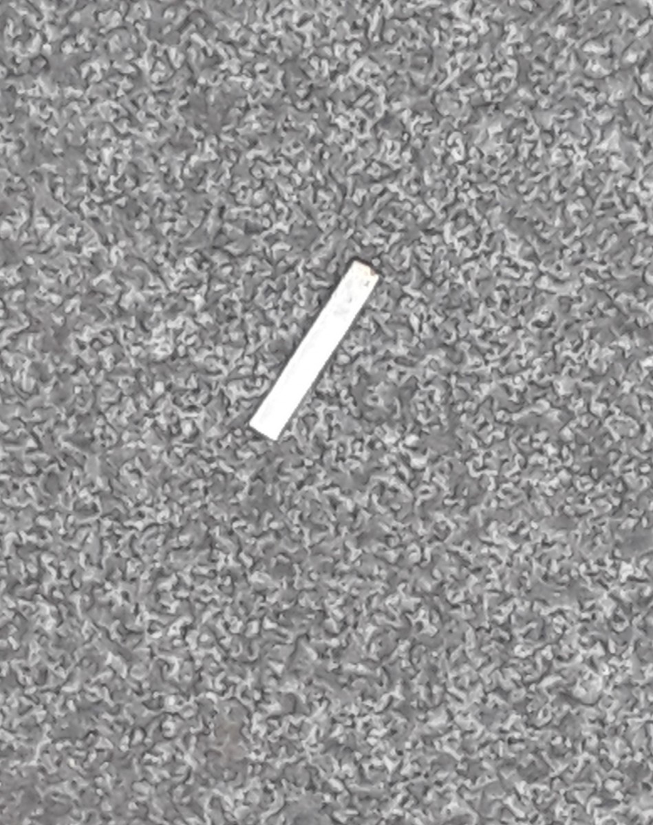
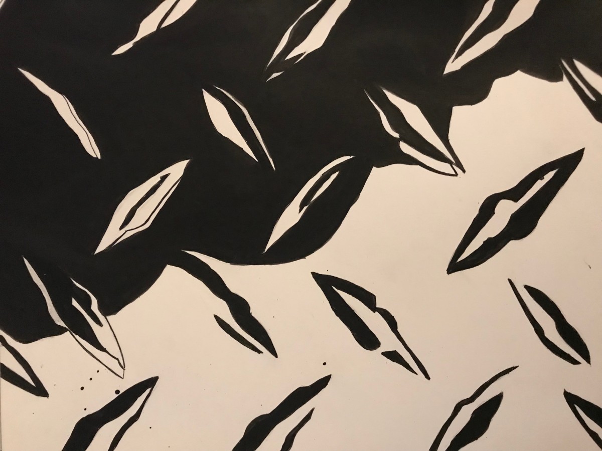
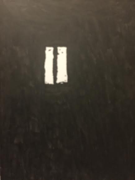
Here we have an obvious figure-ground relationship. The light space is much larger than the dark one. The dark shape is geometric and looks like a crack. Some of the chipped off edges are a little rounded up. This shape makes me think of lightning.
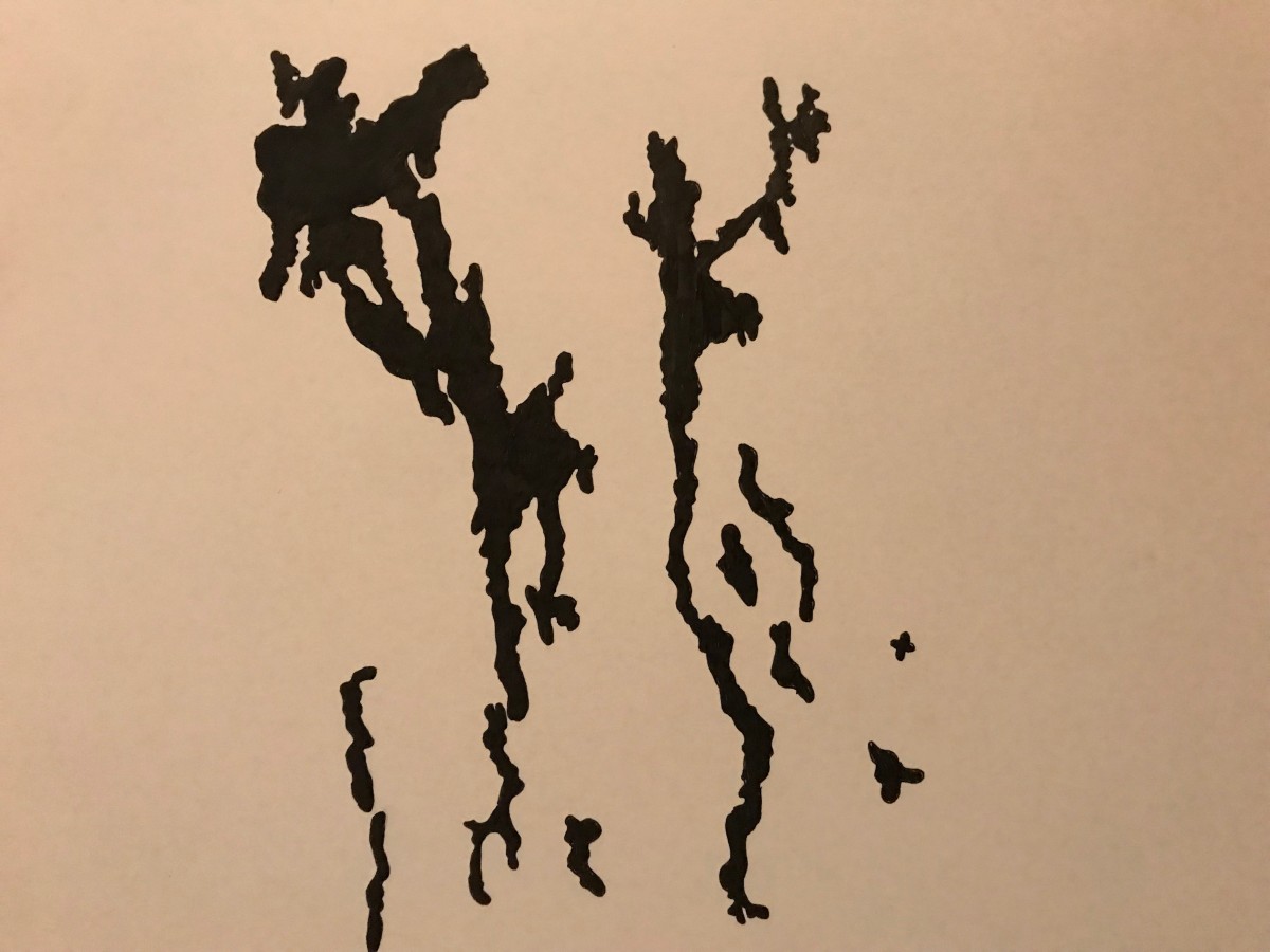
One day at home, I was in my room when I heard a loud crash. When I go to check what had happened, I see that my sister’s boyfriend dropped the blender while making a smoothie. After he picked up the broken blender and pieces of glass, I could see this crackled shape now visible on the kitchen floor. To this day, this crack serves as a reminder that my sister’s boyfriend is the reason why I can’t make smoothies at home anymore.


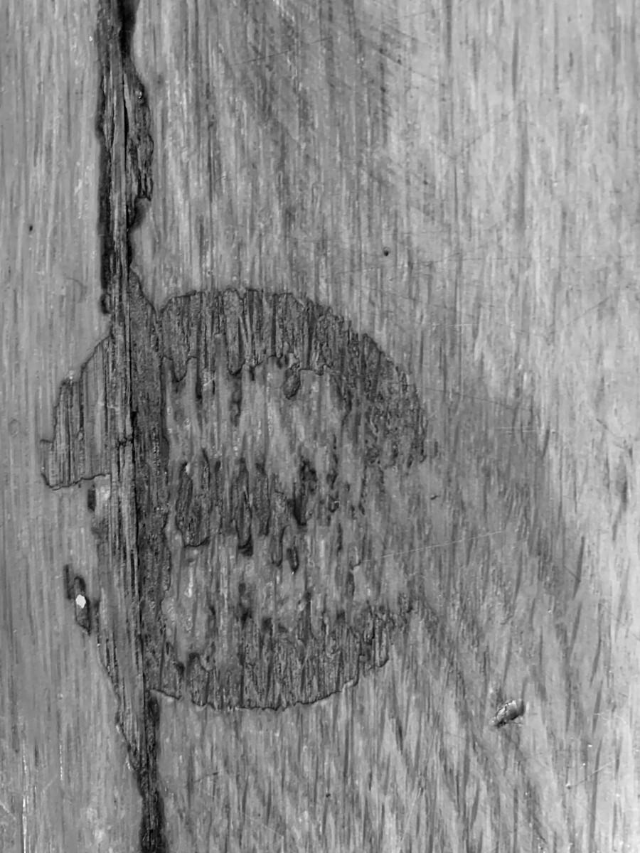
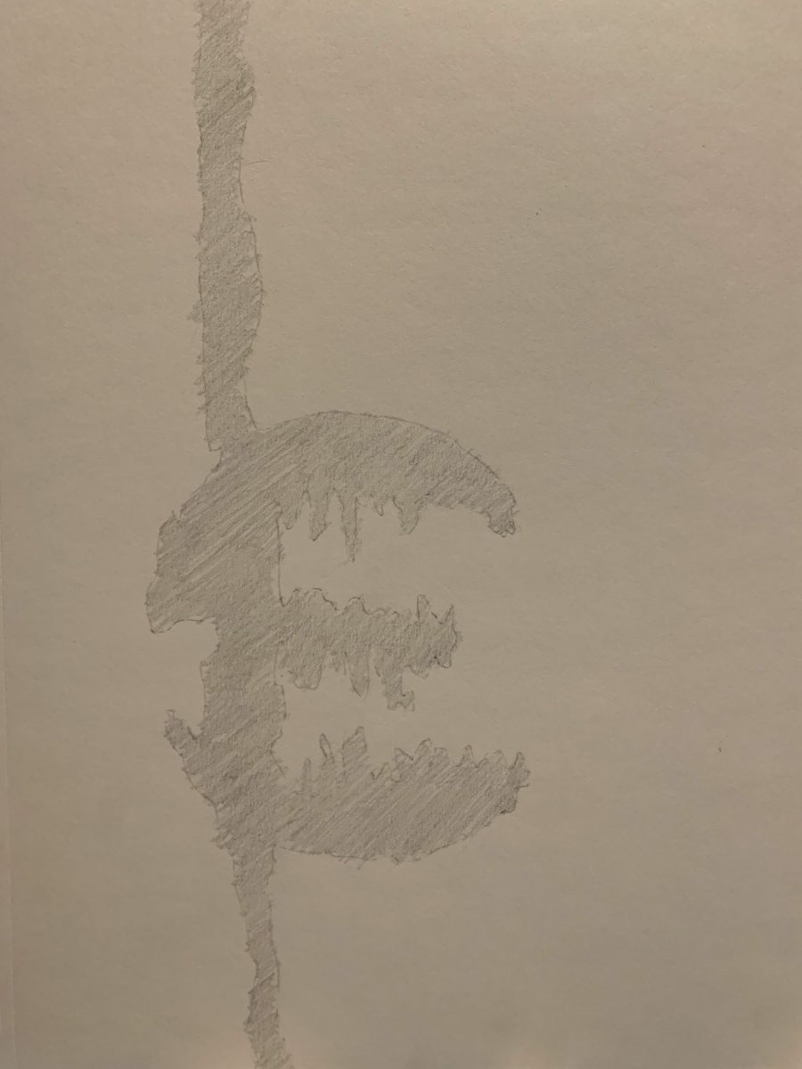
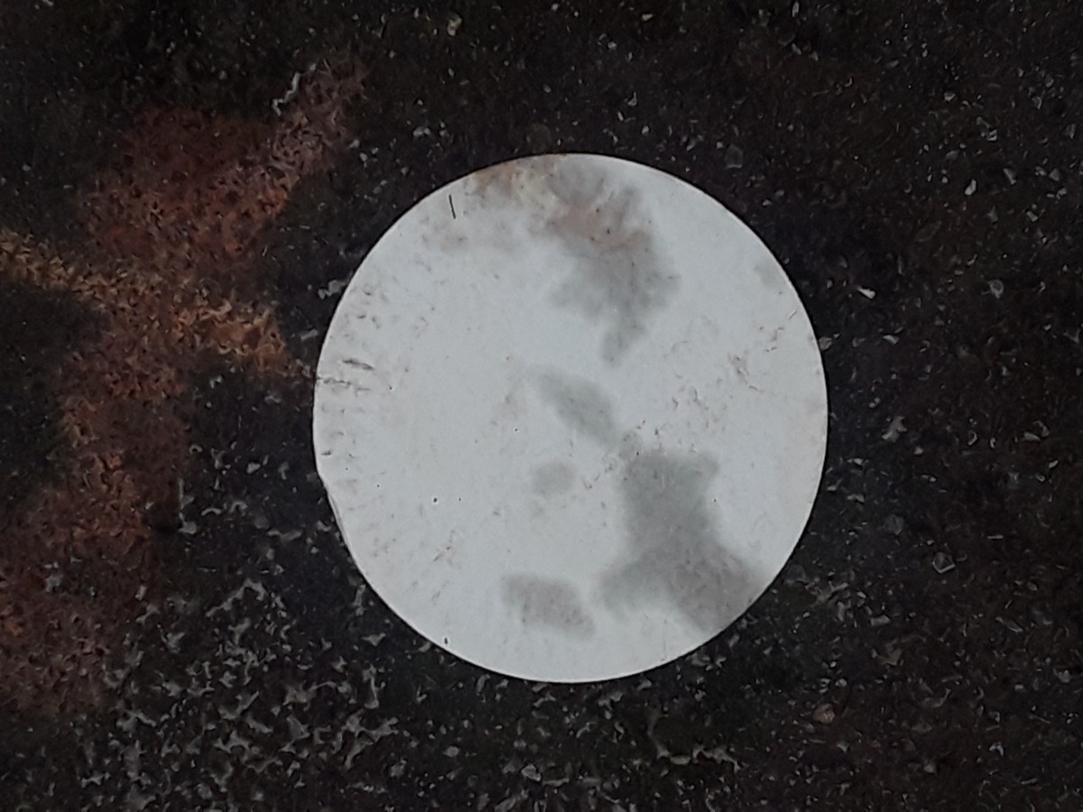
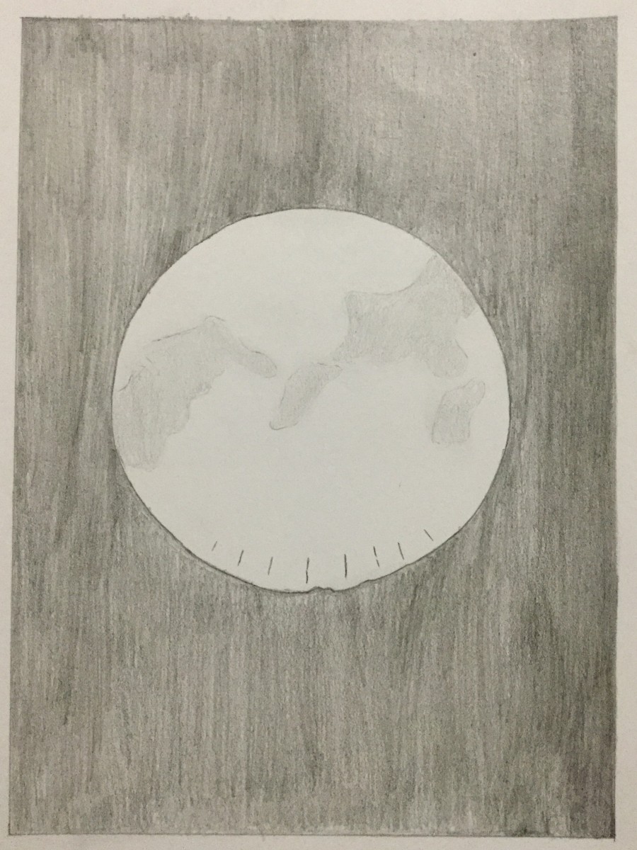
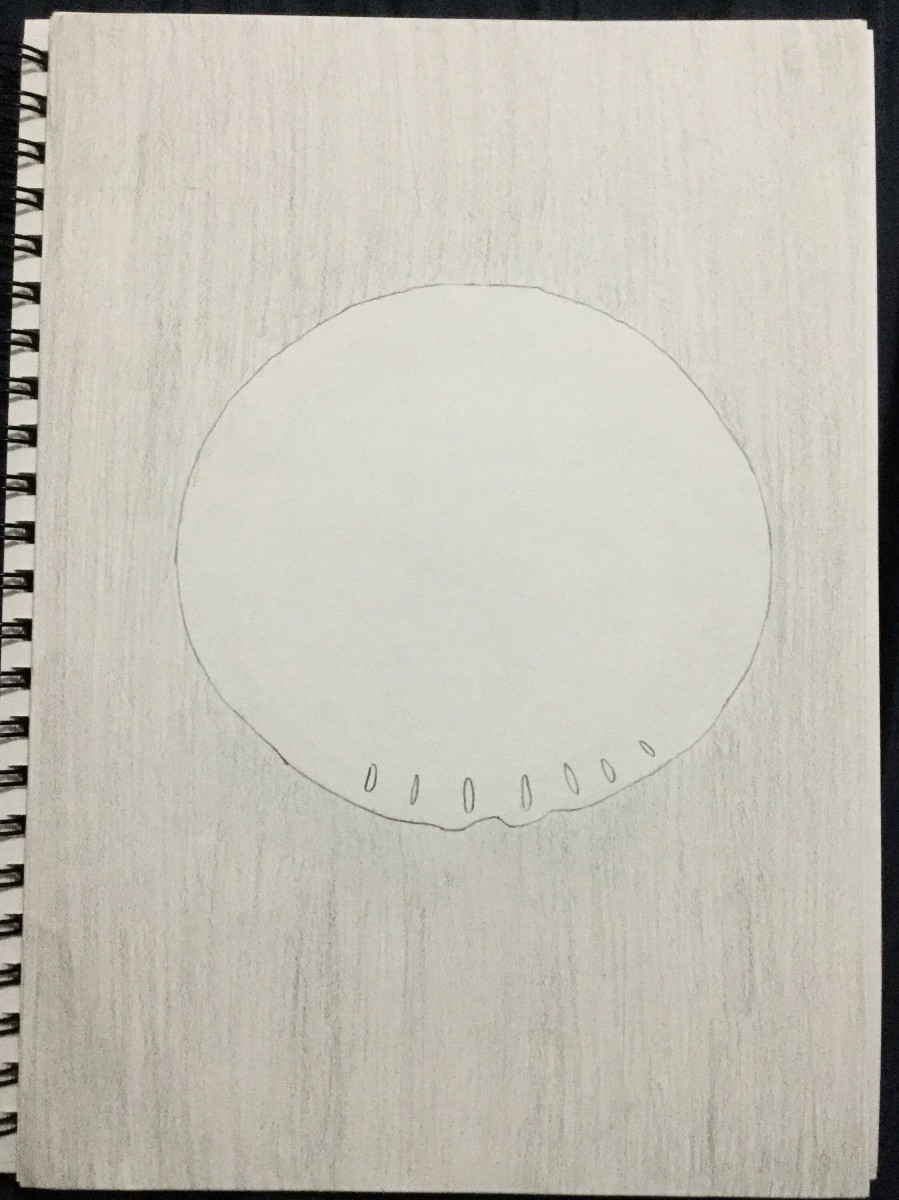
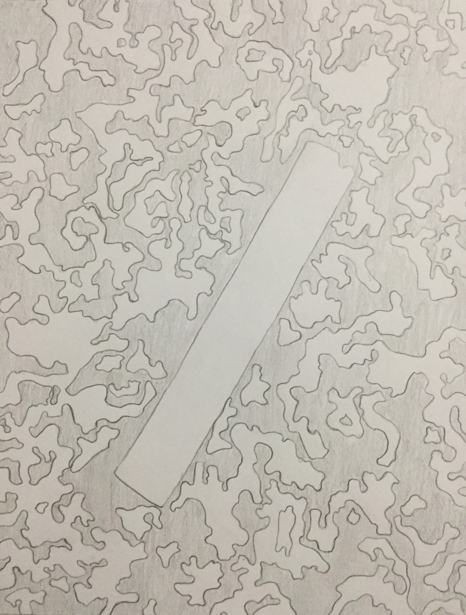
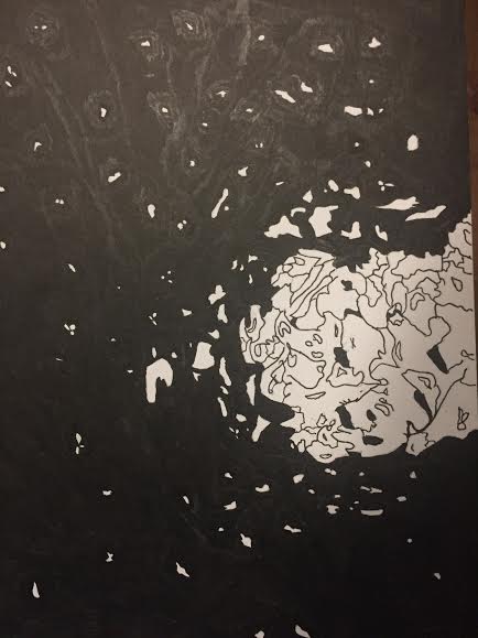
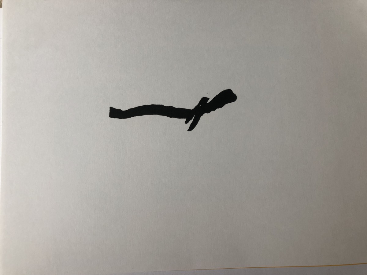
This one is an obvious composition. The foreground has an overall geometric circular shape. When you look closely at the edges of it you can see how it is more loose and organic, instead of uniform. I like the constant jaggedness of this shape.
On a magical night, the moon shined so eminently that its light transversed itself through the window and engraved its own composition on the wooden panels of a New York City apartment.
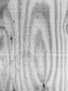
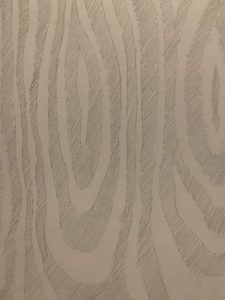

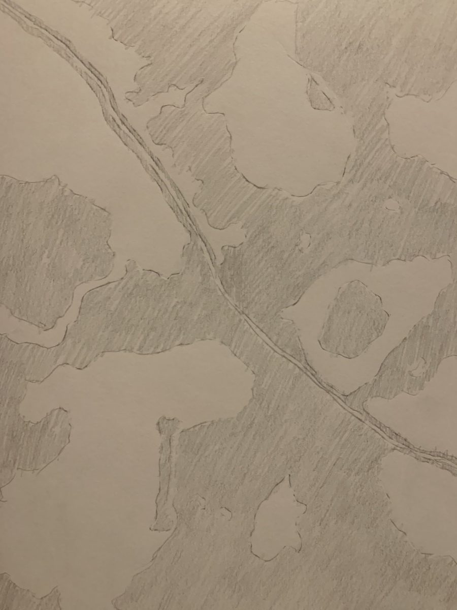
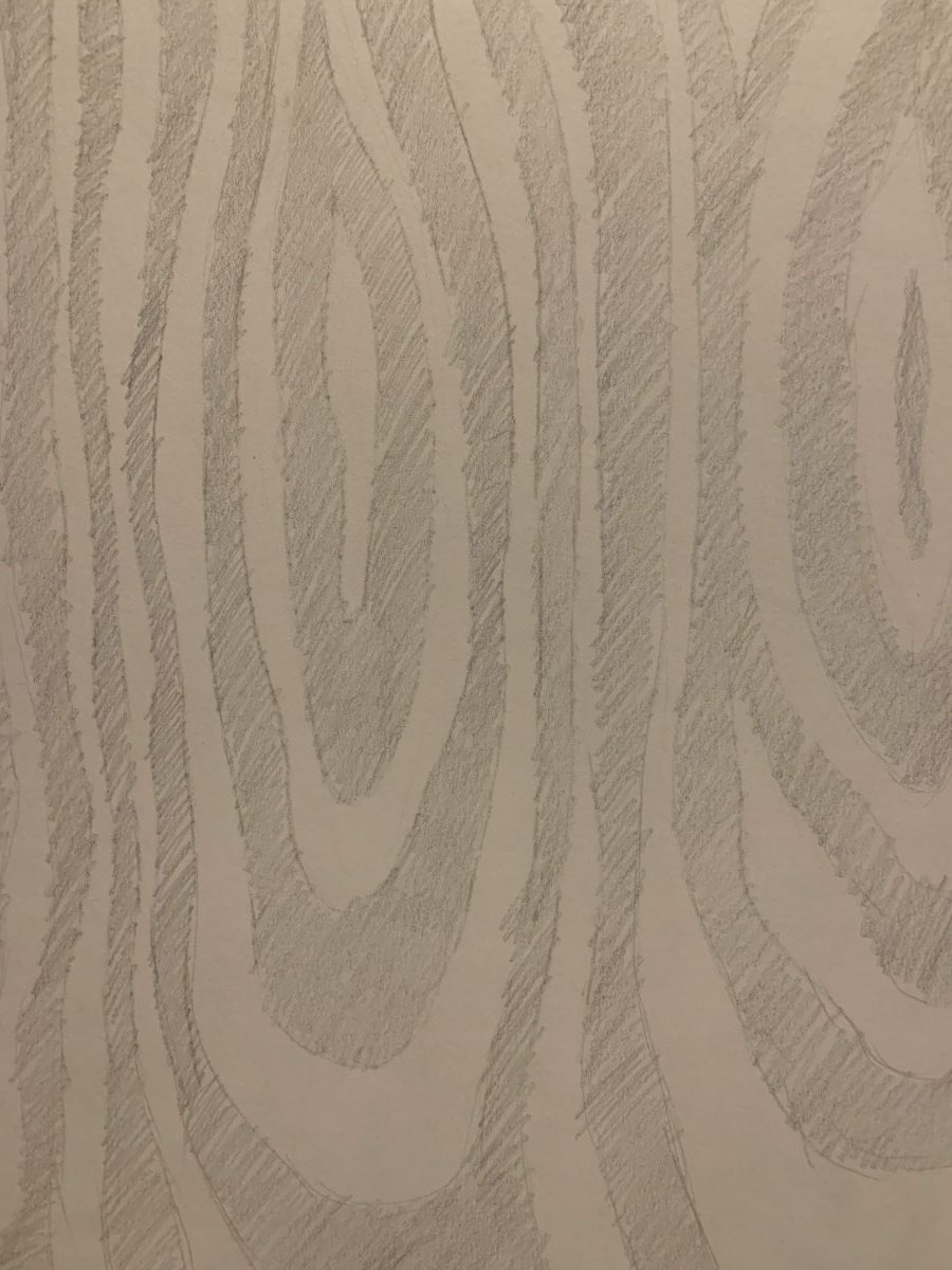
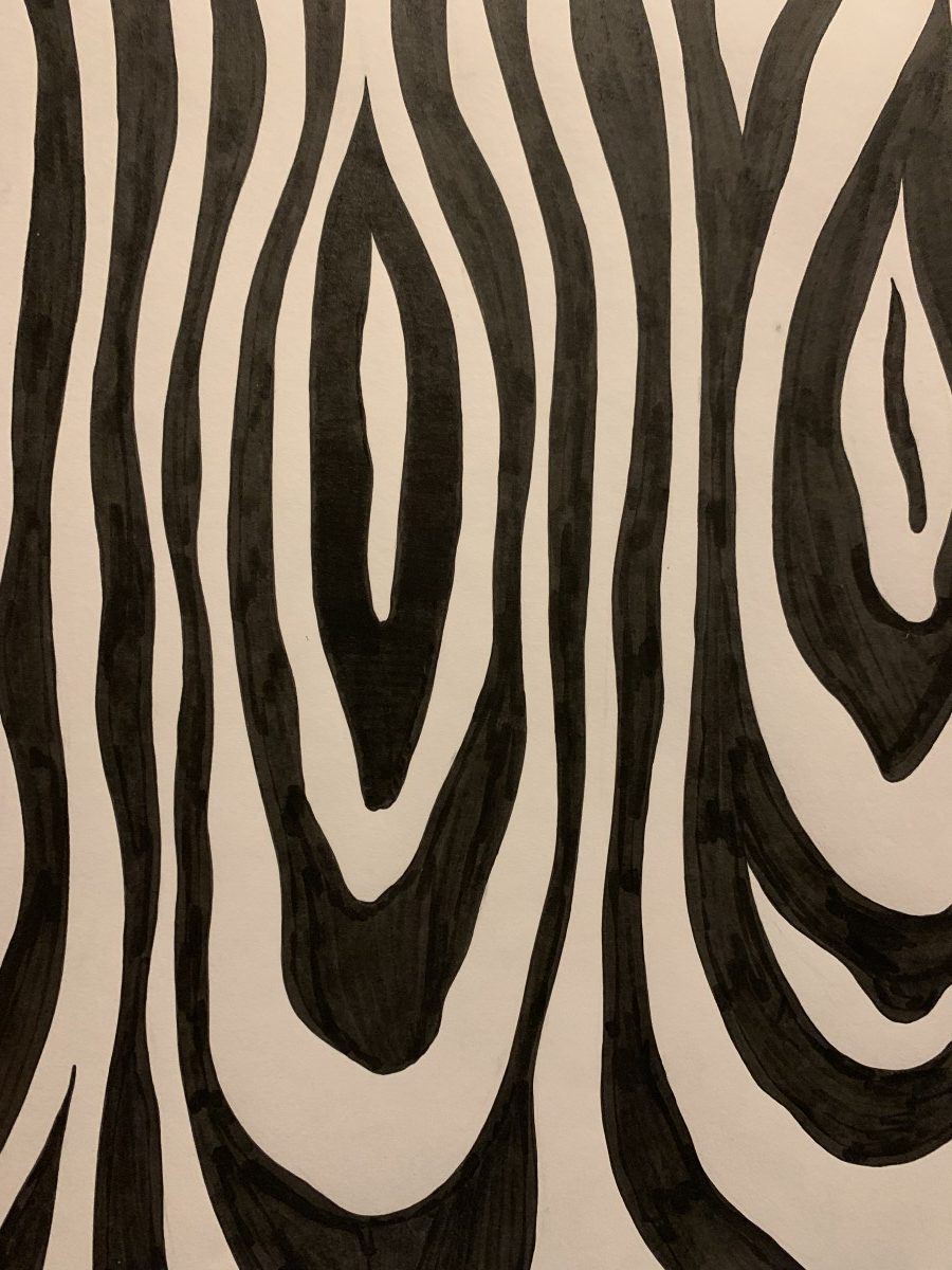
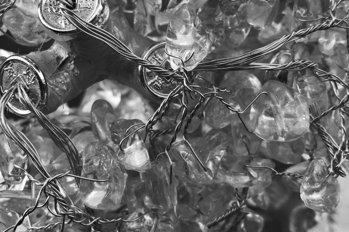
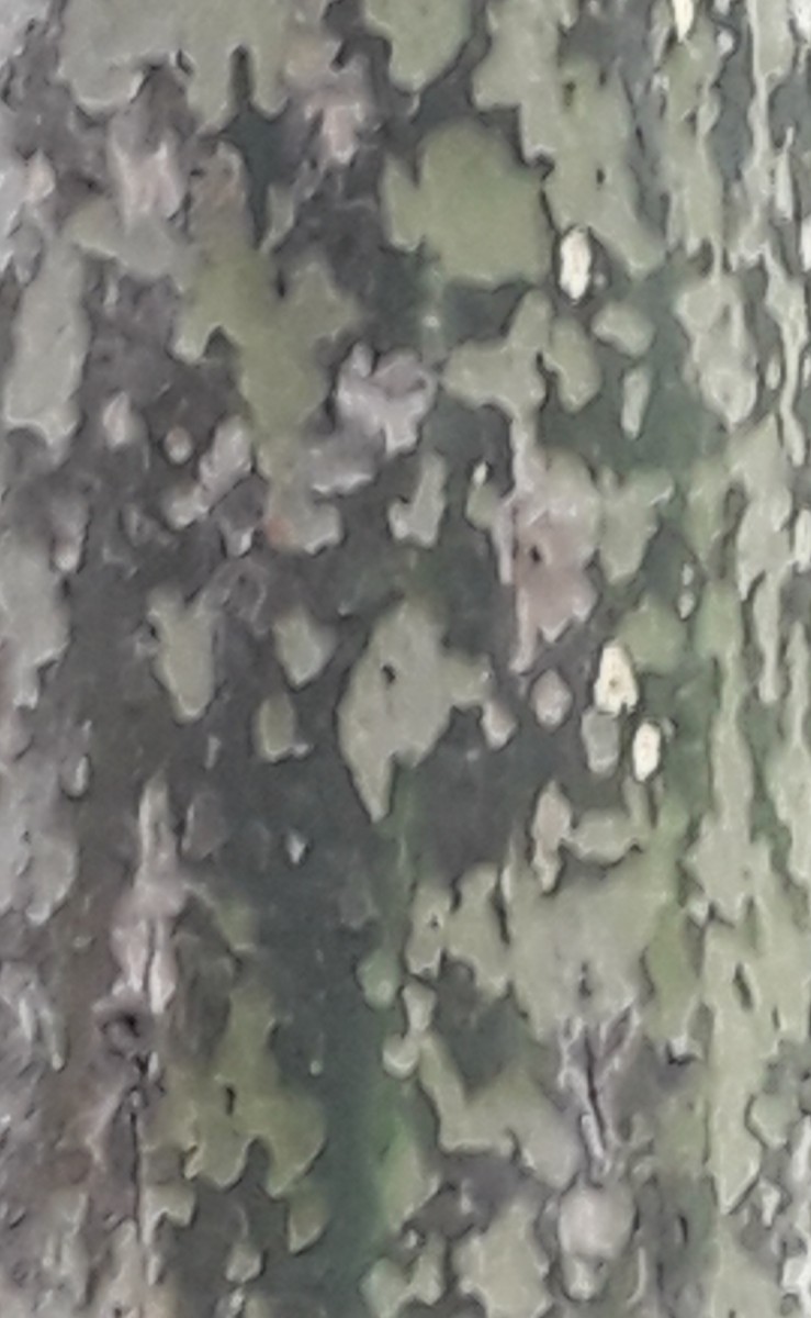
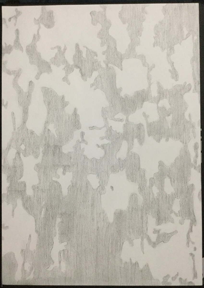
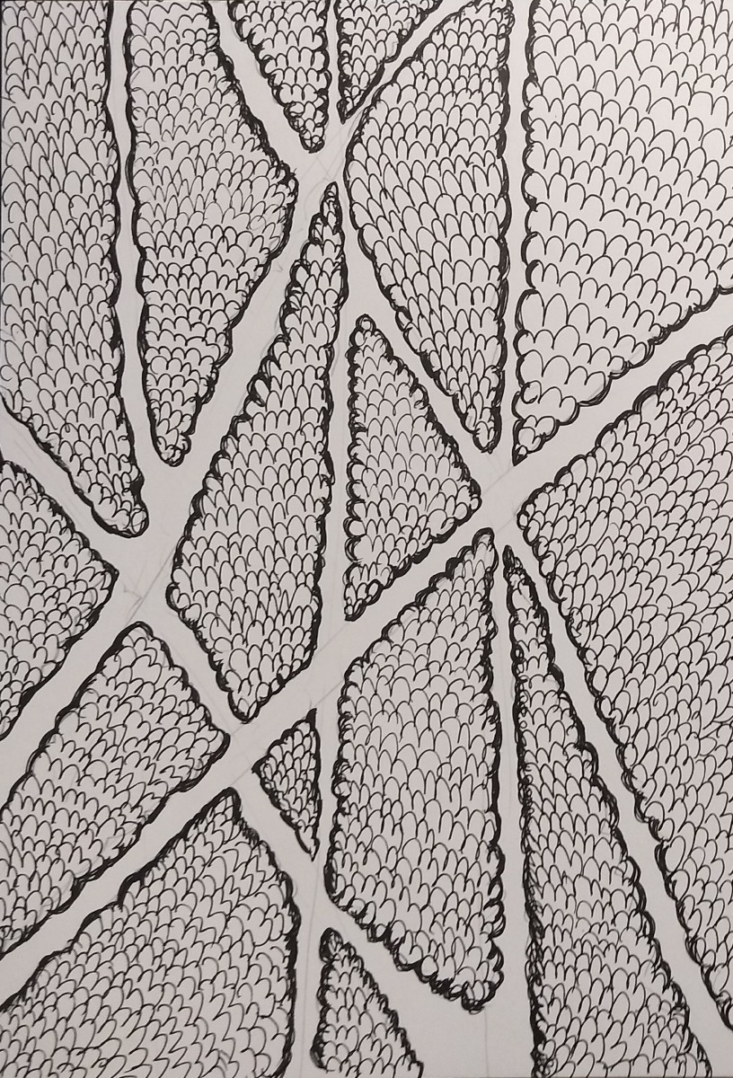
This is an ambiguous foreground-background relation. This texture is known to be seen on and come from trees. It looks like psychedelic oval shapes of different sizes and thicknesses being spread on top of one another.
This composition was born inside a tree. The first filled-in oval shape that you see in the center is the first size that it ever grew up to be. The layer surrounding that one is what its next phase of thickening growth turned out to be. All the following ones continue on to show us the tree’s life span. In order to become a grandiose strong woodwork, this tree first had to be a small, weak sapling. It is the tree of inspiration.

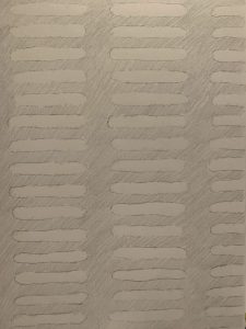

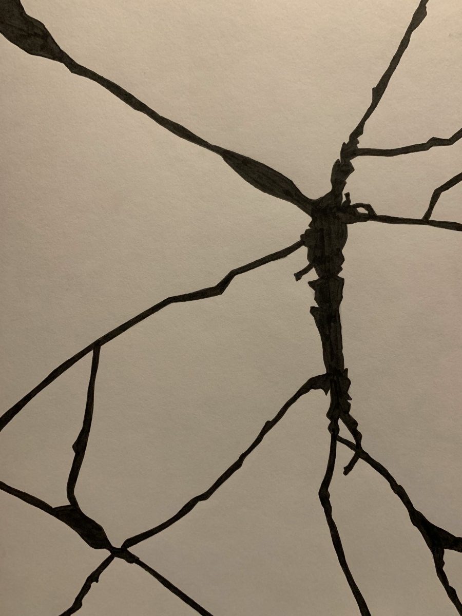
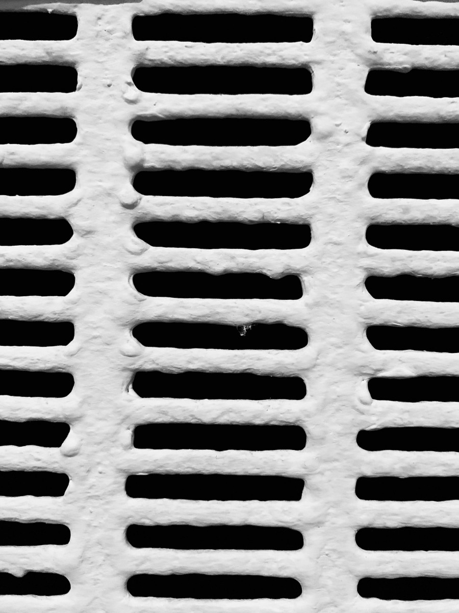
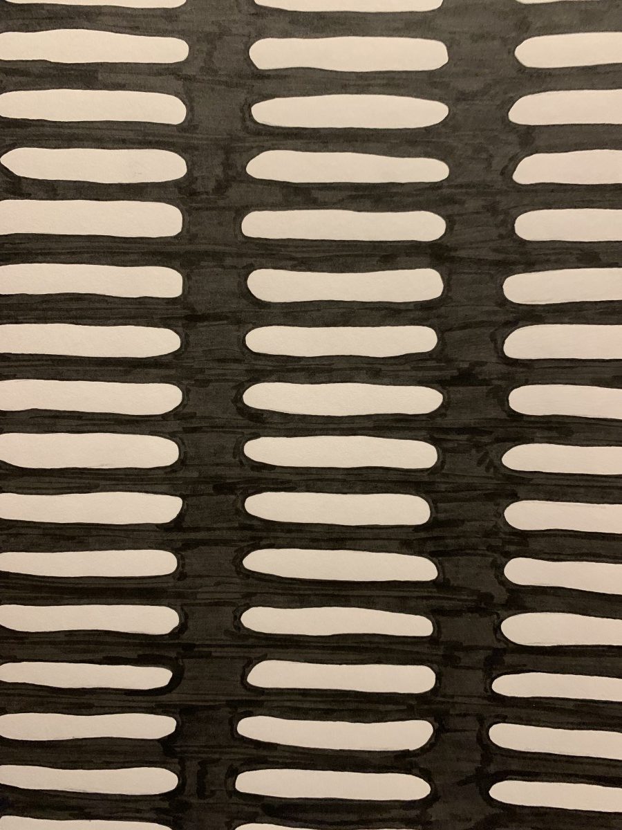
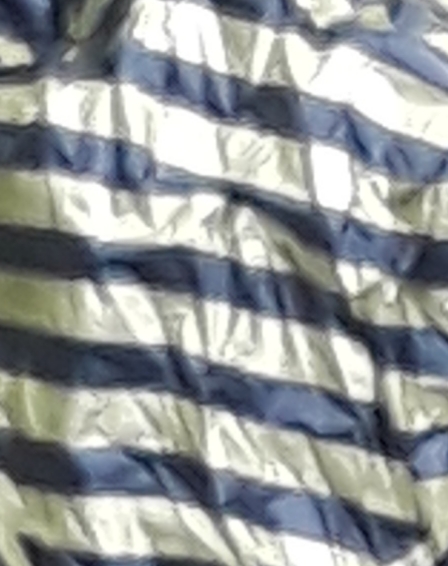
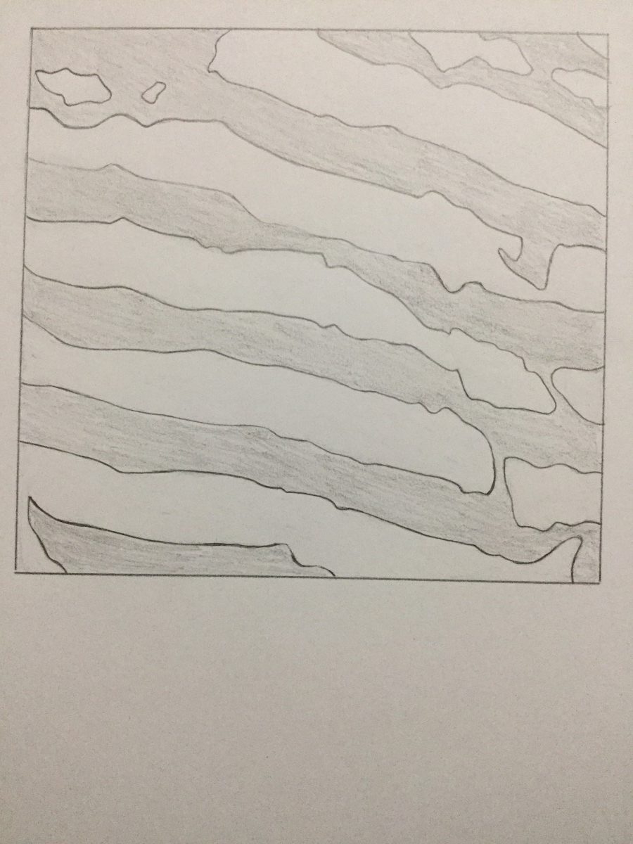
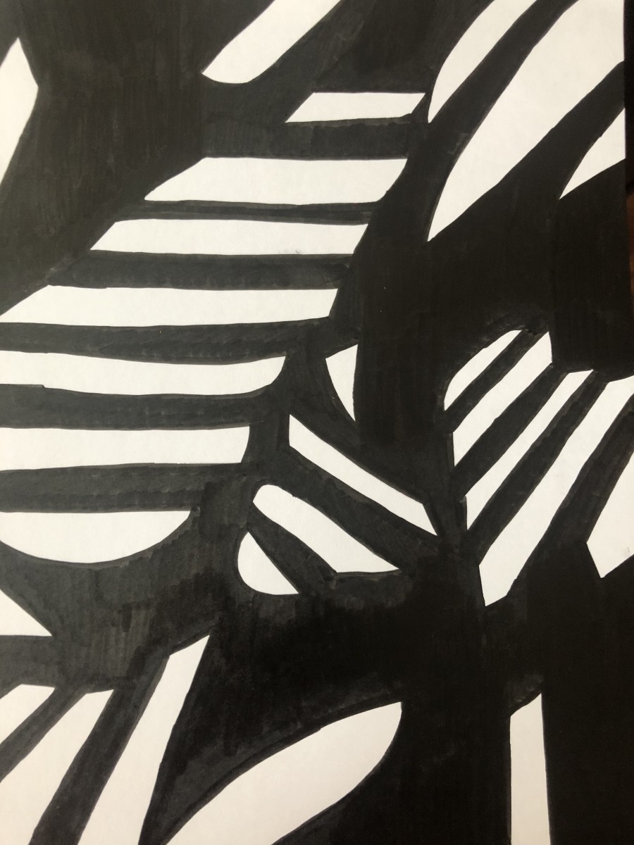
To me this is an ambiguous composition, as the dark and light parts are almost equally sharing the space they’re in. The light parts wrap up the dark parts. The consistency of both parts against each other make it a strong composition.
These shapes make up the ribs that hold in a walls heavy lungs and the abyss of darkness deep inside of it. The room these lungs belong to is never a fun one to be in. Whoever spends the night in it is always uneasy because they cannot stop looking at the walls ribs and wondering if that’s where they hear heavy breathing coming from. Little do they know, it’s exactly where it’s coming from.


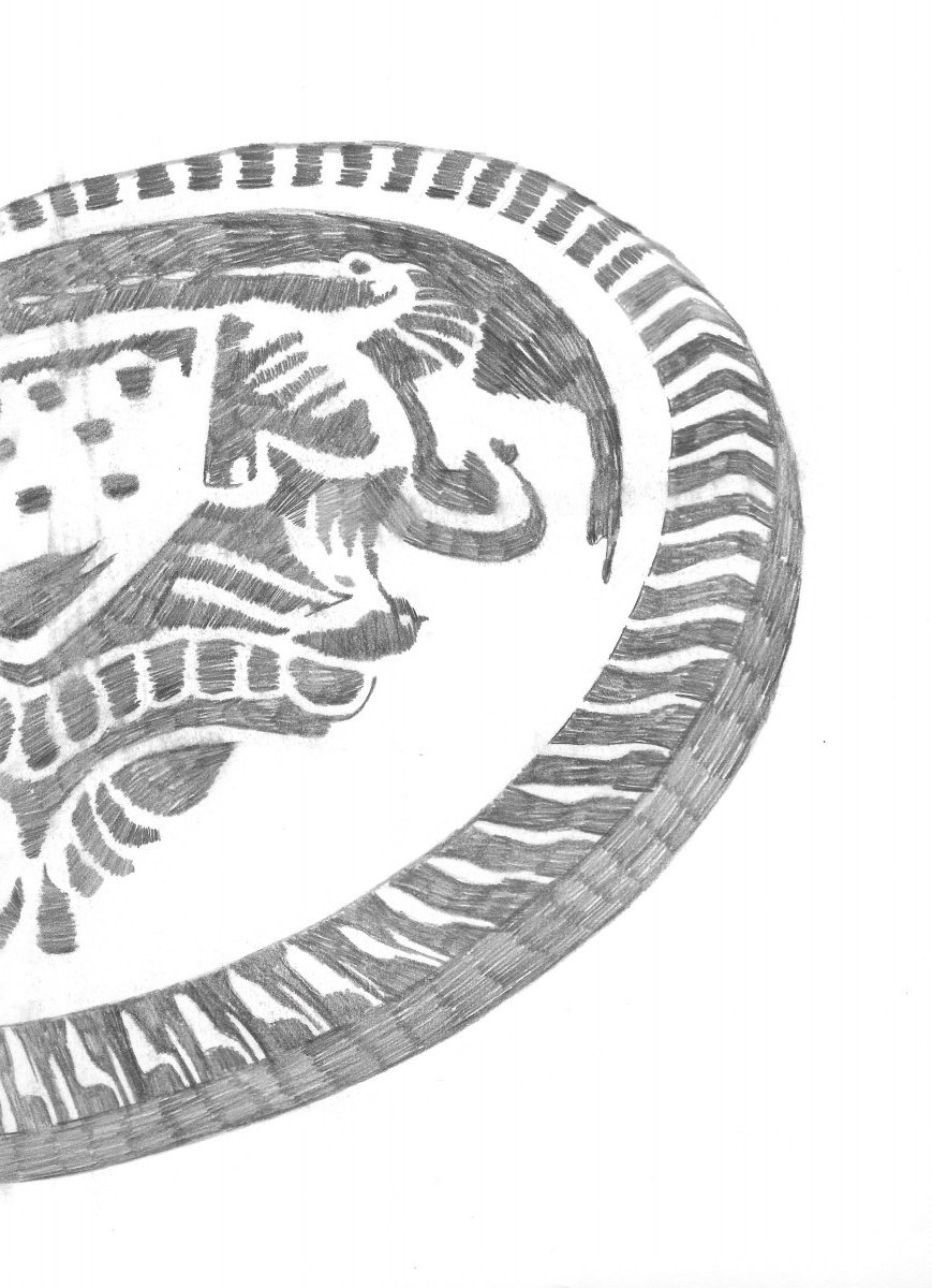

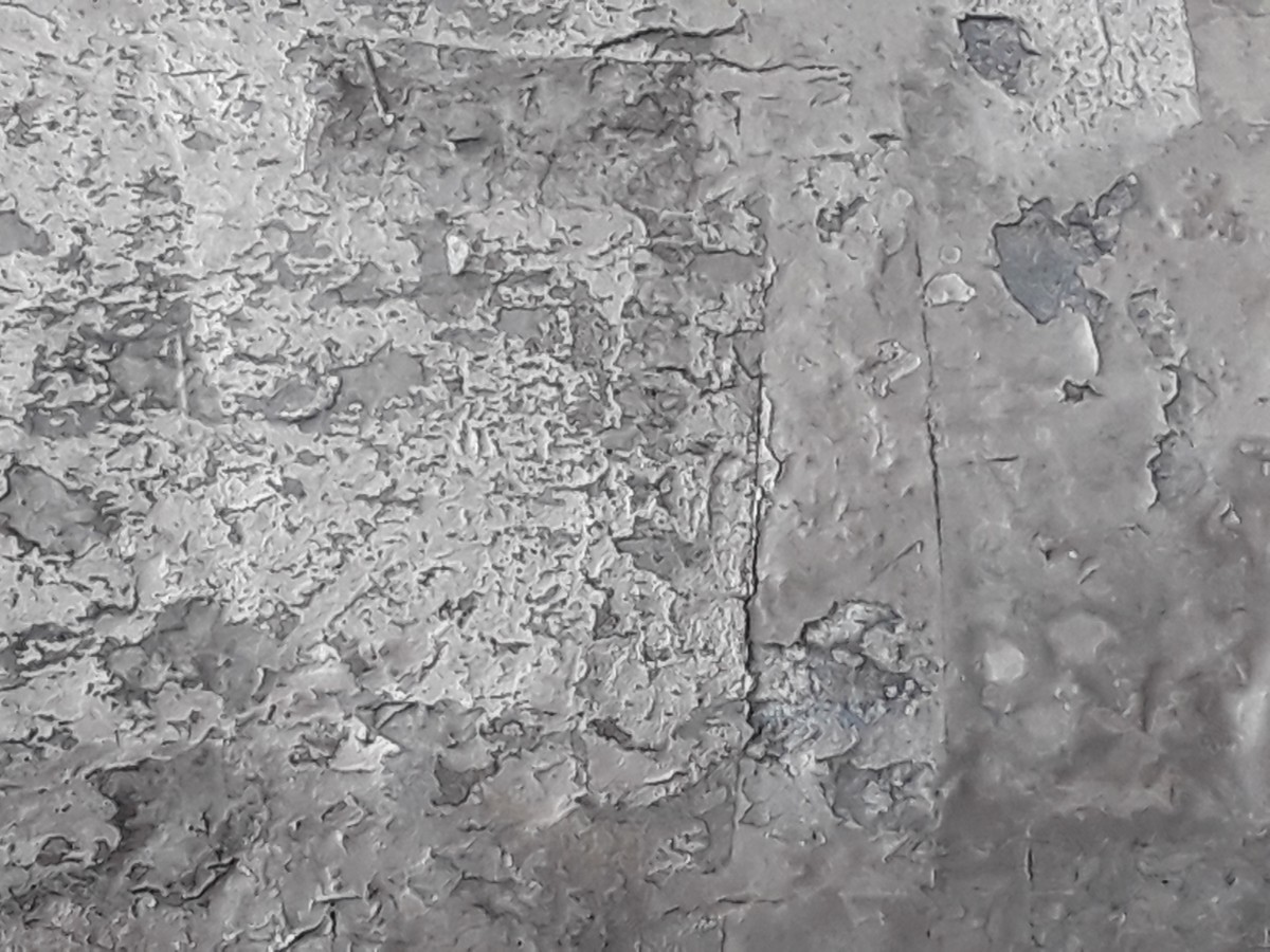


 this is the final composition its a cardboard box which has some cats scratches i found the box really interesting that’s why I choose this image
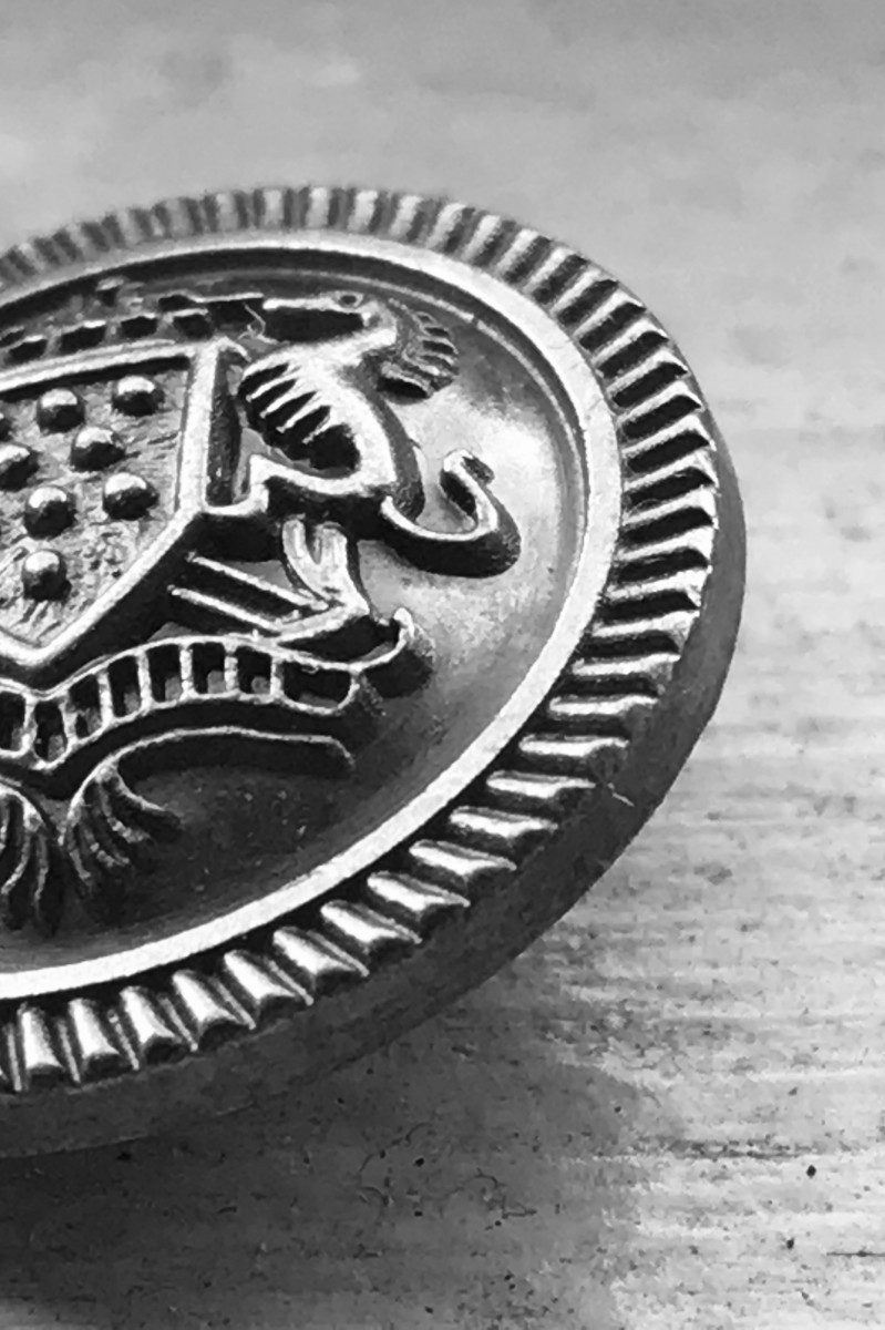