
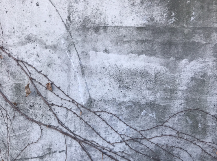
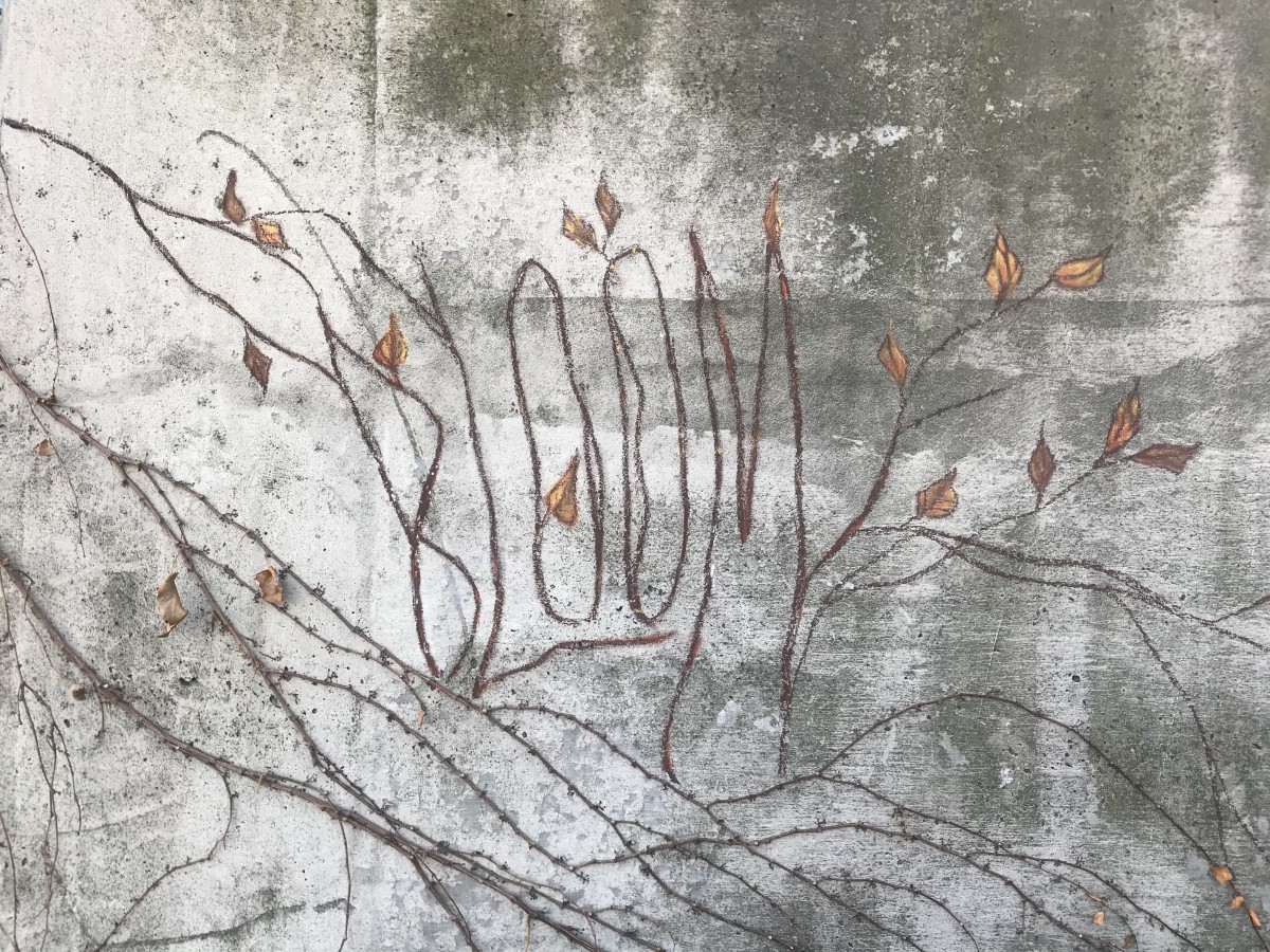
Bloom – For my first typography, I’ve decided to go for the vines crawling on this abandoned building. Personally, this is my favorite one out of the three I’ve done because I think I achieved my goal of making it blend in with my subject but at the same time you could still see the word Bloom. This is also the one I’ve enjoyed making the most, the leaves were pretty fun to do, I thought it was interesting as I tried to make it look somewhat like the actual leaves — I did my best. Color matching the typography was fairly easy too, thankfully I found the colors I needed, I used a combination of black, browns and mustard yellow to match it with the real vines, which helped making the piece look united.
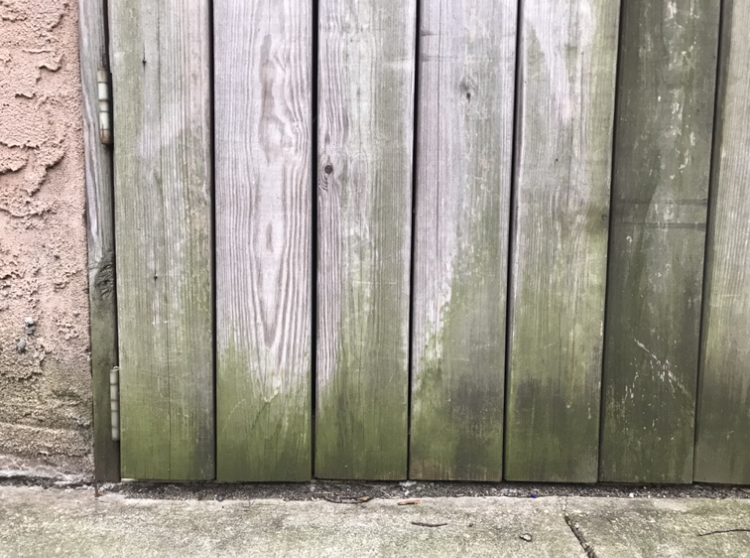

Creep – I had a hard time on this one. I had trouble making the typography stand out. Personally, I think I could’ve approached this better, it just lacks character. The word should’ve been the first thing you should see, but the hand I drew to go along with it takes away all the attention. The color I chose for the letters didn’t match the way I wanted it to be also, it was a tad bit brighter, it had more yellow tint to it. I still somewhat like the mossy look of the actual letters though.

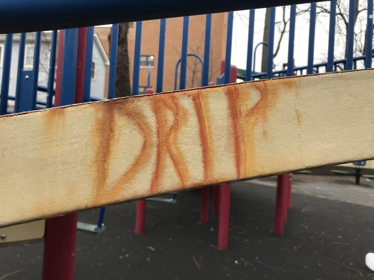
Drip – This was the easiest one to make out of all three. There’s really not much going on for this piece though, it is also lacking character in my opinion. But, I was quite happy I had the almost exact color shades of the actual stain at least.


I really love your work! The words and typeface matched with the settings!
I can really see your commitment to each composition. The colors you used and the texture you replicate are seamless to the starting point.