
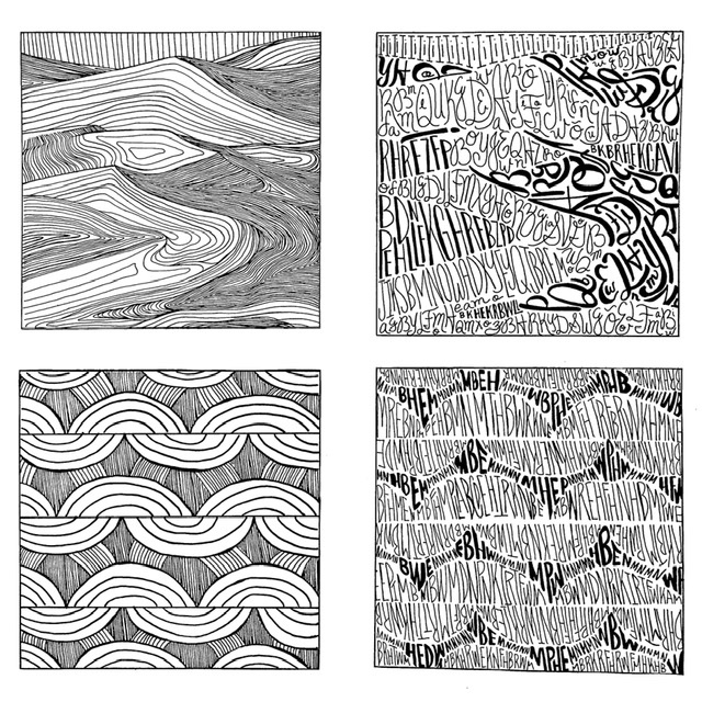
Texture – I’ve decided to stick with one sized pen for my line composition and arranged the lines closeness to each other as a way to show the different grays from the original image. I made some lines a bit bolder to add a little character to the final ink work. For the type composition on the other hand, I used bolder and larger sized type to for the darkest part of the image. I mixed script and sans serif for this composition.
Pattern – I went along with my first experiment for my final line composition. I mixed bold and thin lines in order to get the different grays from the image. Meanwhile, for the type composition, I decided to just use sans serif and I used two different pen size, sized 5 and 1, to get the gradients from the original image.


Really clean composition and smooth lines
Yes very nice comps
You did an excellent job
Beautiful execution! I can definitely see the image through all the words!