This past week has been spent designing the poster for City Tech’s second annual Science Fiction Symposium. I worked on it for the better part of my thanksgiving break. In the beginning it was difficult getting the design to come together even though at this point had done a couple of these illustrated posters, but I am trying to challenge myself to be better with every new poster I do, so naturally each new poster comes with new challenges. This poster was no exception.
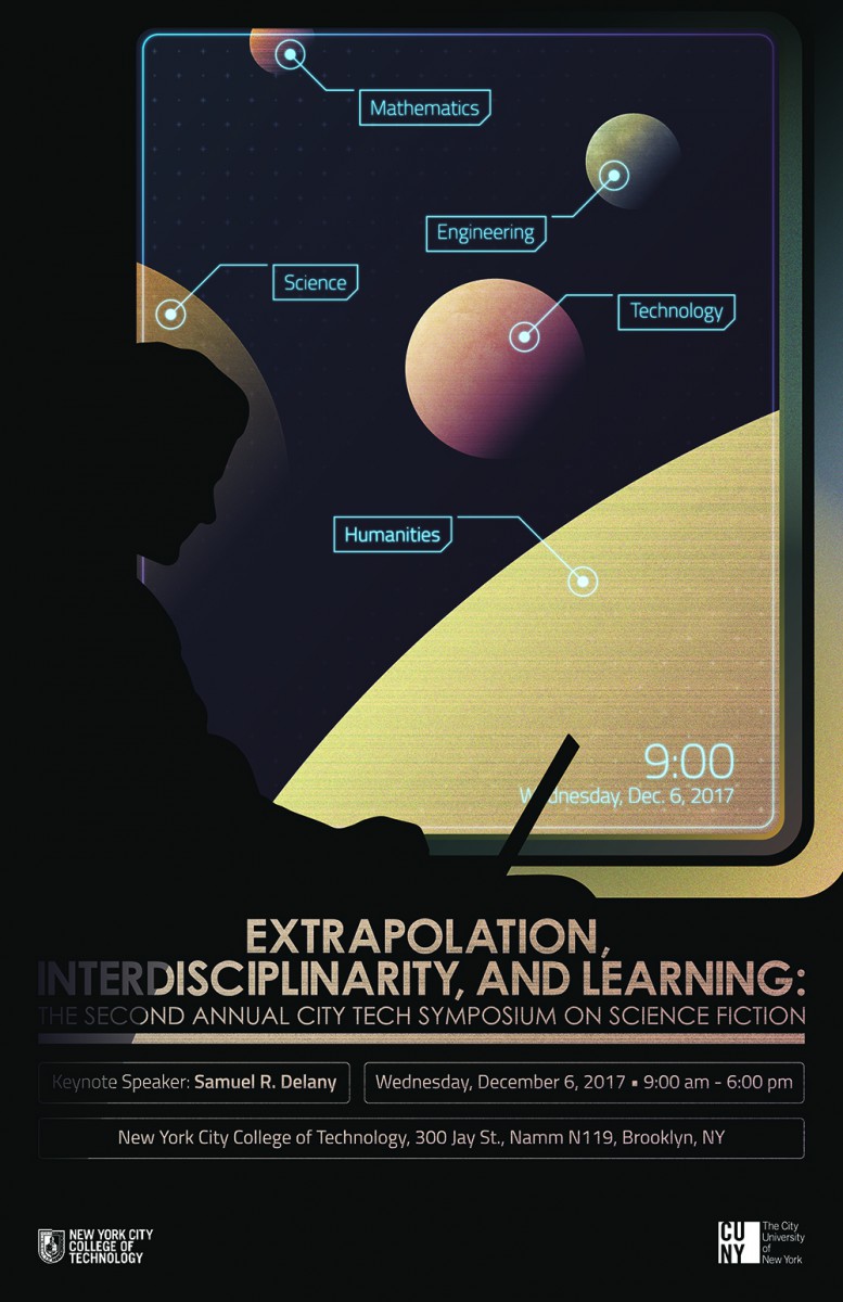
The poster depicts a student traveling in a vehicle though space. He is sitting by a window and you can see a system of moons through it. A major theme of the event and the poster is “extrapolation”. I had to ask myself, “what will the future look like, based off the society we live in today?”, and base my designs off that. I had a little wiggle room though, because the design is based in science fiction, but my choices still had to make sense in the context of science and technology. So, for example, the window needed to look like something that could withstand the vacuum of space, and look “futuristic” enough to be apart of a time where regular space travel is normal.
Once the design problems were solved and the illustration was done, the typography problems came along. Which was the hardest part of this whole project. It took twice as long to figure out the type than it took me to do the illustration. The mistake I made was that I did not consider the type when I was creating my concepts, so I got to the end of the illustration and I had no idea what to do with the type. It was a struggle to get the type to be apart of the design and not just sit on top of it, but after a couple of days I came up with a way to incorporate it. I sent the poster to my client and he loved it, so I can finally say this project is done.
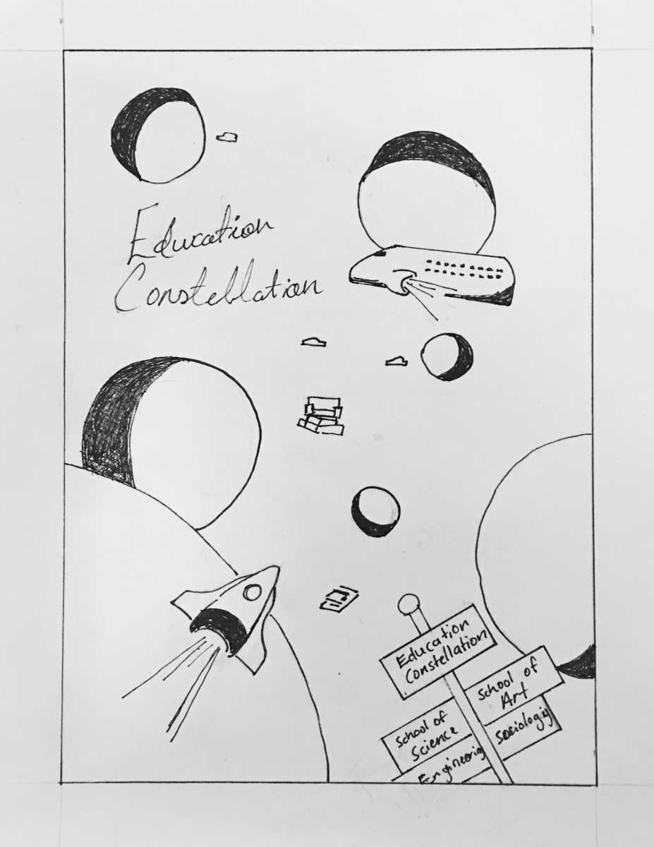
First concept:
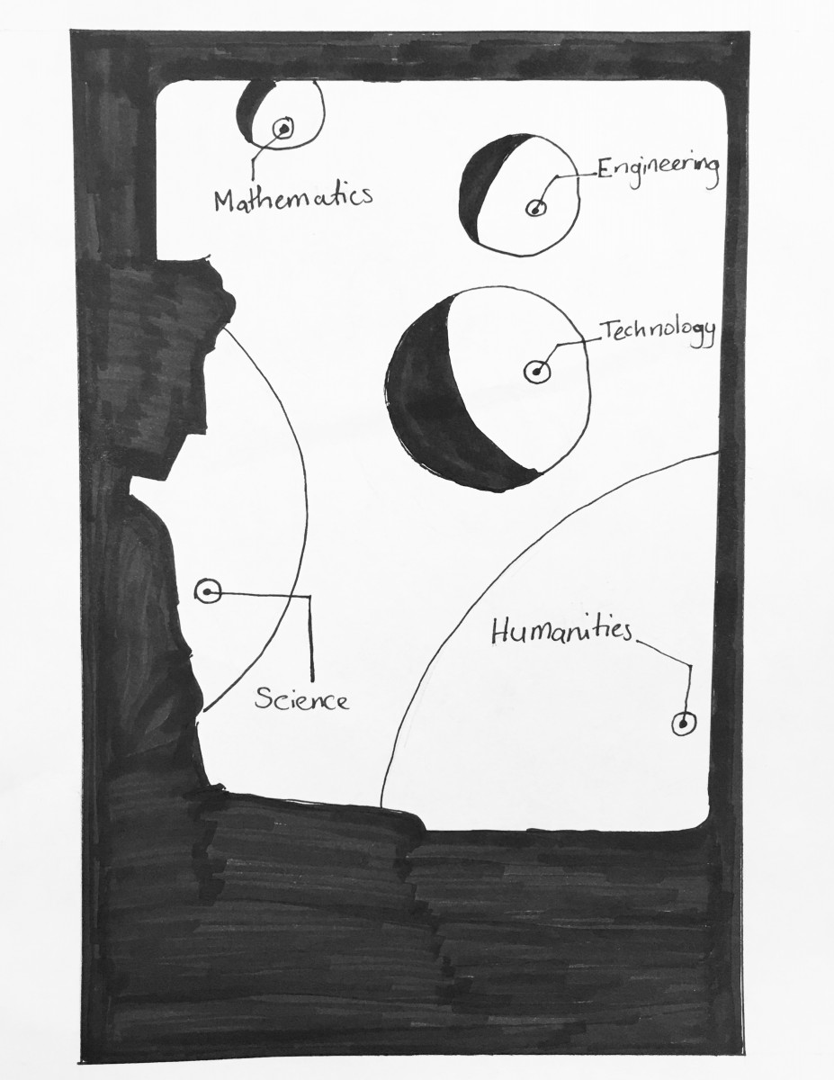
Revised concept:
Computer Draft:
Final: