Professor Montgomery

Author: Josué Pérez (Page 1 of 2)

Final Reflection

Before I even enrolled for this class, my friends told me that this specific history class for NYC Architecture, the professor would take the students on field trips to visit and explore buildings. I was already looking forward to it when I placed that class in my schedule. When my journey began with the class, I enjoyed it very much, from day one. I appreciated the fact that we went out of the four walls to learn more about the architecture of the city I live in. I know for sure, I wouldn’t have learned as much if I were sitting in the dark room, tired from the classes before. If anything, going out in the cold and sometimes, the rain, would wake me up. It’s a more exciting feeling to be literally in front of the building we are talking about. To learn, analyze, and appreciate the history and architecture of it. This was also impactful because it was helped me more in my assignments and paper. All the materials that I grasped from the trips, I put into words for my work in the class. I’m grateful to have knowledge of the architecture of NYC.

Students should get this opportunity to experience this class. I believe there’s a loss of attention when it comes to this matter. The fact that students have to stay in a classroom to learn about the history of the architecture that is sitting right outside the windows is also a loss of education. Students actually want this, and I think they will appreciate this kind of learning.

Short Writing Assignment #12

Walking the, somewhat, entirety of Battery Park City was enjoyable and beautiful. There are many factors that played well with the green open space of the park such as streets and buildings and the generous integration of the waterfront.

Compared to Lincoln Center, Battery Park City is preeminent in its design. You have a more circular and generous flow of circulation that is dictated by the waterfront. The paths of circulation, vegetation, stone railings, as well as the buildings opposite of the water, follows the language given by the waterfront. Whereas in Lincoln Center, consisting of an open plaza and other open spaces with vegetation and fountains, it has a more rectilinear form in plan. You’re also surrounded by such massive buildings that it can get a bit overwhelming. On the other hand, one side of the park is shielded by condos and offices buildings, which are all curved buildings because of the overall curved plan and diverse in its materials and styles. On the other side of the park, you have the waterfront. A beautiful scenery to look at when strolling through the landscape. An exciting feature of the park is that no matter where you are, you will always have a view to the Statue of Liberty, which was intentional in the design of the park. Another great feature is the elevations and slopes the grass areas and circulations paths create, almost like a weaving action like Central Park, for instance. The park itself is below the ground plane where the sidewalk, this gives a better spatial experience to its users.

One similarity that Lincoln Center and Battery Park City shares is the open room. In other words, an open space defined by surrounding buildings acting as the walls, the stairs or path to the open space itself acting as the entrance to the room, and the open sky acting as the ceiling. This feature is found in the park where the Irish Hunger Memorial is.

Spatially, I feel like Battery Park City is more exciting and attractive place to visit because of the sloped circulations paths and views the park gives. It carries a much different story than Lincoln Center, where it has a more structured and ordered plan.

Short Writing Assignment #11

Urban spaces were rising in the 20th Century, and these challenges prompted city officials and planners to keep their city in their minds as they design new large-scale projects and spaces. Civic centers were also prompted, and they are spaces where multiple institutions are grouped in formal compositions around open space. The Lincoln Center is a great example for this approach because of the relationship it has with the city and its users.

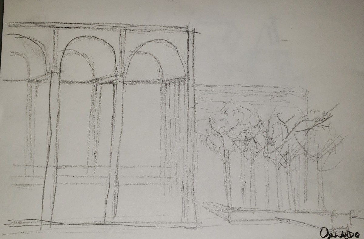
Designed by multiple architects, the Lincoln Center was diverse in its architectural language and styles. From Roman architecture to modern architecture, walking in the space made it feel like you were in the middle of a historical timeline because of the different styles used. However, a lot of the buildings were similar in material: travertine. The three buildings that signified the Roman architecture were: David Geffen Hall, Metropolitan Opera House, and David H. Koch Theater. All of them expressed stripped down classicism, simple and abstract Roman architecture through its tall columns that were supporting cantilevers. This detail relates to the Roman temples. David H. Koch Theater expressed Roman architecture through its minimal arched columns whereas the Opera House had more curvature to its columns. The David Geffen Hall was quite different from the other two. Aside from the tall columns, the building was more expressive in a modern way. No arches are used but more rectilinear forms were implemented into the design.

The space itself is pleasurable. The main entrance is at Columbus Avenue, where grand stairs lead to the Josie Robertson Plaza and the Revson Fountain, designed by Diller Scofidio and Renfro. This beautiful plaza, made up of circular light and dark colored stones, were used to unify the overall trapezoidal ground. It was a beautiful gesture for the public to come from the city and enjoy the plaza. This layout was very similar to the Campadolio Plaza in Italy. Two parallel buildings framing one main monumental building at the center, in this case, being the Metropolitan Opera House. The space grew as we walked more into Lincoln Center, exploring a series of architectural styles. There were seats also provided and green spaces for people to inhabit especially in the summer for shading.

Shorting Writing Assignment #10

For this week’s trip, we visited several buildings that displayed and what also started the language of modernism in office buildings. Some of these buildings include the Lever House, Seagram Building, Lipstick Building, and the United Nations. All these buildings expressed themselves in different ways through massing, materials, and relationship to the ground plane.

Most of these buildings were similar in massing and the relationship they had with the public and its ground plane. They varied in shape but were similar in geometry. They were either square or rectangular. All the buildings except the UN had a much more inviting and even monumental atmosphere. This was done by recessed entrances, so when you walk to it, you end up under the main massing of building cantilevering over you, that is being supported by free-standing columns. These are great examples of one of the five points of architecture established by Le Corbusier, Pilotis. In addition to this pulling factor of the buildings, specifically the Lever house and the Seagram Building, they both had privately owned public spaces, allowing the public to stop and rest with the seats provided. This was great features that added to their designs and helped them stand out from all the other surrounding buildings. The Lipstick Building, on the other hand, with the same Pilotis stragtegy but at a smaller scale, had a different approach which made it stand out. This was done by an elliptical massing, unlike the other buildings with rectangular and squared masses, the Lipstick’s circular mass gave the buildings a delicate and gentle feel to its façade all around.

Two great examples to compare materials are the Lever House and the Seagram Building. both are very minimalist buildings, but the language of materials being used for the face of the buildings are ornamental. The Lever House used two different tones of glass, one acted as the vision and the other as a spandrel. What stands about the Lever House is its green color. Many buildings around it mimicked this color scheme but not as good as the Lever House. Another material used on the Lever House is, I believe, the aluminum structural beams running vertically along the facade, creating a visible grid. The Seagram Building also uses beams but aesthetic purposes. The glass and steel colors are unique. For its glass, amber tinted glass panes were used which gave a subtle and calming vibe when looking inside the building. The steel being used was colored black.

Short Writing Assignment 9

In the 1920s and 1930s, New York City really sparked because of two great high-rise towers, both were a big influence because they helped make the power of automobile industry known: the Chrysler Building and the Empire State Building. While both towers show off beauty in its architecture, surely, they had their differences in massing, materials, and details.

The Chrysler Building, located on the Turtle Bay neighborhood of East Manhattan, at the intersection of 42nd St and Lexington Avenue, was an art deco styled office skyscraper that stood at a height of 1,046 feet. It was the world’s tallest building for 11 months before the Empire State Building surpassed it. However, is it the tallest brick building in the world with steel framework. Its mass was rather basic but purposeful. Starting with a rectangular base, it has several setbacks that were compliant with Zoning Law of 1916, it gave the impression of a wedding cake but really, William Van Alen, the lead designer of the building, was influenced by the massing of a ziggurat and also has a palazzo at the northwest side of the building. These setbacks were extruded rectangularly until at the very top, where you have arches and each four side, that gradually shrunk and shrunk to form an overall massing of a triangle. The materials used for building was stone at the bottom floors, then white and black bricks above it and for the cap, bronze and glass. One of the interesting detail was the horizontal striations that the black bricks were creating at each window, it was smart to use the color black because it made this language of horizontality pop out, despite the dominance in verticality that was expressed by the modules. Another detail of the Chrysler Building that catches everyone’s eyes is the lustrous, chromed ornaments. Gargoyles overhanging at each corner of the 31st floor and eagles at each corner of the 61st floor, were designed to signify flight.

Also, an art deco styled office skyscraper, the Empire State Building, located in Midtown Manhattan, it stands at a roof height of 1,454 feet, defeating the height of the Chrysler Building but defeated by One World Trade Center. Its mass is like the Chrysler Building, the wedding-cake, with a common reason: the 1916 Zoning Law. What’s different is the forms that the setbacks create. It features one major setback and several smaller ones, this allowed for sunlight in the top floors and to the street. The building has a steel framed structure just like the Chrysler Building. The materiality of the exterior façade of the structure is a mix of marble for the storefronts, limestone and granite for the rest. The detailing was done such that everything about the building expresses verticality. The aluminum mullions that striate upwards creates an uplifting feeling that guides the eye to the top of the building. Another detail is the spandrel, art deco is expressed in these spandrels by a series triangulated geometry. Although, not much of the art deco is expressed on the exterior, it is more shown in the interior by many ornamentation especially for the elevators and also, an art deco mural all across the lobby ceiling.
Short Writing Assignment 8

As New York City and the region beyond it grew over time, there was a need in transportation. An important technology that helped people get to their desired destinations easily and faster. The two main buildings that brought nationwide and regional train networks to Manhattan are the Grand Central Station and Penn Station. Both stations were not only helpful in its practicality but also enjoyable to just visit because of its architectural features and space that responded to New York City’s culture and history.

Starting with Grand Central Station, it is one of the most popular visits in NYC. Locals still find this station to be experiential, especially to tourists. One feature that catches one’s attention is the massive space inside. You start by walking on this ramp, giving you a feeling of anticipation that you’re about to enter a whole different world, hence the name GRAND Central Station. Not only grand in its verticality but also horizontality. This is important especially for a terminal to allow better flow in circulation. Ramps are often used throughout the station to also allow better flow that accommodated for such congestions. Another feature is the wide variety in architectural styles. A mix of Greek, Roman, Bozart, and the architects own interpretation of these styles are used. The ceiling is also an art that displays the constellations of the stars. It is shown by a light blue and greenish color with fine white line work and small lights that represent the stars.

What was once a beautiful station, Penn Station is now a less exciting space to be in. Although, it is a successful means of transportation. Before, it’s “renovation,” Penn Station also had a grand space with a steel, domed structure that emitted an extreme amount of natural light. Today, it serves more as a functional space to get people in and out of NYC.

Short Writing Assignment 7

From the US Customs House to the Brooklyn Bridge, Lower Manhattan showed a gradual increase in urban development and a unique composition of key landmark buildings. Unique in its beauty and architecture. A diversity in styles and technologies were implemented in these landmark buildings which really set an exciting atmosphere walking along the streets.

One example of the unique composition of the key landmarks buildings that we came across was our first stop, the National Museum of the American Indian also known as the US Customs House. This landmark held purpose in its architecture and layout. The first attribute of this building was its monumental façade that showed detail and a Beaux-Arts styled architecture. Designed by Cass Gilbert, his goal was to simply use classical features and not quote in a way that made it feel like it was of his own. Gilbert also made it so that the architecture did not compete with the sculptural aspects of the building but served as a “backdrop.” Everything about the building was cohesive even in its general layout. The US Customs House purposely faces the Bowling Green Park so that they can interact with one another. Not only can the pedestrians sit and receive natural light and air but enjoy the beauty of the US Customs House. This is one of the prominent features of that space.

Another great example is the Trinity Church. Standing on Wall and Broad St, you have this exciting view of the church that is being framed by parallel buildings. They all slightly converge as you walk forward to the church, this further sets a spotlight on Trinity Church. In addition, there is a juxtaposition between the church and the buildings that surround in its materiality, style and size. For instance, the first two buildings that are set on the corners opposite of each other are made up of marble and limestone, which are usual in modern architecture whereas the Trinity Church, it’s made up of stoned materials. The style is Gothic Revival, and this sets the church apart from the other buildings. Despite the size of the church, it is more eye catching because of its expressiveness and monumentality.

Short Writing Assignment #6

Central Park’s development along 5th avenue had the most extraordinary homes that was were built for the wealthiest New Yorkers. We focused on the Frick Collection and the Guggenheim Museum, specifically on the strategy used to display their art pieces through circulation and spaces.

Located on the Upper East Side in Manhattan, at 1 East 70th Street, the Frick Collection houses the many art pieces of industrialist Henry Clay Frick. A very successful man in his many businesses, he gained an enormous amount of money and decided to buy this land and build his mansion which he intended it to become what we know now as the neoclassic Frick Collection later. It holds many old master paintings and luxurious furniture that he had collected prior to even moving to New York City. Moving more into the upper east side of Manhattan, to 89th Street, we run into the Guggenheim Museum. This museum holds a collection of impressionist, post-impressionist, early modern and contemporary art. The museum was designed by Frank Lloyd Wright as a cylindrical building that gets wider and wider as you circulate from bottom to the top or narrower as you go from the top to the bottom.

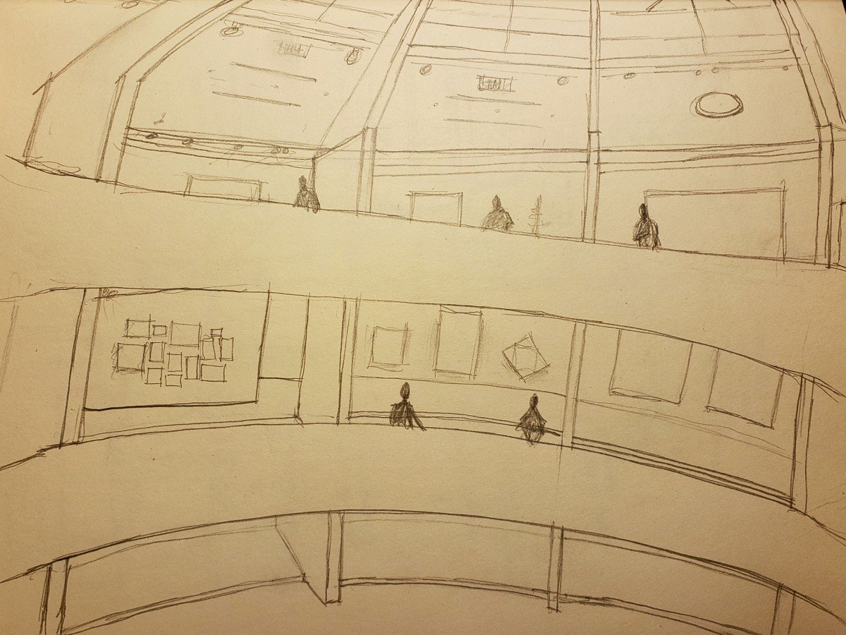
The spaces of each museum are very different. In fact, the Guggenheim is not your typical museum space. However, starting with the Frick Collection, you have the typical circulation of walking into different rooms. It is more of a scattered or unorganized and free circulation. Many of the rooms were joined because it was originally a house, which made it quite difficult to make a circulation that was sequential. Despite its circulation, the art itself was displayed beautifully. Mainly through natural lighting. Some of the rooms had skylights that really brought life to the paintings and the spaces they inhabited. Another way the spaces were lit was with chandeliers. With the Guggenheim, it has a more forced and organized circulation when viewing the art. It is intended for the user to start from the top and make their way to the bottom. Using a circular path, you can hardly miss any of the art. Every level has its room for more art which has the typical layout of a gallery, but you always end up back on the exciting, circular movement of the museum. The space itself, as well as the art, is lit by many light fixtures but the main source is the skylight.

In my opinion, the Guggenheim is a more exciting museum mainly because of the way the museum was designed in terms of its circulation. Because of it, I successfully looked at every piece of artwork.

« Older posts