The History of DC Comics
The brand of “DC Comics, Inc.,” is a particularly dated brand. At first the initials “DC” meant detective comics and was founded in 1934. Although the company was first founded in 1934, they did not don the infamous two letters until 1940, when one of the most unforgettable and infamous characters in comic book history was born, The Batman. The company underwent a numerous amount of changes. Even recently in January of 2012, the company changed of logo appearance.
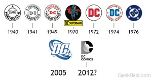
Each of the changes that DC comics made to the logo of their company had a significant meaning as to why it was changed in the first place. As stated previously, in 1940 the first DC comics logo was created with no background and represented the title name for their character, the Batman. The original logo had a thick stroke and was a circular shape. Shortly after in 1941, DC released an updated version of the first logo. This updated version had less of a stroke than the first logo and added the word, Superman, to itself. This was to indicate the acknowledgement of not only Batman but also DC’s new “Super-hero.” In 1949, another change to the logo was made. The “publication” in the logo was removed and replaced with the company’s somewhat formal name, National Comics. Color was also added to the logo, throwing a bright red onto the words DC and Superman.
Twenty-one years later, the next change to the now famous DC comics logo was made. In 1970, DC started using the title characters in the logo itself and putting DC behind the name of that character. For example, the logo would say “DC Batman” or “DC Superman” with the character in the background. In 1972 reverted back to their circular logo style but this time adding a blocky styled san serif. In the 1972 logo, the red in the DC also returned. A couple years later in 1976 another major change was made. When a new publisher, Jenette Kahn, was hired to the company, she hired graphic designer Milton Glaser to re-design the logo. The new logo commonly and popularly known as the “DC Bullet” was premiered on the February issues and was a blue circular shape with four stars. It also had the same block styled sanserif typeface. The logo wasn’t changed majorly again until 2005 where another revamp occurred. The logo was also seen as a representation of patriotism.This change consisted of the DC letters being circled by a star. The letter typeface was changed and the entire logo was blue and white. The last and final change to date was made in January of 2012. The changes were first seen in DC movies and shows, then showed on the covers of the comics.
The history of the DC comics logo is dated but serves a very important purpose as to why so many changes were made to the appearance. Not all fans approved of these changes but the company progressed as usual and continued to strive on.
Sources :
http://comicsalliance.com/dc-comics-logo-history/
http://en.wikipedia.org/wiki/DC_Comics
http://blog.logomyway.com/history-famous-logos-4-dc-comics/
http://www.geekrest.com/wp-content/uploads/2012/01/DC_Comics_Logo_History21.jpg


