
Our letter design project Spring Semester 2015 GDP1
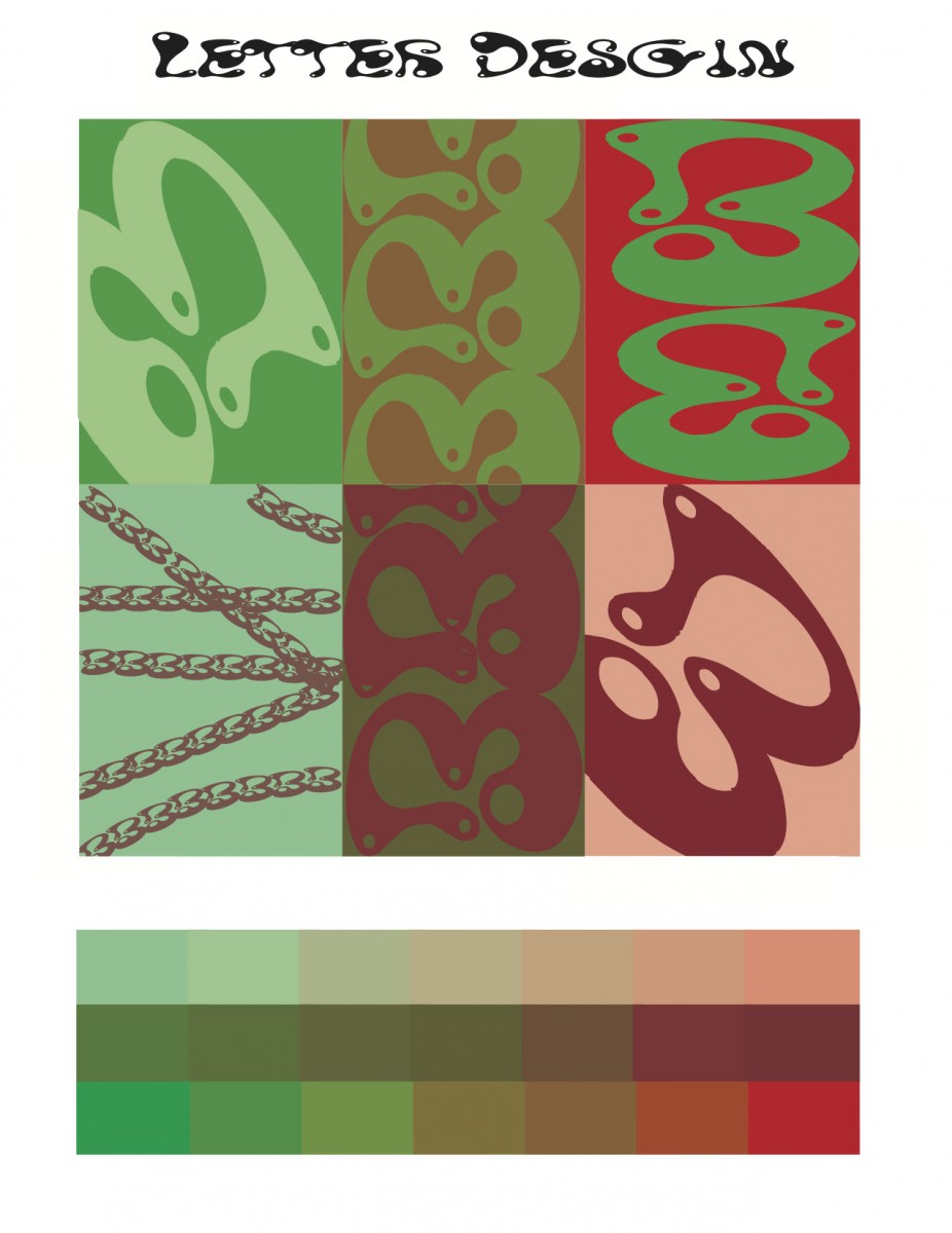
This my first graphic design project thats letter related (Typography). Our professor encouraged us not use an initial from our name which made it more of a challenge to find a letter. We had a choice to either paint it or create one digitally. I decided to go digital because it was more convenient; there was already font on a computer, why not find a unique one and play with it.
So I chose the letter B because it was my third favorite letter after my initials. I looked for the most creative font and I found something called “waterpark”. This is a font you wont use to write a research paper so it was perfect. I played with the font; i made it bigger and smaller, and i made reflections, with symmetry, and contrast that match the color board. In the end I created this.
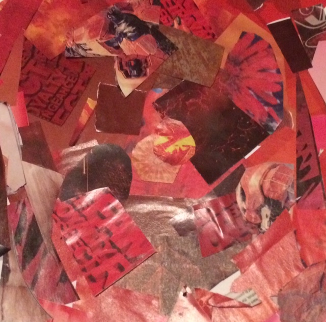
The monochrome project we did in one color.
This my monochrome project for Graphic Design Principles. Before this project we did monochrome using black and white because it was easier and it would help us create this project. we used magazines filled with advertisement and artworks. But we had to stick with one color, so i ended up choosing red because it’s such a common, “eye-popping” color.
I had to use different shades of red to give the design a more unique look. I own a bunch of gaming magazines so it was easy for me to find bright and dark colors of red. I even added some pink inside because it part of the rgb red family.

