Ever since the expansion of industrialization, communication has been a vital way of interaction, the share or passing of information, and getting a message across, whether it is in the form of a song, an action, or a symbol. People have found ways to do just that with a mere picture or text, also known as logos, graphic imagery or symbols representing a group as its trademark, or just an abbreviation of the company name. Every day, people are surrounded by symbols. We see them on our food, our clothing, our devices; remembering the text or symbol in a negative or positive tone. Many people take the time to make these logos to aid in the branding of each product or corporation, embedding their works into culture for time to see.
On Monday, September 29, 2014, I had the honor of taking a trip to the gallery of the School Of Visual Arts to analyze the various creative works of Tom Geismar, a brilliant graphic designer of his time and everlastingly in mine. I saw numerous logos that I used to see around a lot as a child and that I still see till’ this day, for instance, Mobil Oil, New York University, United Nations Development Program, and Chase Bank. Many of the logos that I had the pleasure of looking at had many notes of symbolism.
Mobil Oil logo
NYU logo
UNDP logo
Chase logo
For instance NBC, or the National Broadcasting Company is a peacock with yellow, orange, red, purple, blue, and green feathers. NBC’s logo was made in 1986, also being the first news broadcasting company to be shown in color. Another example would be the PBS, also known as the Public Broadcasting Service logo made in 1984. The red, white and blue heads represents the American public and television.
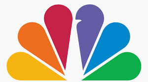
NBC logo
PBS logo
In addition to logos, Tom Geismar illustrated drawings, pieces of art and text. I especially loved the 50 used and 50 untouched framed pencils with the words,” CAROLYN- MAY THERE BE MAY MORE SHARP AND COLORFUL ONES! LOVE FROM JOAN AND TIM 1-18-85” I felt that it represented the time that they spent together.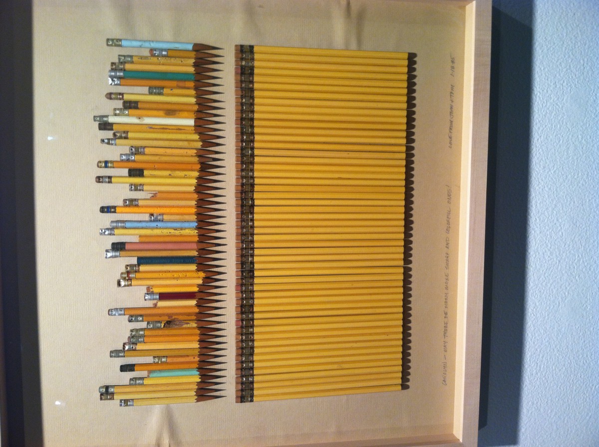
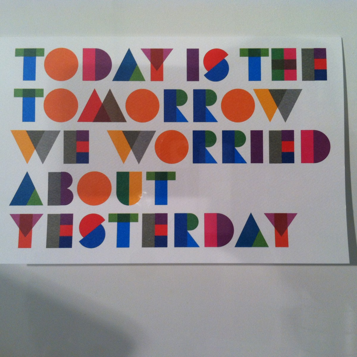
One other piece of work from him was the visual text,” TODAY IS THE TOMORROW WE WORRIED ABOUT YESTERDAY.” The text here was made using squares, circles, triangles and rectangles, blending in the pieces of each shape that connected with another shape. It was also very colorful so it caught my eye.
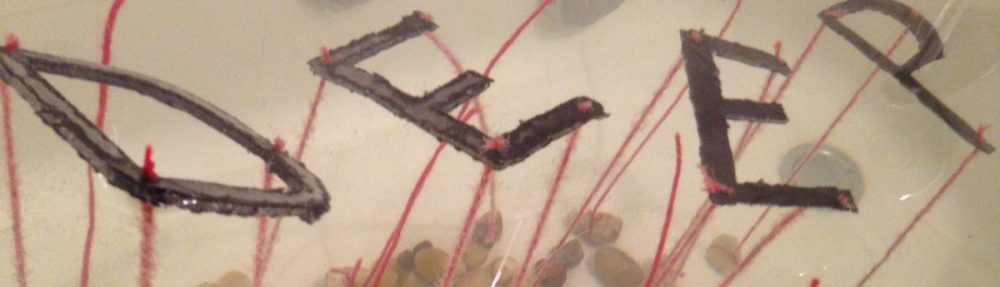
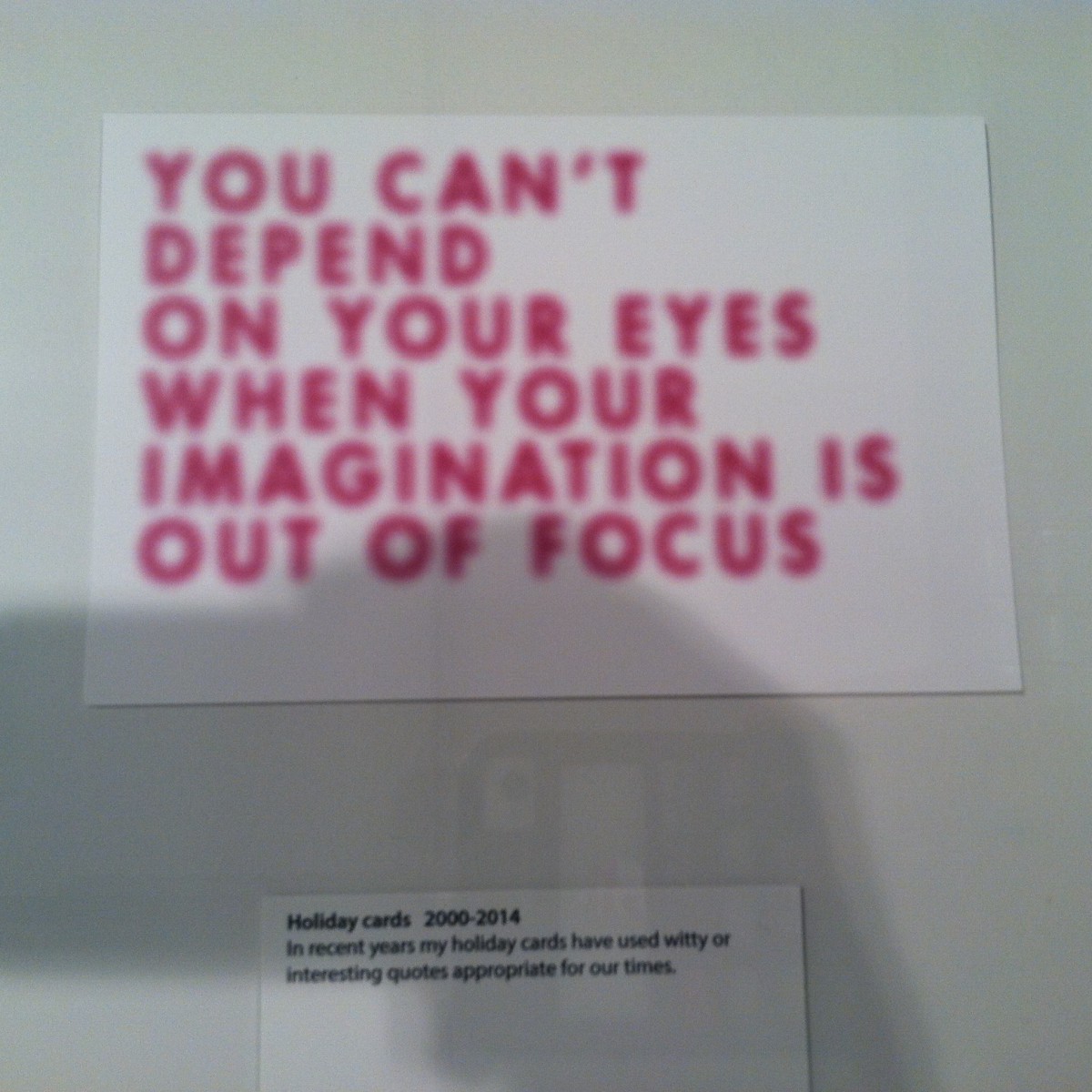
Another one I could not stop staring at was the text,” YOU CAN’T DEPEND ON YOUR EYES WHEN YOUR IMAGNATION IS OUT OF FOCUS.” I adored that one due to the fact that the text was talking about focus and the text was in a way made to be like I was not wearing glasses- if I had to wear any.
Tom Geismar has a way of setting a balance between color, tone, and symbolism so that a strong idea sticks with the viewer for years to come.

