“I would rather die standing up to live life on my knees.”
― Ernesto Che Guevara
The quote chosen to develop this postcard is the South American revolutionary Ernesto Che Guevara. It is worth for people to analyze this quote because of its rich meaning. The quote was said in a very critical moment of Che’s life. Today, we live in critical moments with Media controlling the content that people must accept. We “live on our knees” accepting the information which is shown to us. The information which is convenient only for people with power. However, we as designers and content creators must “die standing” and display to communicate information which is hidden from the from the general population. We must not feel fear of retaliation by those with power. The analysis of this quote, I do without the intention to offend anyone. What motivated me to choose and explain a little deeper this quote, is the frustration I feel when I see how the Media misinforms and chooses particular moments to broadcast content to citizens. I am not an activist, but I believe the information shared to the population have to be complete and inform the entire story not one side of it. This is the reason why we should be proactive and seek for valid true-full content behind the content the Media want us to believe.
Visual Quote 1
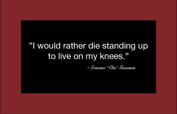
This first postcard is made up of two rectangles, one red and one black. The letters in this design are white which creates a perfect contrast with the small black rectangle that is in the back of them. The first rectangle is red as this color attracts attention of people. In addition, according to the message sent by the quote, the color red is perfect for capturing the eyes of people who view the postcard. The font is Helvetica Neue for the quote and the author’s name is Snell Roundhand. The font size is 24 pt for the quote and 18 pt for the name because is legible for each and every one of the readers. I wanted to create a simple and straightforward postcard so its message is explicit and effective for anyone to read it. That is the reason why the colors and designs enliven and emphasize the message of the quote.
Visual Quote 2

The second post card is created by a white rectangle with a thin black border. The word “CHE” is in capital letters in which occupies the entire width and length of the post card. These three words are black, but with a 25% opacity color. This effect creates a background in which the letters bring the quote in red and can be easily read. The capital font letters are Krungthep Regular 490.55 pt, while the small font letters are Baskerville Bold 24 pt. Finally, the name of the author of the quote is in font letters Brush Script Std Medium Medium 18 pt. The postcard, is designed so the capital letters draws the reader’s attention. Ernesto Guevara is a famous revolutionary man in which his nickname “CHE” is what most people know him by. For this reason it seems a good way to attract the attention of people by developing the design using his pseudonym. The goal is to be clear and concise with the message the quote has it.
Visual Quote 3

The third postcard is designed with a photo of Ernesto “Che” Guevara. The letters’ colors are in red and black. The font letters used are Baskerville Bold 24 pt for quote and for the name the font letters are Brush Script Std Medium Medium 18 pt . This design consists of letters that say “Che Guevara”, which the font is American Typewriter Bold of different sizes and covering the cap in his photograph. This part draws the attention of people in the design and I wanted to highlight his revolutionary ideas, his philosophy and way of acting. The photograph was put under several filters in order to overshadow his facial features and get the letters on his cap, which are red in order to be distinguished better. The quote is at the bottom of the postcard to give a perfect balance and not create visual contamination at the top of the image.

