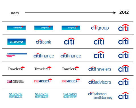
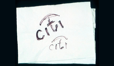
From a napkin sketch at a client meeting, to putting the design on stationaries, than to advertising, the Citi Bank logo has come a long way (Diagram 1). Paula Scher, from Pentagram (a graphic design firm), made a 3 second sketch in 1998 at a client meeting which would eventually change the companies image. This design being Citi with the “t” as an umbrella. This new design wasn’t only for Citi bank, as they changed it during one of the largest mergers in history.
The Citi bank logo was changed during a large merger between two companies, Citi group, and insurance Travelers. The umbrella symbolizing not only the two business now being unified, but also for the consumers and bankers as well, being taken care of and under shelter. The sans serif blue font reading “Citi” with the red arch over the “t” eventually became all that was needed, instead of complicating it, making more with less (Diagram 2). This changed the small branches under the major Citi banking company to eventually just use “Citi”, unifying all that the company can do under one major header. Paula Scher wrote on a blog saying, “The designer needs to be ever present because, inevitably, at some side meeting, something will be suggested that will totally destroy the form of the logo. Something can be suggested innocently, with the best of intentions, that will scuttle all plans, compromise all standards, and destroy the integrity of the design. The only person who can know this and stop this is the designer.” She did the exact opposite of this and suggested one of the sleekest designs at the time, that would later cary the company to great success.
http://breezycreativedesign.com/2010/05/04/citi-logo-by-paula-scher/
http://new.pentagram.com/2007/02/moving-to-the-big-citi/
http://www.logodesignlove.com/paula-scher-identity-forum