
(Image on left)
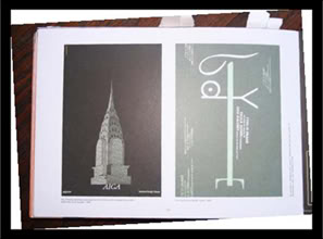
One design I really liked from the field trip to America Institute of Graphic Arts (AIGA), was the Paula Scher piece of the Chrysler Building. From afar the design looked almost like a halftone photo of the building but once you got close you realized the spacing in the building was actually made of names. I believe the names were from people that were in the AIGA at the time, or maybe well known designers in AIGA. The names where in different weights and sizes and in white while the backdrop was a dark blue. They also had it hanging at a unique part of the building when you crossed a bridge like area which was designed by a designer in AIGA, can’t recall the name of the designer. Overall Paula Scher’s piece grabbed my attention because of the thought process and how well the design came off as a whole.

