Please visit and explore the Gapminder website which I will show in class after spring break:
- the homepage Gapminder.org has links to various features on the site
- the Tools page has an interactive scatterplot tool which I will show in class:
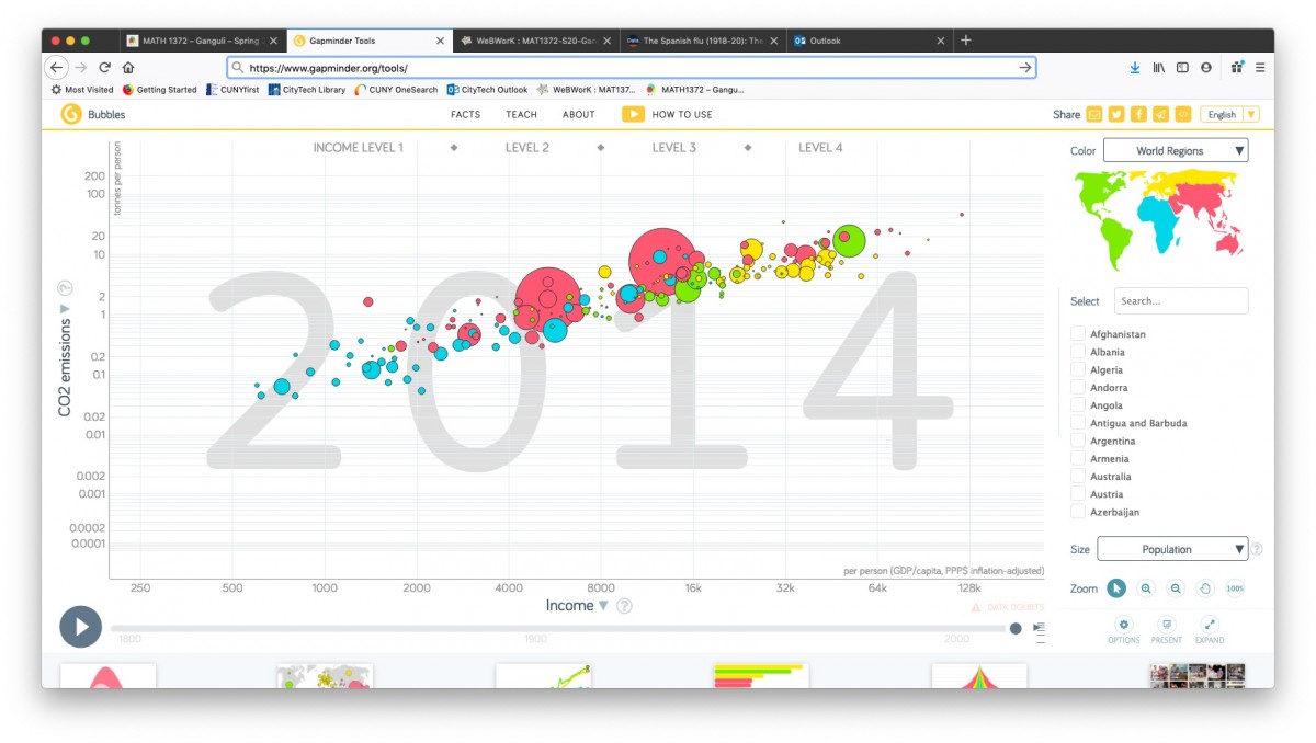
GapMinder has a LOT of data that is available for download, and so is a very good source for project topics and datasets. They provide datasets for 519 (!) different “indicators” listed alphabetically–everything from “Adults with HIV (%, age 15-49)”) to “Yearly CO2 emissions (1000 tonnes).”
Browse through the list to get some ideas for project topics (clicking under the “Download” column downloads the data in an Excel file; clicking under “View” opens a Google spreadsheet with the dataset.)
Here is a scatterplot I will show in class titled the “Wealth & Health of Nations“, as measured by life expectancy (a measure of a country’s health) vs. GDP per capita (a measure of its wealth):

GapMinder actually shows a time-lapse animation of scatterplots, showing how this paired data set evolved over the past 200 years.
(In fact, they produced a video called “200 years that changed the world” in which Hans Rosling, the medical doctor and statistician who created GapMinder, provides commentary on this time-lapse data. Rosling became widely known through his TED talks. His first one, from 2006, is titled “The best stats you’ve ever seen“–it’s worth watching!)


Recent Comments