
Cooper Hewitt field trip
The exhibit How Posters Work in the Cooper Hewitt museum was about learning how and why posters send significant messages. Printed posters have been around the graphic arts industry for copious years but only through skillful techniques have they been successful to aspire reactions.The exhibit focuses on the various principals that are applicable to any poster design and displays iconic artwork that demonstrate just that. Using type, visuals and color, visual language becomes a mix of psychology and art.
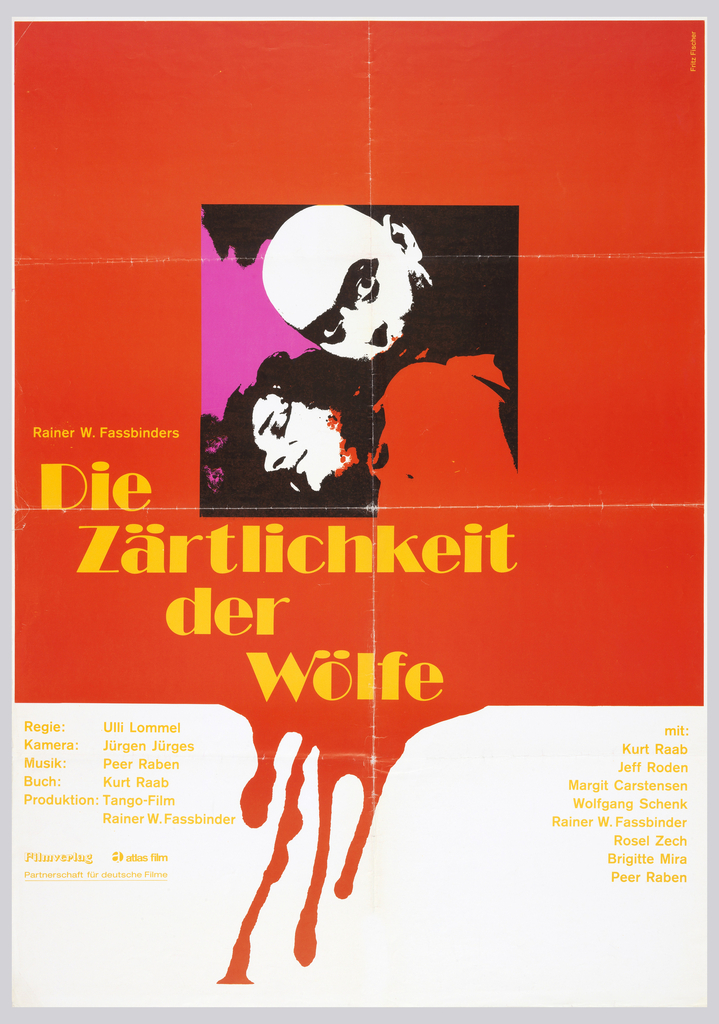 Fritz Fischer Die Zärtlichkeit der Wölfe [The Tenderness of Wolves]1973. offset lithograph on wove paper. Gift of Sara and Marc Benda. 2010-21-15. 102.9 × 72.5 cm (40 1/2 × 28 9/16 in.)
This poster designed by Fritz Fischer uses the idea of “assaulting the surface”. Fischer overlaps his objects by opening the frames and allowing color to bleed through. This cross path between objects plays on the effects of figure ground. It’s also clear that he used additive and subtractive colors in his pallette. Using magenta and yellow as accent colors helps to emit red as a dominant color. Two subtractive colors add up to one additive color, in this example, yellow and magenta add up to red. Fischer also used eye contact in his composition in order to grab the attention of viewers. The red bleeding off the page works conceptually with the theme of horror and blood.
Yusaku Kame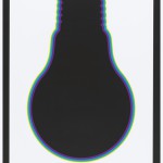 kura Yamagiwa International Competition for Lighting Fixtures Exhibition, 1968. photo-offset lithograph on paper. Gift of Sara and Marc Benda. 2009-20-17.
In Kamekura’s poster, focus is directed by placing a large scale silhouette in the center of the layout. Selecting a light bulb to represent the Lighting Fixtures Exhibition is simple but gives viewers a quick and easy read about the event. What made Kamekura’s poster standout though was his choice of a black light bulb. He used black but gave an illusion of glow through four color borders. Borders begin emerging from purple, blue, green and yellow, this shift between low to high luminosity create movement.
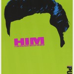
Paula Scher Poster, Him, 1994. screen print on paper. Gift of Paula Scher. 2013-25-1. H x W: 117 × 76.7 cm (46 1/16 × 30 3/16 in.)
In this poster, Scher uses green as a dominant hue with accents of violet to create contrast. High saturation among these colors helps to holistically amplify the attention and contrast of this poster. The contrast is useful in making text eligible and readable from an afar distance. Scher represents a male figure through the word “HIM” placed as eyes surrounded by a men’s hairstyle. Use of type around the eye area automatically withholds attention as if eye contact were coming from the poster. Nevertheless, simplicity remains throughout and this poster remains successful in visually communicating.

