Journal Blog 2: Getting to Work!


CR: vitamintalent

I am a graphic design interning in The Office of Visual Communication. My boss, Katherine Tabares who was once a student at CityTech works at the office as a professional graphic designer. In my previous journal blog, I spoke about the struggle of trying to get into an internship before starting this class and how I had to set a small yet very important goal that I have to get into an internship before or during the second-week class. That part of my journey was a success. Everything happened quickly with the interview and going straight to Day 1 of working. We discussed me being responsible for creating posts and carousals for the school’s social media and spoke about the virtual graduation happening this year in June. Due to the Pandemic, last year began the virtual graduation and this year we talked about how we could make this year’s virtual graduation better than the previous one. We didn’t get into detail with it that much since it’s still a couple of months away but was a great heads up to think about. Working here makes me feel happy and comfortable in a professional way, even though it’s remote, the atmosphere feels familiar.

Journal Blog 1

During the start of this semester, I. had a hard time getting into an internship where I applied to so many of them and none responded back in time. The first week of Internship class passed by and I still was not in an internship. I set a small but important goal that by the second I need to have one so I contacted my work-study boss. He got back to me quickly and gave me one of his co-worker’s contact information who needed an intern. We spoke and thankfully I got the internship by the second week and quickly got to work. I am interning at the Office of Visual Communication under City Tech.  The first day we had a meeting and discussed of the what kind of projects i will be doing, I am responsible of creating posts for the school’s social media based on the academic calendar or if the school has an important event to announce. For the first week I designed posts from Feburary 17-March 11 from the academic calendar. My boss shows her gratitude and gives good feedback and critique based on thw work I give. She is very laid back and fun to work with.

Building of Office of Visual Communication

Gordon Parks

Gordon Parks was a self tight photography, he took great photos that had such a a powerful meaning behind them. His photography focus was on race relations, poverty, civil rights and urban life from early 1940s into to the 2000s. Gordon Parks saw at point he had to have a camera because it could not be weapon against racism, poverty and sorts of social wrongs. He was not just a photographer but a fiction/non fiction writer, music composer, painter and filmmaker, he became the first African-American to write/direct a major Hollywood film in 1969. The work that stood out the most from his is the “American Gothic” photo he took in 1942. In the photo an African American woman named Ella Watson who worked as a cleaning lady for the FSA where Parks worked at. He explored her community which wasn’t in a good shape and continued to take photos. In the photo we see Ella Watson standing behind an American that is hung down from the wall, she stands holding a broomstick in her right hand and a mop leaning against the wall. Her gaze is somewhere else. The photo symbolizes the accusation of the treatment of African Americans focusing the attention on racism and discrimination in this free land. Parks photo was a reference to Grant Wood’s iconic painting (American Gothic 1930) which is a middle aged couple standing in front of their gothic style hole while the man is holding a pitchfork in his right hand.


Visual Quotes

This is my first visual enhanced quote. I chose this quote because I relate to it and not just me, but others who also feel the same way. I chose the background to be a person thats either reaching for the sky or pointing at it like how she is pointing in this one. It shows how this one person is under the night sky brimming of stars, they may seem small to us but unfortunately they are bigger and brighter than they look making us the small ones. For this first visually enhanced quote I used Helvetica neue ultralight to make it go with how the stars and the night sky look together from our own eyes, small and brightThis is my second visual enhanced quote. It is still the same quote I have used for my first design . I chose the background to be a spotlight directed at an angle which shows dust specks due to the bright light. I wanted this background to really be a little accurate by using the speck of dusts as an example of how we really feel like. For this first visually enhanced quote I used Noteworthy Light, I did not want to have a lot of contrast in the font and not too edgy as it does not go with the background image.
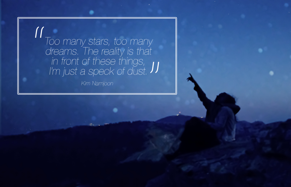
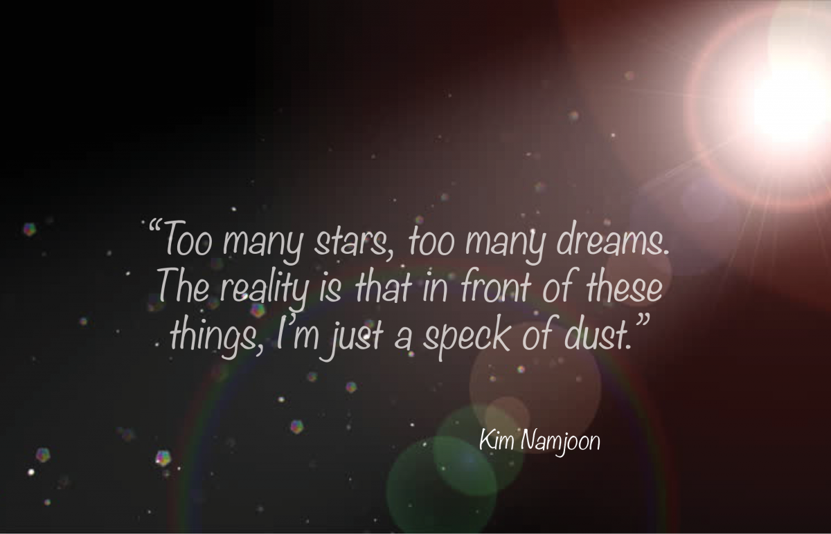
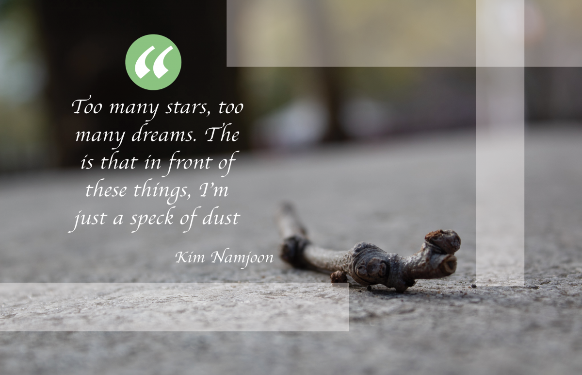
For this third Visually enhanced quote I wanted it to be slightly different from the others. The background image is a photo I personally took of a tiny twig laying on the park ground. It may not be a a speck of dust but it kind of relates to the quote in way of how small the twig looked when being looked at from any human’s point of view, that it is just a small small twig in front of us. The font I used for this is called Apple Chancery and I thought that I went really well with the photograph.