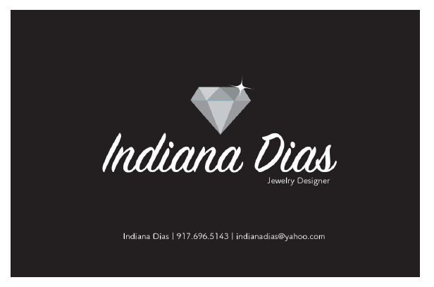
The day started off with my supervisor giving me two business card to design for 2 different clients. The first one I was working on was on a client that made Jewelry and she wanted a diamond in the middle. When making the business card I thought about the fonts which she wanted it to be elegant and simple. I picked a script type font and san serif font that went well with the script type font. The bottom section that included her name, phone, email I used a light San serif font that went well with the top part. When the client viewed the business card she personally liked it and wanted me to change the Diamond, because it used to be blue.
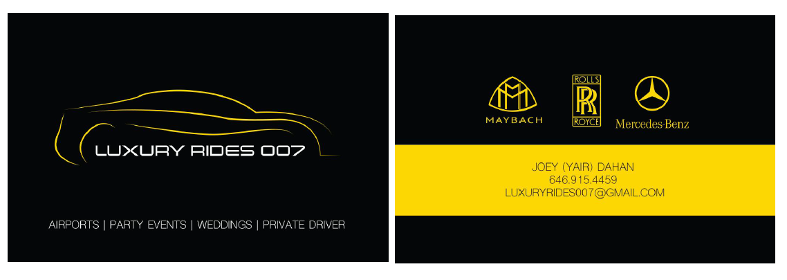
The second business card I worked with was on luxury rides and my supervisor gave me a n old business that I had to redesign. The old business card had was very confusing, and it had a lot of 3D type which made the business card hard to look at. So I made a car logo with lines and made the logo type bold, which went well with the line art. In the back I added the logos of the vehicles that Luxury Rides 007 offered, and added his information in the bottom.