Using color to create typographic hierarchies

Last night, a few great questions came up about the below poster that was shown as an example of the use of color in typography. Why green? and why did they choose the two Es to connect (when E isn’t a blood type).

Anthony-nolan-1

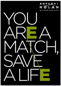
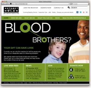
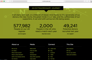
It turns out that this poster was part of a campaign and green is a brand color. Other elements of the campaign connect different letters See screen grabs from their website below, and check out their website here.

Anthony-nolan-2-1

Screen Shot 2016-02-23 at 5.04.03 PM

What do you think? Is the poster confusing when standing alone without knowing about the rest of the campaign? or does it work well by itself?

All comments welcome!

Please Make This Look Nice: The Graphic Design Process as an Act of Drawing

1c1ba87c-a02e-476d-bc4b-607b45db29d7

This would be a great exhibition to check-out. It’s on view from February 19-March 16.

This exhibition looks to expand the general and most basic understanding of graphic design by turning attention away from finished solutions—the “what” of graphic design—to consider the “how” and “why,” focusing on the myriad techniques and methodologies involved in the graphic design process, including writing, traditional drawing, photography, prototyping, assemblage, collage, and collecting.