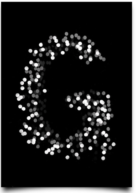
http://www.fubiz.net/2012/10/25/type-scan-alphabet/
This is the work of a designer in Berlin called Tony Ziebetzki. I chose to post it, because I think it is a strong use of contrast and light to create an interesting texture. The lighter dots seem closer and dimmer dots seem further away which makes it a good example of spatial depth as well. I love that there is not an actual contour to the letter G, nor is it necessary. Well done Tony!
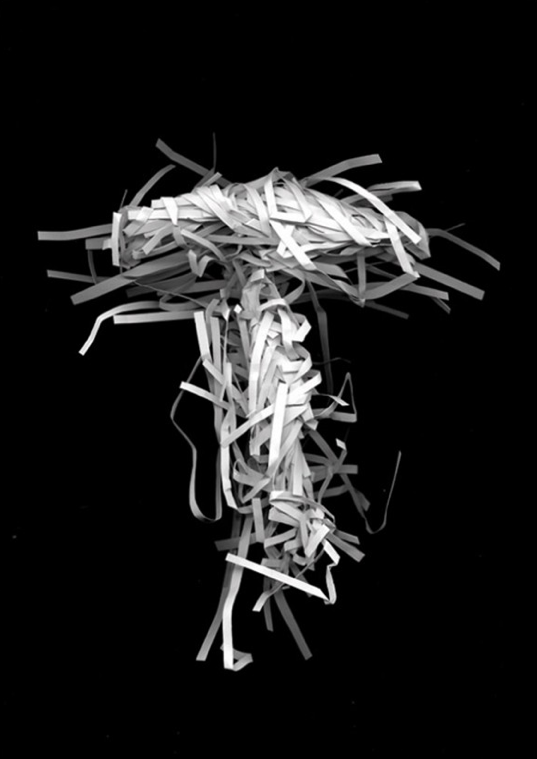
http://www.fubiz.net/2012/10/25/type-scan-alphabet/
This is another letter by Tony Ziebetzki which I found on ffffound.com. This is equally successful as the G for the same reasons regarding spatial depth and value. The contour here is also implied but not as seemingly crisp or clear.
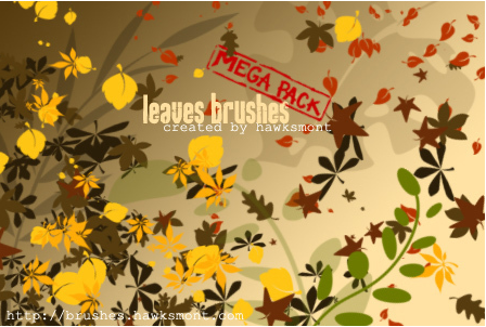 http://www.brusheezy.com/brushes/1338-leaves-brushes-mega-pack
This is a button for a series of leaves brushes on the website brusheezy. I chose it because I think that the contrast of the straight clean contours of the leaves together with the random organic shapes balances well.
Post 5 of them! Have fun with it!

