Author: Elliot Vidalon (Page 1 of 2)
https://www.degruyter.com/document/doi/10.1515/9780822393214-025/html (The Ecstasy of Influence A Plagiarism)
http://na-magazynie.pl/wp-content/uploads/2018/08/The-Politics-of-Design.pdf (The Politics of Design)
https://journals.sagepub.com/doi/full/10.1177/0022243718820548 (The Visual Asymmetry Effect: An Interplay of Logo Design and Brand Personality on Brand Equity)
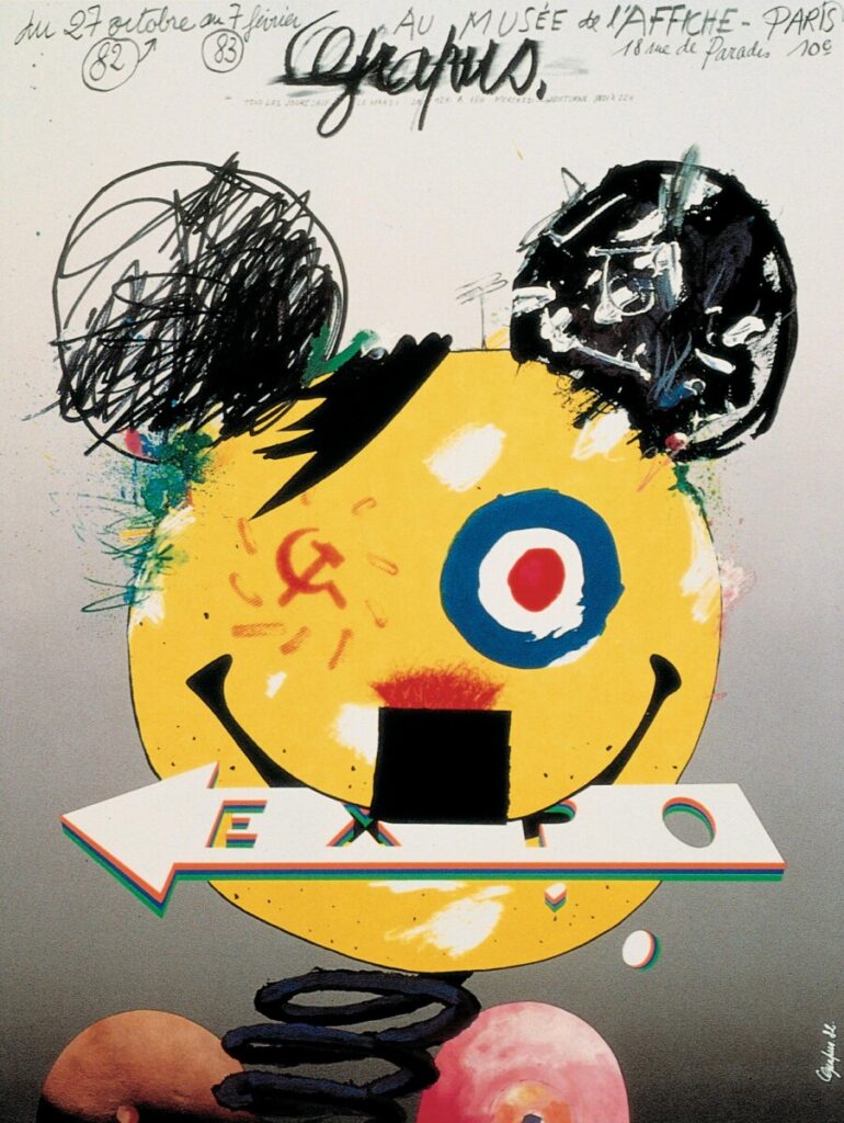
I think how mainstream and underground relevant has adapted to contemporary design is formed by society, we have adapted with new humors, new ideas and concepts. Both mainstream and underground relevant have developed and represent various categories in advertising. As what most today’s artists say, ‘steal is the way of art’, meaning that our idea, our concept is not original but influenced or inspired by the origins. Therefore, we artists create remakes of that topic. This is how the advertising industry or mass markets get their intention of stealing ideas to gain profit towards their advantage. Taking from a source labeled ‘The Ecstasy of Influence A Plagiarism”, Jonathan Lethem cited a quote, “All mankind is of one author, and is one volume; when one man dies, one chapter is not torn out of the book, but translated into a better language; and every chapter must be so translated. —John Donne” A metaphor coming from a classical concept, this practice was passed through many generations and it has yet adapted to our society. One generation passes down to another generation, as for an original concept can be drawn down to a million ideas. Though it does have its advantages and disadvantages, the advertisement industry manages to tackle this method into producing benefits and getting away with it, sometimes.
The design that I chose, ‘amazon’ represents the dichotomy of underground mainstream because the brand is influenced by main ideas in different perspectives, such as its function/ service and symbolism/ logo. As we can imagine, Amazon is well known to be an online mass market with a smile on it. There are two things to consider, how and why the smile creates a strong platform for the brand and two the concept of the smile itself. Since amazon is a world-wide marketing brand, the smile represents a friendly connection to the audience, which is considered as mainstream because the appropriation of the brand is safe for everyone, especially for children. It does not cause any disturbance or expose any danger to the views, meaning that it is safe to advertising. Another source relating to mainstream, the publisher states, “In this article I evaluate parallels between postmodernist analysis and my positions on(1) communication and (2) methodology. I also (3) propose several hypotheses that may account for why some sociologists have embraced and others tolerate the criticism and (4) discuss the implications for the discipline of the factors involved.” It evaluates specific forms that give a mainstream a chance to tolerate society or vice versa. Amazon is one of the safest examples of mainstream because it comes across various appropriations that ranges from favorable to explicit.
To be a little off topic, I want to mention something that would best describe ‘underground relevant’ and that is ‘hentai’. It’s a genre that is close related to pornography and of course influenced by it. Coming from the ideas of japan, hentai is considered to be a mass genre that created various brands dedicated to it but the problem is about advertising. I can already imagine that it creates some discomfort for certain people due to being offensive or inappropriate. Similar to the down fall of pornography, Heller states in his article, “Pornography, once the bane of puritan society, is used by the advertising industry for edgy allure. Most of the time for ‘underground relevant’ marketing, they’re limited to demands, exposure and publications. Though the concept is potential, society has their way to sabotage these brands, leading them to a disadvantage towards advertisement.
Source/ Cites:
https://www.degruyter.com/document/doi/10.1515/9780822393214-025/html
List of all important terms (so far):
. Two euphoric values; freshness of the product & the essential domestic products preparation.
. Second sign (more or less evident); bringing together figures, color, elements etc.
. Coherent whole; general cultural knowledge, imbued with euphoric values.
. Real objects in the scene; photographed objects, signifying in analogical representation, not arbitrary.
. Quasi-tautological; photograph involved, this transition is not a transformation
. Three messages offered by photograph; linguistic message, coded iconic message and non coded iconic message.
A little more context about Quasi-tautological and the three messages.
Ever since our generations have evolved and adapted with technology, it has shaped our future, our society, our media and more. That is called the ‘medium’ of our time, it reshapes and alters patterns of social communications and personal lifestyle or habits. A brief example, compared to how students attend class, we now use technology at its best to connect to ‘zoom’, before the pandemic many students would have to physically attend to school or campus. Going through this adaptation has impacted many students to function with technology that many of the old generations such as parents or elders are unable to cooperate with because they find it to be complicated. How technology influences our generation and society leads to a concerning question for how are we going to shape our future.
Media, today’s essential tool that reshapes the pattern of communication, where we most spend on the internet for entertainment purposes, informational research, publishing, broadcasting and more. Even today, celebrities communicate their fans through social media such as Instagram, Facebook, Twitter and more. It is a convenient method for people to be connected with the media, it doesn’t necessarily mean that you are just a follower, the media can be shifted in any form and function, it could be for business use, personal use (possibly growth), and more. Media is another way of creating communities, where many people can join based on their preferences, interests and more.
For how the media has shaped our society depends on how people deliver in their communities. Media can be used in any way people desire to do so, but sometimes it can be put in the wrong hands. For instance, cyber bullying is one of the common issues among adolescents, releasing false information that causes conflicts through debates, hijacking private information, and more. That is just the interior issues about the media but if we think about ourselves outside the media, think about how we are so drawn to technology that we tend to forget about reality and society itself. We must not forget that we as human beings have a responsibility on our own, our family, our community, and so on. Yes, technology can also benefit people to stay connected from anywhere and whenever possible.
If the ‘medium’ was interpreted as a message for most designers, I think this message designates for most designers and artists in our present to realize that our technology has evolved to its capability to adapt to our creativity, our ambition and our connection to our community. There are many designers in the media competing to reach their ultimate goals but most of the work of designers are subordinate to the media, designers aren’t meant to be famed for what they do, apparently designers are only credited by their work but would never be recognized by the audience.
Jan Tschichold, Karl Gerstner, and Josef Müller-Brockmann all have a similar goal to change the ways of typography but they differ by methods, these approaches can go from being experimental, accurate or in naturalistic form. As for Karl Gerstner, his goal to change typography is for type to be accurate in terms of sizes, value, space, etc. Jan Tschichold’s goal is to alter the old typography in a giving sense of beauty by using asymmetric formats instead of symmetric. Josef Müller-Brockmann uses a similar method from Karl by using grids but he goes for an experimental approach by using the negative space, manipulating the positions of its form and color. I will be discussing each one of the three designers mentioned, by its function and inspirations.
Starting with Karl Gerstner, he developed a diagram called ‘the morphological box of the typo-gram’ that follows with the terminology of Fritz Zwicky and uses it to determine the accuracy of the type and contains criteria such as color, value, space, weight, etc. It’s more of a scientific method rather than for design. According to the article, ‘Designing Programmes’, Karl stated, “It contains the criteria—the parameters on the left, the relative components on the right—following which marks and signs are to be designed from letters.” While this method was partially capable of aiding its assigned placement and analyzing the programme, Karl would pick some elements in the diagram and combine it to create the characteristics of the type because the importance of typography is for text to be readable.
Looking at Josef Müller-Brockmann work, he uses a similar method from Karl by using grids but as I stated in my introduction, he was very experimental in using types and elements that were irrational and chaotic. Bring it under his control by manipulating positive and negative space. He also featured his philosophy about grid and design in his article, he stated, “The designer’s work should have the clearly intelligible, objective, functional, and aesthetic quality of mathematical thinking.” To understand how type is represented, Josef uses logical resources and uses it towards his advantage to create not only a sense of characteristics but an essential form of communication.
Lastly, Jan Tschichold differs from the old methods of typography because his approach was for his type to have a nature or best to describe, ‘beauty’. He uses an asymmetrical method for type to be produced at its purest form. According to his article, ‘The New Typography,’ stated, “Asymmetry is the rhythmic expression of functional design. In addition to being more logical, asymmetry has the advantage that its complete appearance is far more optically effective than symmetry.” Apart from symmetrical typography, Jan describes the asymmetric typography to be more effective to create his own ‘beauty’ type because it gives him a more natural order and it’s more flexible for his design.


Recent Comments