Gelek Samphel – March 10th

 ”not to make creative decisions as prompted by feeling but by intellectual criteria.“ as Karl Gerstner stated. Design with feelings is really a designer’s taboo, we should design to solve the practical problems of specific groups by presenting meaningful concepts and ideas. These ideas and concepts should be based on research, to understand what people really care about, we need to really understand their situation.

Design is the perfect control of the internal details, which can withstand the test of time. What do we value the most when choosing a suit?  It is the size of the fabric of the suit; when choosing a CD player, in addition to its appearance, we are more concerned about the function of the CD player. Any kind of design cannot be separated from its basic functional attributes.

When designing, designers need to grasp the essence of the product and the core demands of users. This is not only reflected in visual design, but also in product interaction and user experience. For example, when you choose a mobile phone, will you pay more attention to the appearance of the mobile phone or the smooth experience of using its functionalities? Design is not only about the surface level visual comfort,  in the era of the mobile Internet, we need to focus on the experience of deep interaction. If Apple only pays attention to the exquisite appearance of their phone but ignores the experience and product interaction, architectural design only pays attention to the appearance of the surface but does not consider the comfort of the occupants, then graphic design only creates the illusion of “good-looking” but cannot convey the message of the product. All these are undermining the essence of design.

Jonathan Valero – March 10th

How should we design? well according to Tschichold in The New Type with the idea of “Clarity above all. Early typography had the freedom to be experimental and expressive because we didn’t have any rules for what makes good design. All that was known was that is the text is large and attention grabbing we can catch a larger audience.In this modern age however we like to have out things small,efficient and clear gone are the days of large serif fonts or fancy italics today we got for curved san serifs fonts for maximum readability.

If you asked Joseph Muller then he would tell you that you should design with mathematical precision in mind with the “Grid” as a blueprint. Design being almost the opposite of Art with Art being a persons self expression design is a calculation and researched piece that is created with a very specific intention in mind. On top of intention it’s also created to be a piece of the environment its created form, designs are creations made to be very modern very “now” they are not made to reinvent the wheel instead they are made to make the wheel more appealing and more appealing to modern audiences.

My opinion of how we should design is a combination of both of these ideas. I feel like design should revolve around the client more then anyone else we as designers work to create the vision of those who use our services so because of this we need to be able to be calculative to create anything that’s asked of us but to be able to try to make it as modern as possible to make sure it has wide appeal to anyone who would observe it.

Paulina Tipantasig – March 10th

From the reading I learn that Gerstner was an artist in the concrete art movement who developed the visual synthesis of graphic design. He created a system connected to computer programming that produces design solutions. He said that to make creative decisions, designers need to use exact and complete intellectual criteria to produce creative work. With the help of Fritz Zwicky instructions, Gerstner created a diagram called “the morphological box of the typography.” This diagram has the parameters on the left and relative components on the right as well as it contains marks and signs designed from letters. The variation of darkness on letters are combined, the parameter of shade will be when the solution crystallizes. Furthermore, Gerstner said that squared paper is a grid which is not a programme. The typographic grid is a program that has a proportional composition in which it is difficult to find balance.

Jan Techichold, was in the new modern typographic movement. He was imprisoned by the Nazis and escaped to Basel during WWII. Techichold said that old typography based on ornament should be taken out as it always had its central arrangement. Moreover, he said that for creating typography, clarity was needed because of the many claims for attention made by the higher amount of print which demands a higher amount of expression. He thought that if designers used clarity and approach each task with fresh and a determined mind, the result will be a good solution. Furthermore, every part of the text should connect to every other part by definite, logical relationship of emphasis and value which is established by content. Techichold said that typography needs asymmetry to be more optically effective, more natural order, and to give an extended range of variations in typography. As we, humans read by starting at one side, axial arrangements are illogical because word sequences vary from line to line. The New typography develops visible form that gives direct expression of the spirit of modern man. The printed text function is to communicate, emphasize and create a logical sequence of the contents.

Josef Muller Brockmann divided and was for him it was a ordering system for design, for this he used the Swiss typography grid as well as he took design elements such as subjectivity, irrational and chaotic. He wanted his work to look constructive, capable of analysis and as an orientation for the future in which he thought that a designer must have clearly intelligence, objective, functional, and aesthetic quality of mathematical thinking. The basis of democratic behavior is based on a well composed and refined design. The use of the grid system is based on solid, purpose, creative and technical production with color, form, and material as well as architectural control over surface and space in a settled way of thinking. Brockmann believes that every design its characterize by its designer.

Anthony Delbrun – March 10th

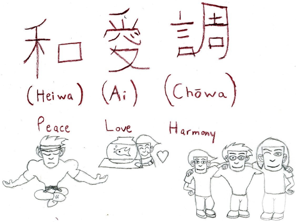
To answer the question, "How should one design?" one should design something they love doing and something people would be able to understand. This design I created is a visual-linguistic example that was shown in class last week. The Japanese symbols mean Peace Love and Harmony. I even drew characters from my career project to give you a visual understanding if you don't know what those words mean. To answer the question, “How should one design?” one should design something they love doing and something people would be able to understand. This design I created is a visual-linguistic example that was shown in class last week. The Japanese symbols mean Peace Love and Harmony. I even drew characters from my career project to give you a visual understanding if you don’t know what those words mean.

Tabarka Tamkin- March 10

According to Jan Tschichold, Karl Gerstner, and Josef Müller-Brockmann, artists should design their creative designs by using their knowledge, ability and mentality that gives clarity.  New Typography that allows us to such variation of asymmetry movements in typography. In the reading by Jan Tschichold, “The New Typography(1928)”. Tschichold talks about the New Typograophy that “the principle of asymmetry gives unlimited scope for variation in the New Typography. It also expresses the diversity of modern life, unlike central- axis typography, which, apart from variations of typeface , doesn’t allow such variety”. In this quote Tschichold talks about that New Typograpghy has asymmetry that gives limitless of range for many variation of typeface that helps us design the creative work in the diversity of modern life. Variation of typography allow us to play with typography that it has clarity and its legible. However in the Old typography, there is only central- axis and it is opposite to New Typography  that it doesn’t allow many variety in typeface and its bacially the known as only one basic form that is center. 

As we talk about the design, In the text by Josef Müller “Brockmann, Grid and Design Philosophy(1981)” talks about the grid system for design that every creative designers needs to have the will to submit their work and  to have a constructive and creative spirit towards their designs. Muller says that “ Every visual creative work is a manifestation of the character of the designer. It is a reflection of his knowledge, his ability, and his mentality”. This quote explains that designers have the will to use their creative knowledge, ability to support and justify the creative and technical production process and thier mentality to design it.

However, In the text by  Karl Gerstner, “Designing Programmes(1964) talks about combining the art and science to create an art.Later he developed a system and this system evolved is computer programming. By that he also said  design is method that pick out the element and combine those elements to create the creative design. So he came up with the “Morphological box of the typography”. He said to use “ The basic unit is 10 points; the size of the basic typeface including the lead. The text and picture area are divided at the same time into one, two, three, four, five and six columes”. This quote explains that Getstner is using the Computer programme as grid to design the text and picture amd making the 6 columes to divide it.

march 10th assignment

     How these artists should design is by being a problem solver to any work or project that clients received. It has an important role in design and should be appreciated more in many ways because we put in our hardwork, time effort and dedication. Typography has specific characteristics. It involves creating a complete and reusable typeface that allows you to make language visible. Back then people did not understand the importance of its function and focused more on its appearance. New typography was made to fix this problem, it is based on clear simple san serif typefaces and an asymmetric layout. The main thing about typography is to communicate a message between the person and the artwork. With those two it plays a big role in regards to a perspective. 

    According to The New Typography by Jan Tschichold , “In the old typography, the arrangement of individual units is subordinated to the principle of arranging everything on a central axis. In my historical introduction I have shown that this principle started in the Renaissance and has not yet been abandoned. Its superficiality becomes obvious when we look at Renaissance or baroque title pages.” As I was saying in the first paragraph, typography was not common and artists would use old techniques to work on projects.  The Industrial Revolution typography was all about communicating with the masses. Through signs, posters, newspapers, periodicals and advertisements, typefaces became larger and catchier with bolder lettering . Also, shading as well as experimental serif and sans serif typefaces. 

   In the reading Grid and Design Philosophy by Josef MĂĽller-Brockmann, “Constructivist design that is capable of analysis and reproduction can influence and enhance the taste of a society and the way it conceives forms and colors. Design that is objective, committed to the common weal, well composed, and refined constitutes the basis of democratic behavior.“ Constructivist design is a movement with origins in Russia, Constructivism was primarily an art and architectural movement. It rejected the idea of art for arts’ sake and the traditional bourgeois class of society to which previous art had been catered. Using the colors plays a big role in an artwork, especially the fonts.

Islam Mahrouss March 10

Typographic design is one of those things that happen to be overlooked by everyone. However it has an important role in design and should be appreciated more. In this case, “Jan Tschichold, The New Typography ”, discusses the importance of typography. He especially  discusses the difference between old and new typography. As Tschichold states, “old typography whose aim was “beauty” and whose clarity did not attain the high level we require today”. Old typography was based on decorative typefaces and having multiple different typefaces in one design. The design of the type was also centered, however this center axis based structure and decorative typefaces made reading very difficult. The function of typography is to communicate a message and this was the issue with old typography. People did not understand the importance of its function and focused more on its appearance. New typography was made to fix this problem, it is based on clear simple san serif typefaces and an asymmetric layout. According to Tschichold, “It also expresses the diversity of modern life, unlike central-axis typography, which, apart from variations of typeface, does not allow such variety”. The new typography is an expression of the new modern world and it makes sense considering the purpose of this new way of designing type is to be more improved and legible. 

Art, science, and math, those three areas tend to overlap lap a lot. One person who has combined both art and science is Karl Gerstner who discusses how he did it in his reading ”Designing Programmes’ ‘. Gerstner talks about how when there is a problem there is always a solution, but that there is never just one solution. Instead there is a group of solutions which and the way to find those solutions is by combining different elements. According to Gerstner, “The creative process is to be reduced to an act of selection. Designing means: to pick out determining elements and combine them”. This reminds me of mind mapping which is when you write down different words or things that are related to a subject and you combine those words to create a design. Looking at Gerstners chart in the reading, I noticed how similar it was to mind mapping. The concept of using this kind of chart helps to find the group of solutions that was mentioned earlier. Over all this way of thinking shows the relationship of problem and solution in design. 

Karl Gerstner also talks about the importance of a grid. A grid provides structure and consistency in design. The measurements help keep text and images proportionate and also keeps the design overall balanced. The use of a girl reminds me of new typography because its purpose was to be simple and well structured and with a grid that is something that you can achieve. Josef MĂĽller-Brockmann also talks about grids in his reading Grid and “Design Philosophy”. He states, “The designers’ work should have the clearly intelligible, objective, functional, and aesthetic quality of mathematical thinking”. All three of the readings have shown me that with modern design a lot of mathematical and science thinking is happening and as a result we are getting clean and efficient designs. It shows that art is not just about a beautiful image but the thinking and concept behind it. 


Assignment for March 10

Our next reading assignment includes 3 short texts from designers who employed rational, systematic methods in their work. They are as follows:

Jan Tschichold, The New Typography (1928): Tschichold_NewTypo

Karl Gerstner, Designing Programmes (1964): Gerstner_DesigningProgrammes

Josef Müller-Brockmann, Grid and Design Philosophy (1981):  MullerBrockmann_Grid_Des-Phil

Here is this week’s question:
According to Jan Tschichold, Karl Gerstner, and Josef MĂĽller-Brockmann, How should one design?

(Remember, you can answer with 3-4 paragraphs, as per usual, or you can use some of the visual-linguistic ideas discussed in class, or outlined in these readings, to design your answer in a jpeg or pdf file.)