COMD3504 - Section OL06 - Fall 2020

Author: Zhanae Dale (Page 1 of 2)

Zee’s Assignment 11

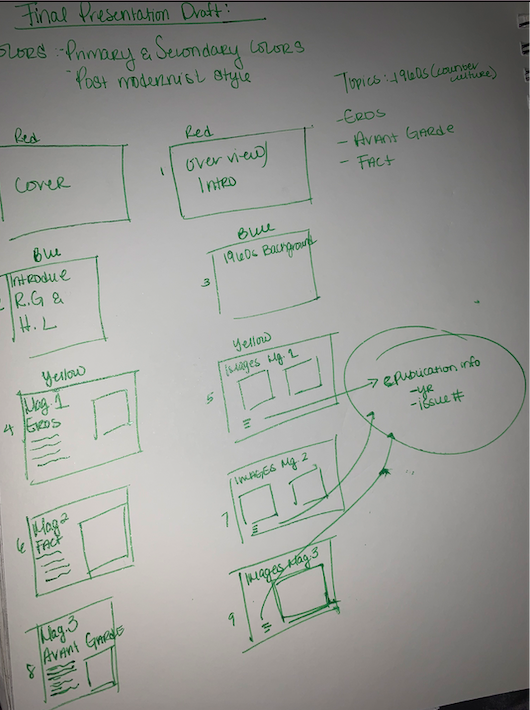
For the final presentation I focused on the 3 publications designed by graphic designer/typographer Herb Lubalin and publisher Ralph Ginzburg. The three publications are Eros, Fact:, and Avant Garde. Each publication came during the mid 1960s in the United States, the publications were very controversial and seen as inappropriate due to the censorship from the government and out dated values in society.

The three publications I talked about for my presentation fit into the dichotomy because during the 1960s these publications weren’t fully accepted by the masses (with the exception of Avant Garde) due to the loud mouth content from the Fact: magazine or the nude images and intimacy of interracial couples seen in the Eros publication. Because this type of content wasn’t fully accepted by the masses I would say they were underground.According to Steven Heller The Underground Mainstream that “popular tolerances have increased to a level where shock in any realm is hard to come by”. If we would to see any of the three publications in 1990s or even now they wouldn’t seem so inappropriate or out of the norm which would show that the same topics and content Lubalin and Ginzburg created are no longer unacceptable to society and mainstream.

I honestly don’t think there was much influence from other underground designs when these publications came out. I feel that the counterculture or “hippie culture” is what influenced Herb Lubalin and Ralph Ginzburg’s work. The counterculture was a classification of the new unique generation of the 60s. The fought for LGBTQ rights, women rights, civil rights and new sexual values. These are similar topics seen in the publications. Lubalin among other graphic designers such as Milton Glaser and Seymour Chwast were “forged a willfully eclectic attitude toward graphic design and typography, rather than subscribe to high minded morality of European design” according to Journal of Design History excerpt by Ellen Lupton (one of my sources from the library). Instead of being influenced by European modernism which was popular to do at the time in the United States, designers like Herb Lubalin created a new expressive style of work that didn’t follow the rules of modernism.

Assignment 8

Fenty Beauty

Fenty Beauty created by Robyn Rihanna Fenty is a make up line that is accessible to all skin types and skin tones. Before Fenty Beauty as advance makeup has become, women and men of color didn’t have the perfect shades for their skin tones. The goal of this brand is to make makeup for everyone no matter their race or skin tone. Race plays a big role in Fenty Beauty as a brand the ads and images you see when just googling “Fenty” or “Fenty Beauty” you see women of different backgrounds and different skin tones. Seeing a brand such as Fenty Beauty makes women from all races feel included.

Fashionnova

Fashionnova is a clothing brand that is huge on social media. Fashionnova’s impact on body composition and social media is negative. When scrolling through their website or main Instagram page I see is women with a specific body shape. Even though the brand makes clothes for all women from extra small to plus size, when looking through their social media you don’t inclusivity for all women. Most models on the page have a hourglass body shape (big boobs, small waist, and big bums). Women with this body shape aren’t the only women that wear Fashionnova clothing, women of all sizes and shapes do find their clothing attractive including me!

GAP

Gap‘s new ad campaign in 2020 is all about inclusivity. They used songs and models of different walks of life to push the idea togetherness, to “stay united”. This shows that the brand is aware of all the craziness of 2020 and is sending a reminder to stick together. Ive always enjoyed Gap advertisements because they use models that aren’t just one race of skin color, also because of the upbeat and original songs they use.

Zee Assignment 7

Media extends human beings and humanity in general. Media is the means of mass communication. Media as an extension of humanity is history repeating itself. In a way that human beings will always find ways to convey and preserve information on a different scale. For instance, cave paintings which started about 40,000 years ago, or a lithograph broadsheet of the 1600s, or the invention of the telephone. As humanity evolved so did the ways we communicate and the amount of people we can communicate to increased.

What “the media is the message” means is how we send and receive messages holds more importance than the message itself. They way we receive and send information does influence how we perceive the message. The role artist and designers can play in creating new ideas is we can create new things based on the media being used making the message more impactful and giving new purpose to the media. For example, web designers design for the internet which is a medium with a substantial and powerful reach. Web designers should be use the medium the internet as the message. What we design shapes the message almost as if our job is to make the message look pretty. Using our skills helps shape the medium and the message.

Although technology has made our lives a bit easier and has advanced society, there are some risk of the increasing technological development. Hazards that might come from technological progress for individuals and society is miscommunication through the media, lack of human transactions (physical human interaction being replaced with a computer, mobile device or robot) .

Zee Assignment 1b

Design is apart of everything. In order for something as simple as a chair to be able to be used for a comfortable seat (depending on the cushion, train seats are not comfortable!) many of us have in our houses, schools, parks and public transportation, someone had to design it. Function is something that distinguishes design from other creative occupations. If the chair is broken or doesn’t fulfill its proper use, the chair has no function and can’t be used.

One difference between art and design is functionality. Art is not necessarily made to function, most art is made from a personal motive and expression. Art is preceptive and emotional. Some may argue that design can be as well however, design has a priority of function.

In order for design to be successful a message has to be clearly communicated for to reader to understand or the object has to be used at is full potential. Bruno Munari who wrote Design as Art states “a designer tries to make an object as naturally as a tree puts forth a leaf. He {or she} does not smother his object with his own personal taste but tries to be objective. He helps the object … to make itself by its own means, so that a ventilator comes to have just the shape of a ventilator”.

Zee Assignment 6

This assignment was actually fun to me. Even though using the grid has been something I hate using, I understand why using a grid for my designs is important.

I have two versions for this weeks assignment. The only difference within the designs is the typography. The first version I used two san serif typefaces (Helvetica for subtext and Futura for Title). But then I thought about our readings from last week more specifically “The Crystal Goblet” by Beatrice Warde and her creation of Gill Sans. So combining the theories of this weeks readings and Beatrice Warde’s take on typography, I used one font for the second version which is Helvetica.

« Older posts