Month: October 2021 (Page 1 of 2)
Our next reading is from a 1981 essay by the cultural theorist, Stuart Hall. In this article, entitled The Whites of Their Eyes, Hall examines the ways in which mass media have portrayed racist ideologies. Here is a PDF:
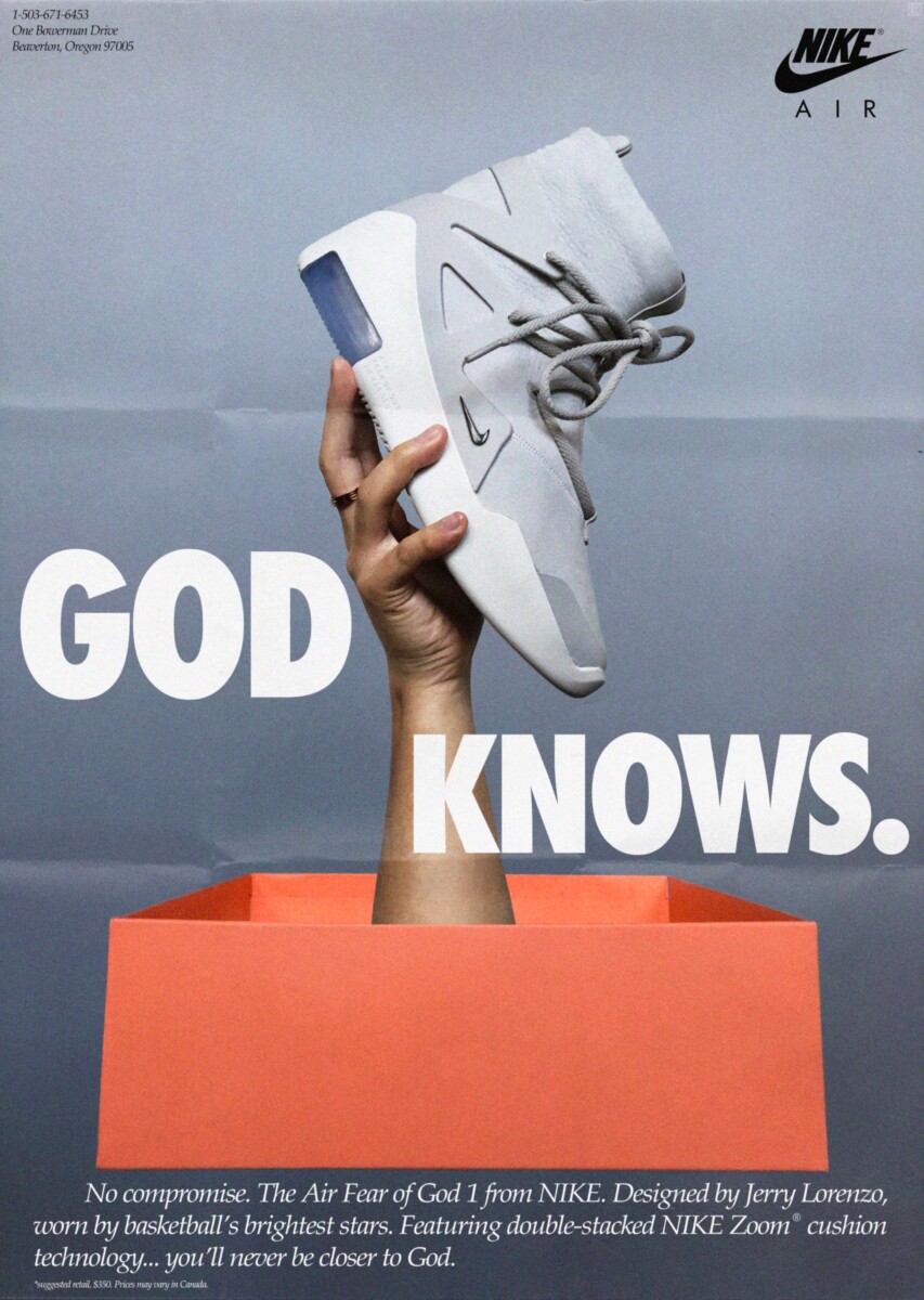
Your post for this reading will be a little different. Instead of writing 3-4 paragraphs, please identify and document 3-4 advertisements in recent magazines, web pages, posters, billboards, etc. where race, ethnicity, gender or cultural identity play a role in shaping a brand’s message.
Note that identity and race can be used in a seemingly positive, embracing way, or in a cynical, negative manner; or it may be difficult to tell. The most interesting ads are probably the most subtle.
Post ads that you encounter this week, after completing the reading. We’ve all seen some of the widely publicized missteps from companies such as H&M, Dove, Sony, etc. …These are all very obvious. They really don’t require critical examination and we really don’t need to see them again.
Post phone pics, scans or screenshots of your selected ads with short captions describing the image and the source from which the image was found.
The prompt for this week is an overly simple one: According to Jan Tschichold, Karl Gerstner, and Josef Müller-Brockmann, How should one design?
According to Josef Müller-Brockmann, Jan Tschichold, and Karl Gerstner they believe in the “scientific way” of design. Now by scientific way they mean by doing things with a purpose and creating grids and outlines for better structure. I believe they saw graphic design, which is by their definition problem solving solutions for the better of society, much how a scientist would look at solving a problem going by identifying the problem, looking for solutions(hypothesis) and implement those solution and try it serval times for consistence’s. They should that graphic design can be seen in a scientific or in mathematical sense.
Josef Müller-Brockmann is known for dividing and ordering graphic design into the grid of Swiss Typography. He saw the grid as a timeless method of communication. As he would say “working within the grid system means submitting to laws of universal validity.” What this illustrates is working in a grid would back up your work or the message you’re trying to get the viewer to see. He also believed in objective work instead of work from straight emotions.
Karl Gerstner and Jan Tschichold were also people that try pushing structure and really saw the value of technology as well. Karl Gerstner created the “the morphological box of the typogram.” What it is a is box divided into grids and it could be used to generate solutions typographic logo designs. Such as the letters varying from degrees of darkness to the direction of the type, the way is read and can show a sense of emotions. Furthermore, Jan Tschichold was known for the New Typography movement. With rise of the printing technologies, it gave artist more freedom when it came to type. From not using the same sans serif typeface to the way the type was placed and the direction. He defined the rejection of the classical rules of typography symmetry. Focused on size, weight, arrangements of lines , color and the photography.
In all three of the articles a central theme of change is present throughout. The emphasis of analysis and careful plotting and planning is at the forefront of most of the discussion and it shown to replace the old of design which was “pretty”. Gerstner is the one that explains the mathematical formula of design he states “The typographic grid is a proportional regulator for composition, tables,
pictures, etc. It is a formal programme to accommodate x unknown items.
The difficulty is: to find the balance, the maximum of conformity to a rule
with the maximum of freedom.” The point of creating the grid and creating the morphological box of typogram is the organize the exact purpose of your design. The components down to its size, color, and purpose. This emphasis of grid layouts is explained further with Brockmann.
Brockmann philosophy is centered around using grid layouts to simplify and clarify the design. The complexity of the grid layout is simply to organize the layout of the typography so it’s easier and more concise to the viewer. He states ” Constructivist design that is capable of analysis and reproduction can
influence and enhance the taste of a society and the way it conceives forms
and colors.” In a way Brockmann believes that the grid layout leads itself to being more visually appealing while also not compromising clarity in the design itself. Which is also echoed in Tschichold article as well stating “Above all, a fresh and original intellectual approach is needed, avoiding all standard solutions”
Our next reading will be from the media theorist Marshall McLuhan. For this reading, you have two options. Please read one of the following:
The Introduction, Chapter 1 and Chapter 7 from McLuhan’s influential 1964 book Understanding Media: The Extensions of Man. This is a fairly straightforward text. Here is a PDF:
-or-
Selected paged from The Medium is the Massage: An Inventory of Effect, co-created by McLuhan and Quentin Fiore in 1967. This is an experimental text that relies heavily on image-text interactions. Here is a PDF:
Please take a look at both, to get a sense of the material, then choose one or the other to really focus on.
Please consider the following:
McLuhan describes technology and media as “extensions of man.” How do media extend human beings, or humanity in general? What hazards might technological progress bring for individuals and society? If “the medium is the message,” what role can artists and designers play in creating new messages? How is the work of a designer subordinate to the media they use to create or distribute information?
You also have two options for this response. You can write 3-4 paragraphs. Or you can respond in a “typophoto-graphic” manner, combining images and text.
Tschichold, Gerstner, and Müller-Brockmann believe one should design through the scientific way. The scientific methods are used within design by supporting a better structure. This can be by creating detailed outlines, grids, etc. to promote structure in a design. They define graphic design as a problem solver in a way that is similar to scientists, hence why they believe the scientific ways are how one should design. The organization of finding a problem and the process of coming to the solution is how they see one should design. Structure, formation, coordination, and overall organization play huge roles in all of this.
Brockmann is known for using swiss typography. The swiss style emphasizes the importance of neatness and comprehension of a design, as well as the design’s objective. He states about the grid system in swiss typography, that it makes things more universal, which is very important for comprehension from many people. This order and methods of graphic design is a classic and ageless method, according to Brockmann. The objective and message behind a design will be picked up easily by viewers.
Tschichold was known for the New Typography movement, which gave people more freedom and versatility when it came to typing. This was during the time that print was coming about and changing society. He overall defined the dismissal of the traditional principles of typography equality. His focal points were on size, color, weight, order of lines, photography, and the shading.
Gerstner created the “the morphological box of the typogram”, which is a confined partitioned to lattices, which is utilized to create arrangements of typographic logo designs. For example, the letters differ from levels of murkiness to the heading of the tone, the way it’s interpreted can show a sense of different feelings.


Recent Comments