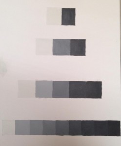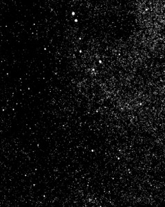
I tried my very best in this project. I didn’t find a very hard time finding the right shades. I started out mixing the black into the white paint to get the high key light grey, then I mixed white into the black paint to get the low key dark grey.
I had an awesome and fun time at BRIC House. I saw the Art into Music exhibition and was blown away. I love both art and music very much, and in class, we try to collaborate the two together. But when I saw professional collaboration of art and music and how modern it is, it moved me. There were graffiti writing that were put together by an artist and played around with with color so that there is a musical pattern an rhythm you can see in it. There was also a wall that had pictures of people in concerts. This really showed the art in these photographs because from what I saw, they were taken simultaneously when music was playing, so there face expressions were natural almost. We saw a video that combined hip hop music with this type of opera music that were merged together so well, and in the video you had a woman expressing her body through the music she heard.
All this was really cool and inspirational and I related a lot of what I saw with what I was learning in class (which is the collaboration of art and music), but I have to say my favorite part of the exhibition was the vinyls. I am a huge vinyl fan! I love them because they are a form of traditional, old fashioned musical aspect of the past. I tend to lean towards things that were used in the past, and in this exhibiton they had a whole stack of vinyls and a wall that consisted of them too, and they put them in such a way that it lmost appeared as something very modern. The pattern that they were stacked up in showed an visual relationship between music and art. The stacked up vinyls showed monotony because they were all in one row, while the ones on the wall had a variety of vinyls that showed different types of music, and different colors too.
Coming out of the exhibition I was that much more inspired. I was inspired to continue on loving art and music and to continue on this path of becoming a graphic designer. I loved it and I will soon visit the BRIC house again with friends who will come to learn to appreciate these types of artistic skills. I was glad I was introduced to this place.


This exhibition was pretty cool. I didn’t get to go through the whole thing, but we did see some awesome photography of ‘snow and ice’. People who don’t know, or don’t care about photography will not understand the meaning of these photos, or how hard it might have been to take some of these photos. I thought they were very nice, and despite the fact the publishers may have used fabrication throughout most of these photos, it was the color, or shades of gray and texture that gave it the meaning of what it was. I liked a lot of the photographs but my favorite piece was the high key value snow photograph. It was just plain flat snow and my focus was on that light gray shade that had a wavy curve to separate one level of snow from the other. It was very simple and I liked it a lot.
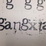
This was a cool assignment. For this classwork project, we had to use our speedball carving knife to carve a letter onto the carving pad. I was given the letter “g”, which was told to me that it’s one of the hardest letters to practice on. The way I carved it was by tracing out the letter, and carving everything else that was not needed. The end result was the letter “g” popping out. I was pretty satisfied with my first attempt.
After carving we starting inking the rubber pad and ‘printing’ them on paper. Because the letter g is lower case, and descends at the baseline, it should be a little below the line. But I didn’t realize my mistake until long after many attempts. But soon I got the hang of it. I tried making words with some of the letters my classmates made. Read it and laugh. 
I learned plenty from this project. I got a hold of the speedball knife, and how to use its different blades to cut through the pads. I also learned a lot about typography. There lots of different fonts and typefaces that are used in many of the designs we see today, mostly Arial or Helvetica. Now if we’re going to get into details, theres ways to set up the type. I mean kerning, which is adjusting the space between characters, leading, which is the distance between the baselines, and tracking, which is the distance between letters. There is also a lot more to say about baseline, the meanline, the x height and many other things that I’ve learned.
The view from my window can be diverse but also unified.
The first thumbnails are sketches of what seemed Stable from what I’ve seen outside my window. By stable, I mean that a person sees that there is one focused image. The first image is just a tree, the second image is just the moon, and the third image is just a side-view of a house. The tree, moon, and house are the figure part of the image, the audience focuses only on them. On the other hand the negative portion of the image is the ground, which is what supports the figure. When you think about the shapes used in the thumbnails, you can easily tell that the house uses lines to create a geometric shape, while the tree uses organic lines, where the lines naturally flow to make an image without necessarily using straight lines. The moon also uses organic lines, because it is actually drawn as a curved line to create an arc.
In the second drawings of thumbnails, I sketched Ambiguous images. Ambiguous meaning there is more than one focused image. So, in the first sketch, I simplified what I saw, and maybe added something. I drew a regular house not adding any details to it, then I added a few flying birds (that I didn’t actually see, because what are the odds) so that I can make the audience focus on them as well. And thats one reason I didn’t add details to the house, so that it won’t be as attractive and it wouldn’t make the audience ignore the little birds. The second thumbnail changed the position that I was initially and saw the view, that again I simplified. I I were to draw everything I saw there would be so many things, the audience might just skip it. So I drew a big tree that was in front of a back yard. you can say that the tree was my foreground, the backyard was by middle ground, and the house or the top of it was my background. Lastly, I drew the street which, once again was simplified. I drew the sidewalk, the crosswalk sign, and I disturbed the ground by drawing the two white cross lines so that a person can also notice it other than the figure.
I apologize if my pictures seem dark, I was trying to be cool and use a charcoal pencil…
I live in Bensonhurst, Brooklyn. Ive lived in my apartment for 15 years now and the view from my window never changed. There are two windows in my room in which you get different perspectives looking out each window. When I look outside, I see 2 big trees, one on my left one on my right. If I were to describe the shape of the trees, I would say they have an organic shape, in which the lines flow naturally. I also see several houses right in front of me, their lines form geometric shapes, like most houses, creating rectangles, squares, and even triangle tops.
If I change my position from one window to the other, I can see the street, stop signs, crosswalk sign, and if I look deeper, I can see the sidewalk on the next block. I can say that the basic components that compose that view are lines, points, and organic lines. The curb on the end of the sidewalk is curved so therefor it can be classified to have an organic shape. In addition, the poles and and the cross lines, and other houses take regular geometric shapes. But I thought deeper into this. I used what I learned in class and I tried to make everything connect with the view from my window. 2 moths ago the street was fixed, and the workers of course used tar to fix the street. If you look closely into my street, they are a bunch of rocks stuck together, this reminded my of points and pointillism, how the little tiny rocks came together to make a whole big “image” if you will. Try looking out your window, you’ll find plenty of elements.