Our objective for this project was to choose one of our favorite quotes and make three different visual concept with them based off wither origin or how much impact the quote makes on either us on society. We are given the task to use different kinds of fonts and visual imagery to personify the quote we have chosen.
I have chosen a quote from the famous movie “Rocky” for the project because I feel that this is by far one of the most powerful quotes I’ve ever heard. It really helped me achieve a lot in life since I am one of those people with a disability. I don’t tend to let the fact that I have a disability phase me since I am pretty much use to it. As I grow over time, I’ve learn to take the hits and keep moving forward. That is where this quote comes in. “It ain’t about how hard you hit…It’s about how hard you can het hit and keep moving forward!!”
Visual Quote 1 Rocky Balboa 2
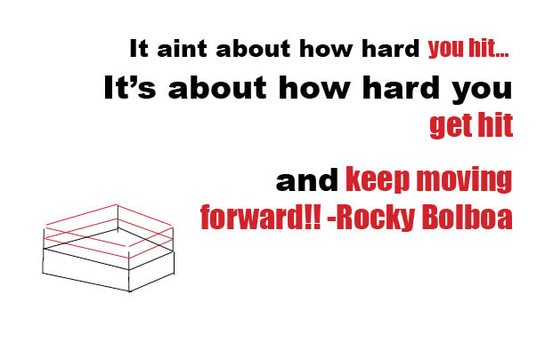
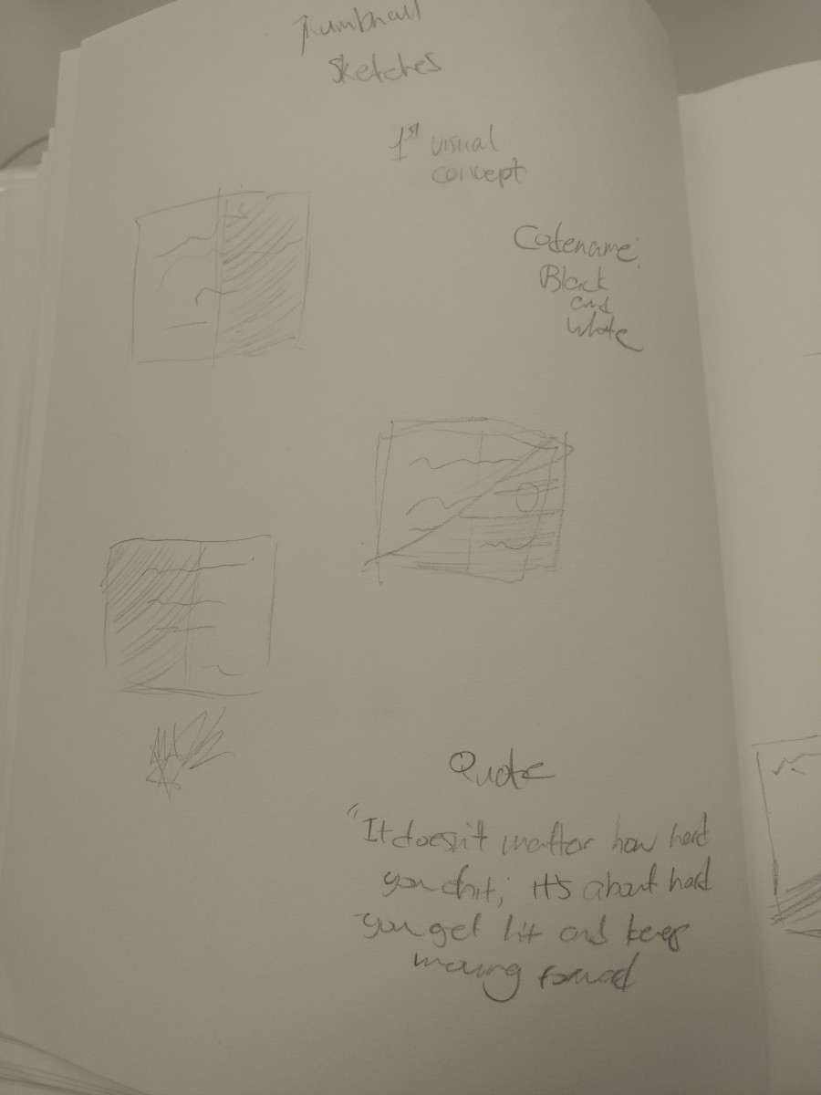
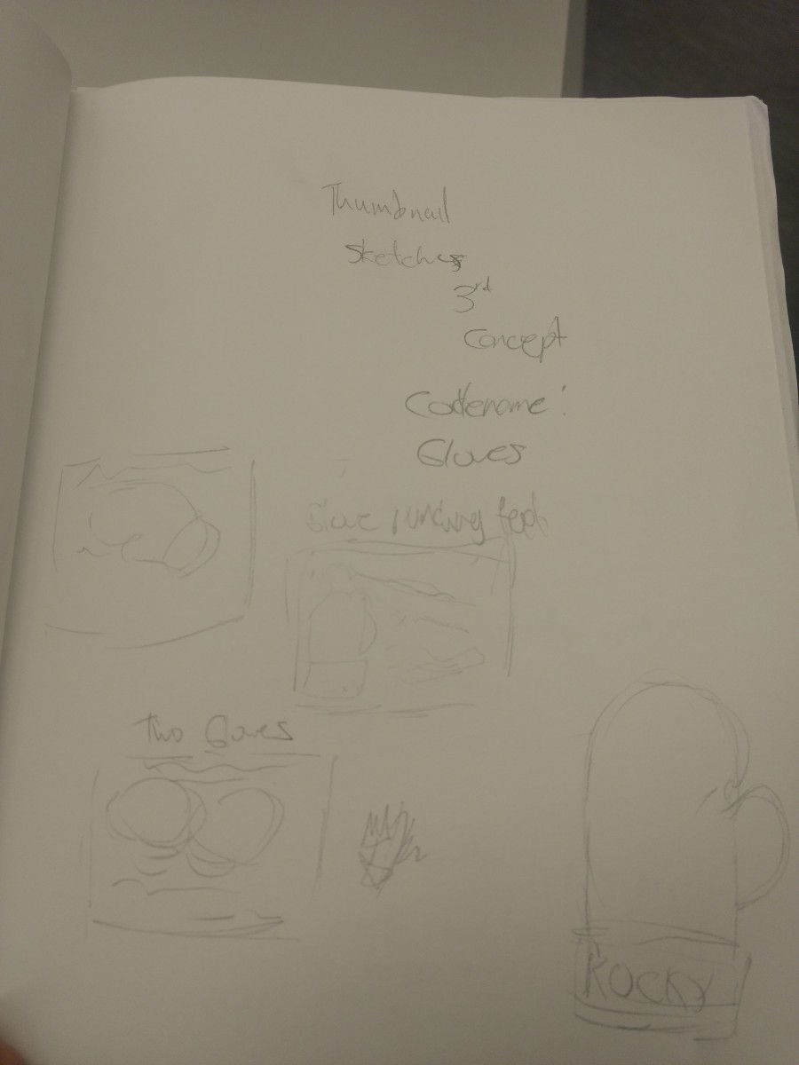
This visual quote was the first to pop into my mind. It was to have the words for forward while some words in the quote are highlighted for a specific reason. That is the theme I carried on when designing these visual quotes to give the image a certain flair. For this one, My professor, Tanya Goetz suggested that I put a boxing ring in the image and fix up the alignment of the text. Here’s the sketch that I thought up to show my process.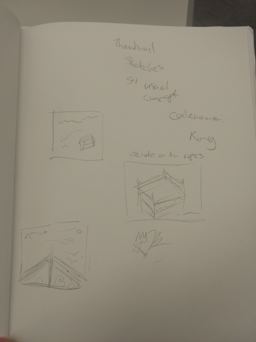
I always make three thumbnail sketches when I’m coming up with ideas and choose the best of the 3. So for this one, I drew varies sets of pictures with a boxing ring in it. I was originally going to have the words on the ropes of the ring. But I decided against it due to it being all over the place and people would be lost.
Visual Quote 2 Rocky Balboa 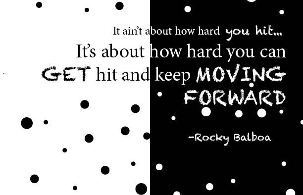
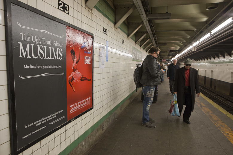
Here’s my second visual quote concept where I have a little dance with positive and negative spaces. Like I said, I kept the theme of having some words either highlighted or bolded to show power and radiance in the image. I got the ideas from the ads I see on the subway trains when I’m coming to school. I didn’t just wanted to add the words so I added some graphic representation with some dots to apprehend one another. Here are the sketches
I kept the goal the same in the end and that was to have a positive and negative space concept. I believe this heavily symbolizes how at times we don’t have one personality. There are occasions in which we feel something even more powerful than the emotions we feel every single day thus giving us the life of a second personality. But enough of that, I wanted to keep the theme of black and white so I played around what’s this concept art in InDesign and came with a solution that is simple, but at its best quality.
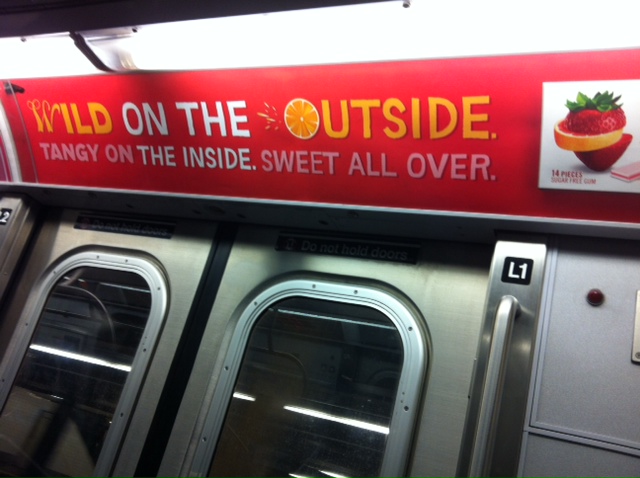
Here are some subway ads that got me thinking for the idea:
Visual Concept 3 Rocky Bolboa 3 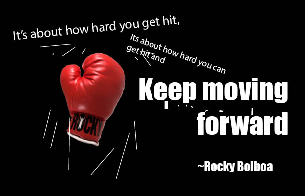
Reference to the boxing glove image: https://www.stickpng.com/img/sports/boxing/boxing-glove
My third visual concept might be my favorite. My professor told me to completely redo this and make it so that a boxing glove is hitting one of the sentences to add a bit of impact. Pun intended since I did use the impact font here. My original idea was to have a big punching glove punching towards us with the words circled around it. But it turns out I didn’t succeed in that and I took a different approach in trying out something new.
I had a plan to draw the gloves of myself, but I figure it’d be better if I went online and got a glove off Google.

