
The History of The WWE Logo

Professional wrestling is a worldwide phenomenon. Mixing the athleticism and intensity of sports and the drama and stories of entertainment, millions of people tune in to see colorful and creative characters duke it out in incredible choreographed displays of strength, speed, and agility. While today there are more options than ever, the undisputed king of professional wrestling is still the World Wrestling Entertainment, or WWE. With a rich and extensive history, WWE is the most popular wrestling promotion and often the standard for all professional wrestling. Started and currently run by Vincent K. McMahon, the company has gone through many changes in its content and target audience. This is evident in its logo which has also evolved throughout the different eras.
1952 – Capital Wrestling Corporation (CWC)
Founded by Vince McMahon’s father and grandfather, Vincent J. McMahon and Jesse McMahon first started the CWC as a wrestling and a boxing promotion. As wrestling promotions were exclusive to certain territories, the two elder McMahon’s had to create a wrestling promotion with performers from other territories. The McMahon’s would partner with nationally-recognized grappler and promoter Toots Mondt to run multiple shows in Madison Square Garden, now widely considered as the home of the WWE. The logo is an altered version of their abbreviation CWC. Two C’s face each other. They both have extensions at the top end that move down to the floor then bend upwards, creating a W. It’s simple, but sleek, especially for the time. The CWC and wrestling as a whole was still regarded as a legitimate sport, so a sleeker, professional logo really cemented them as a sport.
1971 – World Wide Wrestling Federation (WWWF)
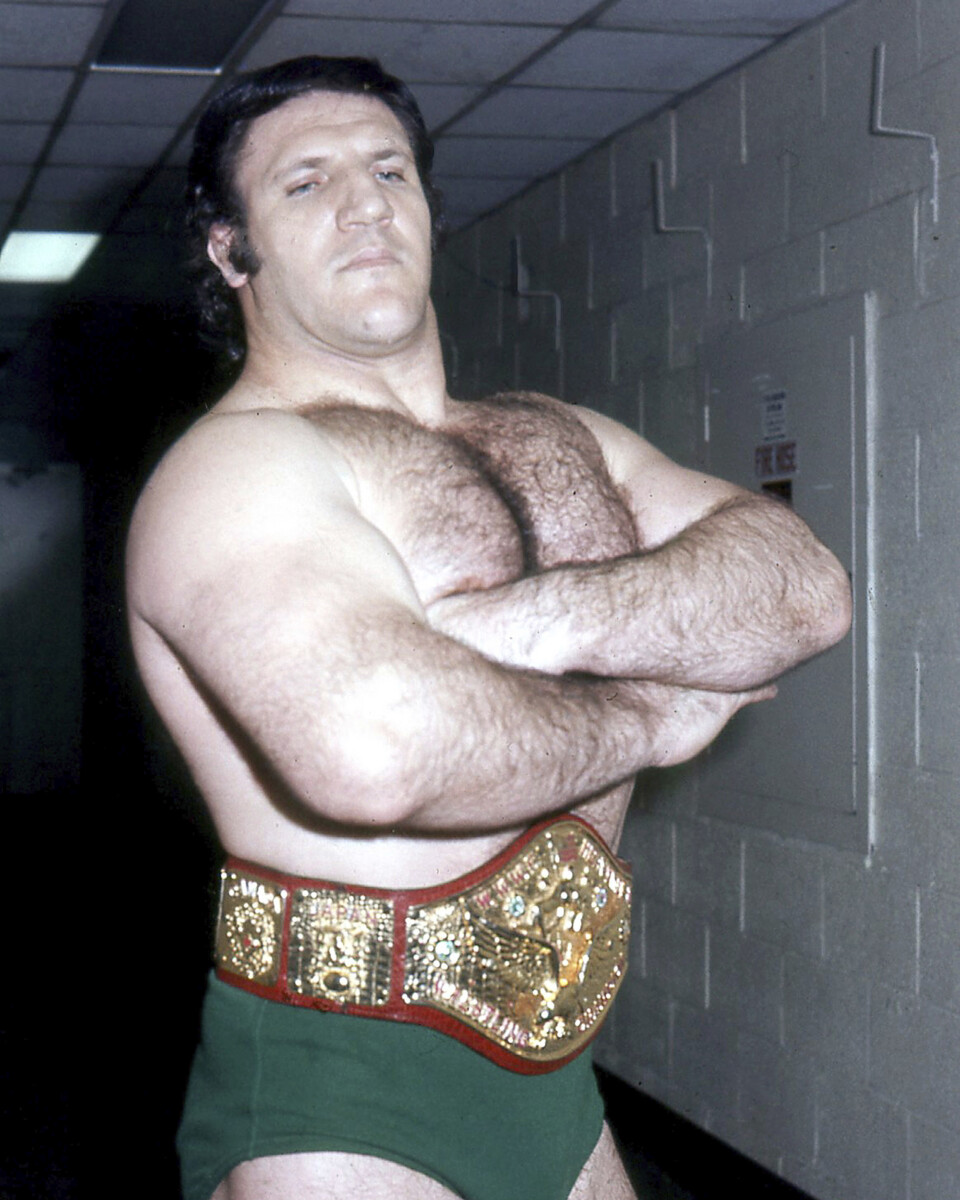
The CWC is bought out by Titan Sports Inc. The CWC joins rival wrestling promotion NWA, and Titan Sports founder Vincent K. McMahon and his wife Linda McMahon create the World Wide Wrestling Federation. The WWWF still operates in the New York area with weekly shows in Madison Square Garden. While the wrestling industry still operates in territories, McMahon begins emphasis on international talents to appeal to a larger audience. This is reflected in their logo in 1971. Two connecting W’s have a drop shadow engulfing a simple globe with the words “World Wide Wrestling Federation” hovering above in an arc. Vince McMahon is notoriously ambitious, so trying to appeal to the wider audiences with wrestlers like longest-reigning world champion Bruno Sammartino and first ever Latino world champion Pedro Morales really helped pulled minority groups into the WWWF.
1982 – The classic WWF logo
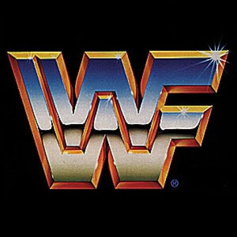
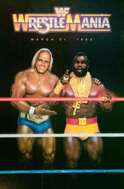
The 80’s were absolutely pivotal for the now WWF. Vince McMahon wanted to change the content he was producing; instead of legitimate technical grapplers, he wanted larger than life, marketable characters. Heroes and villains ripped straight from comic books were commonplace at the time, and legendary performers like Hulk Hogan, Macho Man Randy Savage and the Ultimate Warrior led the WWF into never-before-seen popularity. Around this time, Vince McMahon broke tradition and his promise to his father by taking the WWF national. His first step was to broadcast a show all over the country. He had his colorful roster and the World’s Most Famous Arena, but to truly entice wrestling fans and mainstream audiences from around the country, he invited mainstream celebrities like Cyndi Lauper and Mr. T to participate. On March 31, 1985, the WWF produced the first nationally-broadcast super event: WrestleMania.
To reflect the wacky and flashy product, the WWF created the iconic W logo. The logo had two W’s atop of each other with each W having a protrusion from its side, creating an F. Then the outline of both W’s was colored gold with a glossy finish to it. The inside is a blue to white gradient, also with a glossy finish. Like many logos of the time, bright, colorful, and glossy images defined the new hip and exciting content being brought to audiences by the WWF.
1994 – WWF – The New Generation
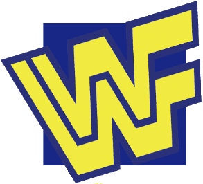
Unlike the 80’s, the early 90’s was a lackluster time for the WWF. Their arch rival WCW was destroying the WWF in the ratings and they even took the WWF’s biggest stars like Hulk Hogan. The characters were also less larger-than-life and more bad Saturday morning cartoon. Performers like Max Moon and Doink The Clown were not well received and the aesthetic of the WWF fell flat.
From a business standpoint, it was even worse. The infamous Steroid Trials, where Vince McMahon was accused of providing steroids and other performance enhancers to his wrestlers, almost took down the entire wrestling empire. The logo is similar to the 80’s version, but with a flatter, less glamorous blue and yellow.
1997 – WWF Attitude
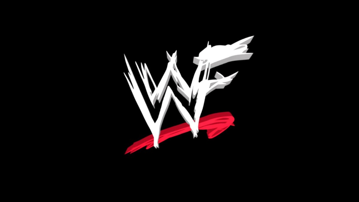
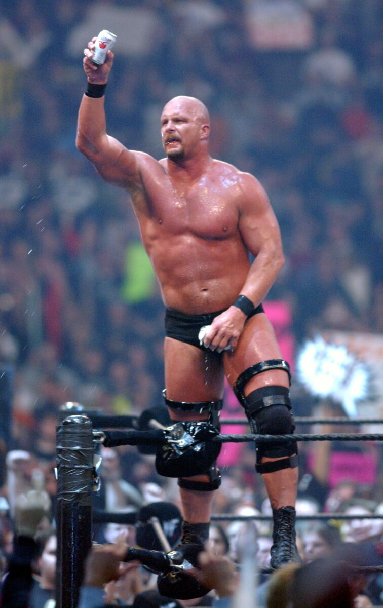
WWF began airing weekly Monday shows called RAW at 8PM. Unfortunately, so did WCW. The now-dubbed Monday Night Wars began, and WWF was losing, and losing bad. The WWF was in desperate need of a shake-up. Times change, and wrestling fans were no longer interested in the colorful, wacky characters of old. WCW shifted their program to reflect a more grounded product, while the Extreme Championship Wrestling (ECW) were pushing the envelope with an edgier, more violent show. WWF followed suit, and soon, vulgar, attitudinal characters like “Stone Cold” Steve Austin and Dwayne “The Rock” Johnson were the biggest stars of the product.
The move away from the cartoonish aesthetic of the 80’s was reflected in their new logo. The two W’s making an F was no longer a solid shape, nor did it have any bright color. The letters were instead made to look like white scratches or scribble on a piece of paper. Then, a red checkmark was placed underneath the logo for emphasis. The crude and unpolished logo was perfect for the new bloody, raunchy, and sometimes offensive program McMahon launched.
2002 – WWE – Get the F Out!
The changes to the program paid massive dividends to the WWE. They beat out and even bought rivals WCW and their top performers. They received never-before-seen ratings and performers like the aforementioned Rock and Stone Cold forever etched their names into the WWF’s legacy. They were riding a huge wave of popularity and success. They seemed untouchable. There was one problem, however. The WWF had one more opponent to take on: the WWF, or the World Wildlife Fund. A 1994 agreement between the two WWF’s stated that the Federation couldn’t use the abbreviations. After violating the agreements multiple times, the World Wildlife Fund sued the Federation and the WWF began operating as World Wrestling Entertainment, or the now famous WWE. The organization ran a campaign promoting the change with the slogan “Get the F Out!” printed on posters and t-shirts.
2014 – WWE – Then, Now, Forever
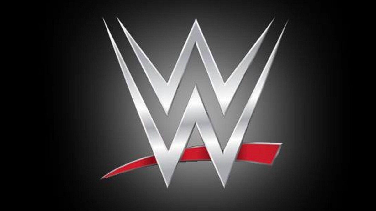
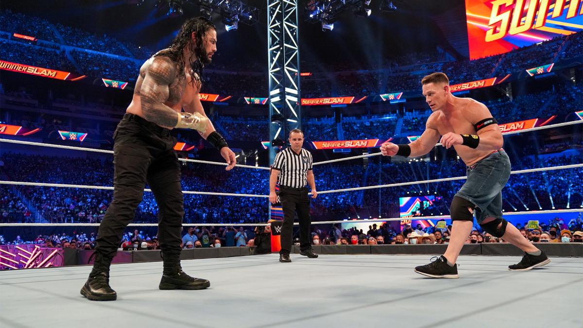
Today, WWE is a more advertiser-friendly product that serves an international audience. The violence was toned down not just for a PG rating, but also for the safety of their performers. WWE has produced exciting new characters and launched Hollywood careers for the likes of Dwayne Johnson and John Cena. The motto for the WWE is “Then, Now, Forever,” to celebrate the long and cherished history of the WWE, while also thrilled to welcome the promising talent. The new logo takes this sentiment and creates an instantly recognizable logo. Drawing inspiration from previous iterations, the logo moves away from the scratchy design, and instead has a solid W in metallic silver. The red checkmark remains, also a solid shape with shiny red. All of these elements make for a sleek, modern logo.
Works Cited
History of the Capital Wrestling Corporation

