Many quotes came across my mind when it came to the thought of actually creating a visually enhanced concept for it. As well as many different ideas and designs, which I soon came to realize, we’re to complexed. I decided to go with more simplicity for the concepts, to give the view a clear focus point on the meaningful quote “life is really simple, but we insist on making complicated” by Confusius. Creating a complexed and busy design would take away from the quote and distract the viewer from it.
 In concept one, I wanted to create a design with a lot a variation in color, lines, shapes and numbers to represent the many different complicated things in life. I choose rectangles in particular for the background to represent structure & strength, standing tall. I put the rectangles to clash together to show that life has its difficulties; it’s up & downs. The pastel colors I chose for the rectangles represent how colorful life may be, the beauty of life. I choose only one number, the upside down 5 in the upper middle. It represents balance and simplicity in life’s many complicated situations. I placed the word complicated in a bigger text size as well as in stencil format to catch the viewer’s attention and show its importance.
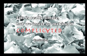
In concept two, I wanted to use a photo to help visually show the  quotes meaning. I chose a piece from my personal photography portfolio to make the concept a bit more personal. The photo is a close up of fallen autumn leaves in black and white. This photo was chosen because it shows life’s simplicity which is the fall of leaves in one of the four seasons. Recognizing the simple beauties in life, nature. I placed black borders around the photo to make the photo stand out a bit more. I chose white colored simple text for the type of the quote so it can have the illusion of disappearance into the white and black leaves. For the word simple I chose to make it italic to represent it’s importance to the concept. I also turned the word complicated into red colored text along with the upside down letter “A” in the word to represent importance and show complication withing font.
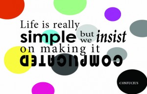
 In concept three, I decided to make it look colorful and fun using circles throughout the background changing from shades of gray to pastel colors such as yellow, pink, blue, purple, blue and green. The change in colors represent the changes in life. Shades of gray representing the bad dull moments and the color representing the good fun moments. There is also a variation in size of big and small in the circles just to show balance. I played with the font in different sizes to make the design inset resting just by using type. Each work has a look to show its importance. As for complicated I decided to make it have it’s own line as well as place the word upside down to make it look complicated as well as show it is an important piece of the quote.


