Session 1
Introduction: Play around with this website. In the comment section of this discussion page, explain how/why color is relative.
1) Section 7 | Legibility: Color Class Workshop / Demo

2) Color’s Value
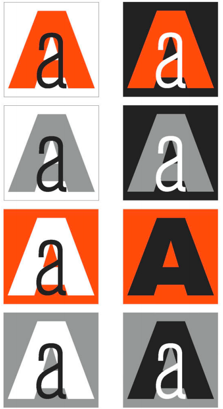
• Please find an instance when your text disappears (or vibrates) on top of your color value scale. Please report the:
– Outside box color code (i.e. C=100, M= 2, Y=10, K=0)
– Type color code
• Let us figure out the value of each color:

Yellow = 6% black
• Next, let us make the text disappear in the color box by adding that much more percentage of black to its hue…

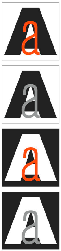
3) Groups: Color Value (In groups of 4-5 people) Divide one document into sections–one section per student–and help make their text disappear by:
1) finding each of their Type Book Section 7 colors’ values
2) figuring out the difference between the two values
3) adding that difference with black (K) to the lighter color
** The document should have 3 items per student: two grey squares set to the value of the two colored squares within them, and one colored square with the name of the student inside with the text color modified to be at the same value as the box. Like so:
4) Colors in monitors and in print
5) Print test
Print the document you created as a group to the room’s printer (which is b/w laser printer). If you did the value activity correctly, all your classmates’ names should disappear in their boxes on the document.
6) Using value to your benefit

** Value alludes to depth (aerial perspective). Use this knowledge to help layer text to suggest depth, and dictate attention of the reader. **
• Why don’t these work?
Session 2
Introduction: Read this article to learn a bit about Gestalt Principles and how it applies to designers.
On our class blog, see if you can post an example of graphic design that applies one of the Gestalt principles listed in the article (the article has design examples for each principle to help you understand them).
1) What is Hierarchy?
2) Tricks for establishing hierarchy:
Generally, English language readers start at the top left and read across and down. Type is often organized to mirror this behavior. But what if the biggest and boldest text is midway down the page? Often a reader will start there and then go back to the top of the page and continue with normal reading behavior.
• Size
• Typefaces (complements)
Remember Type Connection?
• Variations of type

• Color
• Orientation (layout)
• Space (white space)


It is best if you can group the forms, or purpose of content into 3 categories:
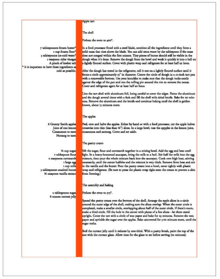
• Primary type is often the typography on the page with the most visual weight, such as main headers or display quotes. The purpose of primary type is to bring readers into the overall design.
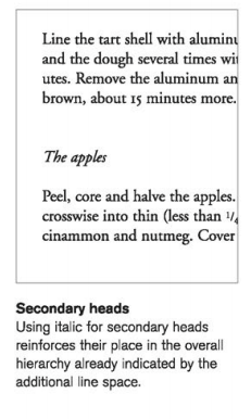
• Secondary type is everything else that is not the main content. This can include captions, subheads and navigational or static type elements.
• Tertiary type is the main body copy. There is one thing to remember about tertiary copy: It must be readable. Little else matters when it comes to the design style of this type level.
3) Finding Hierarchy


In groups of 2-3 people, find one example of good hierarchy and one of bad (or could use improvement) hierarchy in the magazines provided.
• Layer tracing paper on top of each layout, to blur the content of a magazine page
• On top of the tracing paper, point out as many tricks of hierarchy that you can using a thick marker or pencil (here’s the list again):
– Size
– Typefaces
– Variations of type
– Color
– Orientation
– Space
• Next, see if you can group the organization of content into 3-4 categories
• Lastly, photograph and upload an image of your tracing paper over the layout, and your commentary to the class blog
4) Gestalt: Why our brains need Hierarchy
5) Workshop

