SESSION 1
Introduction:
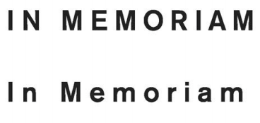
“The difference between a font and a typeface is the same as that between songs and an album.”
Read this link, and come up with one other analogy for relationship between “typeface” and “font”.
1) ePortfolio Workshop
Steps for submitting homework pages:
1. Create a Page for the course
2. Create a second page and assign it to the Parent Page of the course
3. Learn AirDrop or upload homework via email/USB/Dropbox
4. Populate the page with your content
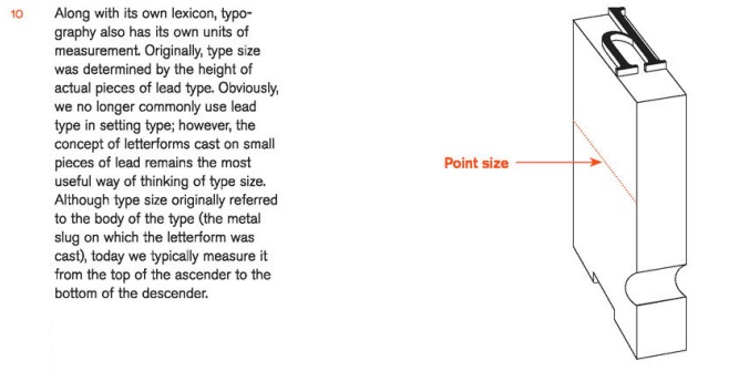
5. Add media
6. Create captions for media
7. “Publish” or “Update” buttons
2) Upload Homework
3) Type for print and beyond:
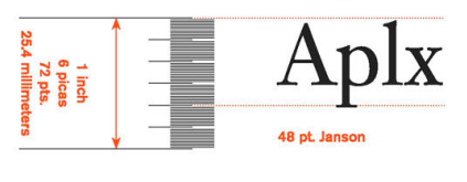
• See measurements in Letrasets and InDesign
5) Discuss answers to Intro “Typeface” vs. “Font”
• See difference in InDesign
6) Font Book
8) Print font-sample printouts
Q1) Upload your ePortfolio Links (before lunch please)!
SESSION 2
Introduction Respond to “Type in Neighborhood” of a peer
When you’re done, explore why kerning matters:
Yeah, kerning does matter. Wait, what is Kerning?
1) Basic Concepts About Letters
• How things space out (from smallest to largest distance)
1. Two curved letters: od, pq, po
2. Straight and round sides: on, tq, pf
3. Two straight-sided: nn, tt, ii, ll, 11
4. Opens and diagonals: ev, cw, zy
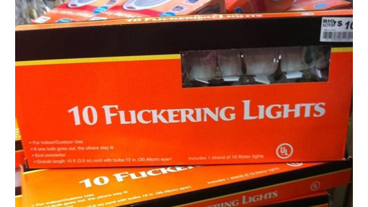
• Trapped spaces:
 Example of Trapped Spaces (click for source)
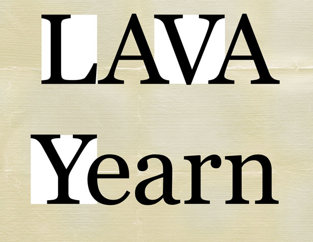
• Most troublesome pairs:
AV AW VA AF AP AT FA Fa Fe Fo LV LW Ye Va Wa
• When is all this necessary?
1. Consider:
2. Also, consider starting from the difficult pairings to judge general tracking choices for that headline.
3) Discover Kerning/Tracking in InDesign
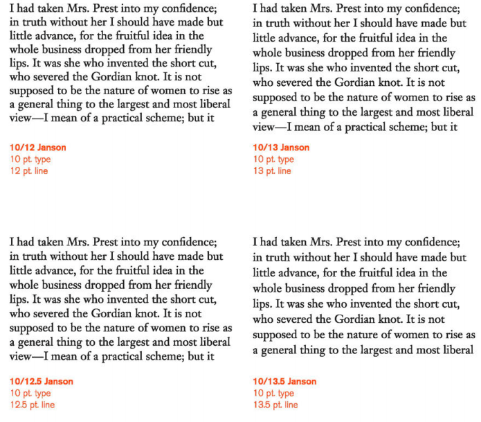
4) Leading
• Measured from baseline to baseline
• Usually set by the computer at 120% of the type size:
10 pt. type is set to a 12 pt. line, or 10/12
12pt. type is set to a 14.4 pt. line, or 12/14.4
• Type set at very small sizes, say 8 point or below, may require extra leading. Leading affects the density of your page, so if your page seems a bit dark, try adding more leading.
• Text that is too tightly encourages vertical eye movement; a reader can easily lose his or her place. Type too loose creates striped patterns that distract:

5) Discover Leading in InDesign
6) Homework

