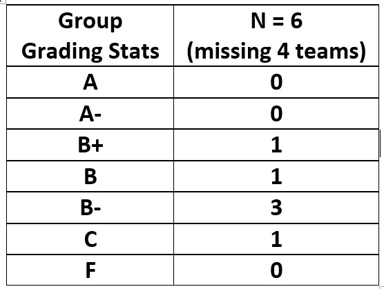
Grading Stats: Both classes.
4 teams have not submitted their presentations to blackboard
Below are some of the comments for various teams. Your comments are posted on blackboard.
Enlarge plans for structural drawings and add dimensions. Check spelling of mechanical and indicate vertical shaft for vertical ducts. Egress is missing. Add more detail to analysis of spaces – include a complete list of spaces to keep, those to remove and those to add. Area circulation information is not accurate – for example the bike path, winds are not correct and should show both summer and winter. Noise and vibration analysis is missing. Good comments on view- a key plan would be helpful. Land use needs to show a larger area to be valuable.
Initial presentation was not named properly and slide credits were not included (has been corrected). Good start on presentation but a bit short on information and not enough slides. The 3d model of the building showing mechanical systems and shadows was particularly helpful. Structure is missing the grid, does not include dimensions, and is missing section showing proposed floor to floors. Egress circulation needs arrows to show direction as well as section drawing. Program analysis is missing. Site circulation needs more details (where will the service access be?) How will the sun path influence the building? View to and from do not include labels or keys to the views. Land use is missing. Only 1 façade sheet –
All structural diagrams are to be drawn in AutoCAD- not a freehand sketch – 2 Shown – one hand sketch and one from AutoCAD. Show dimensions and angles. For mechanical show vertical and horizontal distribution more clearly. Egress analysis is incomplete – need to show all floors and need for 2 means of egress. Program analysis is just a listing – where is the analysis? Circulation around site should add more information and should include a second site plan zoomed in closer to the site. Combine the circulation map with the noise map. For noise – why is this shown on the site? For views / photographs please show these larger. Land use drawing is well done – good size and correct information. Location map is helpful and include block and lot, address. Includes a list of possible case studies. Climate information is not accurate – check winds. For map showing location of schools and museums add a circle around each for a 10 minute walk to determine if our proposed site is a good location. Façade sheet only shown for two students
Structural grids show all floors but floor to floor section needs to be added. For Mechanical section diagram review the flow of good and bad air more closely – remember that the fresh air intake should not be next to where used (bad) air exits the building. For egress routes try drawing single clear lines with arrowheads instead of many lines and arrowheads. Good start on color coded plan identifying spaces as well as chart of spaces with areas. On sheet showing yellow areas that indicate changes – add labels to clarify the changes on each floor. Good job on format and information on site analysis sheet showing aerial view, noise, circulation, sun and wind. Missing views to and from the site. Replace land use with a map showing a larger area. Includes case study information – photos of gym and solar panel façade from one student.
Structural drawings are not clear – should include the perimeter of the building and add a section showing the proposed floor to floors. Mechanical just shows a blue dot on the plan. It needs to show the location of the mechanical room, a vertical shaft and horizontal distribution. Drawing should show both a plan and a section. Egress does not show routes of circulation and does not identify problems with the existing egress. Good listing of spaces but what is the logic of why you are removing some of them? You cannot move the mechanical to the roof without also having an interior mechanical room. Roof systems like the ones you show are good for cooling but not heating. Site plan with sun diagrams needs labels to explain what the long dashed red lines with arrows represents. Winds only show one direction – they should show winter and summer directions. For land use show a larger area and do not allow leader arrows to cross. View “too” should be labeled either “to” or “toward”
Some of the information is sketchy and other parts are well done. Being up everything to a higher level of quality. Structural plans appear to be distorted and dimensions are not readable. No section showing proposed floor to floors. Egress stairs are circled but what is your recommendation? Circulation should show circulation routes for egress – indicate this more clearly. Good list of program spaces and what to keep/remove and add. Label views. Land use is missing. Winds are not shown in the correct direction. Includes case study images of equinox dumbo and fiber c façade.

