Followed – A combination of different sounds taken from BBC sound effects. Created a spooky sound environment.
Mashup Project – My try at mashing up 2 songs. It didn’t go so well, but I tried my best to match them both up. (Songs: “長く短い祭” by Shiina Ringo and “Yamitai Girl” by Rerulili, cover by +α/あるふぁきゅん。
Knives Out – A 2:30 trailer for the movie knives out. Scenes used Integration and opening act
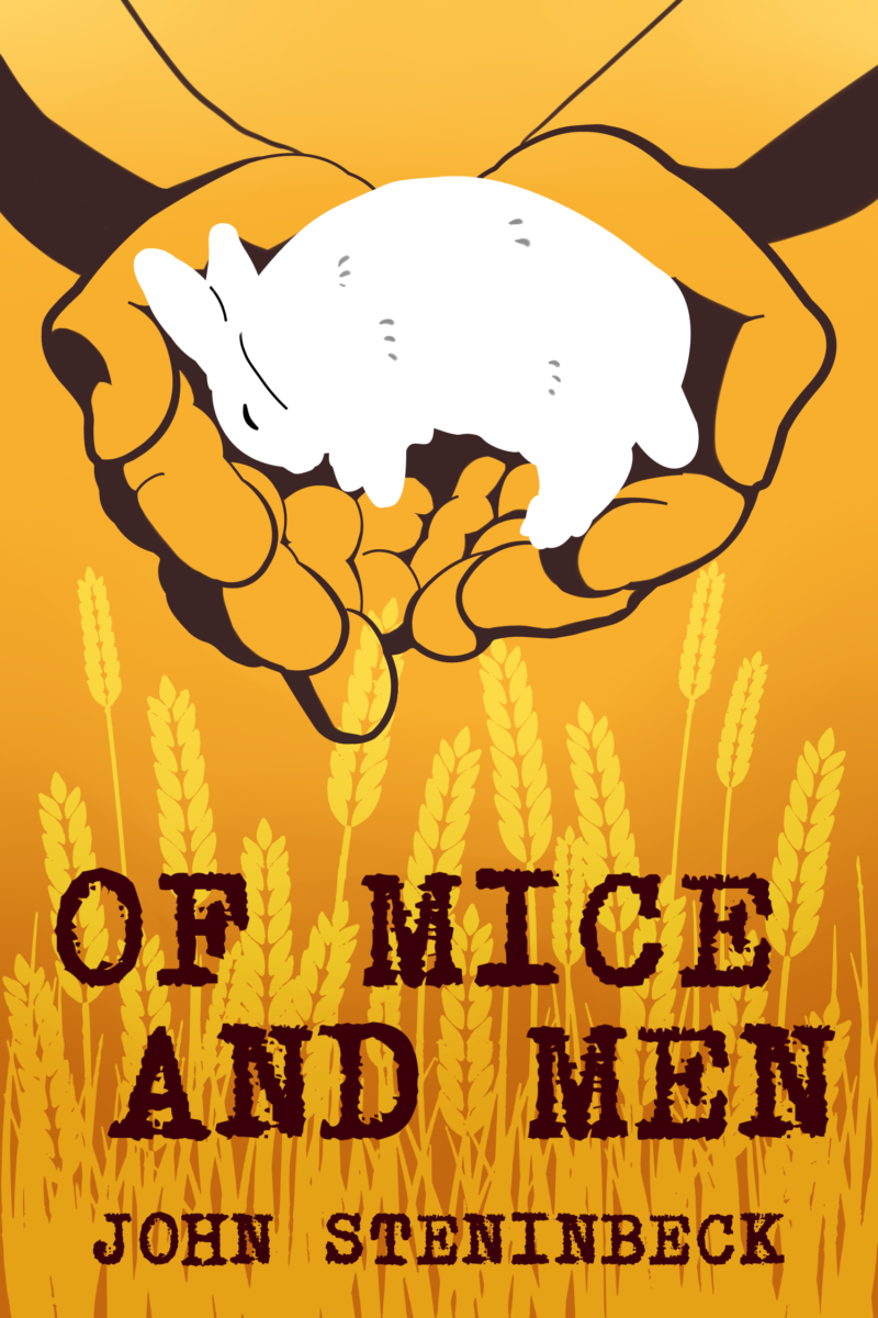
In this project I created a original book cover. I choose “Of Mice and Men” to work with. Using skills I have learn in past projects with Illustrator and Photoshop I made a new cover. In Illustrator I took images I needed from the web and made silhouettes out of them. I also added in a few lines to make the hands more character recognizable. Then over at Photoshop I edited the images, adding in more depth/shades, and more background details.
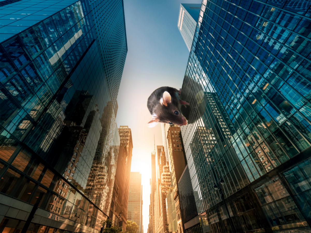
In this project I made 3 images. The first image is focused on scale, the second image is on time travel, and the third is on hyper realism. I have to utilize Photoshop’s selective tool, light/levels tool, contrast tool to make edits of each 3 images. Also while looking for the images I have to keep in mind with the perspective of the images I’m choosing, so they will match each other when I embed them in photoshop.
For the scale image I choose a small mouse to put on a building. I had to make edits to the color of the mouse so it can blend in well to the building’s colors as well as the sky. I also had to add in a shadow or a reflection since the glass on the building is reflective.
Scale image
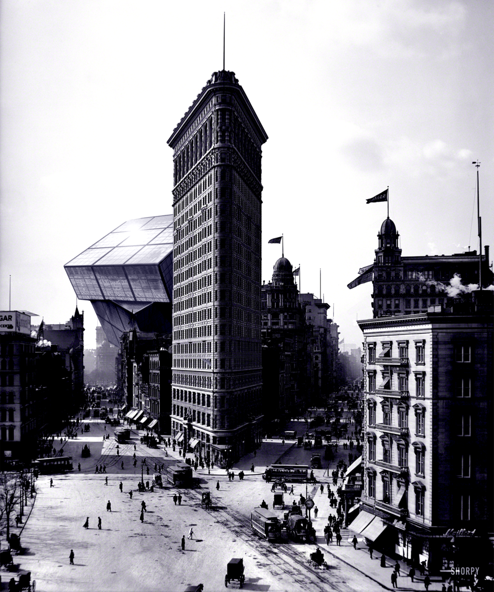
For the time travel image I took from the google a black and white building then I took a complex building structure to put into the black and white image. For this image I focused more on the levels and shading of the picture. I also had to keep in mind with the depth of the image so I can place the complex structure at the right depth level to make it look real.
Time travel image
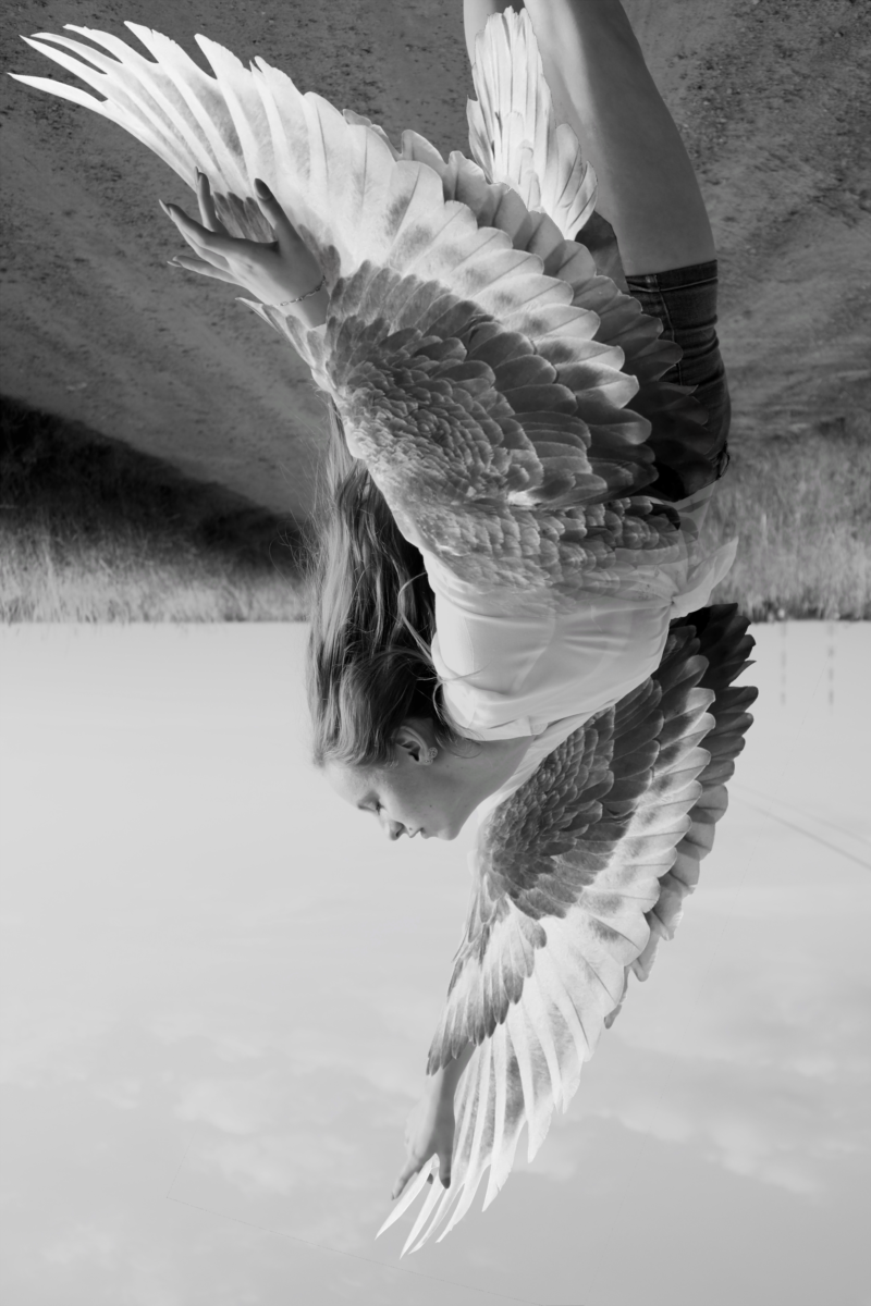
In the hyper realism I wanted to do a girl falling with wings. I only took 2 images the girl and the bird so both of the wings can match each other. To attach the wings to the arms I have to keep in mind of the layers. I made 2 layers of wings. One for the back and another for the front, so I can wrap the arm in feathers. Also where the wing does not cover I added in another wing layer but this time a bit transparent to blend it in. After that I did a bit of darkening and lighting to the image.
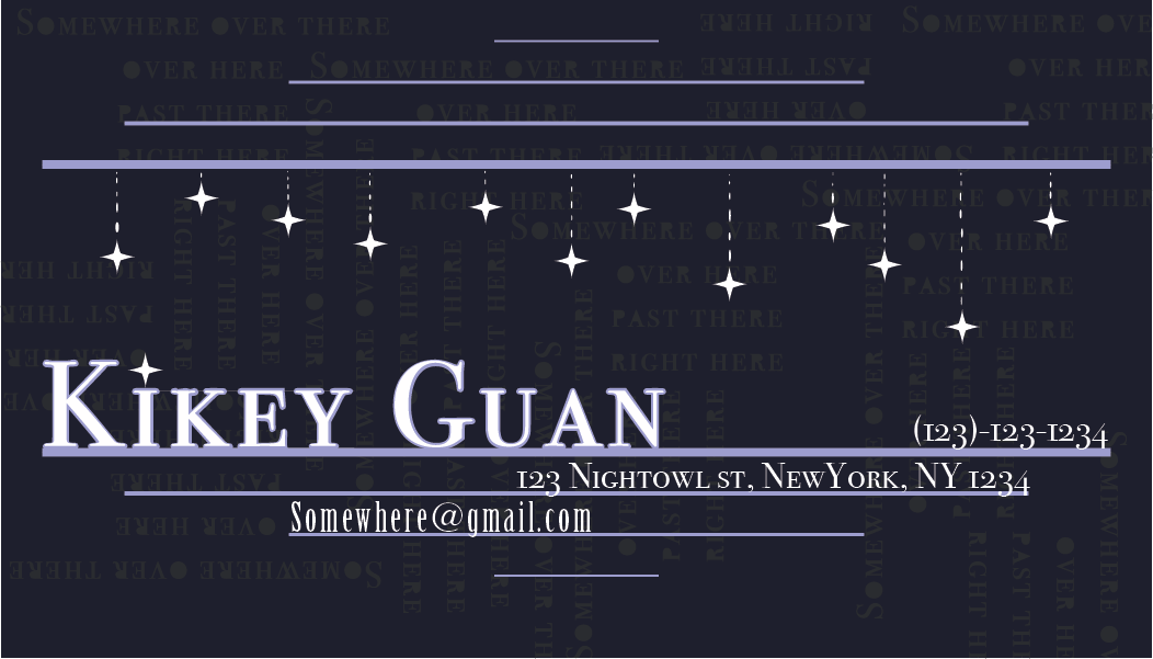
For this project I had to create a business card using the text tool I learned in class. There is many different ways you can mold and stylize the text in illustrator. I went for a more horizonal/vertical look. I made the background dark and the words bright so the text can pop out. To add to the simple design I put complex placing of words in the background to add texture. I also changed the font of the text, and some of it’s properties to make it fancy. Lastly I add stars to complete the night theme.
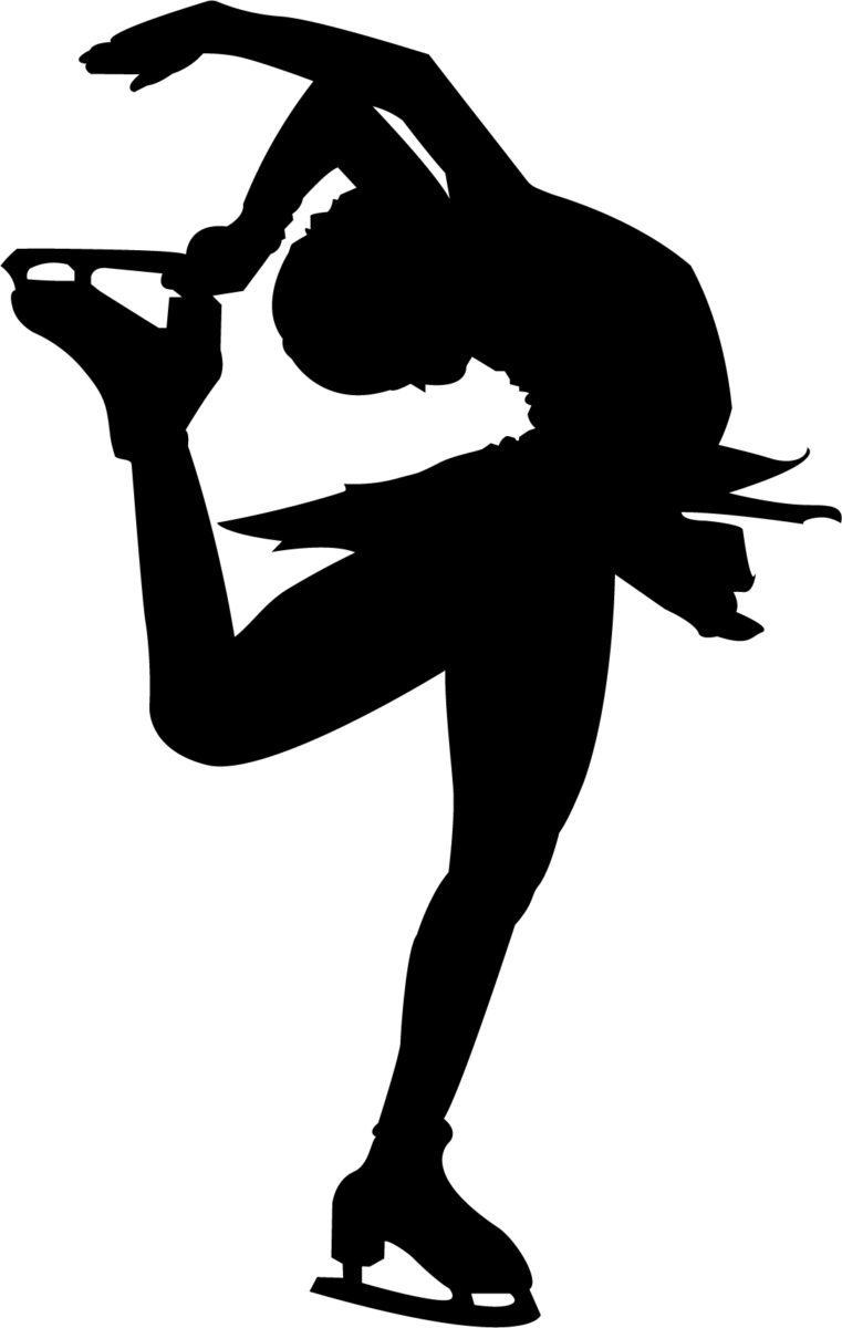
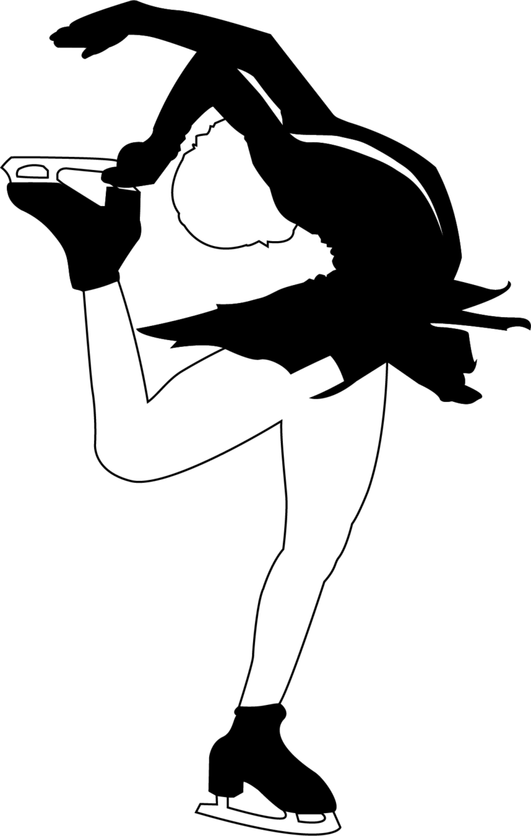
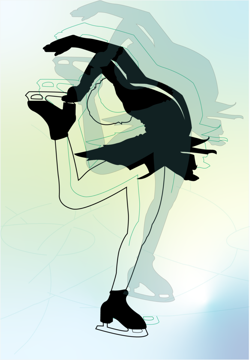
In this project I practiced making an silhouette out of a athletic person in Illustrator. Firstly I had to pick out my model or a refence picture. In illustrator I used the pen tool to trace the outline of the model. After making the outline I had to shade it in to make the actual silhouette. To make one shape I combined the lines using shape builder, then I filled in the shape with one color. For the surrounded spaces I used the shape builder tool to delete the filled spaces so it’s blank.
Outline of the model
Silhouette of the outline (positive space)
A study of positive and negative contrast, where the clothes is positive and the body is negative with the outline
Testing out gradient and adding color to image in illustrator, and combining all the above images into one piece to study layering
In this project I studied the shapes made in Illustrator. I used the shape builder to combine different shapes to make a single shape. With those different shapes I have to keep in mind with how to place them in layers so when I fill them with colors the shapes connect pleasantly with each other.
Hello, I’m Kikey Guan , and my major is Emerging Media Technology. I transferred over from Architecture. Although I may be slow at learning new programs, I’m looking forward to the semester. I have some knowledge in photoshop and clip paint studio, but I usually use Paint tool sai frequently.
I have a variety of hobbies I do from time to time. Reading is a favorite for me. I like to pass time while reading and enjoy the emotions it gives me, angsty stories are the best. I read from different formats (ex: manhwa, manga, web novels, visual novels, and some from text based games). I also do a lot of digital art (sometimes on paper if I want to scribble scrabble). During this summer I picked up embroidery, it’s quite fun to see it come together, but I also stabbed myself with the needle a bit too much. The last one I want to put in here is gaming. I like to play different types of games, but my favorite is Splatoon, all 3 of them. Playing on my phone is my most preferred way of casual gaming, and the most time I spend on. I have a terrible amount of gacha games, and there will be more: )