A Communication Design Portfolio

Author: Karla Franco (Page 1 of 2)

Video Project


I started with a short introduction about and the things that I like I decided to add a  “Fade Transition”  because I wanted to show a picture of myself. Also I add a JPEG image with the names of the class and work so that when people saw the video they would not feel confused by not knowing what it is about. For this video I wanted to show some work from past classes, what I learned from making this video is that I know that I can improve the video, I can changet the view one challange I faced was when I wanted to resize and it was a bit frustrating, however, now I can consciously say that this video turned out fine. For the background music I wanted something fun so I did some searches and I found the page https://www.bensound.com/ where I could find different melodies. I also wanted to add my pet because he is important to me and he is a good partner  when I do my homework because of the sounds he makes. Something that I must improve is that for the future I will record horizontally so that the phone captures all the content.

Logo Research Paper

Logo Research Paper-Yahoo!

Yahoo’s Logo 

Nowadays, it is common for adults and adolescents to resort to websites that provide us with help with homework and this makes it easier for them to answer. Yahoo!, Inc., is a US-based media company whose mission is to be the most essential global Internet server for consumers and businesses  based in Sunnyvale, California, and owned by Verizon Communications since 2017. In 1994, it was founded by Jerry Yang and David Filo who were graduate students at Stanford University. In a cramped office inside a mobile home on the Stanford University campus, Yang and Filo spent their afternoons browsing the Web. The story behind this high-impact logo begins with features like  search access, a directory, or an email service. All of this transcends a favorite collection of Yang and Filo websites. When they were electrical engineering graduate students at Stanford University, both founders had compiled a list of their favorite websites.


                 (First Yahoo Logos design was released to the public in 1994-1995)

The first three Yahoo logos were designed during the years 1994-1996. The first logo in 1994 consisted of the Times New Roman font and the color black. In 1995 the founders created another logo that included the exclamation mark at the end however it only lasted a short time of 5 months. In 1996 the founders also made another design in this case it consisted of an illustrated figure of a yellow “Y” that jumps in a blue circle with the “Yahoo”. The founders of Yahoo! Some consider them heroes. Jerry Yang and David Filo at the beginning both created Jerry’s Guide to the word which was an easier way to surf the net. However both decided to innovate and changed the name to Jerry and David’s Guide to the World Wide Web this would be the beginning of Yahoo! This platform made the internet easier to navigate and more organized. When the founders realized how their quickly website grew in popularity  with their profitable business, they changed the name of their creation to Yahoo! Yahoo! according to the dictionary it means “Rude”, unsophisticated, uncouth” the reason for this is because they both liked the meaning of those words. However, some have speculated that “Yahoo” is just an acronym for “Yet Another Hierarchical Officious Oracle.”. According to the hierarchical term it describes how the Yahoo database was organized in layers of subcategories. In contrast, the founders maintained that they selected the name Yahoo because the term was used by college students in the native Louisiana of founder David Filo.

By 1995, Yahoo had already acquired several companies such as ClassicGame.com and Rocketmail. The exclamation mark  was added to the wordmark since Yahoo was already registered as a trademark. The first logo design was in the 90’s, despite their first design, the founders began to experiment with different ideas in a variety of ways into the future. A great growth opportunity in February 2008 founder Jerry Yang made a decision on a bid proposed by Microsoft to buy Yahoo for $ 44.6 billion. In 2009, former Autodesk CEO Carol Bartz joined Yahoo as CEO after Jerry Yang resigned in November 2008. Over the last 22 years Yahoo has continued to pursue technology company aspirations by investing with new ideas and smart technology.  In 2009 Yahoo updated the old logo for the first time by changing the color from red to purple and flattening it. Later in 2013 under the command of CEO Marissa Meyer the logo got a makeover.

      (The original red, the 2009 update, and 2013 redesign logos. [Images: Yahoo)

The original logo was better for the time of the founders however, for a current time  a change was required for Internet novelty. The process change in presentation to the new logo signified the strong characteristics of the old “Yahoo” logo. The name was held in high regard with a strong brand presence of its own. Michael Bierut, the Pentagram partner who led the rebranding, wanted the logo to be in clear and beautiful letters in order to make them happy when pronouncing it in people’s heads. According to Bierut, he said “All our attempts to go back and try to revise the original felt forced and artificial,” what Bierut explains is that the original logo was suitable for its time, however it was not suitable for a time like the present.

             (Image:courtesy Pentagram)

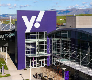
Pentagram developed a broader rebranding of Yahoo. The new logo keeps the purple and the exclamation point, but it touches any remnants of the company’s many previous marks.  The Pentagram-designed identity is crisp and friendly, with thick and curvy letterforms in addition they chose a more lively typeface, Centra No. 2 extra bold, that gives the double-Os in “Yahoo” a friendly, borderline anthropomorphic character. The identity is further streamlined with a simple “y!” monogram, useful for favicons and social media icons. The monogram is also the foundation for a cohesive brand architecture that locks up the “y!” with various channels to create sub-brands for Yahoo Finance, Yahoo Sports, and Yahoo Weather. The important thing that remains is your exclamation point, which is slanted like an italic and which is at a slanted angle is at 22.5 degrees and is repeated throughout the new mark. Yahoo! It led its competitors with a large number of website users with more than 2.4 billion pages  across its various international sites in 13 languages. Over the years, Yahoo! has had a great impact on society as the new CEOs who fought for this company grew with professionalism. 

           (Image: courtesy Pentagram)

Works Cited

https://www.britannica.com/topic/Yahoo-Inc

https://www.fastcompany.com/90407757/yahoo-has-a-new-logo-again

https://logos.fandom.com/wiki/Yahoo!

https://www.siliconvalleyhistorical.org/yahoo-history

https://www.ft.com/content/e812c32c-506e-11e6-8172-e39ecd3b86fc

http://www.fundinguniverse.com/company-histories/yahoo-inc-history/

https://www.techradar.com/news/internet/the-past-present-and-possible-future-of-yahoo-1325383

Yahoo — Story (pentagram.com)


Design Research Paper

Design Research Paper

For this research work I chose the Swiss graphic designer Armin Hofmann because his distinguished posters are full of simplicity and elegance. Armin Hofmann is a twentieth century Swiss graphic designer. Born on June 29, 1920, Armin Hofmann  grew up in Winterthur, Switzerland.  He attended the School of Arts and Crafts in Zurich and later took up a job as a lithographer in Basel and Bern. Armin Hofmann followed the concept of the Swiss style in perfection and simplicity. The Swiss Style is a graphic style which follows the idea of minimalism and perfectionism. The key characteristic of the Swiss Style is the clear organization of elements according to a grid system. Subsequently, he opened a design studio. 

The immeasurable influence on generations of designers is one of the many distinguishing qualities of his work. Moreover, he is looked up to by his students as the most inspiring graphic design teacher. Later with the opening of his design studio he met  Emil Ruder who with Armin Hofmann and joined the faculty of the Schule für Gestaltung Basel (Basel School of Design). Emil Ruder who was a Swiss typographer and graphic designer who shared the news that the Basel School of Arts and Crafts was looking for an art teacher.  Armin Hofmann is considered one of the most influential designers of this style that favors simplicity, legibility and objectivity. In 1947, Hofmann decided to take the job as a teacher and from then on he taught there for four decades. During the 1950s and 1960s, he designed posters for some cultural clients which hold typographic and photographic clarity.

In 1965, Armin Hofmann created a design book outlining the important principles in teaching design titled “Graphic Design Manual”  This manual contains the elements of image and form discussed and contemporary design techniques in addition to the distinguished Hofmann methods to the requirements of modern design practices. In a few words, his designs were didactic demonstrations of the principles he discussed in his book.

In 1968, Hofmann entered the advanced graphic design class with a short time later he had an appointment as head of the graphic design department. He taught at Yale University where he played a key role until his resignation.  His dedication to visual resolution represented a larger vision of civilized society. 

Hofmann’s work, especially his poster designs, always seemed to emphasize an economical and efficient use of colour and typefaces. This was in reaction to what Hofmann called the “trivialization of colour.” His posters have been exhibited as works of art in major galleries all around the world, including the New York Museum of Modern Art. He retired in 1987 but his legacy lives on in his hugely influential body of work. Armin Hofmann, exemplar of the Basel, Swiss approach to Modern graphic design, turned 100 on June 28.

 (Swiss-style posters by Armin Hofmann)
        (Armin Hofmann, Stadt Theater Basel)
              (Armin Hofmann, Giselle, 1959)


Works Cited

Armin Hofmann | Biography, Designs and Facts (famousgraphicdesigners.org)

Everything You Need To Know About The Swiss Style — PROJECT NORD JOURNAL

Graphic Design Manual (niggli.ch)

Heroes – Armin Hofmann | Designers Journal

TomHaganDesign | Spotlight: Armin Hofmann

Armin Hofmann | MoMA

The Daily Heller: Armin Hofmann’s 100 Years (printmag.com)

My Reflective Writing from Viewing the Exhibit Blue

The pieces from the Nassau Museum of Art’s Virtual Exhibit “Blue” that caught my attention was the “Blue Nude” in the gallery one by Henri Matisse, the second artwork in the gallery two by Cristopher Winter “The Huxley Guide to Switzerland” and  in the gallery third the artwork by Yves klein “Venus”.

“Blue Nude” 

(Henri Matisse. Blue Nude II. 1952)

The first artwork by Henri Matisse “ Blue Nudes” caught my attention because at first glance you can see a woman apparently sitting with her right arm over her head and also because it illustrates how provocative a simple design can be. I find this work very interesting because of the intensity of the color and the simplicity that makes me wonder if this work was inspired or just something that came to the mind of the painter. The size of the piece is 116.2 cm × 88.9 cm (45.7 in × 35 in) and the medium is Gouache-painted paper cut-outs stuck to paper mounted on canvas.

 “The huxley guide to switzerland” 

(Christopher Winter Huxley’s Guide to Switzerland 2011)

The second artwork is by Chritopher Winter this piece caught my attention and it seems dynamic to me because of the variety of the blue color it reflects, in addition to how the mountains play an important role as a background. I find it interesting because the two characters appear as if they were floating in a crystal lake. The size of the piece is 35.5 x 27.5 cm made with acrylic on canvas.

“Blue Venus” 

(Yves Klein “Blue Venus” ca. 1961)

This piece “Venus” by Yves Klein the dimension is  27 1/2 x 11 3/4 x 9 1/4 in and medium of Painted plaster. Although this piece is only a blue body, it is the art of reflecting how a woman’s body is without stereotypes to have an ideal body and I think that because it is a natural body and it is beautiful in any case.

Visual Quote Project

“Happiness can be found, even in the darkest of times, if one only remembers to turn on the light”

Visual quote 1.1

Concept 1

I chose this quote from the “Harry Potter” saga because although for some it is boring I find it very interesting because of the magic, the spells and the rare candies that change the characters. For my first design concept, I decided to set an upside down light bulb in the center that represents the light mentioned in the quote I chose. The text is located around the bulb and I chose a black background that represents the darkness so that you can see the glow of the light from the bulb.  I want the spectators’ eyes to go to the Light Bulb because it is a metaphor in life, as if someone is in the dark, the light will not make him or her feel alone.

Visual quote 2.2

Concept 2

For my second design concept, I decided to add a big heart in the center that represents happiness with a white background so that it has contrast and it could demonstrated the differences of the two colors that interact, with a black frame to highlight the color of the background and also I added a lightbulb hanging from the top right of the heart and because I wanted it to connect to the quote with the word “Light”.

Visual quote 3.3

Concept 3

For my third design concept, I wanted something simple but with things that stand out, so for the background I split it in two using the black and white colors as well for the text. Part of a movie character that is “Harry Potter” that I chose replaces the “P” in the word “Happiness”, so with the head and glasses I connect them to the movie. With the same idea of adding a light bulb in the word “Light” replacing the “I”. The words that I want to emphasize are “Happiness” and “Light” because we can both feel them physically and spiritually as the Light when it is very resplendent and the happiness you feel when hearing or touching something or someone that matters to you.


Sketches


« Older posts