Hi my name is Kenneth and I’m working at the Office of Image and Visual Communication. I am currently assigned to create a 20 page Annual Report for New York City College of Technology for the year 2015. Every year or so, city tech redesigns their annual report. This year, I am task with this major project. I’m not certain if I will be working with others in this project but currently, I am working alone.
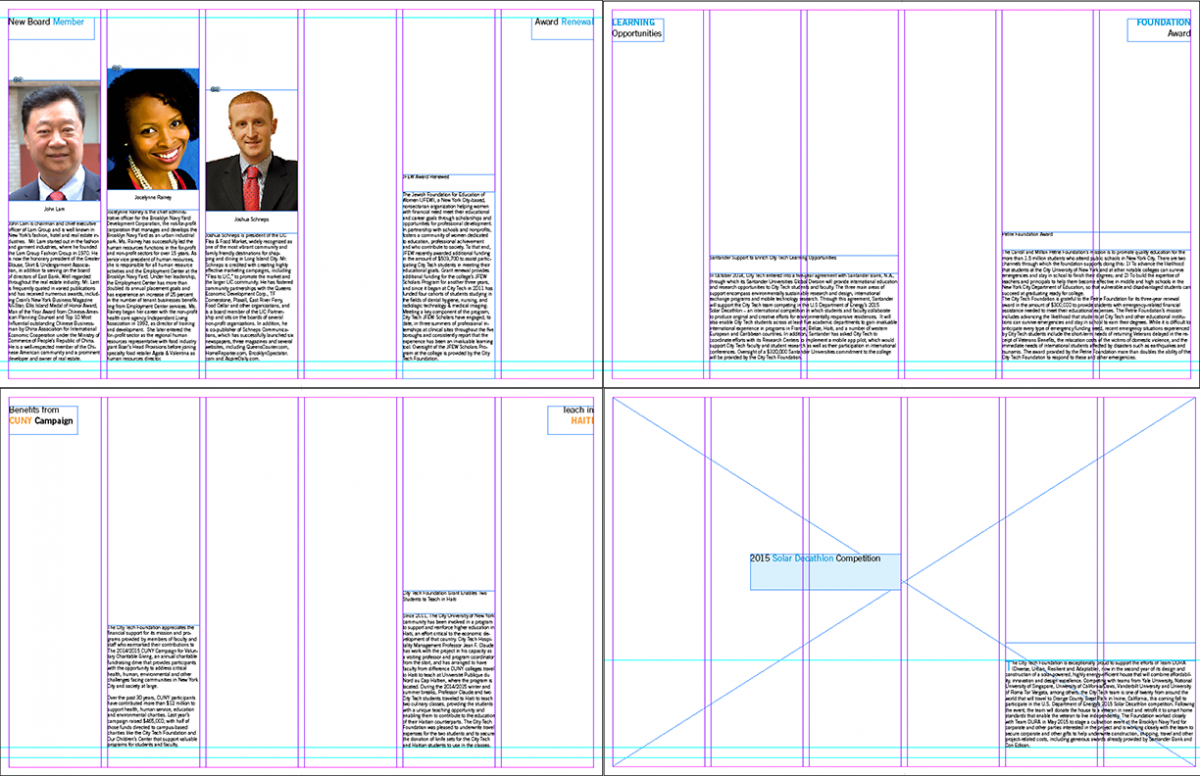
From my previous post, I created thumbnail sketches for the annual report to get a feels of how I would like to position my text layout when working in Indesign. Today, I am placing all the text I will use for the annual report in a respective layout format for a 20 page annual report in Indesign. Working in Indesign, I set up my format to create a 10 page spread, 6 columns, and with .25in margins. I have a lot of text to work with. I haven’t been assigned any images to use for the text so I will use placeholder images for now as a substitute. It’s my first time creating a 20 page magazine layout format in Indesign so I am very excited to take part in this project. Here are the amount of text I am going to work with.

I created a layout in Indesign for the city tech annual report. I am waiting to receive the images to use for the annual report from my supervisor. I will probably receive the images sometime this week or next week. But before that, lets take a look at the Indesign layout using all the text I have to work with.
4 page spread (page 1 – 8) 4 page spread (page 9 – 16)
2 page spread (page 17 – 18) 2 page spread (page 19 – 20)
I placed all the text that will be in the annual report in a layout format using InDesign. As you noticed, there is a lot of negative space. Some of these negative space will occupy images. I have used some placeholder images to get an idea of where the images will be. And of course these placements can change in time.
Although there are a lot of text in an annual report, you can also see a lot of images. My next task for this project is to come up with ideas for the design feel of the City Tech 2015 Annual Report.
Seeing how heavy this Project is, my supervisor assigned an additional Intern to work with me for the City Tech 2015 Annual Report project. Now the load is split between the two of us. I will work on the first 5 page spread (10 pages) of the City Tech Annual Report and the other intern will work on the other 5 page spread (10 pages) of the Annual Report.
Its time for more research. I looked through a lot of design books. Books like Graphic Design 97 by Martine Pedersen, Great Type and Lettering Design by David Brier, Fresh Ideas in LIMITED BUDGET design by Betsy Newberry and Kate York, and TYPOGRAPHY EIGHTEEN by Watson-Guptill. All these books gives some ideas of what to think about when trying to come up with ideas for a design as a graphic designer. I have been co-ordinating my Indesign layouts base on the ideas I think about.

