Author Archives: KaylaDLC

Letterpress and Offset

Gutenberg created the first letterpress. After this letterpress has in advanced. No one had to set the type by hand. This made it much easier to create type that was more clear and organized. Letters become more evens spaced and no longer did people had to write books by hand. This allowed people to create more books.

photo 1 photo 2


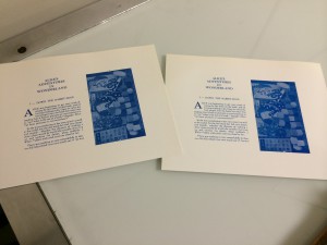
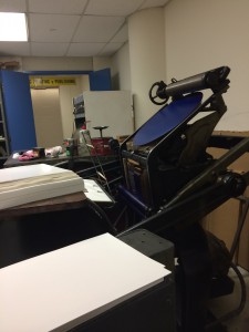
(These are photos of when we went to see printing being done.)

Offset is when the printing press is printing off a plates. Images and text are placed into the plates, which then transfer to the paper. The images and text are made from negatives. Offset printing was a big shift from letterpress. It moved away from what letter press did. Offset is a lot faster than letterpress.

Field Trip to the UFT

I did not know what to expect on our field trip to the UFT. I thought we would see a few printing machines. I did not think that to the UFT printing would be so important. When we entered the Printing station, I was amazed. They had many different machines. The printing faculty had some of the new printing machines and also they old ones. Two machines that I was amazed by was the machine that folds the paper and the machine that puts the paper in the envelope. These two machine I would never imagine were invented. I had never even thought how the paper was folded and put in the envelopes. I never asked myself if this was people folding it and putting it in or a machine.

The machine that folded the paper was quick. I could not see when the machine was folding the paper. This machine folded the paper in thirds. After only about waiting one minutes there was about more than 20 folded papers. If I was to compare that to a person folding the paper, there would be less folded paper folded by the person than the machine.

The paper folding machine would pass the sheets of paper through mini stations. First it would fold was 1/3 of the paper. Next it would fold the other 1/3. This processes happened quickly and was difficult for me to see. This machine is helpful because now this processed of folding paper happens fast and there’s no need to worry about the paper being folding uneven.

The machine that put papers in an envelopes surprised me the most out of all the machine. If I was told this machine was real, I could not imagine how it would work. This machine was able to put placed in different levels of speed. At first the printing working at it going fast. He then slowed it down so my classmates and I could see what it does. The process it takes to put the paper in the envelope I would have never thought off.

The machine that puts papers in envelope goes through a few processes. First, the envelopes are stacked together and places in the machine. Next it passes through and it machine open the opening of the envelope. Then the machine has two small tubes that suck the part that is facing up. This opens it and now the paper slides into the envelope. After that the machine has a small part that puts the opening of the envelope back to the envelope. Finally the the finished envelopes pass through and are ready to be closed and mailed. This makes the process of having envelope ready to mail faster and easier.

I enjoyed see all the different machines that the UFT Printing Facility had. It all amazed me how every machine was made from something different. Some machines where similar, some were more capable of doing the job quicker while other took a longer time, but had a better quality. This field trip taught me that the printing world has changed and improved, but that people will always love the old machines because of their quality.

Researched Logo

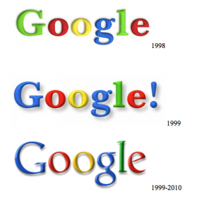
The Google is known around this country. Google is a well-known search engine and now much more. Its now a email source, a place to store and write document, a place to shop and a map of the world. With this Google needs a good logo. The creator of the current Google logo is Ruth Kedar. The owners of Google were looking for someone with a playful style and Ruth Kedar had it.  Kedar also stayed with using the primary colors and with the “L” being a secondary color,  “We ended up with the primary colors, but instead of having the pattern go in order, we put a secondary color on the L, which brought back the idea that Google doesn’t follow the rules.” (FinePrintNYC) Google has gone through many logo changes.

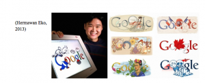
The current Google is popular. Many internet users rather use Google than the other search engines or email accounts. With all this popularity their business rised and they were able to buy other companies like Youtube. Throughout the years, they have kept the   colors and the fun style front. Aside from this logo, Google on special occasions changes their logo. Some of these special logos are created by Dennis Hwang. People enjoy these logos and sometimes they are even interactive. This is a new approach to logo making. Even with these new special logos, the Google logo is still well-known and respected.

My Bio

My name is Kayla De La Cruz. I live in manhattan all my life. I am a sophmore at City tech. I am interested in photography and cinematography. I believe that learning about graphic design and other aspects of the arts will help to expand my knowledge. I have learn from my Graphic Design classes and Raster and Vector how important what text you put in a photo or aside a photo could affect it. I want to continue being in the artist side of our society. I cannot see myself working in an boring office. I want to create art and see the world.

Assignment #6

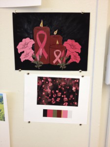
This assignment was made for someone special who passed away from breast cancer two years ago. So I took a moment where I lite a candle for her. I used paint for the background and everything else was made Illustrator. I enjoyed making this and hope she is in the sky enjoying it as well.

photo 2(10)

The bottom piece is where I got the colors from and the top piece is my finished piece.

Paired Color Identities Free-Study

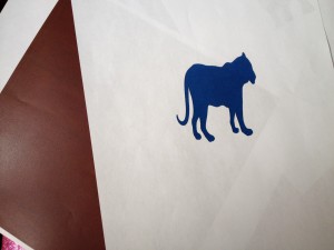
For this free study we had to work with a partner. My partner and I had to create a pair of squares that showed color interaction. In the middle of the square, the center will be a icon that represented her partner. Also the colors that is used for the outside box is a color that represents your partner and the inside icons color is a shared color.  For my partner I picked a dark red for the outside and a tiger for her. For me she picked a elephant and pick a blueish color. I had printed out just a few ideas of how our assignment would look, but the colors did not come out correct.

Paired Color Identities Free-Study (For me, made by my partner.)

Paired Color Identities Free-Study (For me, made by my partner.)

Paired Color Identities Free-Study (For my partner, made by me)

Paired Color Identities Free-Study (For my partner, made by me)

Group 4 : Shifting Hue and Value

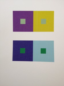
For this assignment, I had to shift hue and value. At first I understood what I had to do, although sometimes I couldn’t see it. When I tried to do the assignment on my own, I was stuck for while trying to figure out how to start. I looked at the example posted on my professors website and then started doing a few pairs that showed this. I chose one and this was it.

Shifting Hue and Value

Shifting Hue and Value

Group 3 : Shifting Hue, Not Value

Now this group was difficult for me to understand. Sometimes I couldn’t see what others saw in the colors or I just couldn’t get the right colors. In this assignment, I had to use hue to make it look like its the same color when set to gray scale. I played around with a few colors, and my out come was this:

Shifting Hue, Not Value

Shifting Hue, Not Value