Blog Post 1
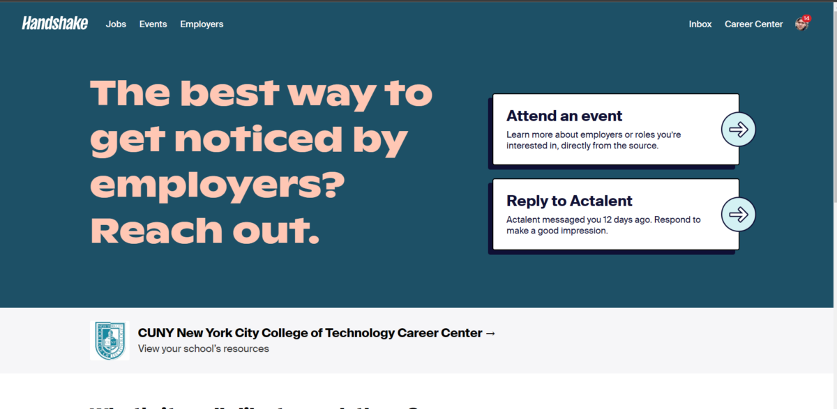
Hey, my name is Kevin Chinchilla and this is the start of my blog for my internship course. Coming in it was expected of me to already be in an internship prior to joining the class, but it’s still completely fine to be searching. While I’m searching my professor looked over my resume and gave me tips to improve it and make it look nicer. Once my resume was in a good spot I was ready to start looking for internships. I created a profile on HandShake and started looking for internships. While searching I applied to 6 different companies and also applied to a graphic design spot at the Student Development Center here at CityTech.

Blog Post 2
While searching on Handshake I was amazed by just how many wonderful opportunities there are. While unfortunately many of the intern positions at bigger companies are already filled there are plenty of other options. even some that are paid. While searching one important thing I took note of was whether I would be working remotely or in the office. While I would love to be in the office to get the most out of the internship, something important to consider is the fact that I live deep in Queens. Just going to my college is an almost 2-hour commute so while I tried to apply to any internship I could find I really prioritized those that can be flexible with my working environment.
Blog Post 3
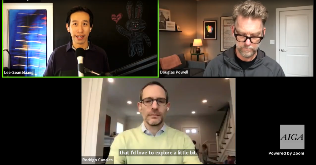
For my virtual event, I attended an online panel hosted by AIGA on LinkedIn. The panel was called “Business Perspectives for Creative Leaders”, the two hosts were named Lee-Sean Huang and Douglas Powell. The panel didn’t have a break-out room but there was a Q&A and there were many people in attendance. Many of the topics were about how creative leaders go about management, hiring people, and leadership. While I’m in no way a creative leader at the moment, it was still interesting nonetheless to hear how these higher-ups deal with management and hear their take on design.
Blog Post 4
One of my Internships emailed me back today, they were interested in interviewing me so I gave them my availability. Their name is Jorwell Perez and they’re the Bilingual Director of Communications and Outreach at the SFC Center. SFC or Strong Families and Communities center is a nonprofit organization that focuses on supporting community-based organizations and providing support to child welfare and community development. The internship focuses on working on projects related to the Center’s brand, website, and social media, while also developing and expanding the center’s exposure all throughout NYC.

Blog Post 5
One of the internships emailed me back and wanted to schedule an online interview with me. The internship was for a graphic design position at Brooklyn College, where they needed help with creating new graphics for their website and other communications for their students. I finally got to talk with Isana Leshchinskaya on zoom, she was very welcoming and went straight to discussing the intern position and all the responsibilities included with it. She was used to having CityTech students as interns so she was already aware of the internship course and the hours I needed I required. One thing I enjoy about the internship is that Isana is very flexible with work hours and if I need anything or have any questions she’s easy to reach by phone. Needless to say, I accepted the position and I’m enjoying my time there.
Blog Post 6
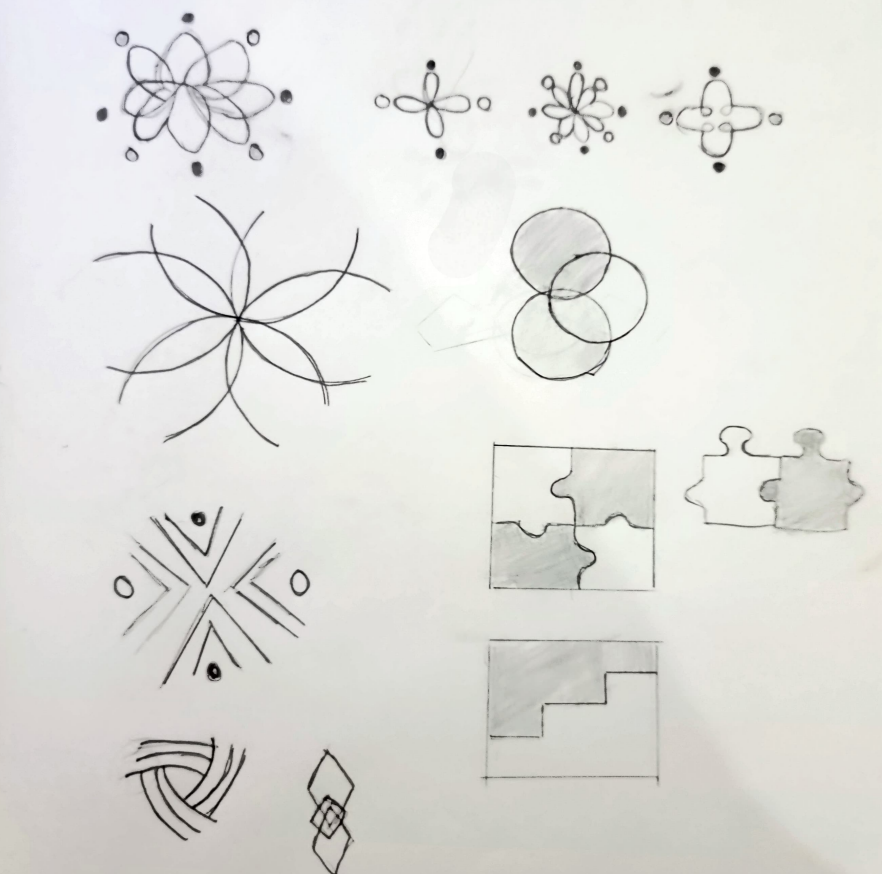
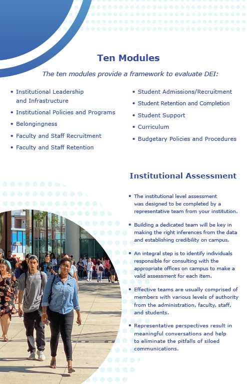
Before I go into detail about my first week of the internship let me give some background details on the Brooklyn College Office of Institutional Effectiveness. They’re objective is to study campus life and other aspects of the college and compile the data. They can then use said data whenever they need guidance on creating new policies or during long or short-term strategic planning and or decision-making. My first week was fully remote so I wasn’t able to go to the office physically. On my first day, I met with Isana and a fellow intern on zoom there Isana gave me an update on what we’re working on and some things we may need to work on in the future. To get me started Isana gave me the branding guidelines and asked me to study it, as well as start finding Annual Employment reports and placing them in a google drive to hold as reference. On the next day, I was asked to sketch logos for their new institution called REACHE however they gave me a restriction with the logo “no hands of any kind”. Doing some research on their institution I found that their goal is to promote diversity and inclusion by conducting quality research. Using those keywords I started creating my first few sketches.
Blog Post 7
The first thing that stood out to me while reading the AIGA ethical guidelines was the page on font use. Whenever I needed to do a graphic design project for school I was so used to just finding fonts online and just using them. They were free for personal use but they always said you needed to buy them if you wanted to use them commercially. The importance of acquiring a font license became more apparent to me once I started interning at Brooklyn College. Once I accepted the internship they gave me their branding guidelines and in them were fonts they had to the licenses for.
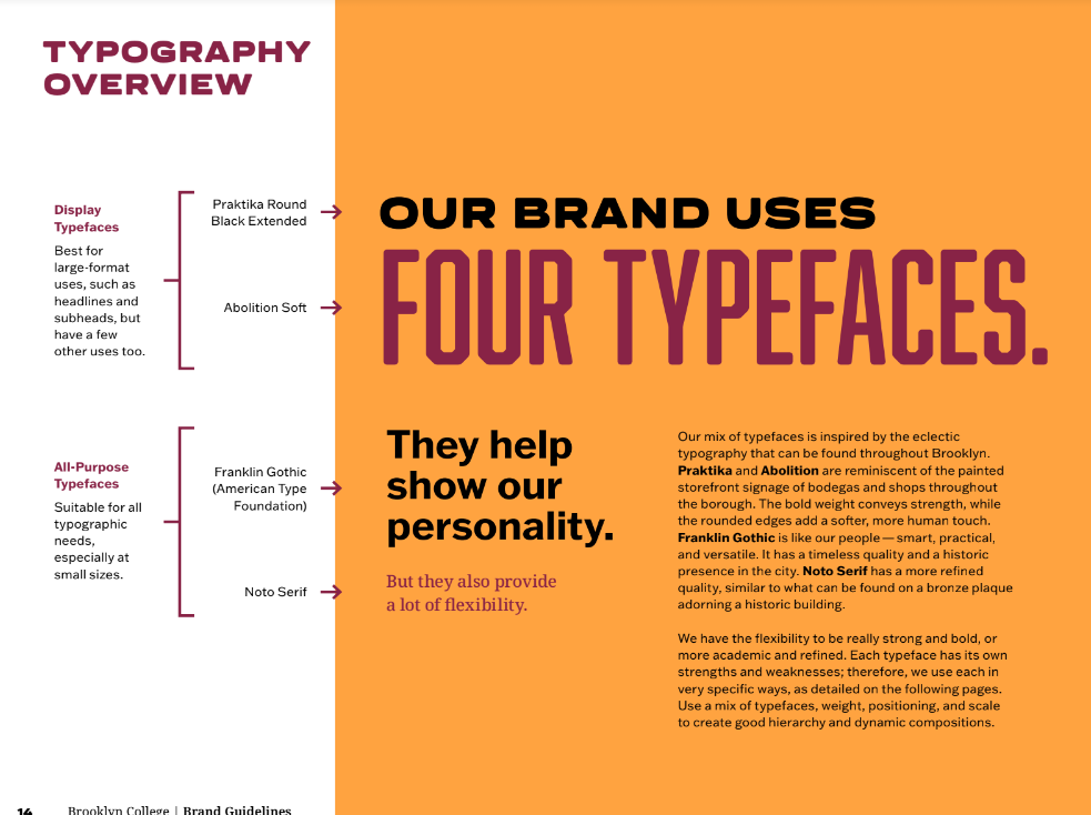
Not only do they have the licenses for their fonts but they also give me tips on how and where to use their fonts. They also give me background information on why they chose these specific fonts. While they haven’t made me sign and nondisclosure form or anything similar to that degree they are very strict about how to use their logo.
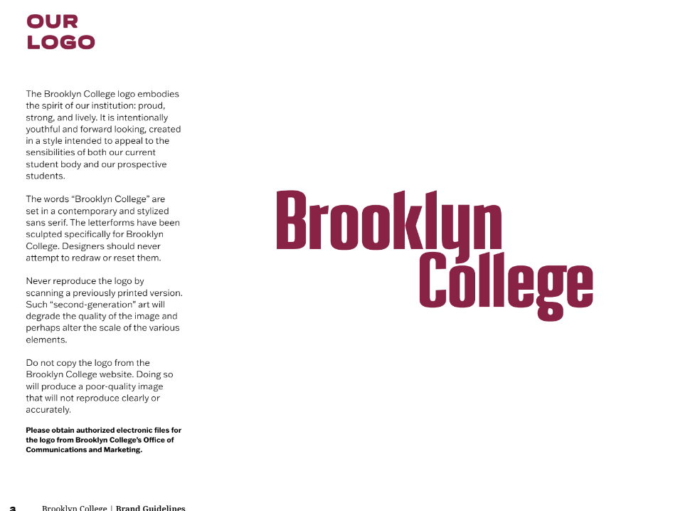
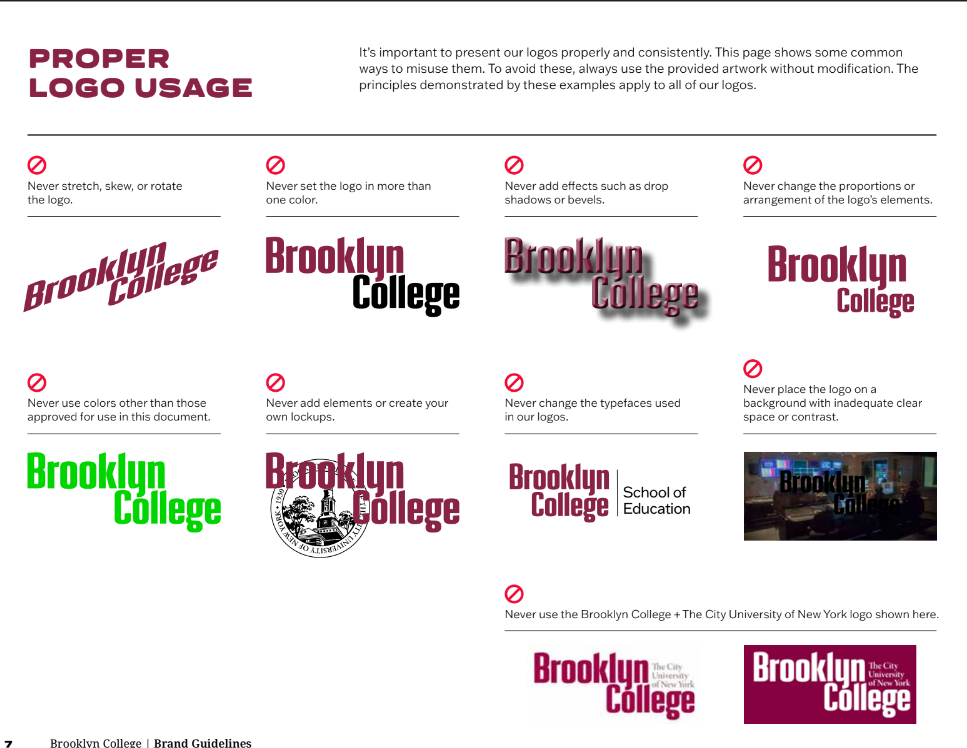
The first thing about their logo is that if I use it on any design I make for them I have to use the png they emailed me. I can’t just take it from Google and risk the logo coming out all blurry. The other thing is they only want the logo in a specific way as they want it to be consistent among all deliverables.
Blog Post 8
The readings did teach me new things about the importance of copyright but one of the first things I learned when I started my graphic design journey in CityTech was the importance of crediting someone if you use their work. One of the designers that really influenced me was David Carson, I personally enjoyed his chaotic style and how different it was compared to the modern minimalistic style of today.
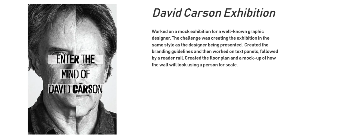
The project was to create an exhibition based on a graphic designer you chose. One of the challenges was trying to do it in their style as if they designed it themselves. One of the things he was known for was messing with images and his use of grunge type. He used all of this to create unique layouts which breathed a breath of fresh air into design in an era of modern design. Influenced by him many of my projects were done with his work being used as inspiration. Some of them may have bordered on copyright ill admit, but for the most part, I tried designing in my own style only taking small ideas from his work.
Blog Post 9
It’s been more than a month since I first joined my internship. I can say that I’ve gotten accustomed to the daily workday. So far my internship has been completely online, my supervisor Isana said that there’s possibly a chance that we’ll have to show up on campus to record some Tik Tok videos and get some pictures of the cherry blossom trees. While I won’t have experience working in an office setting, I won’t have to dread the 2-hour commute that comes with it. My work day usually starts at around 9:30 but this can change depending on how busy Isana is at the moment. I meet on Zoom with Isana and another intern, where she gives us the rundown on what’s due for the day and what’s coming up for the foreseeable future. After giving us our task Isana lets us go to start working, letting us know that she’s available in case we need to ask any questions. I spend the rest of the day working on the task giving Isana an update around 1 which is usually when I take my lunch break. My work days are Monday and Thursday where I work for 7 hours each day. I got my internship late coming to this class so on some weeks I work Friday as well to make up for the lost time. As for keeping in touch, Isana made a group chat so we can ask questions whenever we feel like we need to. Once I’m done with my tasks for the day I’ll usually email my work to Isana or post it in google drive.
Blog Post 10
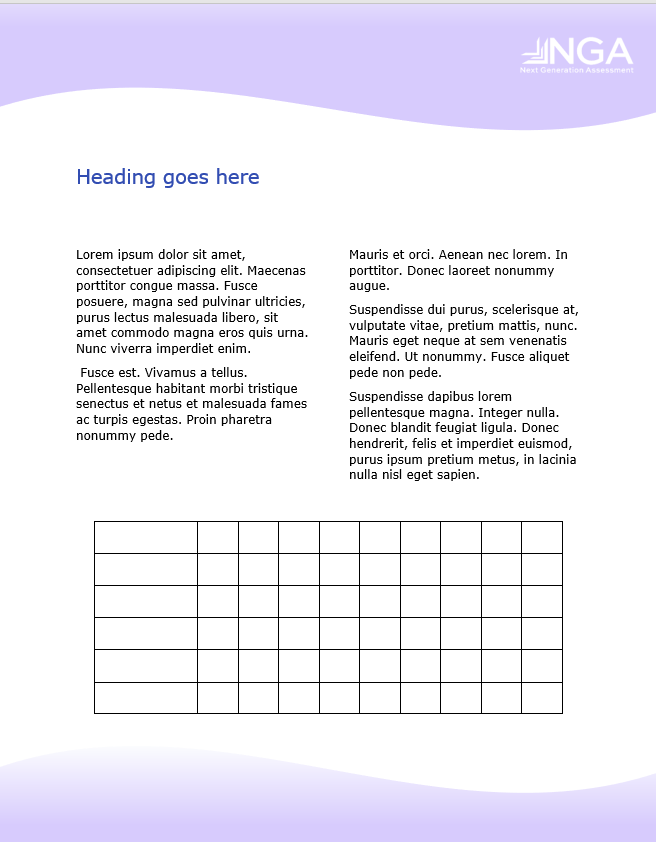
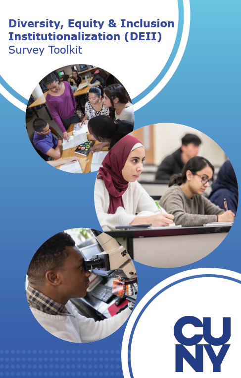
One collaborative project that I’m currently working on is a Toolkit for survey takers (Colleges/Universities) on what they’ll be receiving for participating in the survey. We were tasked with creating layouts that could hold text and graphics alike. One challenge however was that the project needed to be done in Word, cause they needed to be able to edit the document in the event that we were not available. Me and the other intern divided the work among ourselves, I was in charge of the cover as well as 2 other pages. We decided on a font to use Verdana which is a widely available font on Mac and Windows and got to work straight away. I’m still new to Word so the other intern was very helpful in sharing some videos to get me started.
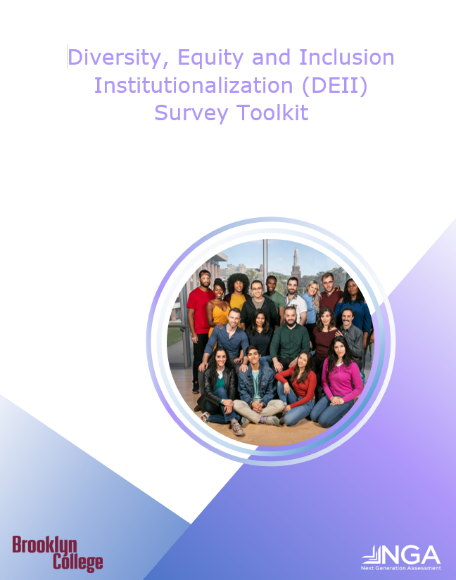
Above is the cover design I made as well as an example of a layout I made. The project is still ongoing so I’ll update this post as I go along.
Blog Post 11
The creative app I want to review today is MURAL. MURAL is a digital whiteboard where teams can collaborate together while working on projects. With MURAL a team of people can draw, add notes, and pin images, and files all in real time. It’s very easy to use and you’re able to set up several whiteboards at a time.
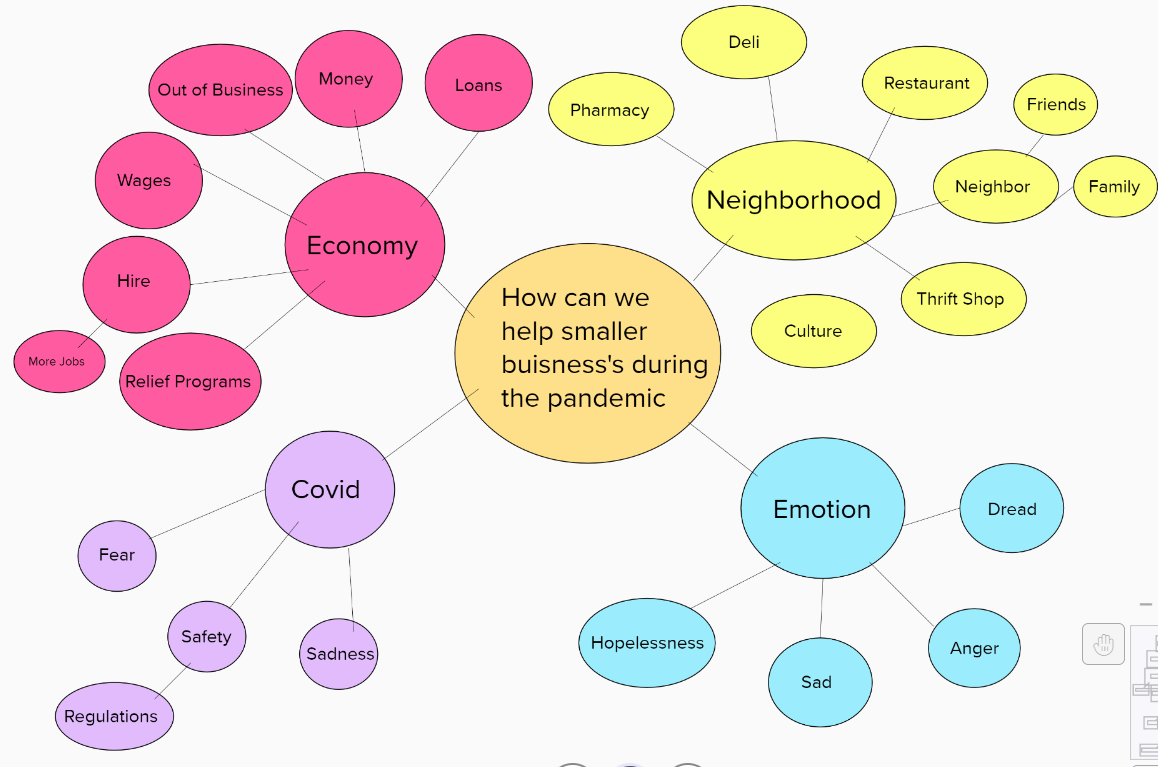
I love using MURAL cause it allows me to brainstorm with my team all in real time. My team can leave sticky notes and draw on the whiteboard at any time. MURAL also includes templates such as mind maps to get you and your group started.
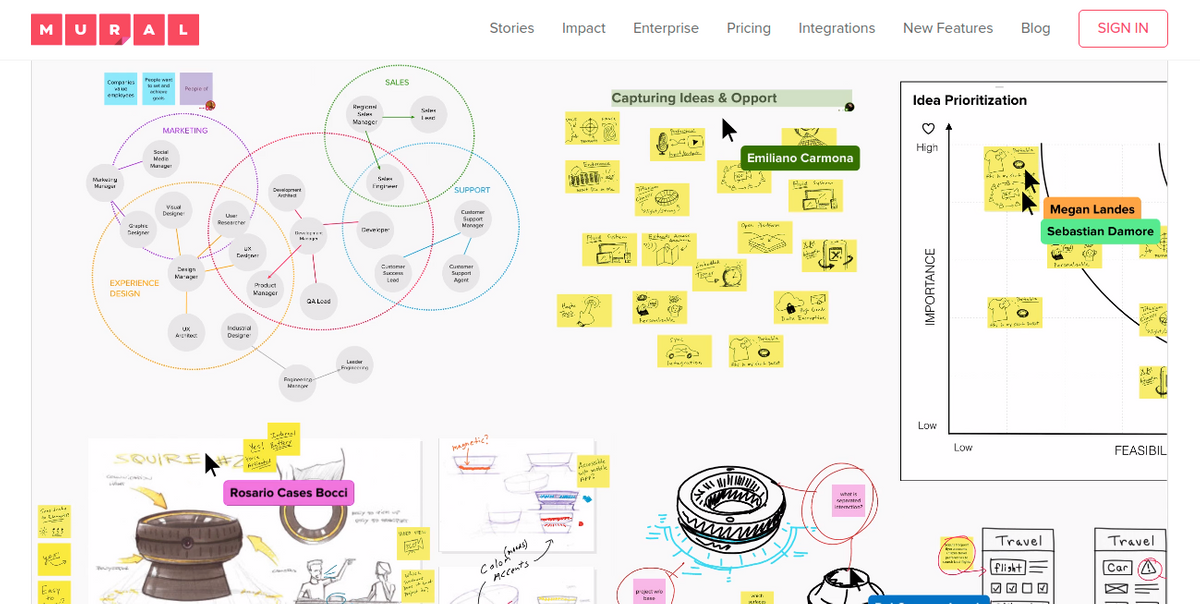
MURAL also supports many file formats and most importantly is affordable. The first time I was introduced to MURAL was by my Design Studio professor, she invited all of us to MURAL together and taught us the basics. We then used it as our own space to brainstorm and post any ideas we might have. It was great to keep notes and whenever my professor wanted to know how my progress was going we could go on my MURAL page and she could visually see my progress. Overall I’d recommend MURAL to anyone that needs a digital workspace to brainstorm and problem-solve with their team.
Blog Post 12

Pinterest is my go-to site whenever I need to be inspired. The issue with Google is that sometimes a search won’t give you the results you’re looking for. Pinterest is great for looking for images and looking at color schemes. It’s free to use, all you have to do is sign up. I use Pinterest when I’m brainstorming and creating mood boards. I can make multiple different mood boards at a time. It’s great whenever I’m looking for mock-up ideas or examples of ads.
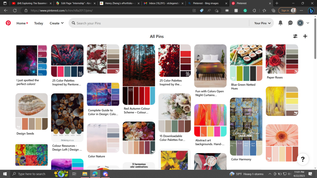
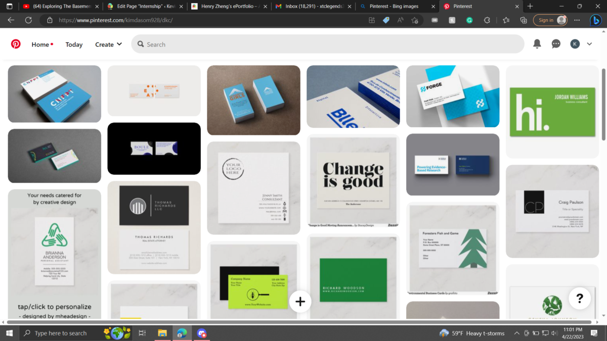
I’ve used Pinterest before while working on school projects in a group. We made a group mood board and asked the group to pin any images that they find. The app is very resourceful and great at suggesting ideas for any project you may need to do. I highly recommend anyone whose looking for ideas for a project to use it.
Blog Post 13
An update to blog post 10, They finally allowed us to use Indesign instead of Word (Finally….). We both went to work with my partner finishing up the overall layout. Once he finished I did some final touch-ups and we got the results above. Making the switch from Word to Indesign I noticed I really took Indesign for granted. What would be a lengthy process to do in Word is done in mere seconds in Indesign.
Blog Post 14
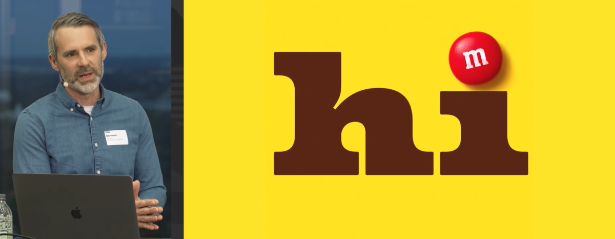
For my Webinar, I decided to see Monotype’s “Why Fonts Make Us Feel” with Phil Garnham. At first, I was a little confused with the idea of fonts evoking a feeling in someone, but Phil did a great job comparing it to music. Everyone loves music and some songs just make you feel a certain way, sometimes the song has a special meaning to you and now I think the same thing can be applied to type.
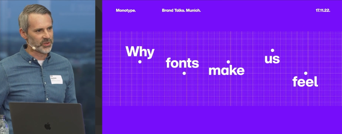
A great point he makes is when he says that type shares a special relationship with your message. I totally agree with this statement and to add onto it I think it also adds to a brand’s identity. The type of font you choose should be something synonymous with your message. He gives the example of M&Ms and their use of playful blocky text, it’s perfect for the brand’s personality cause they’re a candy company.
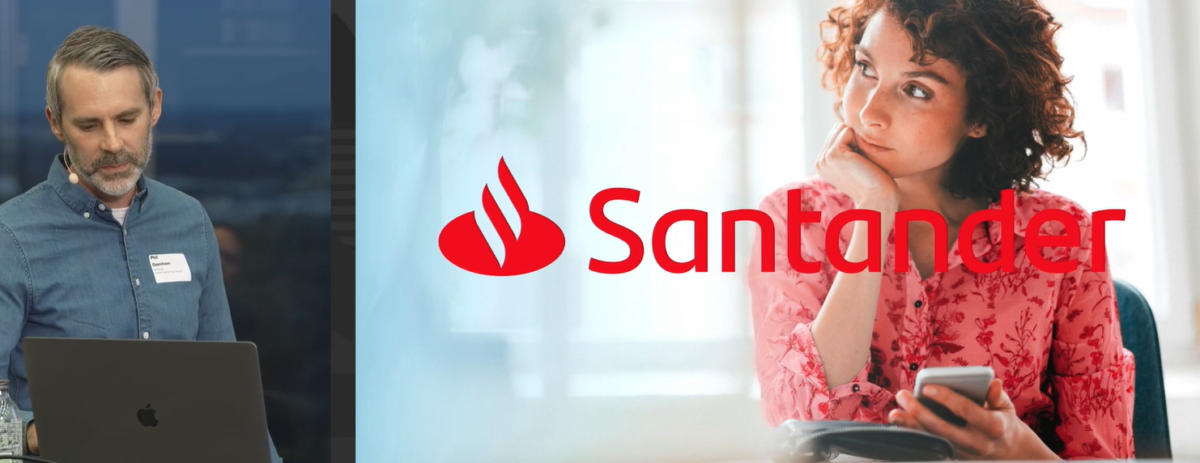
Another great example is Santander which is a bank, and their type is reliable, responsible, and trustworthy, which are all very important traits for a banking brand.

The above image will really stick with me for my entire design career. When I used to choose the type, I just chose a type that looked neat and clean. Now I know there’s another layer to that choice, what type of message am I conveying, will the type be memorable?
Blog Post 15
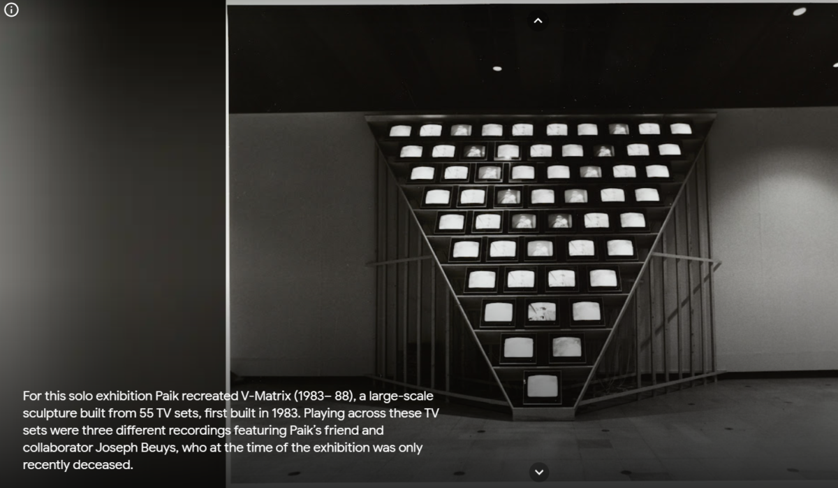
For my museum trip, I decided to head to the Museum of Modern and Contemporary Art in Korea’s online gallery. The site was very organized and it was really interesting to see art from Korea. One of the first pieces that caught my eye was Nam June Paik’s Video Works.
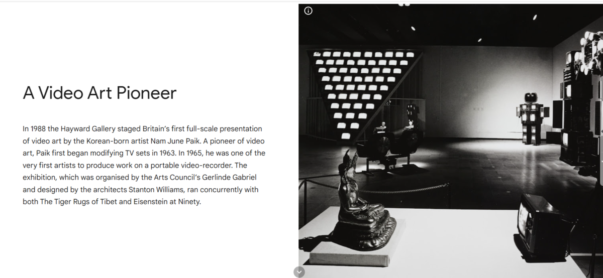
He was the pioneer of video art, being among the first artists to produce work on a portable video recorder. Seeing his work, especially during that time must have been eye-opening for some. Now we take technology for granted but back then it was uncharted territory. So to see art made from this unfamiliar source must’ve been surreal.

Do Bring Seub Back was another piece that really caught my attention. The piece is a reenactment of the famous protest scene of Lee Haneyeol.
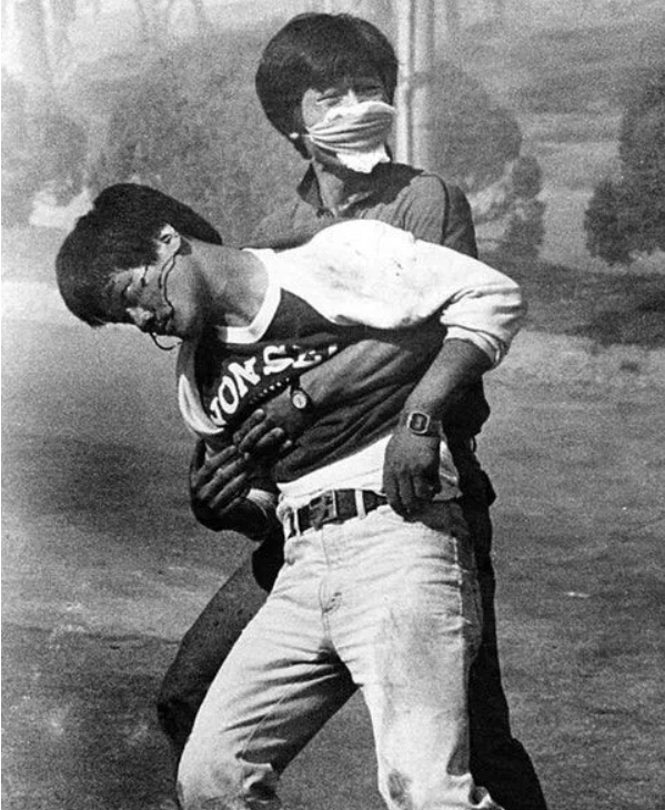
The piece wasn’t just reproducing a historical event, it was brought back because of its meaning. The original piece is meant to be symbolic of the violence brought on due to the military regime. The 2002 piece was created because of recent deaths brought on by the U.S. military. The deaths were overshadowed by the world cup, I like that the artists use soccer jerseys to show that the deaths were covered up. It’s a piece that really gets you thinking, especially with recent events in mind.
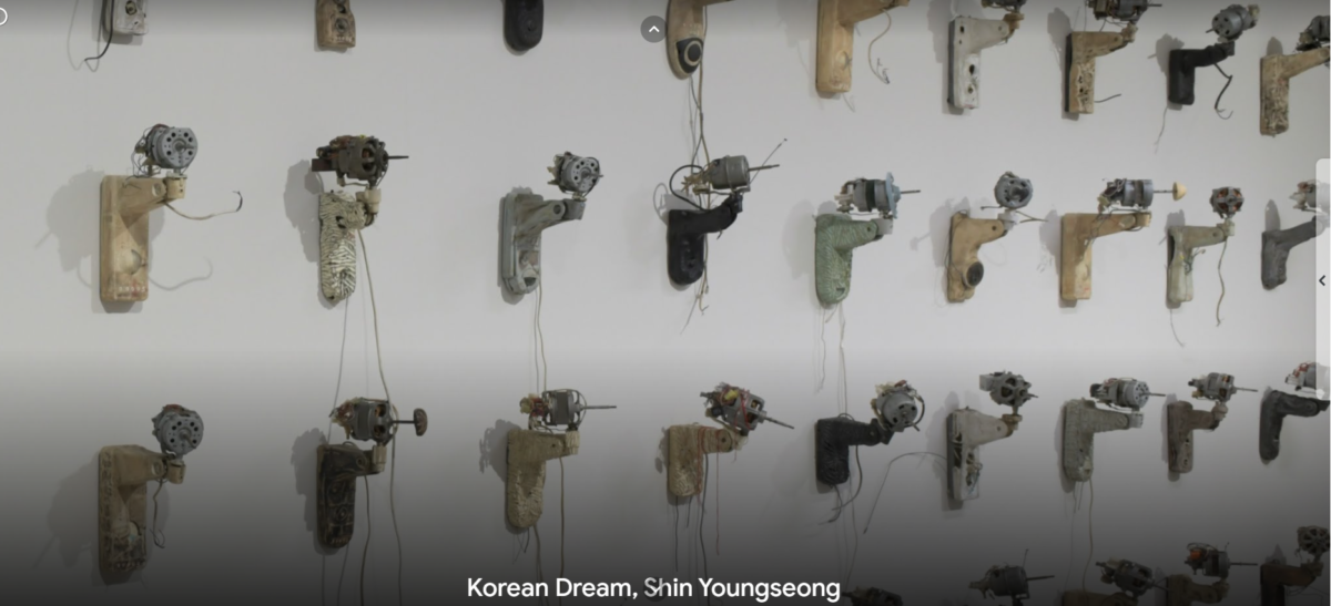
The final piece I want to write about is The Korean Dream by Shin Youngseong. The piece shows fans which were destroyed by hammers to symbolize capitalism in Korea. I really like the name and it seems like it’s inspired by the American dream. We see the American dream as something everyone can achieve but the reality is that only a few get to achieve that dream. To make matters worse we become machines, we become greedy all to achieve this dream. A dream that for most won’t come true, to see someone especially from across the globe voice the same concerns is really interesting.
Blog Post 16
As I start to work on my presentation I really start to reflect on the work I’ve done in class and in my job. This was the first time I really got to design outside of the classroom and to be frank I wasn’t sure if I was up to the task at hand. Now that I’ve finished my first internship I can really shake those doubts, and I can clearly see where I need to improve. It’s a slow process one that may take a large chunk of my life but little by little I know I can do it. I’m glad a class like this existed and allowed me to get real-world experience. I feel more confident to step out into the real world. As I continue writing this reflection, I think back at all my professors, current and old, and I really thank them for their guidance and wisdom. I’m excited to see where my graphic design career will take me.