Overtime, many companies start from one original logo and eventually evolve into new, improved logos. DC Comics is a brand known for its popular superhero comic books, and later in the years, it’s movies and shows. Owned by Warner Brothers Entertainment, it was under the name of National Allied Publications in 1934, and became one of the biggest comic book compan ies in the world (Pena, 2017). The “DC” stands for Detective Comics because it was the first name for the iconic Batman series (Logos Media, 2021). Although it was founded in 1934, the first logo was created in 1940. The company didn’t change it’s name to DC Comics until 1977, but the “DC” remained in the logo from since the first one (Jung, 2020). The company had many different logo changes that resulted in ten different logos by the end of 2016. The brand itself is targeted to different audiences and they release movies rated for everyone, teens, mature teens, and adults (ratings, 2012). Companies usually have many reasons for updating their logo from time to time, and DC Comics certainly changed their logo to signify the different comic book series releases.
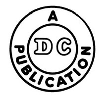
It’s first logo in 1940 was created with simplicity. It was made in black and white, with the letters DC in the middle of a circle, and “A Publication” arced around that circle, and then one more circle around everything. The strokes of both the circle and typography were thick.
The logo was so simple with no background. The “A Publication” had a typeface of a thick rounded sans serif Sebino Soft Heavy typeface, while the DC was a decorative typeface with a black outline (“WhatTheFont”). Only the “D” had a serif in its typeface. The DC was important because it stood for Detective Comics, for the first superhero, The Batman, series. About one year later, the company released a new logo considering seeing that it’s Superman comics were becoming very popular.
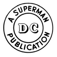
This logo had a white background, and the strokes for both circles and the typeface became thinner. The logo itself was also almost two times bigger than the first one. This time, the company added in “Superman” to the logo, which helped to acknowledge both Batman and Superman series. “A Superman Publication” remained with the same Majestic Romance typeface (“WhatTheFont”). The “DC” part also stood with the decorative typeface, with both “D” and “C” having the serifs this time. A drop shadow was also added to the back of the two letters, making the “DC” more of a 3D look. A few years later in 1949, the logo was updated again, this time with a few more changes.
This logo was designed by logo designer and lettering artist, Ira Schnapp (Ira Schnapp, 2015). It influenced future logos of this company to play more with color in its logo. The words surrounding “DC” were a rounded sans serif Angry Ronin Bold typeface (“WhatTheFont”). However, the words changed. “A Publication” was taken out, “Superman” was kept, and coming from its original name “National Allied Publications” in 1934, the words “National Comics” were added in. Two dots were added to ensure separation of the words “Superman” and “National Comics” also creating a nice symmetrical look. The separation was not enough though as it seems they wanted to make the “Superman” and “DC” pop more by turning both typefaces to a red font color. This time DC’s typeface was a solid red filled in Laquile serif. This one no longer had a drop shadow. About twenty-one years later, DC Comics released its new logo with a lot more updates and color.
In 1970, the new logo was released, acknowledging each DC lead hero the comic book focused on. The logo had the words “DC” and the character name in a yellow filled rectangle with a black border. “DC”’s typeface became what looks to be a Morgan Ps Bold typeface (“WhatTheFont”). The lead hero’s name, in this logo it is Superman, had the same rounded sans serif Majestic Romance typeface that was used in the logos that came before it (“WhatTheFont”). The lead hero was drawn above in an emblem to represent the comic book’s main hero of that series. This logo added in two new colors of yellow and blue, in addition to the already added color of red from the one before it. Two years later, DC Comics released an exclusive logo that was only printed on their special 100-page printed comics issued from 1972-1974.
The geometric sans serif typeface, which still looked to be a bolder version of the decorative NYC outline typeface, was used on the DC letters (“WhatTheFont”). It had stronger angles and thicker lines. This simple logo was inspired by the old ones, continuing that circular look. It had one simple black circle surrounding the “DC” with a white background. The logo was used only for those exclusive comics released in 1972-1974. The logo that was released after this one, was inspired by its shape and centered alignment of the “DC” letters.
This logo was designed by producer of the Batman movies, Michael Uslanin 1974. He added more words to the logo but did not take away the simplicity of it. “The line of super stars” words were added in around the “DC” with a bolded red font-colored rough edged sans serif, which seemed to be inspired by the Hatari typeface (“WhatTheFont”). The “DC” stayed the same typeface; however, its font color was changed to a blue. Two red colored stars were added into the sides of “DC” which inspired later logos to include stars as well. The colors of this logo were used to make a more patriotic look. In 1976, Jenette Kahn became DC’s new publisher. She commissioned Milton Glaser, a graphic designer, to create a new logo.
This new logo was popularly referred to as the “DC Bullet” from 1977 to 2005. Its original form had only black and white as its colors. However, sometimes it varied in size and color printed on some comic books. The “DC” was rotated a few degrees creating this diagonal look. This time the typeface for the “DC” was a bit shorter in height, was colored black, outlined in white, and had another outline of black surrounded that white outline. It’s a custom made font which seemed to be inspired by NYC Outline font (“WhatTheFont”). The circles themselves also had the same white and black outlines. This logo drew inspiration from the first three logos with its original double circle designed around the “DC”. The stars were inspired from the previous logo before it, this time counting to four stars instead of just two, and all being colored white. Sometimes the logo was in a blue color, replacing all the black.

The next logo in 2005 was created by John Beatman of Brainchild Studios and DC executive Richard Bruning. It was created debuting new DC titles and was also created for the use of other media that was released such as movies like Batman Begins and Superman Returns, and TV series such as Smallville and Justice League Unlimited. This fresh new design still held the star in it, with a new typeface called Graffick Outline for the “DC” (“WhatTheFont”). They gave a sleeker and more modern look to the emblem. The decorative typeface for the “DC” had an outline of blue and was placed on an angled oval with a star at the bottom right corner. The typeface seems to be more of an italicized font rather than their regular roman font. The entire logo itself consisted of two different shades of blue. The angled oval surrounding the “DC” gave the logo a sense of motion. This logo lasted for seven years, where in 2012, a new logo was redesigned.
This new logo was created by Landor Associates, a brand consulting firm founded by Walter Landor in 1941 (“Our Story”). This new design consisted of a bold letter C in black font color behind a gradient blue letter D that is folded back to look like a page being flipped. It had a simple sans serif Gotham typeface for the “DC Comics” name right below the emblem (“WhatTheFont”). This logo drew inspiration from a page flipping as one would do when they read a comic book, creating a sense of motion in the logo. The Dark Knight Rises film was the first to use this logo, and the TV series Arrow, was the first to use it as well. This logo lasted for about four years until the newest and latest logo was redesigned in 2016.
In 2016, the company hired Pentagram, one of the most well respected design bureaus, to redesign their logo (“DC Comics”, 2021). This design revisited the old designs from the 1970s, giving a more nostalgic feel to the logo. The size of the letters DC was sized up bigger, touching the edges of the circle that surrounds it. The bold custom serif typeface was created as sharper on the outsides of the letters and rounded on the inside. It is a custom font made inspired by the Pretender font (“WhatTheFont”). The entire logo is created with one blue color, a white background, and the circle was just one simple thick line. This logo was first used when they released DC Universe: Rebirth Special #1 by Geoff Johns (Logopedia). This is the most recent logo that was created for the company, bringing back the old original style from the 1970s into the new century of 2016.
DC Comics is a great brand that shows the different logo changes throughout the years. Often companies and brand names changed their logos to create a new style, or as they release new things. DC Comics did not change their logos just for the style of it but changed them in recognition of their new released content at different times, which included comic books, TV shows and movies. These logo changes helped their audiences notice that the new content that was put out would be special. So far, it’s been 5 years since their last logo update, however with new releases of content, possibly in a few more years, we may see a new fresh logo appear. They might even continue to let their logos have that same circular feel, keeping up with the first logo they ever made.
Sources:
Jung, Michael, and Michael Jung (698 Articles Published) Michael Jung is a mild-mannered freelance writer-for-hire. “The History of the DC Comics Logo.” ScreenRant, 13 May 2020, https://screenrant.com/dc-comics-logo-history/.
Pena, Anthony. “DC Logo Design History and Evolution.” Logo Realm, 3 July 2017, https://logorealm.com/dc-logo/.
“DC Comics Logo.” 1000 Logos The Famous Brands and Company Logos in the World DC Comics Logo Comments, 7 May 2021, https://1000logos.net/dc-comics-logo.
“DC Comics.” Logopedia, https://logos.fandom.com/wiki/DC_Comics.
“Ira Schnapp Lettering Exhibition at the TDC! – the Type Directors Club.” Archive, 30 June 2015, https://archive.tdc.org/news/ira-schnapp-lettering-exhibition-at-the-tdc/.
Logos, Media. “DC Comics Logo.” Logos World, 12 Aug. 2021, https://logos-world.net/dc-comics-logo/.
“Extraordinary brand transformation, by design.” Landor, https://landor.com/about.
“Ratings.” DC, 20 Aug. 2012, https://www.dccomics.com/ratings.
“WhatTheFont.” Whatthefont! ” Myfonts, https://www.myfonts.com/WhatTheFont/.

