My logo is based on my middle name Gianni and what I like to do, drawing. I made it based off the instagram profile I made to showcase all the artwork I’ve been doing for the past few years. I always thought words that made alliteration sounded nice, so when I first came up with the name, I was glad to know my middle name made a nice alliteration with the word “draws”. When I first made this logo I drew up a bunch of thumbnail sketches and I thought about pencils and wondered how I could incorporate it into the logo. Then I realized it could fit perfectly on the bar of the capital G. I used Adobe Illustrator create this, and used the type on a path tool to make the “draws” part flow within the letter. The font style I use for all the letters are Rubik Bold. I created outlines from the G in order to tweak it a little to make the pencil shape, and then I filled it with color to make it look more noticeable as a pencil.
Month: December 2021
Poster Project
Most of the time, when I think of posters, think of something that is announcing something or possibly stating a fact. Since I’m up almost every night, it’s usually due to staring at a screen such as my laptop from doing work, or my phone. So I decided to make a poster that shows that maybe a person isn’t able to sleep if they’re on their phone at night. The phone is something that associates with insomnia as well. Pretty ironic that I’d make this knowing that I usually am on my phone at night anyway.
Auto Bio
Here’s a Video of my Journey as a Student and becoming a Designer
I wasn’t so sure at first what kind of video I wanted to make, but I remember when I was younger and use to watch YouTube videos of artists who drew their life in a video. I didn’t think of myself ever really making one because it looked so difficult, but I decided to give it a try for this video because it just made sense. I feel like I could’ve drawn better because I did draw most of the pictures pretty fast, I could’ve done more detailed drawings. I’m still happy with the way it came out though because it went well with my VoiceOver. My experience making this was pretty nice because at least it might even encourage those who aren’t sure about themselves to really follow their passion in what they love doing.
Research on Designer Nicholas Moegly
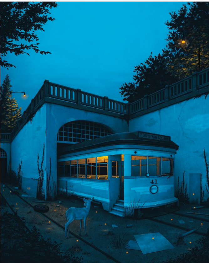
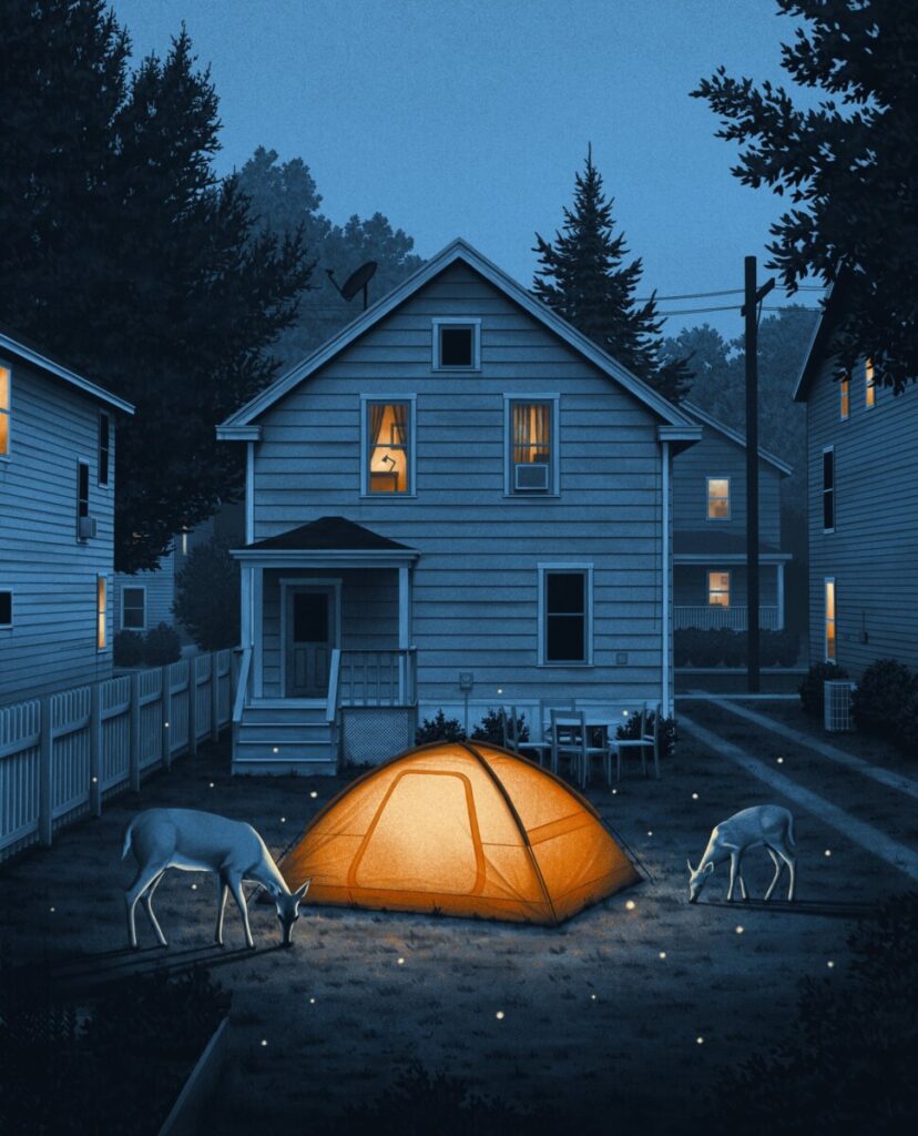
In the world of designing art, there are many artists that have their own style of design. They become known for their type of style and hired for projects that their style fits. One designer and illustrator, Nicholas Moegly, certainly has his own sense of style in the work that he creates. His line of work all fits well together when put side by side and his Instagram is a great example of how well they all look when gathered in one place. Each piece of work tells its own story while still following the same style, whether it’s for a poster, an advertisement, a print, or album art for the music industry (Colasuonno, 2019). His small hand-drawn illustrations give a lovely sense as if looking at realistic photos. He’s also designed some hand-lettering pieces that show quotes in an elegant way. I selected this designer because looking at his work gives me a sense of calmness. His work plays a lot with light and shadows, and it is extremely satisfying to see how realistic he can draw things you see around outside. Houses, street sides, animals, and trees are some examples of the things he has drawn in his pieces of work. Nicholas stated that he likes to create quiet serene moments that are typically at night. Creating mood was one of his favorite things about his style (Colasuonno, 2019). He works a lot with using monochromatic colors in his designs, which could also a reason his illustrations give a sense of mood.
Nicholas Moegly is a designer and illustrator from the Midwest. His work “specializes in creating moody, dark, nostalgic imagery that plays with light and shadows” (Moegly, 2021). The creative way he uses light coming from a streetlight, or even the sunlight shining through an open window truly sets the mood.

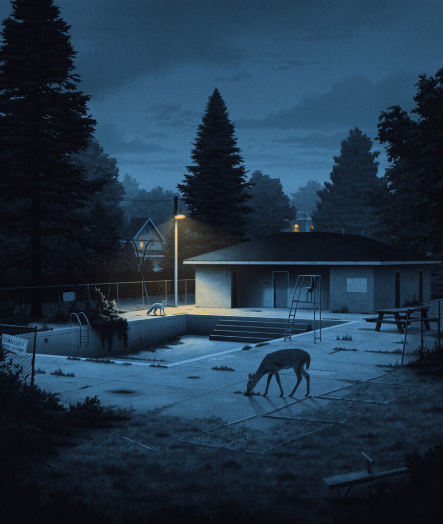
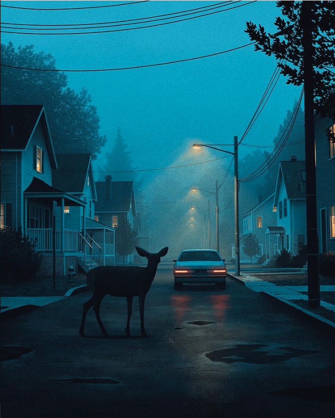
Sometimes he uses monochromatic cool colors and other times warm colors which helps the audience get a sense of whether it is nighttime or daytime in the piece. His work is mostly influenced by nighttime photography, not by any particular artists, just a collection of things he found online (Colasuonno, 2019). His designing career started during his third year of college in 2009, when he created his own personal brand called Moegly Design. After he graduated with a marketing degree from the University of Cincinnati College of Business in 2011, he worked for several companies and agencies while still maintaining his own brand. His first job, he worked for 10 months as a web analyst/designer for Axcess Financial, “designing, sending, and analyzing data of all their email marketing” (Linkedin, 2021). His last 2 months working there, he started working as a lead designer for Mindbox Studios at the same time. Mindbox Studios is a web design and development studio located in Cincinnati which focuses on web and mobile applications. There he spent his time creating the overall look and feel while leading production of projects. He also oversaw work of freelancers and design interns. After Mindbox Studios, Nicholas moved onto being a designer for POSSIBLE, an agency that has worked with some of the world’s largest brands including Coca-Cola, P&G, Smuckers, and more (Linkedin). He helped create digital strategies, maintain the web presence, and come up with engaging social content. After a year and 8 months, he moved on to become senior designer for Hyperquake, a branding agency. He was responsible for leading branding projects and production vendors on designing. After 2016, Nicholas quit his last job and has worked as a freelancer in his own brand to this present day, excited to finally work for himself.
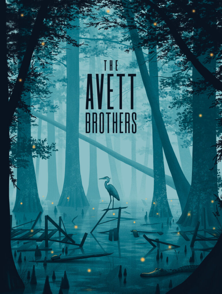
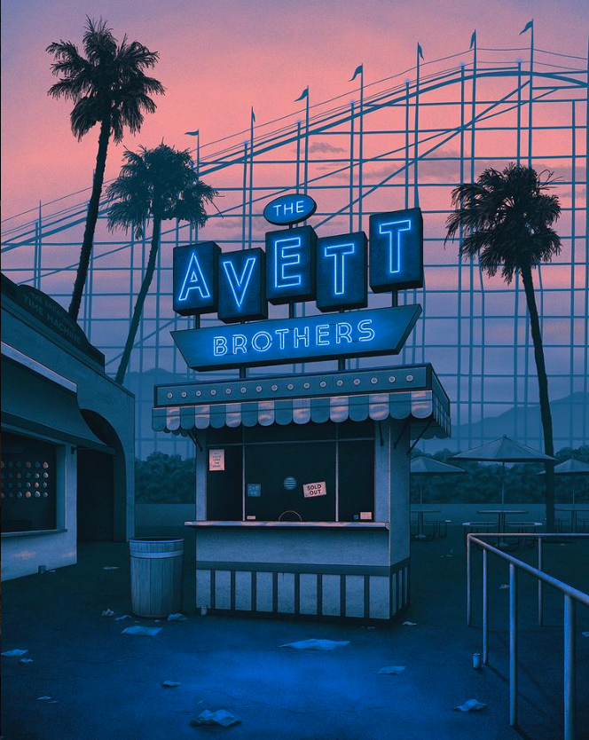
Since becoming a freelancer, Nicholas has had clients which consisted of many different companies, agencies, and other artists. His work has also been shown in galleries around the world. He also worked with “several Grammy-winning artists, multiple Fortune 500 companies, international apparel, and beverage brands” (Moegly, 2021). Fortune 500 is an annual list that ranks 500 of the largest corporations in the United States by total revenue (Fortune Editors, 2021). They are well respected companies, and he was hired multiple times to create designs for some. Some of Nicholas’ clients include well-known companies such as Columbia Records, Blue Moon Brewing Co., Publix, Smithsonian Magazine, and more. He has even created work for other artists such as Dave Matthews Band, The Avett Brothers, Grateful Dead, Ray LaMontagne, and others (Moegly, 2020). His career used to primarily consist of creating gig or tour posters for larger bands, “but in early 2020 when concerts were all cancelled, so was all of my [his] work. With nothing else to do, I [he] began taking nightly walks around my [his] town and the inspiration for my [his] current work was found” (Ebert, 2021).


Nicholas’ journey of becoming a designer and illustrator is both inspiring and appealing because he made something of himself through experience and practice. He was able to create his own brand and style that he is well-known for today. Being that he has many interesting clients, it gives a great sense of how popular and well-known his work has become to many people. It also goes to show how many people have trusted that his work would live up to its great reputation of being successful for showcasing their company, music, or even a message about something their company stands for. The random photography he finds on the internet is truly what inspired his work most and when you look at his work, they look like literal photography. One of his favorite pieces is called “A Buried Endeavor” he did in the summer of 2019 (Instagram).

Today, Nicholas Moegly continues to create new designs for Moegly Design, becoming more and more known for his style of creating mood. In 2019, Goldleaf, a company that wishes to address the myths and misconceptions of cannabis by pairing design with the latest peer-reviewed research, once had an interview with Nicholas. In that interview, Nicholas stated that although he does not use cannabis himself, his favorite aspect about collaborating with them was being able to showcase the beauty of nature because there is so much natural beauty in this world, and he felt that is becoming more forgotten (Colasuonno, 2019). Nicholas is a great example of how fulfilling it is to be a designer because he gets to design work that is inspired by his interests while having fun doing it. His work is in galleries and is known around the world, which is a great success in his career as a designer and illustrator. He worked hard for his career and ended up being able to freelance successfully, a dream many artists desire to achieve in life. Most importantly, he enjoys creating the work he does because he loves it and will always be able to put his well-known mood-setting style into it. Every artist has a dream whether it’s becoming a freelancer, sending out a message to the world, or having their work in a gallery, but to achieve those things means one may need to practice and gain a lot of experience in the type of work they want to do. Nicholas has even gone on to doing movie posters in today’s work. Moegly Design has been around for over 12 years, and with the achievements and publicity Nicholas has gained from his clients and work, it may be around for a long time.
Works Cited
Colasuonno, Alfonso. “Artist Profile: An Interview with Artist Nicholas Moegly | Goldleaf.” Goldleaf, Goldleaf, 13 Nov. 2019, https://shopgoldleaf.com/blogs/newsfeed/artist-profile-interview-with-nicholas-moegly.
Ebert, Grace. “Wild Animals Occupy Suburban Nights in Nicholas Moegly’s Mysterious
Illustrations.” Colossal, 4 Nov. 2021, https://www.thisiscolossal.com/2021/11/nicholas- moegly-illustrations/.
Fortune Editors. “Fortune 500 List of Companies 2021 | Fortune.” Fortune, Fortune, 1 June 2021, https://fortune.com/fortune500/.
Moegly, Nicholas. “Freelance Graphic Designer, Lettering Artist & Illustrator » Nicholas Moegly.” Freelance Illustrator & Artist » Nicholas Moegly, 2021, http://www.nicholasmoegly.com/about/.
Moegly, Nicholas. “NICHOLAS MOEGLY | LEVY CREATIVE WELCOMES NEW ARTIST NICHOLAS MOEGLY! | Levy Creative Management | Artist Representative.” Levy Creative Management | Artist Representative, 1 Sept. 2020, https://levycreative.com/nicholas-moegly/.
“Linkedin Profile.” Linkedin, 2021, https://www.linkedin.com/in/nicholasmoegly/.
“Instagram.” Instagram, 2021, https://www.instagram.com/nicholasmoegly/.
DC COMICS BRAND LOGO
Overtime, many companies start from one original logo and eventually evolve into new, improved logos. DC Comics is a brand known for its popular superhero comic books, and later in the years, it’s movies and shows. Owned by Warner Brothers Entertainment, it was under the name of National Allied Publications in 1934, and became one of the biggest comic book compan ies in the world (Pena, 2017). The “DC” stands for Detective Comics because it was the first name for the iconic Batman series (Logos Media, 2021). Although it was founded in 1934, the first logo was created in 1940. The company didn’t change it’s name to DC Comics until 1977, but the “DC” remained in the logo from since the first one (Jung, 2020). The company had many different logo changes that resulted in ten different logos by the end of 2016. The brand itself is targeted to different audiences and they release movies rated for everyone, teens, mature teens, and adults (ratings, 2012). Companies usually have many reasons for updating their logo from time to time, and DC Comics certainly changed their logo to signify the different comic book series releases.
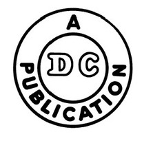
It’s first logo in 1940 was created with simplicity. It was made in black and white, with the letters DC in the middle of a circle, and “A Publication” arced around that circle, and then one more circle around everything. The strokes of both the circle and typography were thick.
The logo was so simple with no background. The “A Publication” had a typeface of a thick rounded sans serif Sebino Soft Heavy typeface, while the DC was a decorative typeface with a black outline (“WhatTheFont”). Only the “D” had a serif in its typeface. The DC was important because it stood for Detective Comics, for the first superhero, The Batman, series. About one year later, the company released a new logo considering seeing that it’s Superman comics were becoming very popular.
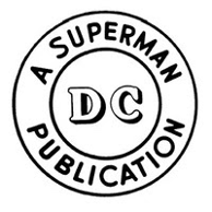
This logo had a white background, and the strokes for both circles and the typeface became thinner. The logo itself was also almost two times bigger than the first one. This time, the company added in “Superman” to the logo, which helped to acknowledge both Batman and Superman series. “A Superman Publication” remained with the same Majestic Romance typeface (“WhatTheFont”). The “DC” part also stood with the decorative typeface, with both “D” and “C” having the serifs this time. A drop shadow was also added to the back of the two letters, making the “DC” more of a 3D look. A few years later in 1949, the logo was updated again, this time with a few more changes.
This logo was designed by logo designer and lettering artist, Ira Schnapp (Ira Schnapp, 2015). It influenced future logos of this company to play more with color in its logo. The words surrounding “DC” were a rounded sans serif Angry Ronin Bold typeface (“WhatTheFont”). However, the words changed. “A Publication” was taken out, “Superman” was kept, and coming from its original name “National Allied Publications” in 1934, the words “National Comics” were added in. Two dots were added to ensure separation of the words “Superman” and “National Comics” also creating a nice symmetrical look. The separation was not enough though as it seems they wanted to make the “Superman” and “DC” pop more by turning both typefaces to a red font color. This time DC’s typeface was a solid red filled in Laquile serif. This one no longer had a drop shadow. About twenty-one years later, DC Comics released its new logo with a lot more updates and color.
In 1970, the new logo was released, acknowledging each DC lead hero the comic book focused on. The logo had the words “DC” and the character name in a yellow filled rectangle with a black border. “DC”’s typeface became what looks to be a Morgan Ps Bold typeface (“WhatTheFont”). The lead hero’s name, in this logo it is Superman, had the same rounded sans serif Majestic Romance typeface that was used in the logos that came before it (“WhatTheFont”). The lead hero was drawn above in an emblem to represent the comic book’s main hero of that series. This logo added in two new colors of yellow and blue, in addition to the already added color of red from the one before it. Two years later, DC Comics released an exclusive logo that was only printed on their special 100-page printed comics issued from 1972-1974.
The geometric sans serif typeface, which still looked to be a bolder version of the decorative NYC outline typeface, was used on the DC letters (“WhatTheFont”). It had stronger angles and thicker lines. This simple logo was inspired by the old ones, continuing that circular look. It had one simple black circle surrounding the “DC” with a white background. The logo was used only for those exclusive comics released in 1972-1974. The logo that was released after this one, was inspired by its shape and centered alignment of the “DC” letters.
This logo was designed by producer of the Batman movies, Michael Uslanin 1974. He added more words to the logo but did not take away the simplicity of it. “The line of super stars” words were added in around the “DC” with a bolded red font-colored rough edged sans serif, which seemed to be inspired by the Hatari typeface (“WhatTheFont”). The “DC” stayed the same typeface; however, its font color was changed to a blue. Two red colored stars were added into the sides of “DC” which inspired later logos to include stars as well. The colors of this logo were used to make a more patriotic look. In 1976, Jenette Kahn became DC’s new publisher. She commissioned Milton Glaser, a graphic designer, to create a new logo.
This new logo was popularly referred to as the “DC Bullet” from 1977 to 2005. Its original form had only black and white as its colors. However, sometimes it varied in size and color printed on some comic books. The “DC” was rotated a few degrees creating this diagonal look. This time the typeface for the “DC” was a bit shorter in height, was colored black, outlined in white, and had another outline of black surrounded that white outline. It’s a custom made font which seemed to be inspired by NYC Outline font (“WhatTheFont”). The circles themselves also had the same white and black outlines. This logo drew inspiration from the first three logos with its original double circle designed around the “DC”. The stars were inspired from the previous logo before it, this time counting to four stars instead of just two, and all being colored white. Sometimes the logo was in a blue color, replacing all the black.

The next logo in 2005 was created by John Beatman of Brainchild Studios and DC executive Richard Bruning. It was created debuting new DC titles and was also created for the use of other media that was released such as movies like Batman Begins and Superman Returns, and TV series such as Smallville and Justice League Unlimited. This fresh new design still held the star in it, with a new typeface called Graffick Outline for the “DC” (“WhatTheFont”). They gave a sleeker and more modern look to the emblem. The decorative typeface for the “DC” had an outline of blue and was placed on an angled oval with a star at the bottom right corner. The typeface seems to be more of an italicized font rather than their regular roman font. The entire logo itself consisted of two different shades of blue. The angled oval surrounding the “DC” gave the logo a sense of motion. This logo lasted for seven years, where in 2012, a new logo was redesigned.
This new logo was created by Landor Associates, a brand consulting firm founded by Walter Landor in 1941 (“Our Story”). This new design consisted of a bold letter C in black font color behind a gradient blue letter D that is folded back to look like a page being flipped. It had a simple sans serif Gotham typeface for the “DC Comics” name right below the emblem (“WhatTheFont”). This logo drew inspiration from a page flipping as one would do when they read a comic book, creating a sense of motion in the logo. The Dark Knight Rises film was the first to use this logo, and the TV series Arrow, was the first to use it as well. This logo lasted for about four years until the newest and latest logo was redesigned in 2016.
In 2016, the company hired Pentagram, one of the most well respected design bureaus, to redesign their logo (“DC Comics”, 2021). This design revisited the old designs from the 1970s, giving a more nostalgic feel to the logo. The size of the letters DC was sized up bigger, touching the edges of the circle that surrounds it. The bold custom serif typeface was created as sharper on the outsides of the letters and rounded on the inside. It is a custom font made inspired by the Pretender font (“WhatTheFont”). The entire logo is created with one blue color, a white background, and the circle was just one simple thick line. This logo was first used when they released DC Universe: Rebirth Special #1 by Geoff Johns (Logopedia). This is the most recent logo that was created for the company, bringing back the old original style from the 1970s into the new century of 2016.
DC Comics is a great brand that shows the different logo changes throughout the years. Often companies and brand names changed their logos to create a new style, or as they release new things. DC Comics did not change their logos just for the style of it but changed them in recognition of their new released content at different times, which included comic books, TV shows and movies. These logo changes helped their audiences notice that the new content that was put out would be special. So far, it’s been 5 years since their last logo update, however with new releases of content, possibly in a few more years, we may see a new fresh logo appear. They might even continue to let their logos have that same circular feel, keeping up with the first logo they ever made.
Sources:
Jung, Michael, and Michael Jung (698 Articles Published) Michael Jung is a mild-mannered freelance writer-for-hire. “The History of the DC Comics Logo.” ScreenRant, 13 May 2020, https://screenrant.com/dc-comics-logo-history/.
Pena, Anthony. “DC Logo Design History and Evolution.” Logo Realm, 3 July 2017, https://logorealm.com/dc-logo/.
“DC Comics Logo.” 1000 Logos The Famous Brands and Company Logos in the World DC Comics Logo Comments, 7 May 2021, https://1000logos.net/dc-comics-logo.
“DC Comics.” Logopedia, https://logos.fandom.com/wiki/DC_Comics.
“Ira Schnapp Lettering Exhibition at the TDC! – the Type Directors Club.” Archive, 30 June 2015, https://archive.tdc.org/news/ira-schnapp-lettering-exhibition-at-the-tdc/.
Logos, Media. “DC Comics Logo.” Logos World, 12 Aug. 2021, https://logos-world.net/dc-comics-logo/.
“Extraordinary brand transformation, by design.” Landor, https://landor.com/about.
“Ratings.” DC, 20 Aug. 2012, https://www.dccomics.com/ratings.
“WhatTheFont.” Whatthefont! ” Myfonts, https://www.myfonts.com/WhatTheFont/.

