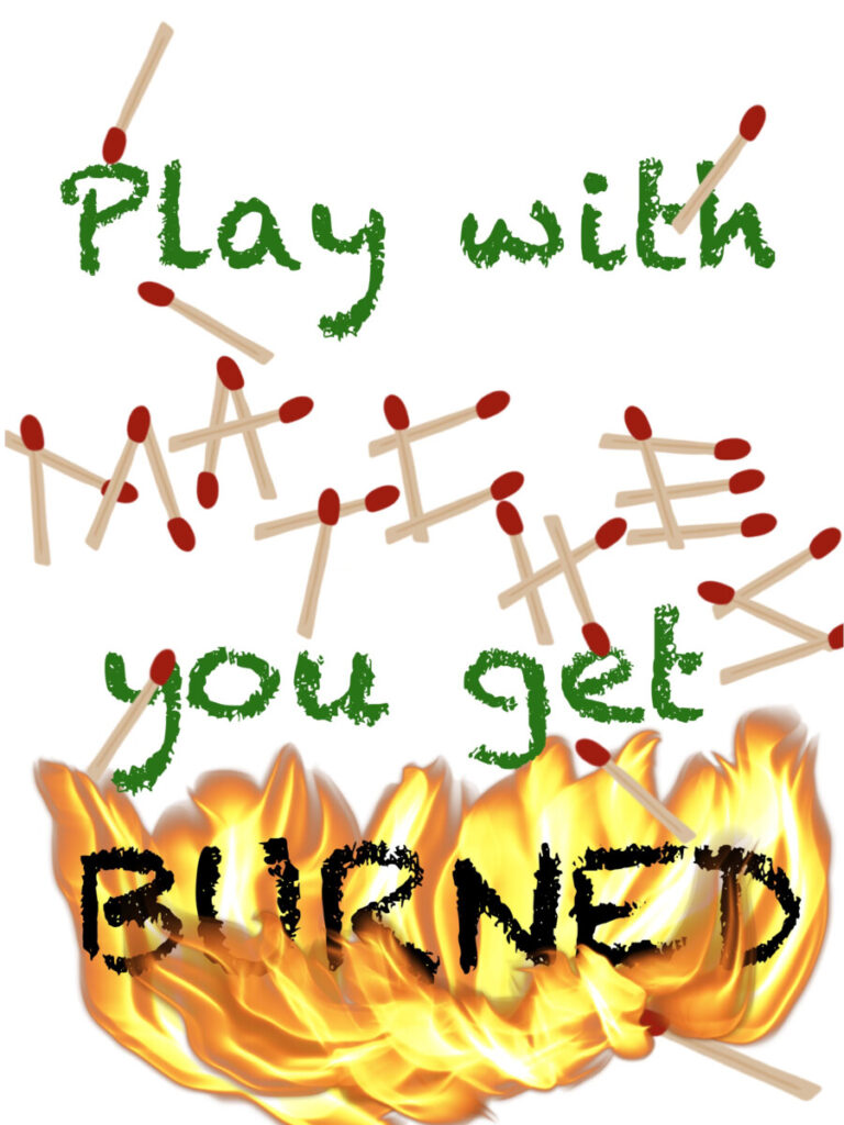
The quote I used is “Play with matches you get burned”. It’s from the movie Pulp Fiction, said by the main character, Vincent, played by John Travolta.
For the first quote, I made the word “matches” by using actual matches. I used a font that would make the rest of the words look like it was written in crayon for the other words. I did this because when I think of the word “play”, I think of kids that play, which is why I thought of crayons. I changed the font color for “burned” to black to make it seem as if the word itself was being burned.
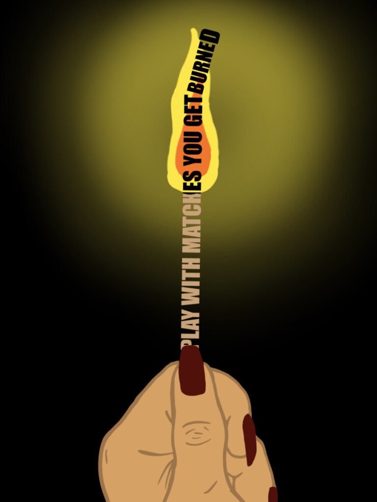
Second one, is not too different from the first. I made fire go on three of the words, as if it’s spreading. Also added some smoke in the middle while making the words at the top look like it could possibly be a font from like a button that says “play”.
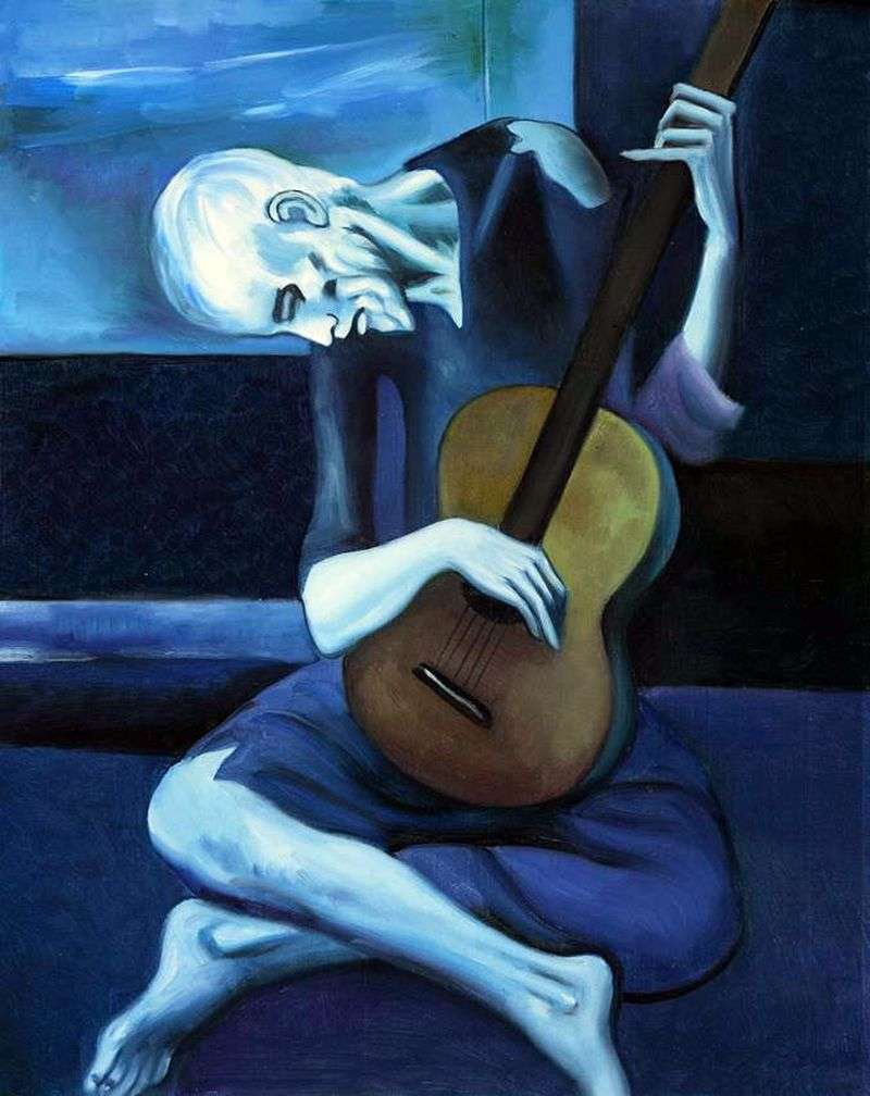
And this third one is by far my favorite so I saved it for last. I wanted to make it look like a person was holding a burning match. You know how the tip of the match starts to kinda fall to the side when it burns? I tried to do that with the word “burned” and made the ‘D’ a little bit bigger to make it seem like the tip of the match. I made the background black to make it look as if they were in a dark place to create a luminous light around the fire. This idea was actually inspired by a designer named Nicholas Moegly who is known for creating luminous work that makes it seem as if there is light coming from his work. I absolutely enjoyed looking through his work, and decided to create a little luminous look for my own!
Looking into the art world, you’ll find so many amazing pieces of work in many different mediums. I like to think that art brings a great peacefulness, being able to get lost into the meaning of what a piece might mean or the story it might tell. It’s hard to choose favorites, however, it came down to three that stood out the most to me from the Blue Exhibition at Nassau Museum. The three pieces I chose are by Pablo Picasso, Cao Jun, and Yves Klein. This exhibition was meant to explore the many different artists’ “blue period” and how they went about incorporating the color into their work. Blue is such a beautiful color and it is a color that can even give off an emotional feel when it comes to using it in the world of art.
The first piece I’d like to talk about is The Old Guitarist by Pablo Picasso. This was an oil painting on canvas created by Picasso in 1903. He painted this shortly after the suicide of his dear friend Carlos Casagemas, which caused a great sadness over Picasso and led to his “blue period”. I believe this piece to be a form of expressionism because of the way Picasso felt during the time he painted it. It contains different shades of blue, greys, ad white. It also had a small amount of green and browns for the guitar itself. The guitar was one main shift in color that’s very noticeable, compared to the monochromatic blues that were used overall. The painting was 4 feet by 2.9 feet in dimensions. Something people would not know just by looking at it, is that there is another painting behind it, which was discovered when the piece was x-rayed. When I read up about this, it gave me a chilling feeling of knowing there was another painting that seemed to look ghostly behind it. I chose this piece because as soon as I looked at it, I felt like this calm, but sad feeling as if I could tell that Picasso was in dark times when he painted it. Although it gave me a sad feeling to it, the piece itself is so eye catching from the bright white coming from the guitarist’s head, and the whites help create a luminous feel to the dark and somber painting.
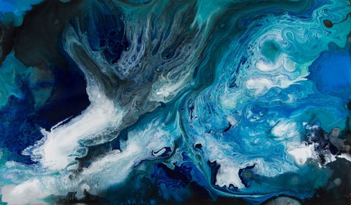
This second piece that caught my eye is Poetic Water by Cao Jun. It was made in 2013. This is a mixed media on canvas piece, which means it is composed from a combination of different media or materials by the artist. The dimensions of this piece is 2.78 feet by 4.66 feet. The piece seems to be a form of surrealism since it looks like a bird’s eye view of the ocean. Jun has done many pieces of work inspired by the waters he grew up around. This piece gives me a feeling of both flying over water, but also as if I could touch the painting and feel the water. It looks almost like photography! For a split second, I thought of a marble table top. The different blues and whites and even smidges of green really pull the painting together as if you’re staring right at the ocean. I chose this piece because although I have a huge fear of the ocean, it still gave me a nice calm feeling of the beautiful waters of our earth. The white gives a texture of foam, while the blues create a soft, smooth feeling of water moving.
The last artwork I chose is Blue Venus by Yves Klein. It was sculpted using painted plaster by him in 1961. This piece uses the one color of a vibrant blue. It’s extremely eye catching for it’s vibrancy and stands out so beautifully. The medium of this piece is sculpture and the subject is probably a visual art, representing itself in a three dimensional way. It reminds me of those old white sculptures except it’s all blue. I love this piece because the color is so eye-catching, it’s such a pretty blue and gives me an awe feeling. It’s pleasing to stare at. Standing alone like that on it’s own makes it pop from the picture, as if it were just photoshopped into the photo. I chose this piece because I don’t always come across such a beautiful blue as this one so often. I even showed my boyfriend and he had the same reaction of awe I had when I first saw it.
This difference between going to a museum and going on a virtual tour is very simple. For the virtual tour, I feel like I learned more than if I was to go in person alone. However, I enjoy seeing art pieces up close with my own eyes rather than virtually seeing it. I believe being in person is more enjoyable because you can really see the textures of the pieces rather than what the photos show on our virtual tour. But when you have a virtual tour, there is someone giving you more explanation of the pieces, rather than you interpreting it a different way. But I still find it more enjoyable to try and analyze and figure out the meaning behind pieces when I’m there on my own. This entire experience has made me feel inspired to have a period of my own where I incorporate only blues into different pieces of work.