Page 2 of 2
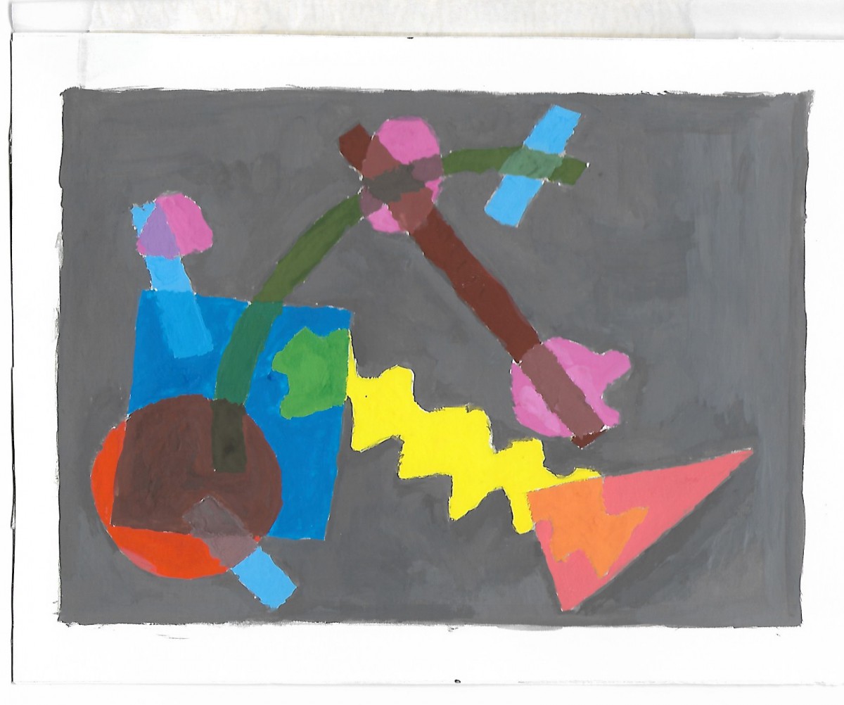
Quote Design 2
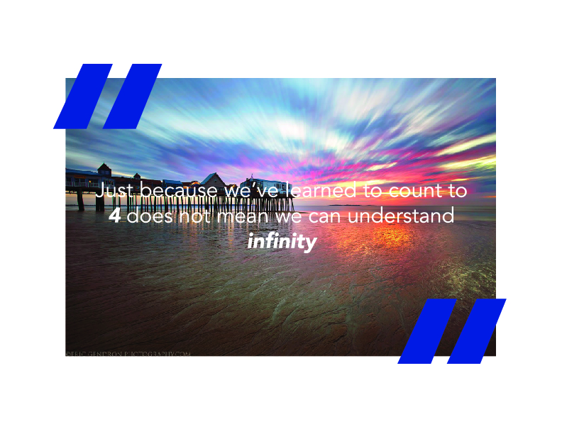
This is the second quote i chose. liked it because i read a book called “Blasphemy.” The concept of me being able to say ok “1 2 3 4” and that pattern going on forever is not the same thing as infinity. Infinity is supposed to be a concept of endlessness.
Quote Design 1

for my assignment i had to choose two quotes and design it what it means. I chose this quote because of how i could relate to it in so much depth. Getting in some type of trouble to make change and make a difference.
Bottle
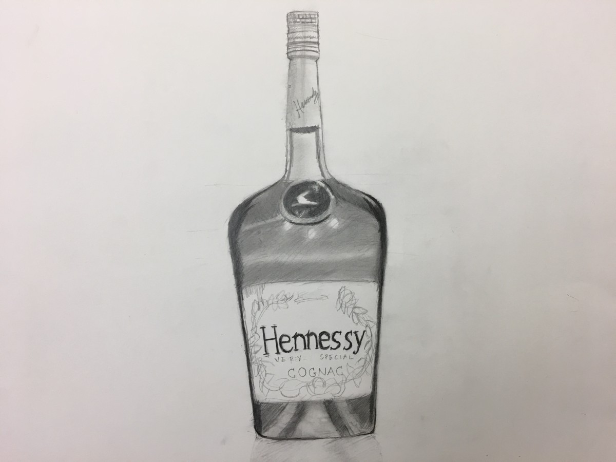
This is an assignment we had to draw which was a bottle. We had to draw it in one point perspective and using the box technique we learned in class. This was a very fun assignment and I drew in extra details on the bottle.
Ground Level
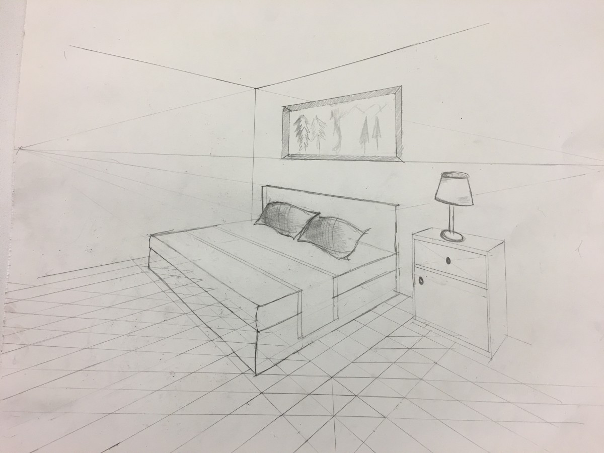
The objective of this lesson is to draw a ground level with boxes to help us place objects in a room much more easier. I found this lesson to be useful because of the placement I see when there’s an object in a room and I want too see how many boxes the object takes up.
Inside Of a Train
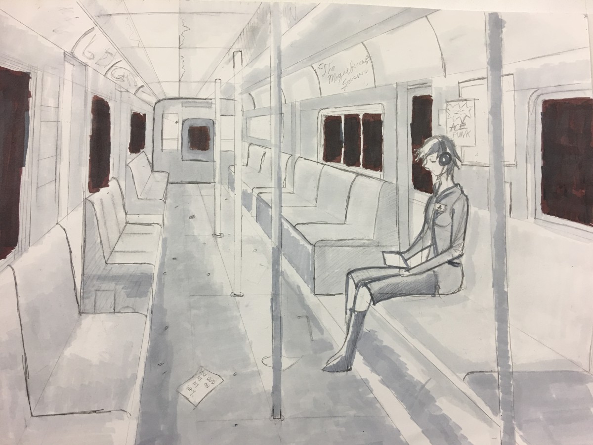
This drawing was based on the inside of a train in one-point perspective. There was an option to draw either your kitchen or a train station. I thought to do something a little different and to draw this. I liked how I use Prisma Markers to help me draw and to add details which I enjoy and to make it real. There’s a woman sitting alone in the train just listening to music and reading and wanted to add the sense of New York City in .
Transparency
I was pretty excited about this project because I never touched on the transparency topic in my days. We had to draw different shapes and choose which of the drawings had the most overlap. We later started painting and mixed both color that were overlapping with the illusion to give it that transparency look. The toughest part was creating the illusion when it can with two or more shapes overlapping. This was an interesting project and I learned a lot about transparency and will definitely do this again.
Figure/Ground/Texture
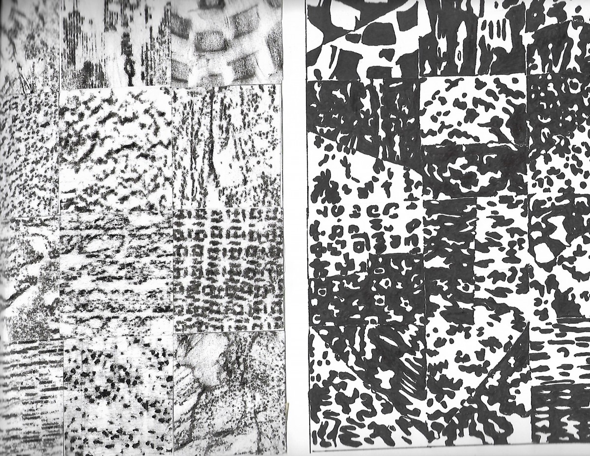
This project was the first project that had a lot of layers to deal with. We first started by finding objects that had a good texture and trace them with a black crayon. We had to choose 12 textures that had more definition and we had to do trace all of our textures to another paper and to find the positive/negative space in all of our drawings with Sharpie. This one took a little more time than expected but I enjoyed the results
Parallel Lines
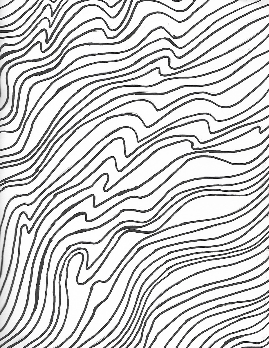
This was the first project I had to do I’m my communication design class and when the assignment was to do different parallel lines, I only thought of straight lines and didn’t imagine they can be different like wavy or arching and so forth. This was a moderate project having to do nine different parallel drawing and choosing the best out of them. From the top of the project, you can see the Lines are complex and later it ends on a smooth note.
Welcome!
This is the first post on your Learning Blog. Edit or delete it, then start blogging!
The ePortfolio is both a Learning Blog and an Academic Career Portfolio. Use the Learning Blog to document your learning experiences and class assignments each semester. As time goes by, add content to the Academics and Career sections to show your department, graduate institutions, or future employers how well prepared you are for your chosen career.
NOTE: Remember to add appropriate Categories and Tags to your posts. This will help your professors and other visitors find the content they are looking for. The Categories “Coursework” and “Field Trips” and the Tags “OpenLab” and “City Tech” have already been applied to this post. Feel free to make changes!

