Graphics and Typography
Graphics
Graphics should be used sparingly, and again, must be applied with the user in mind. Too many images, animated images, or backgrounds can make your page load extremely slow. This is due to the increase of file sizes due to numerous, complex graphics. Also, placement of graphics should be consistent throughout the site. Lastly, it is important to include alt tags within graphics for users who are visually impaired or browsers that cannot display images.
Graphics can be added using the img tag
<img src=”http://whereIhostFiles.com/images/nameOfImage.gif” alt=”Description of the image”></img>
The src attribute is the URL of the image. The alt attribute describes the image to text-only browsers.
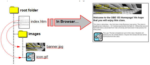
If you notice, many websites have their files contained in a folder called images. Websites are usually structured into folders. The index.html file is the index of a folder. Within that folder, could be images, or other sub sections of a site. This helps website developers organized.
Hard-coded websites contain web pages that are ready to be presented by the server are called static websites.
Dynamic websites are webpages that have content that is assembled at the time of a page is requested. Most websites that use WordPress, tumblr, or blogger are considered dynamic websites.
Hotlinking Images
You can also link images by combining the anchor tags and the image tag. For example:
<a href=”http://www.google.com”><img src=”http://nameOfImage.gif”></img></a>
This code links Google.com to the image called nameOfImage.gif.
There are two major common types of images used on the web: jpeg and gif.
The difference is the number of colors, how these images are compressed, and the file size.
As a general rule of thumb, jpegs are used for photographs and gif are used for line-art or graphics.
Typography
Typography refers to the font style that you use. There are two different kinds:
Serif and Sans-serif.
Generally speaking, sans-serif is more easily readable on a screen yet serif faces are useful for printed matter. The best way to see what’s work best is to look at the page from different systems when possible. Also, varying types can help organize information. For instance, the face used in the content of your page may be different than the content of your footer.


Leave a Reply