Navigation and Layout
Navigation
A simple navigation is best. One of the more frustrating elements of using the web is to “learn” an unfamiliar navigation system. Basically, the navigation provides information on where the user is in relation to the site or page as well as where they can go next. Here are a few tips on navigation:
- The navigation system should also be consistent and in the same place on each page of the site.
- Navigation should use easy to understand words. Could you use simplify the top-level content of your outline to language your students understand?
- The golden rule of the number of links in a navigation is 7±2, which translate to at the very least 5 links and at the very most, 9.
The two most common place for navigation is at the top of the page or to the left side of the page.
Housing Works has an excellent top navigation scheme.
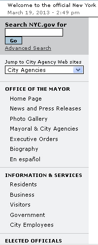
NYC.gov demonstrates a left-handed navigation scheme.
When using WordPress, navigation is dictated by which theme you are using.
Layout
An effective layout is predictable and easy to understand. Using a template supports this predictability and facilitates organization.
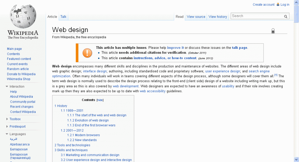
One example is Wikipedia. The pages in Wikipedia use a standard template that contains headers, titles, subheaders, image holders, footers, and styles. Since all the pages use the same uniform format, the user can easily recognize traverse the page regardless of content.
Again, the combination of the content and your users’ need will determine what the best layout is.


Leave a Reply