Unheard Colourist
If you were asked if you knew who Michiyo Yasuda was, you would have most likely answered no. If you were asked if you knew the animation films Spirited Away, My Neighbour Totoro, or even Ponyo then you would most likely have answered yes as well as may have made a connection with Studio Ghibli. Well, what is the relation between the two questions, you may ask? Michiyo Yasuda was the colourist/color designer behind these projects. Ever since Michiyo Yasuda met Hayao Miyazaki and Isao Takahata, both founders of Studio Ghibli, she’s been the colourist behind their animations. The three animated films I have mentioned are popular works known from her and they have left an impact.
Michiyo Yasuda was born in Tokyo in April of 1939. She initially started working in different companies before she landed in a company called Toei Animation (known as Toei Doga before). At Toei animation she learned about animation series, commercials and developed a skill set in color design. At one of the Toei Animation productions she met Hayao Miyazaki and Isao Takahata, who were known as legends, and jumped on board with them for a collaboration. Since then, Yasuda has been delivering variation of color palettes between films and bringing the characters to life. Working for 40 years, she has also quickly adapted to new coloring technology which has led her to produce some great staple images of the animation films such as Spirited Away and My Neighbour Totoro.
There are many animation productions not mentioned that Yasuda has been a part of working at Studio Ghibli. She has been with them since their beginning days. Figure 1 shows a still image from the animated film My Neighbour Totoro which was released in 1988.

This film is set in post-war rural Japan and follows the journey of two daughters encountering the wood spirits. This still image became an iconic representation of the film, from being on the poster to being on merchandise. In this image we can see Michiyo used dark tones for the environment and still kept the characters true to their original colors. The environment is the only thing affected by the rain. In an interview with the LA Times Yasuda states that “Color has a meaning, and it makes the film more easily understood. Colors and pictures can enhance what the situation is on screen.” From this still we can tell that this is an important scene that unifies both characters as they both hold an umbrella and even though the two little girls are well lit, the big Totoro character has a part of him coming into light. This would suggest that he is trying to be friendly while keeping one foot back in case things don’t work out. On the girl, Michiyo Yasuda chooses red and orange which are both tones to describe courage and strength. She gives Totoro dark tones of grey because he is a spirit from the woods but not an evil one.
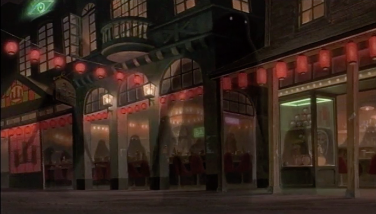
Another project Yasuda worked on is the most recognized animated film Spirited Away which won an Oscar in 2002. Her colour choices brought to life the environment in the spirit world giving it an almost surreal look and each character resembled their chosen colors throughout the film as shown in Figure 2. For example in Figure 3, the character Chihiro, when she enters the spirit world she carries the color of a light pink. Whereas the character Haku, a dragon, carries the color blue in both a human and dragon body. In her interview from LA Times she mentions that understanding the director’s vision is the first step in determining the color for the animated film and how she tries to translate the color used in the storyboards to the actual film. Her color choices bring a natural relation to the subjects/objects as they are in real life, which helps relating to the fictional world.

Michiyo Yasuda worked on Ponyo, shown in Figure 4, which was her last film before retirement. She was interviewed by the LA Times during this time and she broke down the color choice for the character Ponyo. This explanation gave us a glimpse into her creative process. She states “I just choose which color fits each character. The reason Ponyo is pink — or red — is because she’s based on a red goldfish.” So Yasuda keeps Ponyo to her true form through color. Even though Ponyo is in human form the color reddish pink is a reminder that she is in fact a goldfish. In Figure 4 you can also see the color blue being used interchangeably between other fish and the water. She states in her interview, “I chose a color that can be both the fish and the sea simultaneously.., I want to show the audience how you see or feel the color in the water.” So we can see that Yasuda believed in color being a form of expression.

No matter which project Michiyo Yasuda worked on she always had the same mission in mind which was to have the color translate from real life in the animated world. Not only to reflect reality but to also give the audience a fantasy world that they can jump on. Her choices are seen through the animated films she has worked with Hayao Miyazaki and the colors are rich and vivid without being so strong, giving off a sense of pastels. Down below are some color palettes she used seen throughout the animated films she has worked on. She would be dearly missed on future Studio Ghibli productions but those who worked closely with her know how valuable she was in bringing Miyazaki’s visions to life.
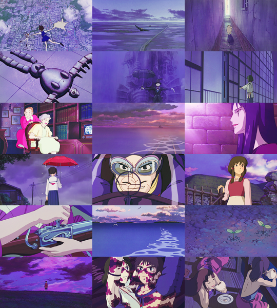
Palette: Purple 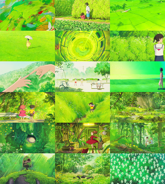
Palette: Green 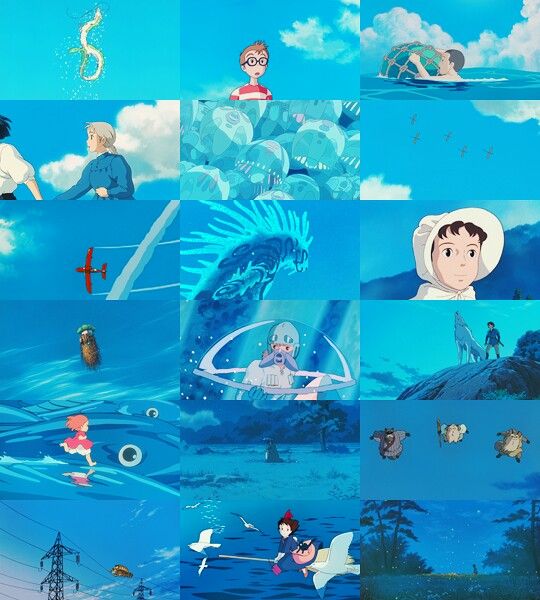
Palette: Blue 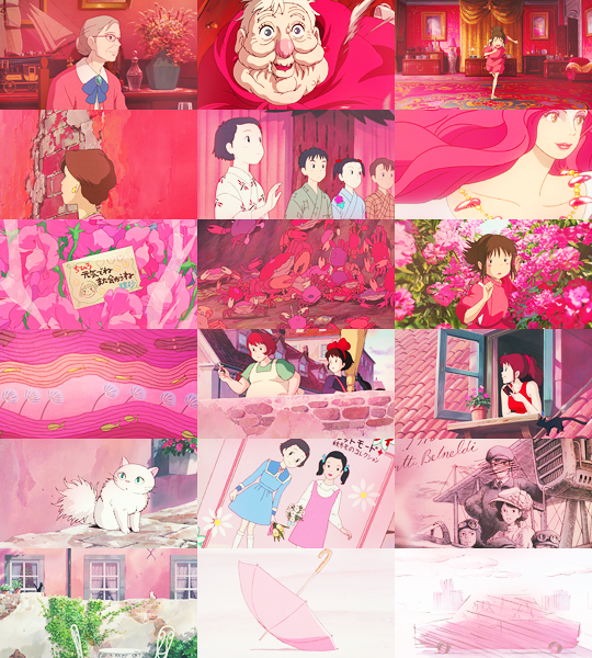
Palette: Red
Sources and citations are located on the next page.