
Author: Jessenia
Postcard

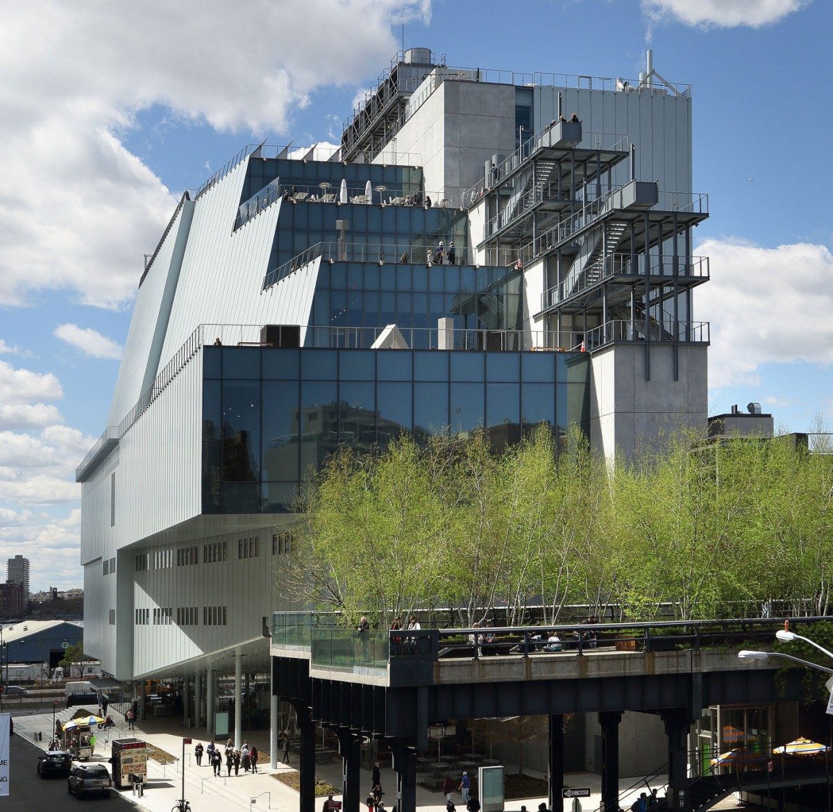
Whitney Museum of American Art
The Whitney Museum is known to be in New York City by the Highline. Being able to enjoy the view of the buildings in the Highline, seeing the Museum is even more marvelous due to its structure. The Whitney Museum is known to showcase the twentieth century, and contemporary American art primarily works from living artists. The Whitney Museum is known for collecting, preserving, interpreting, and exhibiting American art.
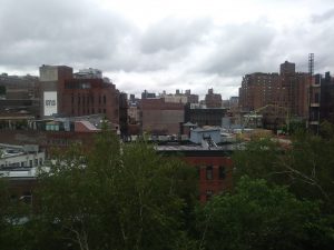
My first time attending the Whitney Museum was when I went to my class field trip on the 21st of June. I enjoy going to museums and admire artist work, as well the museum’s atmosphere and environment where is located so being able to experience this feeling again set my goals on going back and not stop my enjoyment in visiting museums.
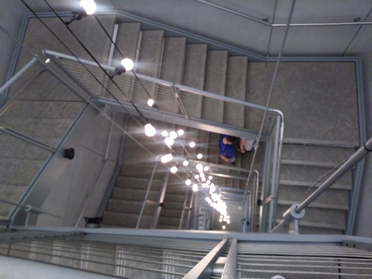
The first thing while walking in the museum and having your ticket scanned is seeing the elevators which inside seemed to be precious yet, this time I took the staircase and my oh my it was beautiful. Although lightbulbs were something simple to decorate the stairs, it still gave a warm welcoming to the visitors.


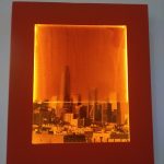
While enjoying the walk towards the 4th floor, the first thing that caught my attention was these pictures in a frame with different colors and water running in all of them. These images were done by the photographer Josh Kline who was born in 1979 in Philadelphia, PA. Looking at Kline’s work made me think of a city underwater, and when reading his description, he describes his work as “washing the images away like bad dreams or traumatic memories” also mentioning that “the future hasn’t happened yet, It can be shaped in the present.” Reading the description helped me understand his viewpoint and be amazed at his beautiful work.
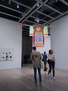
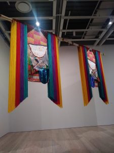
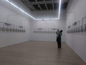
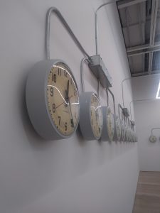
Continuing exploring the same floor, some works that caught my attention, was the work done by Jeffrey Gibson, born in Colorado Springs CO 1972, which was hanging. His work was one of the most beautiful to walk under it, carefully looking over the work I imagined it took days on finishing the final piece since it includes brass grommets, cotton thread, glass stone, tin jingles, and other materials. Then while walking further, a room was seen but plain surrounded by clocks. It may have been simple, but putting yourself in the center also makes you feel like you’re in a different dimension. Agustina Woodgate, who was born in Buenos Aires Argentine 1981, did the work.
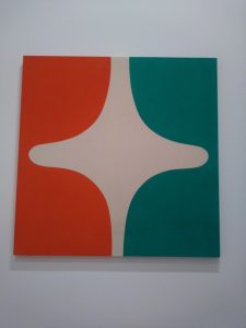
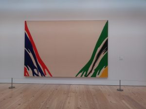
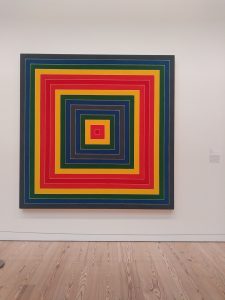
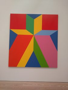
Exploring other floors, I got to encounter a fantastic section which I adore and thought of how careful all of these artists worked so hard to get an outstanding clean piece of artwork. I see these artworks as inspiration to keep trying to improve how colors work with each other as well as keep an exceptional part of work.
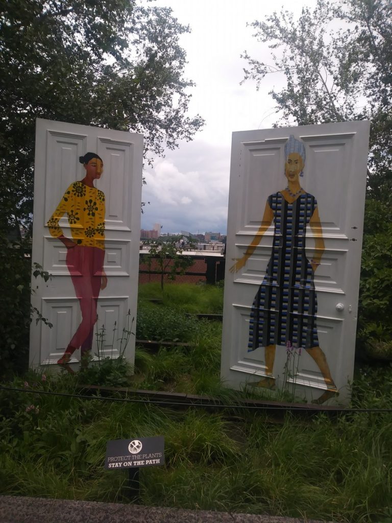
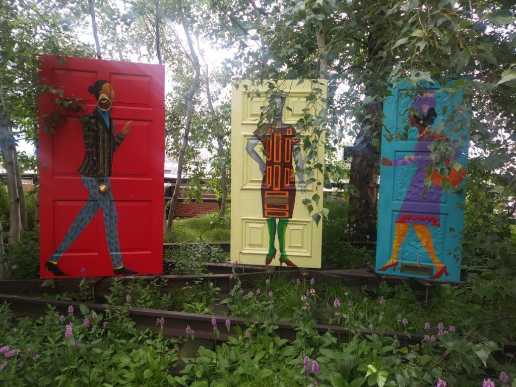
Lastly, once exiting the museum and if you were to walk towards the Highline, you get to bump into this fantastic work done in a door. In the end, it was the right way to end my class and the day from visiting the Whitney Museum.
Dove Logo
While researching for logos to research their history, I found Dove quite impressive due to Dove’s history and importance in skin care during the 1950s. Ian Brignell design Doves logo and is a famous Toronto-based lettering designer. He is known for designing many known brands such as Duracell, Burger King, and alcohol drinks like Coors Light and many more. He has impressive illustrations and other work that I recommend checking his website and see his work as inspiration.
Ian Brignell Lettering Design – Portfolio

Unilever is a global company that developed products to aid military personnel in the 1950s. They are the once to create the soap and as the soap got famous Dove was born. The actual cause for creating soaps was to give it to soldiers since they always dealt with sea water and sand exposure they needed soaps and detergents to prevent getting their skin hard and dried. Later on, the company turned the soap into a commercial product in 1957.
Dove did manage to influence the marketing but more based on advertisement as their soap was known to be used by elders. To change their target market, they launched an ad where eight women were on their underwear in which that time, there were no ads that did this type of ads. Dove also gave a voice to women, so they did be able to choose their essentials in their skin care. As Dove focused on personal attention, they introduced hair care, deodorant, shower gels, and skin care products.

The Dove logo represents joy and prosperity. In other words, the yellow dove emblem demonstrates love, kindness, and purity as the letter colors of “Dove” demonstrates excellence, determination, and high quality in which the product gives to the consumer. Additionally, the dove logo has not changed much since 1955- up to now only merely the change of typeface and color of the Dove.
![]()
I do not own any image, credit belongs to their rightful owner

