
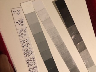
 The work progress is going not so well. I cut up the strips of work and paste into a new bristol. I still need a lot more work to be done with the boxes.
3 Companies Interest To Work For
http://www.mta.info/nyct
http://www.nyandcompany.com/
These three companies I would be interest to work for. One is a website for designers to create and make logos or to make a web page. Second one would be the Mta, which would be a good way to show a design to make the trains or buses a little better. Last one would be online shopping and store related for women and it would be a good interesting work to design a logo for their company.
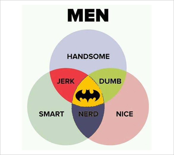
Funny Venn Diagram
Transparency Work


The first picture is very successful due to the fact that the lines are transparent to the sun. The second picture is a glass which is see through but how the design of the glass is like interest me. The third picture is transparent with almost similar colors but not too much. Theres two different types of yellow in the picture.
Visual Hierarchy

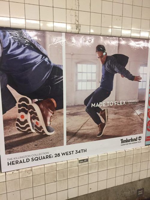

For the first picture the visual hierarchy would be, “coke cola”, then it would be the glass bottle, then it would the words to the left of it. The second picture would be the shoes on the left then the guy on right, then the phrase “made to flex”. Last picture would be “murder on the orient express”, then the cast of the movie, last the words on top of them. This all were posters in the subway.
Movement from Coroflot
http://www.coroflot.com/skylargremel#specialties=51
http://www.coroflot.com/adriennedeluca#specialties=60,14,51
http://www.coroflot.com/oriolvidal#specialties=60,14,51
These three people shown in their artwork movement which really intrigued the way they shown it. Each may look like an drawing or art without movement but you are able to look at the artwork and picture the movement towards it. Not only the art work but the way lighting and shading was place so you are able to picture it carefully.
Design Student Artwork Interest
http://www.coroflot.com/richardkneale#specialties=57
I chose this student artwork because he is more involved in the game designs, he is able to create a 3D module with dark colors. I searched from the website coroflot.com and I looked game design and his artwork is what caught my interest the most.
Copper Hewitt Collection Post
https://collection.cooperhewitt.org/objects/18633987/
https://collection.cooperhewitt.org/objects/18471033/with-palette-css4/
https://collection.cooperhewitt.org/objects/18490249/with-palette-css4/


The contrast with these artwork is that it shows light and dark. As you can see there is bright hot pink color in all three of these artwork and they pop out. The reason they pop out is because the dark colors around it makes sure it blend in with the background. In the other hand, the first art with the leopard is a dark color of pink while all around is bright which still help it to pop out.
Texture Pictures

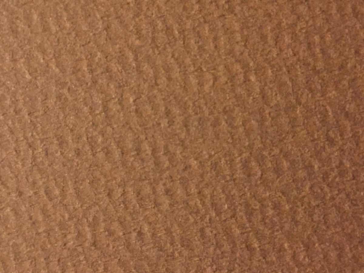
I would use the third texture because it seems interesting to create a project to show others.
Perks
One of the best perks that I can think of is free membership to New York Times. It’s amazing how we get to have a membership for something because of college and cuny students.

