Logo Research Paper
Throughout our past few decades of humans being able to use technology, we have encountered certain search engines that somehow helped us. But when I think about going on the web and trying to get to a website, I would always come to Google for my main source of searching on the web and I am almost sure it is for a lot of people too. At this point in time, we are very far ahead with technology and alot of people own a phone, or laptop, or any device that concludes a browser. Looking at the Google logo itself though, and as any other thing that is published to the world throughout the few decades that humans had technology and google, it has changed quite a bit from when it was first branded and being used. Even the generic red, yellow, green, and blue was changed as google was progressing.

Sergey Brin in 1998.
In 1988, Sergey Brin published the first google logo to the public with colors varying from blue, red, yellow, and green. The logo itself was very simple but very colorful so it stood out no matter what. “Some sources say that Brin designed it with a free image editor called GIMP” stated in the article “The Secret History of the Google Logo” by Aja Frost. Also, another article titled “Google logo And its History” states “ The google logo is probably one of the most recognized logos in the world”. As Google progressed through the years, they were able to pull off a colorful but simple logo that is surely now a reconizeable logo for millions of people as stated.There is also another thing you can noticed with the first logo compare to other google logos is that this logo has a exclamation point, having there work inspired of yahoo, with their logo. The logo began to make changes throughout its time.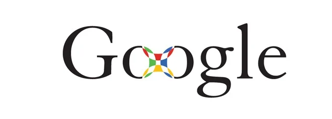
Showing that first design compared to this prototype is very different visually. Throughout 1999-2010 there were similar designs to this and the reason for that was because Ruth Kedar, a Stanford assistant principal, created a few prototypes.


Kedar got really playful using color and the logos typeface to make adjustments.She began interlocking those Os and those Os basis for every search engine out there. Also you can notice that these were more playful and less serious rather than the first Google logo was published or compared to today’s logo with a more professional look.
But in 2010, Google created their first official logo, updating their logo by changing their “o” from yellow to orange and removing the dropshadow.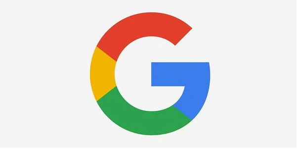
Google came a long way from its first logo piece to what it is today.From its colors, to its natural typefaces, or just being one of the best search engines to date. If you see that “G” that was posted this was used for many apps and certainly used on google website for the rest of the time being.
In the article “The Secret History of The Google Logo” it states “Catull – the former typeface — has serifs, the small lines that embellish the main vertical and horizontal strokes of some letters”. As known, Google loves to play around with their typefaces. Product Sans was a serif typeface so it was really easy for google to manipulate or alter the logo with different sizes. Google managed in 2015 to make the logo look still fun and unthreatening to try and welcome everyone that wants to use Google’s software. And that’s why Google is so big today, with their evolution of logos in the picture.

