![]()
AMC stands for American Movie Classics. AMC was originally known, debuted on October 1, 1984 with the above logo as a premium channel. Its original format focused on classical movies, largely those made prior to the 50s. These usually aired during the afternoon and early evening hours in a commercial-free, generally unedited, uncut and uncolorized format. AMC was originally operated as a joint venture between Rainbow Media and cable television provider Tele-Communications Inc. This style of logo is very basic and follows the design of the time to follow their programming. The type is of that era and used in many of the advertisments of that time. This logo was used from 1984- 1989.
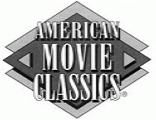
From late 1989 to 1995, AMC used a logo with one filled diamond (for use in the acronym-only version of the logo) or two filled diamonds stacked over one another used in the logo with the channel’s full name at the time “American Movie Classics. At this time the company began broadcasting on a 24 hour schedule. The company was now focusing on “lost” movie and would broadcast a specific director or actor all day.
1995-1998

1998-2002
2002-2007
![]()
2007-2013
![]()
2013-present![]()
This current logo represents the switch the channel went through from movies to original programming. The logo now contains three lower case letters inside a filled rectangle with a gradient. The type is basic times roman bold all black.
Sources:
https://en.wikipedia.org/wiki/File:AMC_logo_2013.png
http://logos.wikia.com/wiki/
Nellie Andreeve. “AMC Introduces New Look, Logo & tagline”. Deadline.com. April 1st, 2013 8:29. http://deadline.com/2013/04/amc-introduces-new-look-logo-tagline-464756/

