Category Archives: Uncategorized

Email Blasts.

Working on the email blasts, was an amazing experience why because I was working with a template. But the difference was that I added a certain detail that they all added towards all their designs. That box, that box is supposed to give the designs a fashionable flair but also a cohesive adjustable design that they can use online and off. They believe that this box would be the answer to all of their problems, which are contents that are too long for circular or odd shaped designs.

When I approached the designers at the meeting with a design that the art director and I have come up with, they were happy to see that there was something different and unique that they didn’t have in their current templates.  When the meeting was to be over they had another project that they needed to be accomplished, the creative director thought that it would be a good idea to assign me to a project that would be soon due and shown to the higher ups.

Email_Templates


Meetings.

I’ve gone through so many meetings that I as an intern feel even important having to walk in with everyone else. The current meeting we had was a small one, It was with the marketing department well with one individual in that department, she wanted my supervisor to create a splash banner for a sale that is coming up with a timer. My supervisor felt that I was able to handle this task, since she has seen me work rather quickly on small items that were on the list for the big thursday meeting. That same day I was at another meeting 30 mins after the first one, all the creatives had to show their progress and any changes they made to certain contents, I as well had certain parts to present, promo samples (basically tags) on how they would look on different models. The creative director was impressed that all the designers were in the same design mentality on placing boxes in the design, the creative director chosen two of the designs to present on the big thursday meeting each with different style but showing continuity. While at the same meeting I’ve noticed that I have been sitting between the art director and creative director and my supervisor intentionally does that, don’t know why, maybe to let the creative director see me as one of them. Besides that in the meeting she began to talk towards any other designs and how the head honchos wanted to bring back gift cards, all this while I was writing notes, she spoke out and said “ I don’t know why I’m looking at jen, but jen can you do these gift card designs” and of course I agreed. 

tag1 tag2

Fullbeauty?

I have gotten accepted to the company FullBeauty, the most trusted comprehensive resource for plus-size women and men seeking fashion inspiration, style advice, and clothing tailored to their individual needs. They have over 100 or so employees working with them over different sections of the company, the fullbeauty brand has extended its branches from NYC to Texas, they work to have the best customer services available but also be the most trusted fashion icon for plus size individuals. The company is public company that is dedicated to eccommerce and also fashion, they had many names before they began to know themselves as fullbeauty.

The company has various typed of clienteles but they are mainly dedicated to plus size individuals that want to look good but also feel good. The customers are individuals with various fashion sense who want to be independent from the ideal that even if you are a plus size you can not find anything to wear, thats why fullbeauty is dedicated to show and empower such individuals to cherish and love their curves even though they are not a size 6.

The section of the company that I would be working under would be the creative team, under the supervison of karen the art director. My title at the company is creative web intern meaning that I would be working mostly on web items rather than print, even though I’m a graphic designer I can still manage to work with the web, both mediums come in hand in hand and I’m still utilizing what I have learned through out the years at city tech.

An online article http://www.bustle.com/articles/132053-this-holiday-clothing-ad-from-full-beauty-is-ridiculously-body-positive-video

Gave a positive out reach towards how fullbeauty used #ownyourcurves campaign to bring body positivity, this video was seen by many and were applaud with the amount of effort showing that having curves should not stop you from being fashionable.


3D printer launched into space..

Reading the article based off 3D printing, it seems pretty amazing that our scientists are thinking beyond just sending things to space, but what would be helpful for everyone who is willing to go up to space. With 3D printing in space it is basically less expensive since the astronauts would be able to print the tools or parts they would be needing rather than wasting fuel to go back and forth.

Starbucks (researched logo)


Starbucks is my selected company. From the research that was conducted Starbucks was and still is one of the most popular and recognizable logos in history, while also being recognizable it also has won prestigious awards. Around 1971 the logo was based of a century Norse wood cut, it had designed a circular ring that surrounded a mythical two-tailed mermaid figure. At this time the color pallet of the Starbucks coffee logo was a mere brown to represent the coffee grains and at that time of 1971 the logo had the mermaid showing her bare breasts. In 1987 Starbucks was under new management of Howard Schultz, with a new corporate in charge they agreed to cover Starbucks mermaid breast with her long flowing hair, with also with that change they also changed the brown to green to imply growth, freshness, uniqueness, and prosperity. In 1992 the logo went thru another change, which was introducing a close up of the mermaid making sure her naval disappeared. Around 2011 there was another change that became a controversy in which many designers and consumers have disapproved of which was a wordless logo and enlarging the mermaid yet again.


In the details of which was written above towards the subject of change on the logo and color it can be seen that a logo is never the same over time and it can be seen the many designers have had different ideas. In the 1971 logo the designer name was Terry Heckler of heckler associates logo was based from a classic 15th century Norse woodcut of the mythical siren. Each modification of the logo has been made from the same company. The mermaid was changed over and over again for the risk of her offending anyone and making it easier on branding purposes as well as can see from the details that she carries. Terry heckler is only known for his drawn logos, so after the Starbucks logo he has not stopped drawing and has become well known for his craft. Besides the design of the logo and color it should be said why was the type chosen for that product, the type chosen Freight Sans Black (Garage Fonts) gives the brand a sense of empowerment and appealing to the public.

Untitled

Sources:

http://famouslogos.net/starbucks-logo/

http://www.logoblog.org/starbuck_logo.php

http://www.answers.com/Q/What_font_does_Starbucks_use


Assignment #1 (responses)

Graphic Designers from the United States department of labor occupational handbook 2010-2011 editions.

What was read from the informative handbook were the median pay, what graphic designers do, work environment, how to become a graphic designer, job outlook and much more. By reading upon each section I learned much more on my duties as a graphic designer and also having a clearer and broader idea towards what I’m getting myself into before going into the field. It is emphasized that when perusing to become a graphic designer it is important to receive your bachelor’s degree because it is required in most work areas. Advancements In graphic design are when designers have 1-3 year’s experiences before they can advance to any higher position, also it has also shown the important qualities that each graphic designer must have. The handbook also shows us that in the field in graphic design there is competition amongst designers. Besides being a graphic designer there are similar jobs out there that have the same qualities as graphic designers.


 New York Times article “ Super bowl logo reflects N.F.L’s growth and design trends” from January 28th 2009

The article has been written to inform the readers unto why the logos of the super bowl were changed. The logos were of Greek numerology and in which would have large letters “super bowl” big and bold. The concerns were based on the construction of the numerology and the fact that it wouldn’t look well on branding merchandise, they decide to create a new logo in which was patriotic and memorable and easy for branding purposes.


“ who made those nasa logos?” New York Times august 3, 2011

Beginning of the article NASA was searching for a logo redesign that will revive their image. NASA heavenly used their 1959 logo in all their merchandising and were very attached to that image. Since they wanted to create, re-image themselves a designer decided to remove all details and just used the letters refining them to look minimalistic.


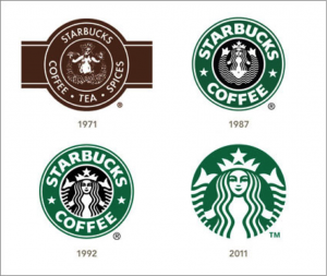
“ company logos aim for personal touch”, New York Times June 13,2011

The article describes how company logos came to be. They gave examples of the companies thoughts and ideas. The writer explained how from those era’s those logos looked powerful to the person but in this era those logos look bland. Some companies have left their initial mark from their time like Kellogg’s and Coca-Cola in which have become powerful icons, but at the same time other companies have dropped their signature logo to something more abstract, since “handwritten” fonts not only look old-fashioned, but they lacked clarity of the individual letters in modernist-style logos like those I.B.M and American Airlines.


 Before and after magazine “creating logos from letters

From reading and analyzing this PDF I’ve learned a lot that I have not learned in previous design courses that I have taken. The many ways you’re able to shape the letters, also the way your able to place together the letters to create this beautiful form made me realize not all logos have to be made from icons or actual shapes they can be made from actual letters that intertwine well with each other.


“Color in Design awards 2011

From the view of the article the competitors have chosen fairly wonderful colors that have made the product more appealing to the public. The competitors have chose colors that balance the view of the product, which also would be appealing to the consumer. With the various font style added to these products you can view how specific they were, and how precise they were looking for the correct typography style that will balance and complete the designs. These designers were very careful and detail oriented with their designs, even though these designs were minimal you can sense the hard work and dedication they have added to the products also how much research they have done on the company and it’s product and whom it would be shipped out.