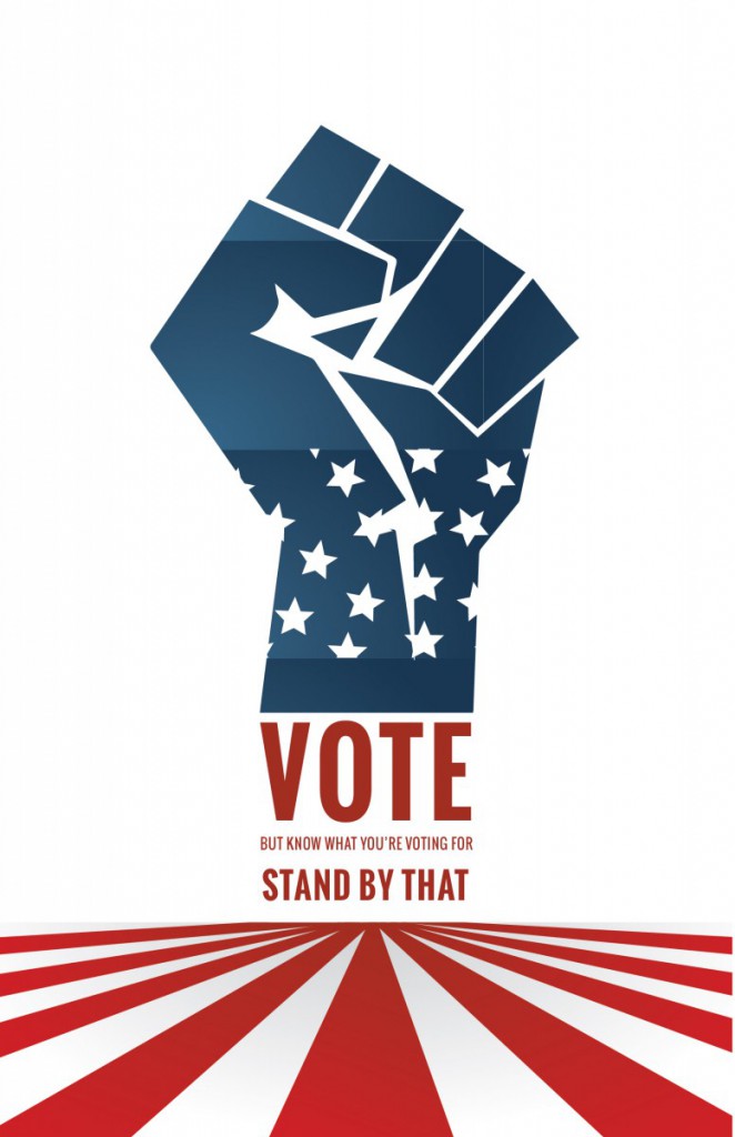
This “Effective Behavior Poster” was design to persuade the youth of today to take a stand and vote.
This “Effective Behavior Poster” was design to persuade the youth of today to take a stand and vote.
Reading the article based off 3D printing, it seems pretty amazing that our scientists are thinking beyond just sending things to space, but what would be helpful for everyone who is willing to go up to space. With 3D printing in space it is basically less expensive since the astronauts would be able to print the tools or parts they would be needing rather than wasting fuel to go back and forth.
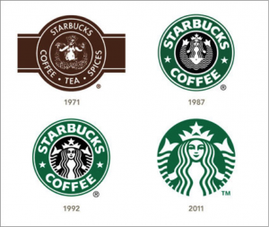
Starbucks is my selected company. From the research that was conducted Starbucks was and still is one of the most popular and recognizable logos in history, while also being recognizable it also has won prestigious awards. Around 1971 the logo was based of a century Norse wood cut, it had designed a circular ring that surrounded a mythical two-tailed mermaid figure. At this time the color pallet of the Starbucks coffee logo was a mere brown to represent the coffee grains and at that time of 1971 the logo had the mermaid showing her bare breasts. In 1987 Starbucks was under new management of Howard Schultz, with a new corporate in charge they agreed to cover Starbucks mermaid breast with her long flowing hair, with also with that change they also changed the brown to green to imply growth, freshness, uniqueness, and prosperity. In 1992 the logo went thru another change, which was introducing a close up of the mermaid making sure her naval disappeared. Around 2011 there was another change that became a controversy in which many designers and consumers have disapproved of which was a wordless logo and enlarging the mermaid yet again.
In the details of which was written above towards the subject of change on the logo and color it can be seen that a logo is never the same over time and it can be seen the many designers have had different ideas. In the 1971 logo the designer name was Terry Heckler of heckler associates logo was based from a classic 15th century Norse woodcut of the mythical siren. Each modification of the logo has been made from the same company. The mermaid was changed over and over again for the risk of her offending anyone and making it easier on branding purposes as well as can see from the details that she carries. Terry heckler is only known for his drawn logos, so after the Starbucks logo he has not stopped drawing and has become well known for his craft. Besides the design of the logo and color it should be said why was the type chosen for that product, the type chosen Freight Sans Black (Garage Fonts) gives the brand a sense of empowerment and appealing to the public.
Sources:
http://famouslogos.net/starbucks-logo/
http://www.logoblog.org/starbuck_logo.php
http://www.answers.com/Q/What_font_does_Starbucks_use
Graphic Designers from the United States department of labor occupational handbook 2010-2011 editions.
What was read from the informative handbook were the median pay, what graphic designers do, work environment, how to become a graphic designer, job outlook and much more. By reading upon each section I learned much more on my duties as a graphic designer and also having a clearer and broader idea towards what I’m getting myself into before going into the field. It is emphasized that when perusing to become a graphic designer it is important to receive your bachelor’s degree because it is required in most work areas. Advancements In graphic design are when designers have 1-3 year’s experiences before they can advance to any higher position, also it has also shown the important qualities that each graphic designer must have. The handbook also shows us that in the field in graphic design there is competition amongst designers. Besides being a graphic designer there are similar jobs out there that have the same qualities as graphic designers.
New York Times article “ Super bowl logo reflects N.F.L’s growth and design trends” from January 28th 2009
The article has been written to inform the readers unto why the logos of the super bowl were changed. The logos were of Greek numerology and in which would have large letters “super bowl” big and bold. The concerns were based on the construction of the numerology and the fact that it wouldn’t look well on branding merchandise, they decide to create a new logo in which was patriotic and memorable and easy for branding purposes.
“ who made those nasa logos?” New York Times august 3, 2011
Beginning of the article NASA was searching for a logo redesign that will revive their image. NASA heavenly used their 1959 logo in all their merchandising and were very attached to that image. Since they wanted to create, re-image themselves a designer decided to remove all details and just used the letters refining them to look minimalistic.
“ company logos aim for personal touch”, New York Times June 13,2011
The article describes how company logos came to be. They gave examples of the companies thoughts and ideas. The writer explained how from those era’s those logos looked powerful to the person but in this era those logos look bland. Some companies have left their initial mark from their time like Kellogg’s and Coca-Cola in which have become powerful icons, but at the same time other companies have dropped their signature logo to something more abstract, since “handwritten” fonts not only look old-fashioned, but they lacked clarity of the individual letters in modernist-style logos like those I.B.M and American Airlines.
Before and after magazine “creating logos from letters
From reading and analyzing this PDF I’ve learned a lot that I have not learned in previous design courses that I have taken. The many ways you’re able to shape the letters, also the way your able to place together the letters to create this beautiful form made me realize not all logos have to be made from icons or actual shapes they can be made from actual letters that intertwine well with each other.
“Color in Design awards 2011
From the view of the article the competitors have chosen fairly wonderful colors that have made the product more appealing to the public. The competitors have chose colors that balance the view of the product, which also would be appealing to the consumer. With the various font style added to these products you can view how specific they were, and how precise they were looking for the correct typography style that will balance and complete the designs. These designers were very careful and detail oriented with their designs, even though these designs were minimal you can sense the hard work and dedication they have added to the products also how much research they have done on the company and it’s product and whom it would be shipped out.
![]()
The rational reason behind the design concept for my logo was the pattern effect that I wanted to give it. Decided to attach two letters J’s because my first and last name start with the letter J giving this design a personal effect. This logo has been used in most of my professional work; I have gone thru more than 10 logos to find the perfect one and this logo represents me very well. This logo shows the way I work and the style I work with which is minimalism.
The OpenLab is an open-source, digital platform designed to support teaching and learning at City Tech (New York City College of Technology), and to promote student and faculty engagement in the intellectual and social life of the college community.

