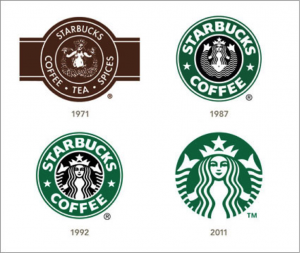
Starbucks is my selected company. From the research that was conducted Starbucks was and still is one of the most popular and recognizable logos in history, while also being recognizable it also has won prestigious awards. Around 1971 the logo was based of a century Norse wood cut, it had designed a circular ring that surrounded a mythical two-tailed mermaid figure. At this time the color pallet of the Starbucks coffee logo was a mere brown to represent the coffee grains and at that time of 1971 the logo had the mermaid showing her bare breasts. In 1987 Starbucks was under new management of Howard Schultz, with a new corporate in charge they agreed to cover Starbucks mermaid breast with her long flowing hair, with also with that change they also changed the brown to green to imply growth, freshness, uniqueness, and prosperity. In 1992 the logo went thru another change, which was introducing a close up of the mermaid making sure her naval disappeared. Around 2011 there was another change that became a controversy in which many designers and consumers have disapproved of which was a wordless logo and enlarging the mermaid yet again.
In the details of which was written above towards the subject of change on the logo and color it can be seen that a logo is never the same over time and it can be seen the many designers have had different ideas. In the 1971 logo the designer name was Terry Heckler of heckler associates logo was based from a classic 15th century Norse woodcut of the mythical siren. Each modification of the logo has been made from the same company. The mermaid was changed over and over again for the risk of her offending anyone and making it easier on branding purposes as well as can see from the details that she carries. Terry heckler is only known for his drawn logos, so after the Starbucks logo he has not stopped drawing and has become well known for his craft. Besides the design of the logo and color it should be said why was the type chosen for that product, the type chosen Freight Sans Black (Garage Fonts) gives the brand a sense of empowerment and appealing to the public.

Sources:
http://famouslogos.net/starbucks-logo/
http://www.logoblog.org/starbuck_logo.php
http://www.answers.com/Q/What_font_does_Starbucks_use


