In this video I have provided 3 screen recorded clips on how I draw my illustrations. The fist image is a hand image I’ve drawn and the video shows how I edit my drawings to make it more vibrant and alive.
Poster (video game)
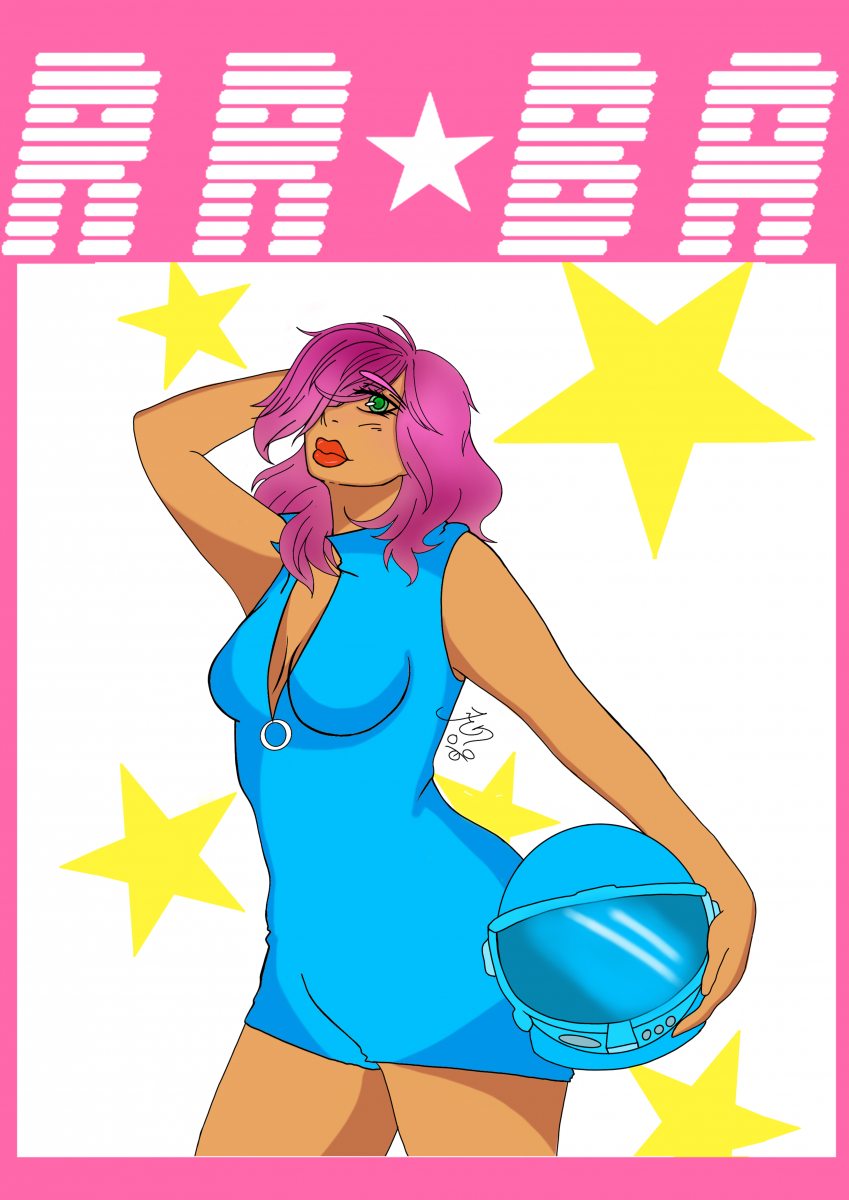 This poster is a video game I’ve created it is called, “Relay Racers Beyond the Ages”. It is a racing game starring the man character Scarlet. She is a martian human hybrid who was sent to earth after her planet was destroyed by a an invasion of their enemies, “The Quaizers”. They are an unknown species created by the last remains of the last king, who was Scarlet’s father. Now Scarlet must race against the Quaizers to protect her new home and friends.
Designer Research paper
Jasmyne, Perez
City Tech College
Fall 2019
Professor: Thelma Bauer
Research Paper
April Greiman Research Paper
Throughout history there have been many great graphic artists. However none of them could compare to April Greiman and her brilliant ideas. April is an influential contemporary American graphic designer. She was considered one of the first designers to see computer art from a different perspective. Her most popular works include the ‘New Wave’ design in the U.S. and “Made in Space” in Los Angeles.
New wave Design Made in space design
April was born on September 10, 1948. She grew up in New York City from 1966 to 1970. She attended Kansas City Art Institute during her undergraduate studies and graphic design. April greiman states that her work was so new and so unthought of that it was “freeing”. There wasn’t an aesthetic for what she had created, so it was very revolutionary. April says she “stopped being a graphic designer during the year 1984”. Greiman was so infatuated with the texture of technology that she started creating intangible art.
April was the first to manipulate computers to create art the way she saw it. “She made use of pixelation and other digitization “errors” as integral parts of digital art. She has been exploring and spreading the idea of involving advanced technology in the arts and design process. The California Institute of the Arts appointed her the head of the design department, in 1981.” April opened a new world in the art community with the help of a computer.
April then had purchased a macintosh and was given “Mac World’s First Macintosh Masters in Art Competition”. In 1986, she published, it was notable for its development of graphic design, Design Quarterly. The Walker Art Center published her edition, titled Does it Make Sense. She owns a desert spa retreat, It represents the three-dimensional design of space in natural landscapes which her recent works are based on. The image below shows what would have been revolutionary work if the internet existed during this time.
In conclusion April Grieman was a revolutionary artist who opened a new world with the macintosh. She brought a new light to the art industry with the designs she created. Currently, April Greiman is appointed at Woodbury University, School of Architecture as an art instructor. She also teaches at the Southern California Institute of Architecture.
Quote_01
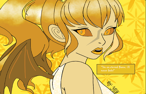
I created the quote is “I’m an eternal flame I’ll never fade”. The reason why I came up with this quote is for personal reasons. It’s to encourage me and to tell me to never give up my passion.” The flame” resonates with my soul, my existence. The word flame shows my energetic and caring heart. The “I’ll never fade” part shows my perseverance how strong I am and how I should never settle for less and I should continue to keep up with my dreams. The way my quote is structured is with an illustration I’ve created the colors are yellows and oranges. The yellow flame while being the least hottest flame, does holds its place as an illustration in the quote. This signifies the “I am an eternal flame”. Yellow is a bright color and it is color that stands out than most. The meaning for the color yellow in this one is to show my bright and joy child like nature and how it reflects on other beings who associate with me. My art style which is anime and comic type style. The reason why I set up this way is to show my creative side to show what I can create and if I continue with my passion what more I can achieve.
Quote_03
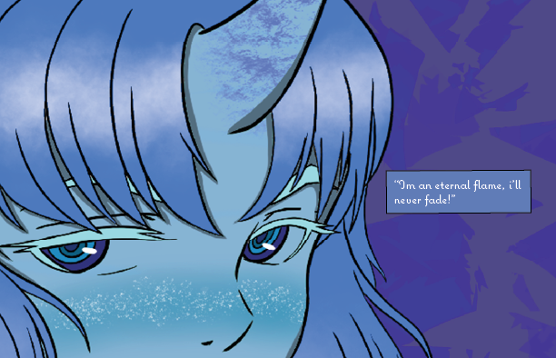
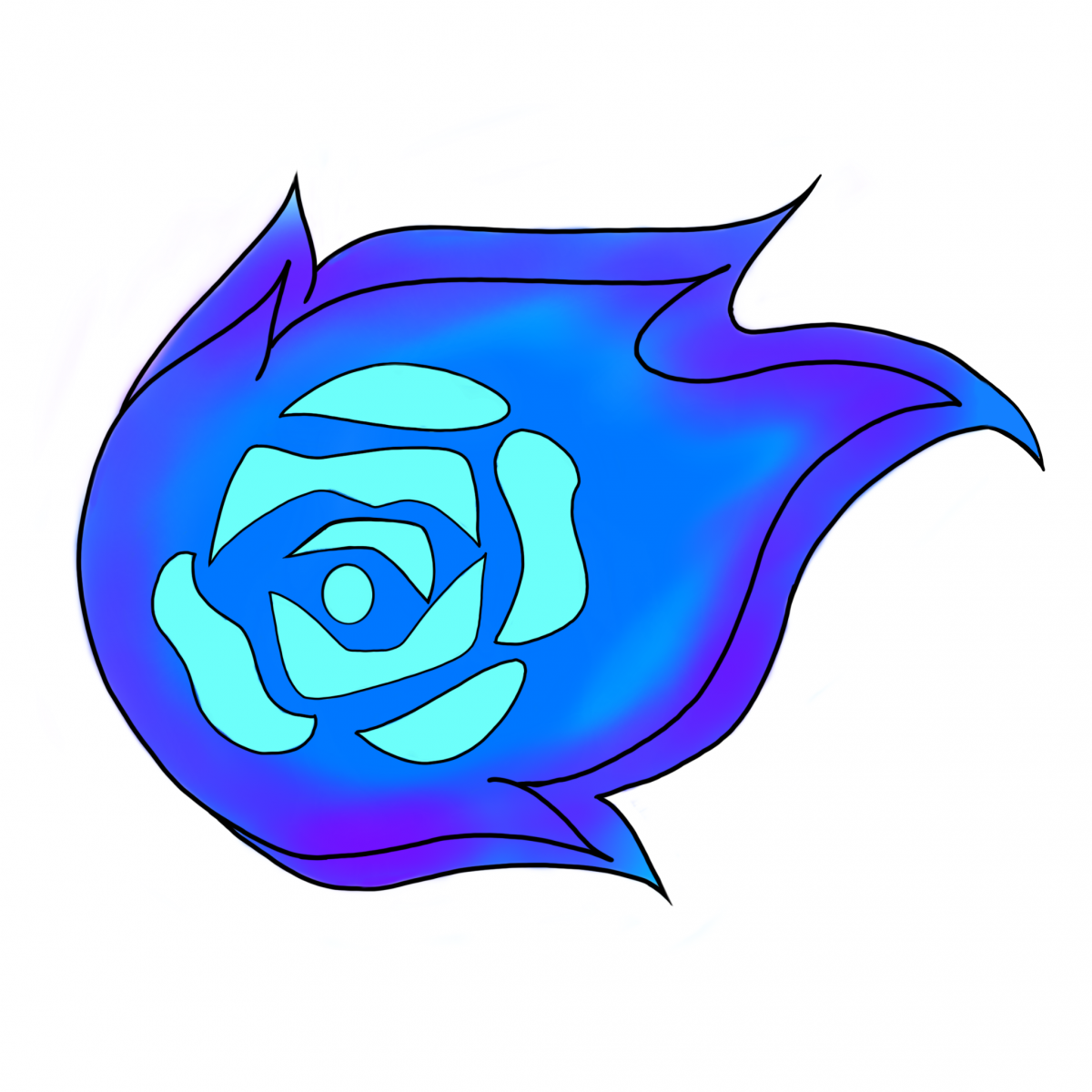
I created the quote is “I’m an eternal flame I’ll never fade”. The reason why I came up with this quote is for personal reasons. It’s to encourage me and to tell me to never give up my passion.” The flame” resonates with my soul, my existence. The word flame shows my energetic and caring heart. The “I’ll never fade” part shows my perseverance how strong I am and how I should never settle for less and I should continue to keep up with my dreams. The way my quote is structured is with an illustration I’ve created the colors are blues and purples. Blue flames are hotter than red flames which signifies the quote how hot “flame” is. This signifies the “I am an eternal flame”. Blue usually states a cooler color however in this project this is not the case this color is to show the strength within me. showcases my art style which is anime and comic type style. The reason why I set up this way is to show my creative side to show what I can create and if I continue with my passion what more I can achieve.
Quotes
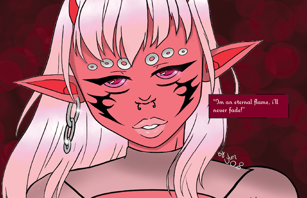
“I’m an eternal flame, i’ll never fade”
I created the quote is “I’m an eternal flame I’ll never fade”. The reason why I came up with this quote is for personal reasons. It’s to encourage me and to tell me to never give up my passion.” The flame” resonates with my soul, my existence. The word flame shows my energetic and caring heart. The “I’ll never fade” part shows my perseverance how strong I am and how I should never settle for less and I should continue to keep up with my dreams. The way my quote is structured is with an illustration I’ve created the colors are red and pink which signify the “I am an eternal flame”. The quote is put it in a box which showcases my art style which is anime and comic type style. The reason why I set up this way is to show my creative side to show what I can create and if I continue with my passion what more I can achieve.
Logo Research project
Jasmyne, Perez
City Tech College
Fall 2019
Professor: Thelma Bauer
Research Paper
McDonal Logo History
Over the years the marketing systems have become smarter on how they sell their products. Promoting their services or products with logos. With eye catching logos many people from all over the world know they signify. This research paper will explain the history of the Mcdonald’s logo. This research paper will also explain the success of the McDonal trademark, the start of the creation of the logo, and the changes the logo went through, to now in the present time.
Before the McDonald logo was created, the McDonald brothers ventured off to the entertainment industry, in hopes of a better life after their father was laid off without pension. The brothers were born into a poor family. The entertainment industry did not work out so well for the brothers, only getting twenty five dollars weekly. The brothers saved up what they could and bought a 750 seat theater, opened a snack bar. However not everything bend to the will of the brothers because of the great depression. The brothers were always late to pay their bills and even buried some silver, “in case the bank foreclose on their theater”. After this the brothers decided to close “The Beacon”, they decided to try the food business.
Long before the golden arches as we know them today, McDonald’s was named McDonald’s Barbeque, a food stand. Their first opening was at San Bernardino. Brothers Richard and Maurice McDonald soon found out their top seller was burgers, they then closed down their store to perfect “the art of fast food”. Their first ever logo started in 1948, they named their service the ‘Speedee Service System’.
The brothers created a winking chef with a sign that states “custom built hamburgers” to promote the start of their service. “The double golden arches were not the original of McDonalds”. Ricard then hired an architect “ Stanley Meston” to design a “neon-trimmed golden arches”. This was the start of The McDonald’s logo.
However this eye catching design worked up until 1962, then came the time where the brothers sold out to Kroc. The first change to the McDonald’s logo was the speedee chef. Another artist that had a help in the McDonald’s logo was design consultant Louis Cheskin. Louis then created the double “M” we all know today, however the original idea of the golden arches was by Richard McDonald. While the first “franchised unit of McDonalds was designed by Stanley Clark Meston”. Ray Kroc then incorporated the arches to turn into the letter M, with the help of Fred turner and Jim Schindler. Ray Kroc was the influence to push the double arch into the McDonald’s logo.
History of the McDonald’s logo.
The font used for the McDonald’s logo was McLawsuit. The font created by Jesse Burgheimer with 99 characters. The reason for this is because of “the simplicity of the fonts that make the name McDonald’s look appealing to the eyes”. The colors used was also a smart marketing decision, the colors used were red and yellow. Red triggers stimulation, appetite, hunger, and attracts attention. Yellow triggers the feeling of happiness and friendliness. The colors are also bright which will help the customers see from a distance.
Not only is this logo universally well known, but it has impacted the pop culture. McDonalds has “redefined the concept of dining out, from fast service food to affordable fast and a delicious meal. Mcdonald has changed the views of society and the way people eat, with creating food items like the Big Mac, McGriddles, and a Happy meal. The branding was the first step that led other food industries to come up with their own brands and leave their mark as well.
In conclusion,the success of McDonald’s logo has been a long history. There have been many people who had a part in the success. However the original creators were the McDonald brothers. Kcroc only bought the business from the brothers because he saw the potential it held.
References and Citations
“The story behind the McDonald logo, Julia Sagar CB Creative Bloq”, Art and Design Inpiration, November 19, 2013 https://www.creativebloq.com/logo-design/mcdonalds-logo-short-11135325
“History Of The McDonald’s Logo Design”, Inkbot Design, April 12,2018
https://medium.com/@inkbotdesign/history-of-the-mcdonalds-logo-design-abb29ef78741
“The Origins of McDonald’s Golden Arches”, Alan Hess Journal of the Society of Architectural Historians, Journal article, March 1986
https://www.jstor.org/stable/990129?seq=1#page_scan_tab_contents
“The tragic real-life story of the McDonald brothers”,JOEL STICE, https://www.mashed.com/147897/the-tragic-real-life-story-of-the-mcdonald-brothers/
“The surprising reason why the McDonald’s sign is red and yellow” ,Jessica Brown,
September 14, 2017 https://www.indy100.com/article/mcdonalds-brand-signs-yellow-red-psychology-calming-hungry-7944036
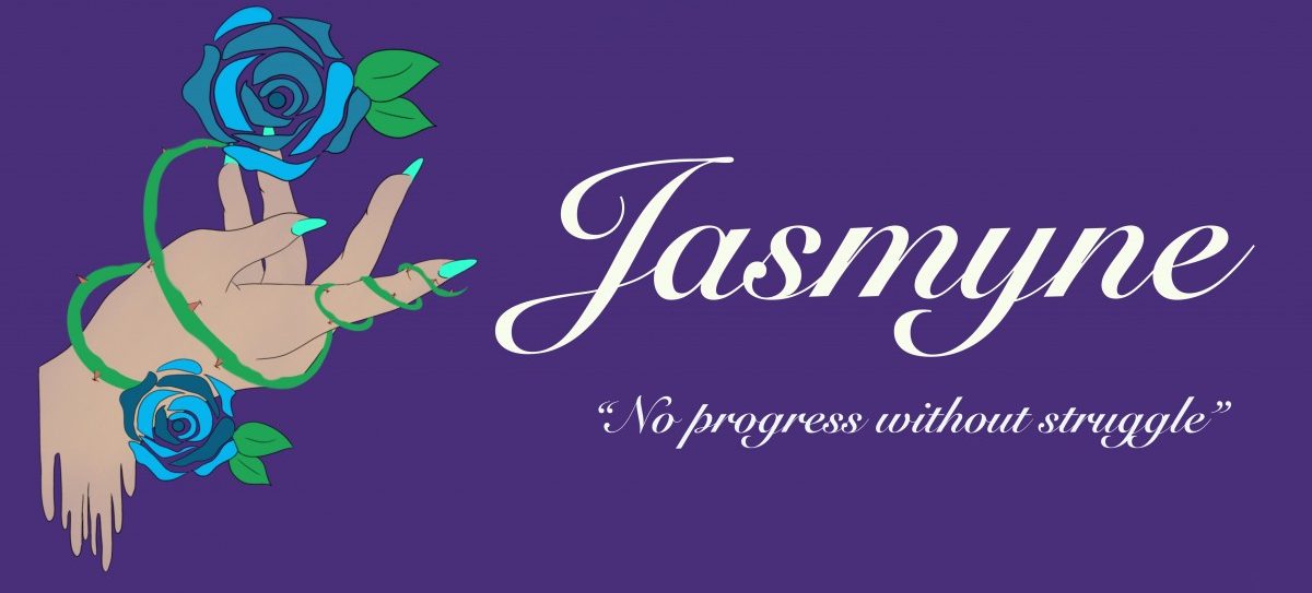
Banner
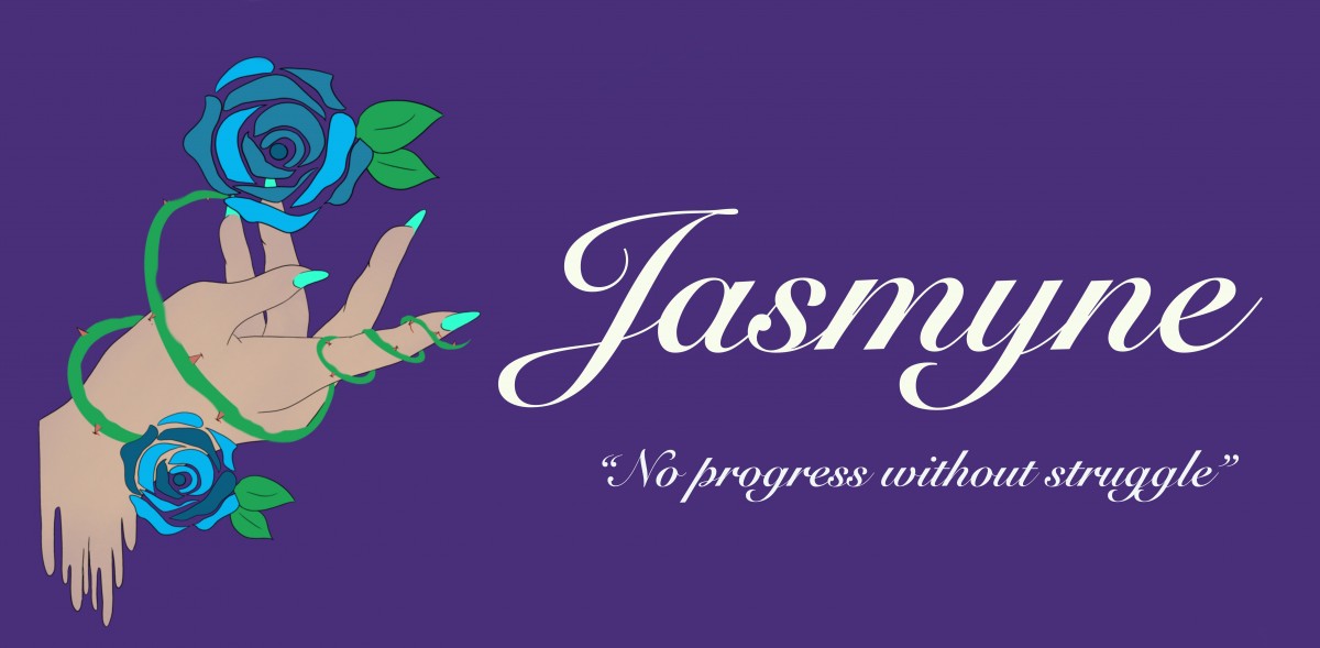
“No progress without struggle”
I was assigned to create a banner that represents me. This is the banner I came up with, which showcases a hand with two blue roses with thorns piercing the flesh. The reason for the blue roses is to show my perseverance, to show how much I strive through all the hardships. Blue roses do not exist in the natural aspect that a red rose does, it is man made, however this is the message that i am trying to showcase, ” even when things seem impossible make it your business to make it possible”. The thorns represents any negative statements said to me or struggles that might stop me from achieving success in the art community.
Welcome!
Leave a reply
This is the first post on your Learning Blog. Edit or delete it, then start blogging!
The ePortfolio is both a Learning Blog and an Academic Career Portfolio. Use the Learning Blog to document your learning experiences and class assignments each semester. As time goes by, add content to the Academics and Career sections to show your department, graduate institutions, or future employers how well prepared you are for your chosen career.
NOTE: Remember to add appropriate Categories and Tags to your posts. This will help your professors and other visitors find the content they are looking for. The Categories “Coursework” and “Field Trips” and the Tags “OpenLab” and “City Tech” have already been applied to this post. Feel free to make changes!

