
1964-1973
From 1964 to 1973, the Doritos logo was a very brightly colored shade of yellow and orange blocks with a darker red for the actual letters. The typeface was transitional because the lowercase serifs are really horizontal. This logo showed no sign of Doritos being a tortilla chips brand whatsoever.

1973-1979
From 1973 to 1979, the logo still had the colored blocks but had changed the color scheme from those bright yellow and oranges, to a more subtle yellow and orange with the letters being dark brown. The typeface was still transitional.
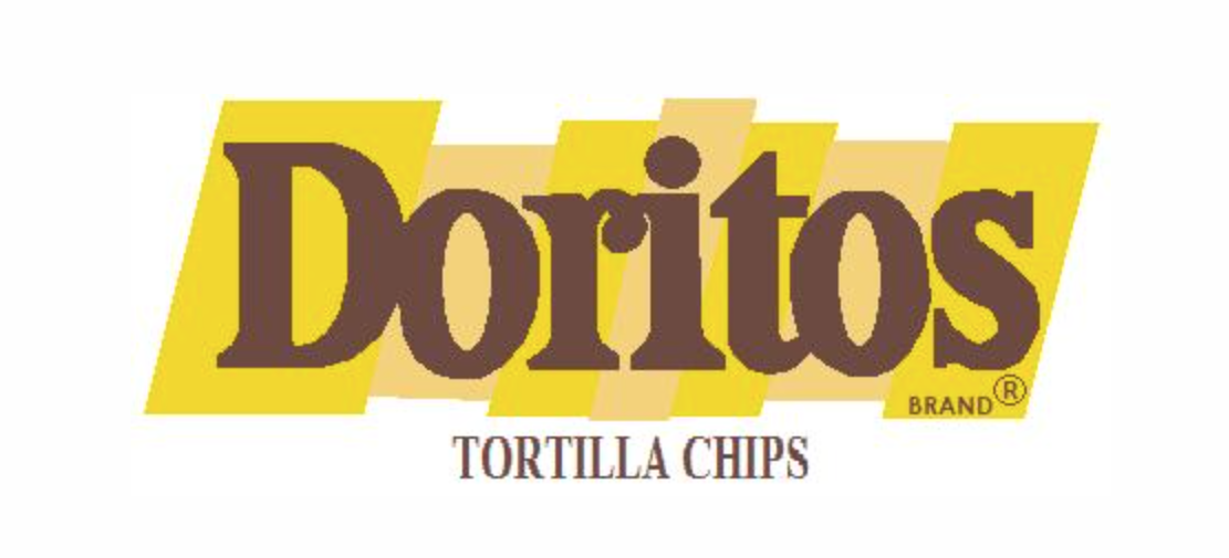
1979-1985
From 1979 to 1985, the logo made its blocks look more like parallelograms and changed the color to a mustard yellow color. It went to a much bolder transitional typeface for the letters, and a lighter shade of dark brown. This latest logo also included ” Tortilla Chips” underneath the initial Doritos brand text.

1985-1994
From 1985 to 1994, the Doritos logo changed the color of it’s transitional typeface to all black with a thin white stroke around it as well as five large red and yellow blocks. They got rid of the words ‘ tortilla chips’ on the bottom. They also made the top of the letter i, a triangle for the shape of the chip.
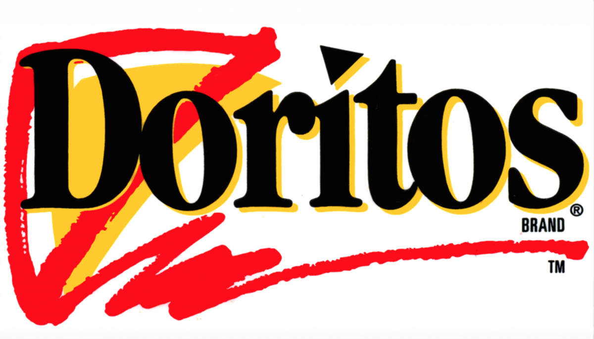
1994-1997
From 1994 to 1997, Doritos kept its black typeface and its triangular shaped chip as the top of the i. However, they got rid of the colored blocks behind the letters, instead adding a yellow layer of the text right behind it with a red drawing of the chip right behind the D.
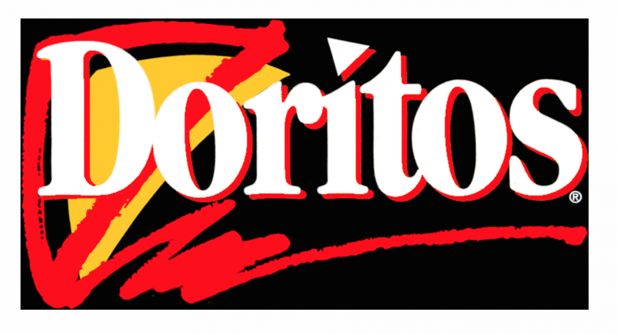
1997-2000
From 1997 to 2000, Doritos kept the same design as before but slightly tweaked it by adjusting the background color to black, the transitional typeface to white, and making the drop shadow of the text red, instead of yellow.
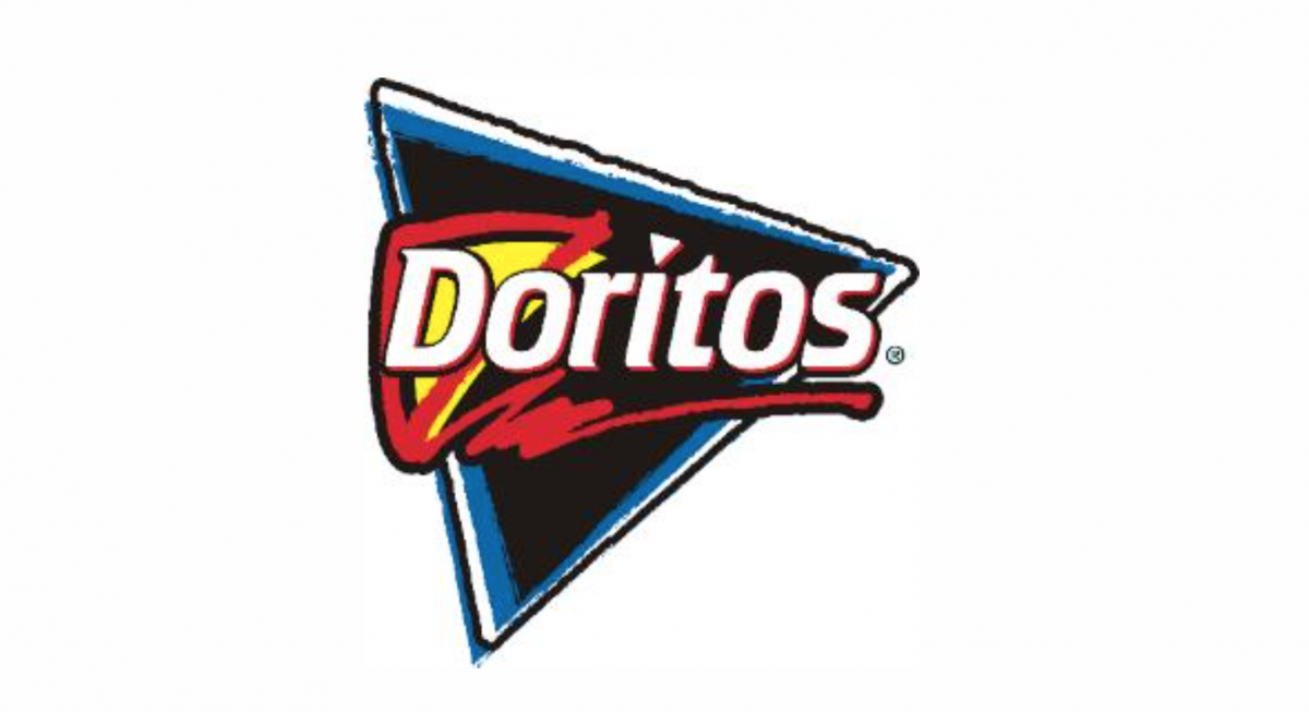
2000-2005
From 2000 to 2005, Doritos changed it’s usual rectangular layout to the triangular shaped chip being the background with a blue border. They used the same logo as they did in 1997 and placed it on the chip. However, they used what seems to be a sans serif and decorative style for their typeface.
From 2005 to 2013, Doritos had a white decorative typeface with a red drop shadow and a thick black drop shadow on both their name and fire flame. The typeface also has a ore 3D effect than before because of the various drop shadows in the back of the original text.
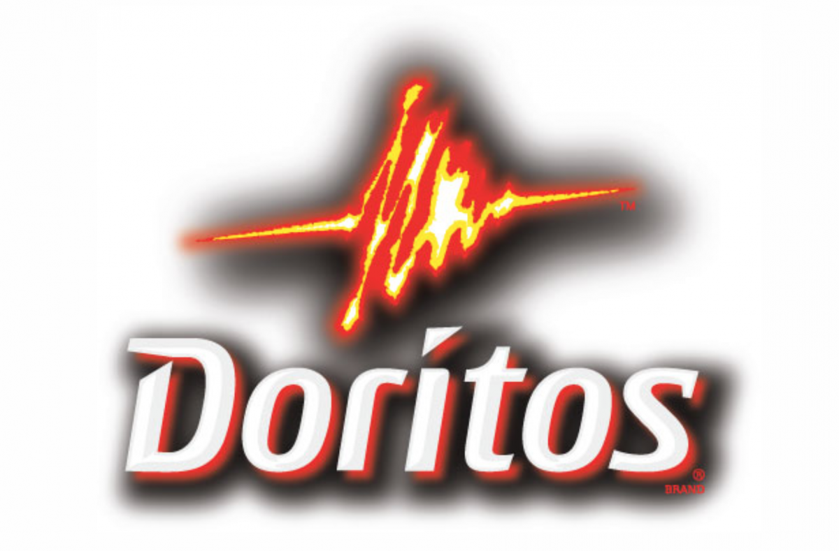
2005-2013
The most recent Doritos logo has a thin red outer glow and then an even thicker black outer glow. The orange, yellow, and red are a much more vibrant tone than before. Hornall Anderson, a creative branding and design agency and Doritos, partnered up and designed the most recent Doritos logo. There were numerous factors that went into the thought process of the Doritos logo. According to Hornall Anderson, “We considered everything from photography, tone of voice and visual personality to create a bold and inspiring look and feel. The new identity and package design brings to life the emotional equities of the Doritos brand and what it means to the consumer.”
The Doritos logo is found on the product itself, websites, television, and several print materials including supermarket flyers and newspapers. The images that surround logo in advertising are intended to complement it, from the color of the chip to the flames and flavors that Doritos come in.
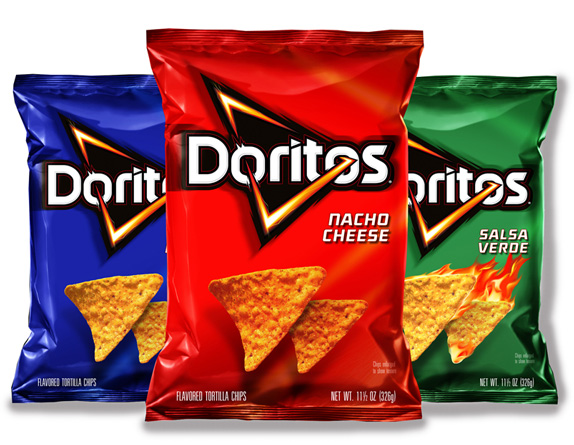

Doritos Nacho Cheese Chips
SOURCES:
http://www.creativebloq.com/logo-design/new-logo-and-packaging-doritos-3132259

